025; ask the maker 2015 tutorial.
Two updates in a day - I'm really surprising myself here. Anyway, I still have some tutorials and guides left to write and since I intend to finish them all, here comes another one for this year's Ask the Maker activity.

from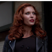
to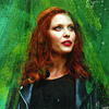
requested by dark_x_huntress
STEP ONE.
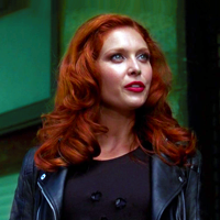
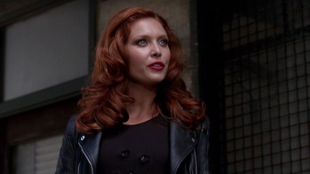
original image
I made this icon for a challenge at thehuntergames and decided I'd try out that painty look. I hadn't done it before using brushes, so this icon was mostly trial and error.
At first I placed the screencap on a 200x200px canvas (I usually work with 100x100px canvases but I wanted to be able to see things better without having to zoom in for the painty bits.
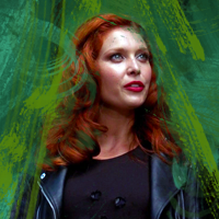
Then I smudged the top bit and blurred the smudged part a bit. Afterwards I brightened the image by running the auto adjustments (auto tone, auto contrast and auto color) and added a curves layer with two points (output: 209, input: 186; output: 179, input: 160) for more brightness.
STEP TWO.
Now it's time to add some color. For that, I added two selective color layers with the following settings:
Whites
Cyan: +3
Magenta: +7
Yellow: +12
Black: 0
Neutrals
Cyan: +29
Magenta: -11
Yellow: +10
Black: +4
Then I added a layer mask and removed the parts of the selective color layer that covered Abaddon with a round black brush.
These are the settings for the second selective color layer:
Reds
Cyan: -51
Magenta: +41
Yellow: +100
Black: +26
Yellows
Cyan: -51
Magenta: -74
Yellow: +100
Black: +55
I added a layer mask to this layer as well and removed the parts that covered Abaddon's face with a round grey brush.
STEP THREE.
At this point, I think we need a little more brightness and I also wanted to make the colors pop more, so I added another curves layer (Red - output: 255, input: 232; Green - output: 255, input: 226; Blue - output: 255, input: 228). I also added a vibrance layer (vibrance: +53, saturation: +9).
STEP FOUR.
Now it's time to do some painting. For that, you will need different kinds of paint brushes. At least, that's what I did. I think I found them in one of the tutorial posts from Ask the Maker activities but you can also just use Google and type in paint brushes to find some or go to DeviantArt.
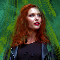
So, I used different shades of green for my paint brushes which I then rotated and resized to fit the icon. I covered some parts of Abaddon's clothes and hair but made sure her face stayed clean. Depending on the color scheme you want to go for or the colors that already are in your image, you may use different colors.
These are some of the greens I used: #4d7e0c, #326428, #359c76 and #175031.
Then I added another layer and used some hair brushes to add some waves to Abaddon's hair. I once again rotated and resized them to make them fit the size of Abaddon's head. I used different shades of a brownish red: #753111 and #4f0e01. I might have also used some other colors but I can't tell because I just threw them on the same layer.
STEP FIVE.
For this step I duplicated the layer on which I ran the auto adjustments, dragged it to the top, set it to soft light and lowered the opacity to 48%. Then I copy merged everything and used surface blur and lowered the opacity of this layer to 36%. Afterwards I added another curves layer for some more brightness (output: 255, input: 247; output: 207, input: 178).
STEP SIX.
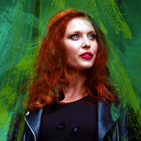
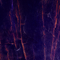
The last step is adding some textures. I added this texture (I can't remember who made it and can't find it in my folders either, sorry) and set it to subtract at 58% opacity. Then I added this texture by rosebein (Tumblr) and set it to linear dodge (add) at 55% opacity. I also added a layer mask to the latter and removed some of the bits over Abaddon's face and body with a light grey brush.
Afterwards I copy merged everything again and placed it on a 100x100px canvas and used paint daubs to sharpen the icon. I can't remember the exact settings but it must have been something like this: brush size: 1, sharpen: 1 (maybe 0), brush type: simple. Then I lowered the opacity to 78%. Really, just play around with it or use smart sharpen or high pass to sharpen your icon.
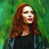
AND THIS IS THE FINAL RESULT:
I hope this tutorial was helpful and understandable. If you happen to have any questions about any of the steps, though, please feel free to ask.
from
to
requested by dark_x_huntress
STEP ONE.
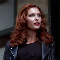
original image
I made this icon for a challenge at thehuntergames and decided I'd try out that painty look. I hadn't done it before using brushes, so this icon was mostly trial and error.
At first I placed the screencap on a 200x200px canvas (I usually work with 100x100px canvases but I wanted to be able to see things better without having to zoom in for the painty bits.
Then I smudged the top bit and blurred the smudged part a bit. Afterwards I brightened the image by running the auto adjustments (auto tone, auto contrast and auto color) and added a curves layer with two points (output: 209, input: 186; output: 179, input: 160) for more brightness.
STEP TWO.
Now it's time to add some color. For that, I added two selective color layers with the following settings:
Whites
Cyan: +3
Magenta: +7
Yellow: +12
Black: 0
Neutrals
Cyan: +29
Magenta: -11
Yellow: +10
Black: +4
Then I added a layer mask and removed the parts of the selective color layer that covered Abaddon with a round black brush.
These are the settings for the second selective color layer:
Reds
Cyan: -51
Magenta: +41
Yellow: +100
Black: +26
Yellows
Cyan: -51
Magenta: -74
Yellow: +100
Black: +55
I added a layer mask to this layer as well and removed the parts that covered Abaddon's face with a round grey brush.
STEP THREE.
At this point, I think we need a little more brightness and I also wanted to make the colors pop more, so I added another curves layer (Red - output: 255, input: 232; Green - output: 255, input: 226; Blue - output: 255, input: 228). I also added a vibrance layer (vibrance: +53, saturation: +9).
STEP FOUR.
Now it's time to do some painting. For that, you will need different kinds of paint brushes. At least, that's what I did. I think I found them in one of the tutorial posts from Ask the Maker activities but you can also just use Google and type in paint brushes to find some or go to DeviantArt.
So, I used different shades of green for my paint brushes which I then rotated and resized to fit the icon. I covered some parts of Abaddon's clothes and hair but made sure her face stayed clean. Depending on the color scheme you want to go for or the colors that already are in your image, you may use different colors.
These are some of the greens I used: #4d7e0c, #326428, #359c76 and #175031.
Then I added another layer and used some hair brushes to add some waves to Abaddon's hair. I once again rotated and resized them to make them fit the size of Abaddon's head. I used different shades of a brownish red: #753111 and #4f0e01. I might have also used some other colors but I can't tell because I just threw them on the same layer.
STEP FIVE.
For this step I duplicated the layer on which I ran the auto adjustments, dragged it to the top, set it to soft light and lowered the opacity to 48%. Then I copy merged everything and used surface blur and lowered the opacity of this layer to 36%. Afterwards I added another curves layer for some more brightness (output: 255, input: 247; output: 207, input: 178).
STEP SIX.
The last step is adding some textures. I added this texture (I can't remember who made it and can't find it in my folders either, sorry) and set it to subtract at 58% opacity. Then I added this texture by rosebein (Tumblr) and set it to linear dodge (add) at 55% opacity. I also added a layer mask to the latter and removed some of the bits over Abaddon's face and body with a light grey brush.
Afterwards I copy merged everything again and placed it on a 100x100px canvas and used paint daubs to sharpen the icon. I can't remember the exact settings but it must have been something like this: brush size: 1, sharpen: 1 (maybe 0), brush type: simple. Then I lowered the opacity to 78%. Really, just play around with it or use smart sharpen or high pass to sharpen your icon.
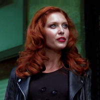
AND THIS IS THE FINAL RESULT:
I hope this tutorial was helpful and understandable. If you happen to have any questions about any of the steps, though, please feel free to ask.