Cycle 03 - Challenge 11: Final - Results
CYCLE 03 FINAL RESULTS
THIRD PLACE
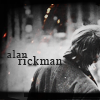
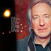
xenylamine!

SET A
1.
2.
3.
TALLY
Negative votes: 4
Positive votes ~ #2 = 1 + #3 = 1.
Overall: 4- + 2+ = 2-
SECOND PLACE
spikesbint!
SET B
4.
5.
6.
TALLY
Negative votes: 2
Positive votes ~ #5 = 1
Overall: 2- + 1+ = 1-
FIRST PLACE
spiffydaze!


SET C
7.
8.
9.
TALLY
Negative votes: 2
Positive votes ~ #7 = 2 + #8 = 2 + #9 = 1.
Overall: 2- + 5+ = 3+
[N = Negative votes & P = Positive votes]
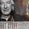
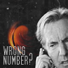
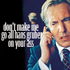
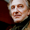
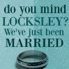
SET A] - xenylamine - N = 4/P = 2
[x] "the colouring in icon 2 is so lacking in saturation that the text is difficult to read, and the icon background takes all the attention away from the quote. Icon 3's text is unimaginative and the crop too close on the right hand side. Icon A's light spots seem overly contrived because of the way they've been used, and as a result look odd and unnatural."
[x] "the first icon is very busy, as the texture, colored image, and black and white image are a lot to take in at once, plus the contrast is a bit high. The second icon is good, but the third is too dark and the text is unnecessary."
[x] "Wow, this was really hard to decide, but Set A because there isn't enough contrast on #2 and the scratches on #1 take over too much of the icon."
[x] "I love all these icons especially the last one... but the light textures and the scratches in the first icon overwhelm the icon a bit - it's already fantastic with the double image and doesn't need more. Also, the second icon is great but compared to the others it seems lacking."
[x] #2 - "Witty text with a good font that blends in well with the texture chosen. The way all the colours fit well together also makes the icon seem interesting with a good flow and balance."
[x] #3 - "Nice crop"
SET B] - spikesbint - N = 2/P = 1
[x] "The overall style of the icons feels unbalanced and all 3 icons have a somewhat heavy tone. The first icon has a very interesting crop and the images are well used, however the text down the centre is rather distracting. The second icon has an odd use of text and the font does not work well for the subject matter. The last icon has nice colouring, but once again, the text looks out of place and a little over-sized."
[x] "This is a very strong set and very difficult to choose one in the end. Icon 5 is certainly one of my favorite arrangements and icon 4 was one of the most successful blends. The overall look was very polished, however the typography felt a little too large which makes it come across as less sophisticated."
[x] #5 - Positive [No Comment]
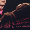
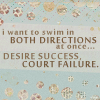
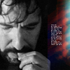
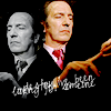
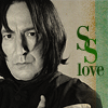
SET C] - spiffydaze - N = 2/P = 5
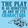
[x] "The text is too tiny to being very legible in the text icon, and the small images in the first icon are very hard to see."
[x] "Although really artist in design, the text icon was difficult to read without coming closer to the screen. Icons 7 & 9 could have done with being a little sharper."
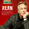
[x] #7 - "Simply adorable. I love the coloring, and the photos across the top are a creative and effective touch. Fantastic work."
[x] #7 - Positive [No Comment]
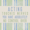
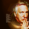
[x] #8 - "This icon seemed the most unique to me of everything presented here. Everything else feels as though it employs standard iconing techniques while this is more original and still successful. The quote works well with the image and color scheme. It is also a nice choice of quote."
[x] #8 - Positive [No Comment]
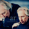
[x] #9 - Positive [No Comment]
Congratulations to all three of you! :D and thank you to everyone who participated this round ^_^
Cycle 04 Sign Ups will be posted soon!
THIRD PLACE
xenylamine!
SET A
1.
2.
3.
TALLY
Negative votes: 4
Positive votes ~ #2 = 1 + #3 = 1.
Overall: 4- + 2+ = 2-
SECOND PLACE
spikesbint!
SET B
4.
5.
6.
TALLY
Negative votes: 2
Positive votes ~ #5 = 1
Overall: 2- + 1+ = 1-
FIRST PLACE
spiffydaze!
SET C
7.
8.
9.
TALLY
Negative votes: 2
Positive votes ~ #7 = 2 + #8 = 2 + #9 = 1.
Overall: 2- + 5+ = 3+
[N = Negative votes & P = Positive votes]
SET A] - xenylamine - N = 4/P = 2
[x] "the colouring in icon 2 is so lacking in saturation that the text is difficult to read, and the icon background takes all the attention away from the quote. Icon 3's text is unimaginative and the crop too close on the right hand side. Icon A's light spots seem overly contrived because of the way they've been used, and as a result look odd and unnatural."
[x] "the first icon is very busy, as the texture, colored image, and black and white image are a lot to take in at once, plus the contrast is a bit high. The second icon is good, but the third is too dark and the text is unnecessary."
[x] "Wow, this was really hard to decide, but Set A because there isn't enough contrast on #2 and the scratches on #1 take over too much of the icon."
[x] "I love all these icons especially the last one... but the light textures and the scratches in the first icon overwhelm the icon a bit - it's already fantastic with the double image and doesn't need more. Also, the second icon is great but compared to the others it seems lacking."
[x] #2 - "Witty text with a good font that blends in well with the texture chosen. The way all the colours fit well together also makes the icon seem interesting with a good flow and balance."
[x] #3 - "Nice crop"
SET B] - spikesbint - N = 2/P = 1
[x] "The overall style of the icons feels unbalanced and all 3 icons have a somewhat heavy tone. The first icon has a very interesting crop and the images are well used, however the text down the centre is rather distracting. The second icon has an odd use of text and the font does not work well for the subject matter. The last icon has nice colouring, but once again, the text looks out of place and a little over-sized."
[x] "This is a very strong set and very difficult to choose one in the end. Icon 5 is certainly one of my favorite arrangements and icon 4 was one of the most successful blends. The overall look was very polished, however the typography felt a little too large which makes it come across as less sophisticated."
[x] #5 - Positive [No Comment]
SET C] - spiffydaze - N = 2/P = 5
[x] "The text is too tiny to being very legible in the text icon, and the small images in the first icon are very hard to see."
[x] "Although really artist in design, the text icon was difficult to read without coming closer to the screen. Icons 7 & 9 could have done with being a little sharper."
[x] #7 - "Simply adorable. I love the coloring, and the photos across the top are a creative and effective touch. Fantastic work."
[x] #7 - Positive [No Comment]
[x] #8 - "This icon seemed the most unique to me of everything presented here. Everything else feels as though it employs standard iconing techniques while this is more original and still successful. The quote works well with the image and color scheme. It is also a nice choice of quote."
[x] #8 - Positive [No Comment]
[x] #9 - Positive [No Comment]
Congratulations to all three of you! :D and thank you to everyone who participated this round ^_^
Cycle 04 Sign Ups will be posted soon!