Cycle 3 - Challenge 01 - Results
Eliminated:
- jadedanielle [13 votes]
- secret0window [12 votes]
- a_silver_story [10 votes]
Please stick around for the special challenge and for voting! ♥
---
People's choice:
- spikesbint [3 votes + 11 tie breakers]
---
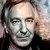
Mod's Choice
- xenylamine [indeed he is ;) love the text and the light texture.]
1
2
3
4
5
6
7
8
9
10
11
12
13
14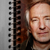
15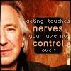
16
17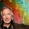
18
19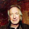
20
21
22
23
24
25
26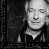
Votes:
[N = Negative votes & P = Positive votes]
01] - crazybanana726 - N = 0/P = 0
02] - semi_subtle - N = 2/P = 0
[x] "The bottom black is a nice effect though the colors on him are darkish and not very appealing and looks a tad boring. maybe some text at the bottom will help ^^"
[x] "Seems a bit unoriginal. It doesn't look as if anything has been done, other than cropping."
03] - a_silver_story - N = 10/P = 0
[x] "The rainbow texture/gradient over his face looks sloppy and haphazard because of how glaringly different the stripes of color are. The icon looks unfinished without any other decoration or something to tie in the REASON there's a random bunch of rainbows over his face."
[x] "oversharpened and alan's face looks a little stretched"
[x] "image seems overly grainy, probably due to the brush used, regardles its overpowering bringing down the over all image quality"
[x] "Grainy and colors don't compliment the image."
[x] "The black and white image is a bit too dark and a little oversharp. The way a bit of colour has been used takes away from rather than adds to the icon."
[x] "icon is far too oversharpened and overcontrasted, and the coloring is distracting."
[x] "the icon is over sharpened in appearance and the coloring gives it an uneven feel."
[x] "The coloring doesnt seem to go well with the image.it looks very bland and washed out but i love the cropping :)"
[x] "The splashes of color are done awkwardly and the icon is too sharp and rough."
[x] "The coloring gives the icon an odd look and lessens the quality of the icon."
04] - anet_art - N = 1/P = 1
[x] "Although the colouring of Alan is very nice and suits the picture very well there seems to be too much sudden contrast between the colourful and rigidly square middle and the grey outside, and the two elements don't blend very well together. Also, the inner picture is cropped so that Alan's eyes are not all there but it seems as though they should be."
[x] "very stylish, me likes :D"
05] - phistolemon_ - N = 0/P = 1
[x] "the use of text and the coloring of the icon are all in harmony with each other, and nice cropping"
06] - girlboheme - N = 0/P = 3 TIE BREAKERS = 6
[x] "Great composition. And I love the colouring. ^^"
[x] "I like the crop, brushes and background"
[x] "Very original! I love the sepia toning."
---
[x] "This is a subjective comment so I hope it's OK, but I love how it looks like a photograph on the mantelpiece. I think it is very creatively done :)."
07] - neke - N = 1/P = 1
[x] "The colouring is too grey and the font too common."
[x] "Fantastic crop really stands out and I love the B&W."
08] - so_severus - N = 0/P = 1
[x] "Great cropping and balance to this icon! It stands out as well arranged and executed."
09] - secret0window - N = 12/P = 0
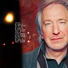
[x] "This image was sooooo HQ, there is no reason your icon should be blurry. It's way past soft and into blurry territory, unfortunately. Also, creative cropping doesn't mean a giant white area and nothing else done to the icon."
[x] "Odd cropping and looks a little over sharpened."
[x] "Picture is grainy; although nice crop, it's a dull icon with no coloring or text of any kind."
[x] "Bad cropping and the colouring is too reddish."
[x] "cropping is awkward, colors seem off"
[x] "The cropping is interesting but the colouring lacks interest and is a little dull"
[x] "the crop could have been done better"
[x] "It looks like nothing was done to the icon apart from the crop, which is way too close up. I don't see the reason for the blank white space on the left either."
[x] "the picture quality has been reduced from the original image, giving it a slightly grainy look and the cropping is not complimentary to the subject"
[x] "I like the cut out image but it looks like that was all was done.maybe something extra like some text or some colors would help :)"
[x] "The white space on the left makes the icon look like it's less than 100x100 pixels. The image is also a bit blurry."
[x] "The crop could be better and the coloring is too rough and makes his skin look pink-ish."
10] - already_used - N = 3/P = 0
[x] "Coloring is great but the crop of the icon makes it seem incomplete."
[x] "cropping is awkward"
[x] "The icon is a bit blurry, and the crop is a bit off."
11] - pocoyo_moi - N = 6/P = 0
[x] "icon is over-sharpened and has a grainy feel"
[x] "Too sharp."
[x] "A little too sharp; the textures are overwhelming."
[x] "Too oversharpened."
[x] "way too oversharpened and overcontrasted, and the crop is unoriginal."
[x] "The picture is over-sharpened and the cropping is uninteresting."
12] - whiteroseofdark - N = 2/P = 0
[x] "Selective coloring abuse (why is his hair blue at the edges?) and the typography is unremarkable... maybe try downloading some new fonts, because Lucida isn't a good choice for any graphics. Plus, the text is blurry (or anti-aliased badly), and it looks strange with how sharp Alan is."
[x] "the text and colouring could have been done better"
13] - cdg - N = 2/P = 1
[x] "the flip of the picture makes him look a little odd"
[x] "The texture does not really fit the rest of the icon. The colouring on Rickman is too dark."
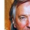
[x] "The background is very beautiful and works well with the image of Alan. Alan is well positioned in size and angle."
14] - linz_lou - N = 2/P = 0
[x] "The paper texture thing just looks badly placed and it doesnt really do anything positive to the icon."
[x] "rickman looks very dark and hidden, maybe brighten him up to draw him forward a bit?"
15] - sra33 - N = 0/P = 1
[x] "color all work well together and nice handling of a large bit of text"
16] - xenylamine - N = 0/P = 0
17] - lydkami - N = 2/P = 0
[x] "Cropping is wonderful!but the rainbow effect doesnt seem to go well with the bright crisp image.maybe a different color would match more :)"
[x] "Rickman doesn't really fit with the rainbow texture in the back."
18] - jadedanielle - N = 13/P = 0
[x] "Horrible contrast. His gorgeous facial features are almost obliterated by the brightening/contrast, and the rest of the icon is so dark that it just throws the too-light area into sharp relief. Try toning down the brightness and upping the contrast. The burn tool works wonders, too."
[x] "icon looks over-sharpened"
[x] "The icon is a little over contrasted."
[x] "too bright, you can hardly see his features"
[x] "The icon is way too bright and sharp and the brush adds nothing to the composition."
[x] "over lightened, looks like poor mr. rickman had all the color sucked right out of him. the green is quite nice though"
[x] "Really bright! His face is sort of flushed out."
[x] "Too much contrast."
[x] "the colouring is so bright, i can hardly make out the features"
[x] "Rickman's face has been contrasted into oblivion and the icon is too sharp."
[x] "The face is too bright and over-sharpened."
[x] "the image looks over exposed, although the textures/brushes do compliment the icon and it has a slightly over sharpened look to it"
[x] "The image is over-saturated."
19] - spiffydaze - N = 0/P = 1
[x] "I love how simple and nice it is and yet it still really captures your attention with the coloring and cropping!"
20] - angryteabag - N = 4/P = 0
[x] "seems like too much contrast in his face - it's hard to see the features"
[x] "his face is too bright"
[x] "Too bright and not enough contrast."
[x] "Too much contrast."
21] - without__wings - N = 0/P = 0
22] - jessickah - N = 0/P = 3 TIE BREAKERS - 5
[x] "like the colors, effect, crop and text/font"
[x] "great text and cropping; colors all meshed well. All in all, a wonderful icon (that I would love to use after the voting is complete!)"
[x] "it was a hard tie for me, but I like this one most because of the choice of color scheme, and I always love icons that outline the subject matter, very cool."
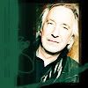
23] - spikesbint - N = 0/P = 3 TIE BREAKERS - 11
[x] "It's simple and cute. Clean, lovely coloring, and good use of brushes/textures."
[x] "great use of texture and tinytext. both are very effective in this icon, and I like the coloring as well."
[x] "The icon is simple, but elegant. The tiny text and the light texture are working very well with the rest of the icon."
---
[x] "The tiny text and textures are so eloquently placed. ^^"
24] - lovesnape - N = 4/P = 0
[x] "highly distracting how the white swoosy lines go right through the subject's face. would have been much stronger if they just went behind the image"
[x] "Although the idea of this icon is very creative and lovely and the background is very pretty, Alan is too blurry and indistinct and seems to just be floating in the middle. Similarly, the text doesn't seem to be positioned quite right."
[x] "the texture used blurrs the top of the main image"
[x] "The icon looks too busy with too many light textures and brushes which almost obscure the person on it"
25] - theblackeyeddog - N = 7/P = 2
[x] "The coloring is a bit off."
[x] "I like the concept but it's too bright, the texture doesn't doesn't blend well and the border is distracting."
[x] "coloring is too over saturated/too red, both crops are somewhat distracting"
[x] "Colours are too bright."
[x] "colors don't seem to fit the icon, oversharpened."
[x] "The texture somewhat distracts from the actual picture and the skin is too brownish/yellowish."
[x] "the texture is overpowering"
[x] "It's so colourful and the placement really works."
[x] "Gorgeous colouring, crop and use of double images."
26] - orlandogirl - N = 1/P = 0
[x] "The border/outer texture is hard to see and it isn't really effective."
Participants Status
The following people are still in the contest. If you're name is not in this list, it means you have been eliminated/disqualified.
anet_art
angryteabag
bad_day666
cdg
crazybanana726
girlboheme
jessickah
linz_lou
lovesnape
lydkami
neke
orlandogirl
phistolemon_
pocoyo_moi
semi_subtle
so_severus
spiffydaze
spikesbint
sra33
theblackeyeddog
whiteroseofdark
without__wings
xenylamine
Thank you to all who participated in the challenge and voting.
A new challenge will be put up soon.
- jadedanielle [13 votes]
- secret0window [12 votes]
- a_silver_story [10 votes]
Please stick around for the special challenge and for voting! ♥
---
People's choice:
- spikesbint [3 votes + 11 tie breakers]
---
Mod's Choice
- xenylamine [indeed he is ;) love the text and the light texture.]
1
2
3
4
5
6
7
8
9
10
11
12
13
14
15
16
17
18
19
20
21
22
23
24
25
26
Votes:
[N = Negative votes & P = Positive votes]
01] - crazybanana726 - N = 0/P = 0
02] - semi_subtle - N = 2/P = 0
[x] "The bottom black is a nice effect though the colors on him are darkish and not very appealing and looks a tad boring. maybe some text at the bottom will help ^^"
[x] "Seems a bit unoriginal. It doesn't look as if anything has been done, other than cropping."
03] - a_silver_story - N = 10/P = 0
[x] "The rainbow texture/gradient over his face looks sloppy and haphazard because of how glaringly different the stripes of color are. The icon looks unfinished without any other decoration or something to tie in the REASON there's a random bunch of rainbows over his face."
[x] "oversharpened and alan's face looks a little stretched"
[x] "image seems overly grainy, probably due to the brush used, regardles its overpowering bringing down the over all image quality"
[x] "Grainy and colors don't compliment the image."
[x] "The black and white image is a bit too dark and a little oversharp. The way a bit of colour has been used takes away from rather than adds to the icon."
[x] "icon is far too oversharpened and overcontrasted, and the coloring is distracting."
[x] "the icon is over sharpened in appearance and the coloring gives it an uneven feel."
[x] "The coloring doesnt seem to go well with the image.it looks very bland and washed out but i love the cropping :)"
[x] "The splashes of color are done awkwardly and the icon is too sharp and rough."
[x] "The coloring gives the icon an odd look and lessens the quality of the icon."
04] - anet_art - N = 1/P = 1
[x] "Although the colouring of Alan is very nice and suits the picture very well there seems to be too much sudden contrast between the colourful and rigidly square middle and the grey outside, and the two elements don't blend very well together. Also, the inner picture is cropped so that Alan's eyes are not all there but it seems as though they should be."
[x] "very stylish, me likes :D"
05] - phistolemon_ - N = 0/P = 1
[x] "the use of text and the coloring of the icon are all in harmony with each other, and nice cropping"
06] - girlboheme - N = 0/P = 3 TIE BREAKERS = 6
[x] "Great composition. And I love the colouring. ^^"
[x] "I like the crop, brushes and background"
[x] "Very original! I love the sepia toning."
---
[x] "This is a subjective comment so I hope it's OK, but I love how it looks like a photograph on the mantelpiece. I think it is very creatively done :)."
07] - neke - N = 1/P = 1
[x] "The colouring is too grey and the font too common."
[x] "Fantastic crop really stands out and I love the B&W."
08] - so_severus - N = 0/P = 1
[x] "Great cropping and balance to this icon! It stands out as well arranged and executed."
09] - secret0window - N = 12/P = 0
[x] "This image was sooooo HQ, there is no reason your icon should be blurry. It's way past soft and into blurry territory, unfortunately. Also, creative cropping doesn't mean a giant white area and nothing else done to the icon."
[x] "Odd cropping and looks a little over sharpened."
[x] "Picture is grainy; although nice crop, it's a dull icon with no coloring or text of any kind."
[x] "Bad cropping and the colouring is too reddish."
[x] "cropping is awkward, colors seem off"
[x] "The cropping is interesting but the colouring lacks interest and is a little dull"
[x] "the crop could have been done better"
[x] "It looks like nothing was done to the icon apart from the crop, which is way too close up. I don't see the reason for the blank white space on the left either."
[x] "the picture quality has been reduced from the original image, giving it a slightly grainy look and the cropping is not complimentary to the subject"
[x] "I like the cut out image but it looks like that was all was done.maybe something extra like some text or some colors would help :)"
[x] "The white space on the left makes the icon look like it's less than 100x100 pixels. The image is also a bit blurry."
[x] "The crop could be better and the coloring is too rough and makes his skin look pink-ish."
10] - already_used - N = 3/P = 0
[x] "Coloring is great but the crop of the icon makes it seem incomplete."
[x] "cropping is awkward"
[x] "The icon is a bit blurry, and the crop is a bit off."
11] - pocoyo_moi - N = 6/P = 0
[x] "icon is over-sharpened and has a grainy feel"
[x] "Too sharp."
[x] "A little too sharp; the textures are overwhelming."
[x] "Too oversharpened."
[x] "way too oversharpened and overcontrasted, and the crop is unoriginal."
[x] "The picture is over-sharpened and the cropping is uninteresting."
12] - whiteroseofdark - N = 2/P = 0
[x] "Selective coloring abuse (why is his hair blue at the edges?) and the typography is unremarkable... maybe try downloading some new fonts, because Lucida isn't a good choice for any graphics. Plus, the text is blurry (or anti-aliased badly), and it looks strange with how sharp Alan is."
[x] "the text and colouring could have been done better"
13] - cdg - N = 2/P = 1
[x] "the flip of the picture makes him look a little odd"
[x] "The texture does not really fit the rest of the icon. The colouring on Rickman is too dark."
[x] "The background is very beautiful and works well with the image of Alan. Alan is well positioned in size and angle."
14] - linz_lou - N = 2/P = 0
[x] "The paper texture thing just looks badly placed and it doesnt really do anything positive to the icon."
[x] "rickman looks very dark and hidden, maybe brighten him up to draw him forward a bit?"
15] - sra33 - N = 0/P = 1
[x] "color all work well together and nice handling of a large bit of text"
16] - xenylamine - N = 0/P = 0
17] - lydkami - N = 2/P = 0
[x] "Cropping is wonderful!but the rainbow effect doesnt seem to go well with the bright crisp image.maybe a different color would match more :)"
[x] "Rickman doesn't really fit with the rainbow texture in the back."
18] - jadedanielle - N = 13/P = 0
[x] "Horrible contrast. His gorgeous facial features are almost obliterated by the brightening/contrast, and the rest of the icon is so dark that it just throws the too-light area into sharp relief. Try toning down the brightness and upping the contrast. The burn tool works wonders, too."
[x] "icon looks over-sharpened"
[x] "The icon is a little over contrasted."
[x] "too bright, you can hardly see his features"
[x] "The icon is way too bright and sharp and the brush adds nothing to the composition."
[x] "over lightened, looks like poor mr. rickman had all the color sucked right out of him. the green is quite nice though"
[x] "Really bright! His face is sort of flushed out."
[x] "Too much contrast."
[x] "the colouring is so bright, i can hardly make out the features"
[x] "Rickman's face has been contrasted into oblivion and the icon is too sharp."
[x] "The face is too bright and over-sharpened."
[x] "the image looks over exposed, although the textures/brushes do compliment the icon and it has a slightly over sharpened look to it"
[x] "The image is over-saturated."
19] - spiffydaze - N = 0/P = 1
[x] "I love how simple and nice it is and yet it still really captures your attention with the coloring and cropping!"
20] - angryteabag - N = 4/P = 0
[x] "seems like too much contrast in his face - it's hard to see the features"
[x] "his face is too bright"
[x] "Too bright and not enough contrast."
[x] "Too much contrast."
21] - without__wings - N = 0/P = 0
22] - jessickah - N = 0/P = 3 TIE BREAKERS - 5
[x] "like the colors, effect, crop and text/font"
[x] "great text and cropping; colors all meshed well. All in all, a wonderful icon (that I would love to use after the voting is complete!)"
[x] "it was a hard tie for me, but I like this one most because of the choice of color scheme, and I always love icons that outline the subject matter, very cool."
23] - spikesbint - N = 0/P = 3 TIE BREAKERS - 11
[x] "It's simple and cute. Clean, lovely coloring, and good use of brushes/textures."
[x] "great use of texture and tinytext. both are very effective in this icon, and I like the coloring as well."
[x] "The icon is simple, but elegant. The tiny text and the light texture are working very well with the rest of the icon."
---
[x] "The tiny text and textures are so eloquently placed. ^^"
24] - lovesnape - N = 4/P = 0
[x] "highly distracting how the white swoosy lines go right through the subject's face. would have been much stronger if they just went behind the image"
[x] "Although the idea of this icon is very creative and lovely and the background is very pretty, Alan is too blurry and indistinct and seems to just be floating in the middle. Similarly, the text doesn't seem to be positioned quite right."
[x] "the texture used blurrs the top of the main image"
[x] "The icon looks too busy with too many light textures and brushes which almost obscure the person on it"
25] - theblackeyeddog - N = 7/P = 2
[x] "The coloring is a bit off."
[x] "I like the concept but it's too bright, the texture doesn't doesn't blend well and the border is distracting."
[x] "coloring is too over saturated/too red, both crops are somewhat distracting"
[x] "Colours are too bright."
[x] "colors don't seem to fit the icon, oversharpened."
[x] "The texture somewhat distracts from the actual picture and the skin is too brownish/yellowish."
[x] "the texture is overpowering"
[x] "It's so colourful and the placement really works."
[x] "Gorgeous colouring, crop and use of double images."
26] - orlandogirl - N = 1/P = 0
[x] "The border/outer texture is hard to see and it isn't really effective."
Participants Status
The following people are still in the contest. If you're name is not in this list, it means you have been eliminated/disqualified.
anet_art
angryteabag
bad_day666
cdg
crazybanana726
girlboheme
jessickah
linz_lou
lovesnape
lydkami
neke
orlandogirl
phistolemon_
pocoyo_moi
semi_subtle
so_severus
spiffydaze
spikesbint
sra33
theblackeyeddog
whiteroseofdark
without__wings
xenylamine
Thank you to all who participated in the challenge and voting.
A new challenge will be put up soon.