Icon Tut! :D
Fwee! First try at a icon tutorial! x3 This is really for newbies but, if you'd like to try it anyways and you're not a newbie to icon making, then go right ahead! ^__^ This works for Photoshop, but should easily work on other programs but if you have any questions, don't hesitate to ask! :D Feel free to show me your results and critque on this too!
Going from this to
this!
Step One:
First off, you need a good picture. I'm using this one right here of our favorite spiky blonde haired boy, Roxas. :3 Crop it with the crop tool and then, you're ready to start!
Tip for Everyone: Its a good idea to use pictures that aren't so grainy. This one is HIGH quality so, no graininess will show in the final icon. Pictures scanned from magazines, low quality JPEGs, and the like are good examples of what not to use if you're trying to make it close up. Another tip is to get a focal point in a way. Icons with the main character in the middle are a bit boring, but jazzing it up a bit by cropping them to the side a bit and showing another object adds onto getting a good focal point.
Step Two:
Alright! You've got your image all cropped in it's shiney, shiney glory but cropping it was just the start! There's one more thing you gotta do before you can add your gradients and special effects: Sharpening. Blurring icons make you wanna go "Eww..." but sharping them makes them pwetty! x3 Go to Filter>Sharpen>Sharpen and, if you want, press CTRL+F and it'll do it again! But, with that one more sharpening, you just made the whole icon a complete mess! What now? That's easier to fix than you think. ;] Just go to Edit>Fade Sharpen and lower the opacity to your liking. Make sure the preview box is checked!
Tip for Everyone: This is a REALLY important key thing you must remember when making or editing any kind of graphic: LAYERS. I'm a layer nutcase, I duplicate the cropped picture and sharpen it on the new layer on every single icon I make! Layers are so very very VERY helpful and you can easily fix your mistakes by making new layers. Sure, there might be a ton of layers in the end, but you can organize them with names and layer sets if you're an organizing nut.

Step Two Result!
Step Three:
Preparations are now complete! :D You've got a shiney new icon that you could probably just save and put up to show everyone! Okay, not yet. Not until you get a border up, atleast. We start off by duplicating the newly sharpened layer and opening up "Hue and Saturation" or just pressing CTRL+Shift+U. This desaturates the whole thing. Now, put this new layer on Overlay or Soft Light. If that's too bright, put it on Multiply and, if its too dark, put it on Screen. If you did that last step, duplicate the sharpened layer, drag it up to the top, and put it on Overlay or Soft Light. I just put mine on Overlay because it would get too dark on Multiply and it would get too light and weird on Screen.

Step Three Result!
Step Four:
Now its time for gradients! I only use one or two gradients on each of my icons and, most of the time, its on Lighten. What's Lighten do to the image? The lighter part makes the corner where it's at sorta shiney in a way. I suck at explaining so, you'll have to see for yourself about this one. I also use my own gradients so, for this one, the lighter color is gonna be a light, pearly blue color while the darker color'll be a midnight blue. Now, hold down the shift key and drag the Gradient tool across the canvas from one corner to the opposite top corner. Then, put it on Lighten, Overlay, whatever! It doesn't matter, you'll probably use more gradients than I do anyways.

Step Four Result!
Step Five:
Text time! One good little tip to remember is to use plain, just fancy fonts. What I mean is, don't use something too plain, like Arial, or too fancy, like Scriptina. Some good fonts that I use are Baskerville and Minion. I LOVE Baskerville. Its either set to 2, for tiny text, 12, for normal text, or 36, for big text. Alright, so... just find something that's simple but not too fancy and not too blocky and icky. Basically in the middle.
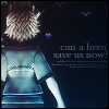
For my text, I have it set to 10 and on Crisp. That's the text that says, "Can a hero save us now?" Now for the tiny text. I either put a mini poem, sometimes song lyrics, or randomly pounce on the keyboard. Seriously. For this one, I think I'll put a poem. Set it to 2 and put it on Sharp. If its on Smooth, the text gets a bit... icky. This time, though, I put my tiny text on Crisp to go along with the normal font. Now, you can put both text blocks on Overlay or Soft Light or you could just lower the opacity to your liking. That's up to you.
After I put mine on Soft Light, I selected all of the text and grabbed a 100 pixel soft brush at about 30% opacity, made new layers, and lightly brushed over the text. Gave it a cool gradient effect.

Step Five Result!
Step Six:
Last step! w00t! x3 Select the canvas, create a new layer above it all, while making sure your foreground color is black or white depending on whether your icon's more dark or light, and go to Edit>Stroke. Put 1 pixel, inside, and click Okay. Now, you're complete done! Save, save it as a PNG or JPEG, and show off your newly finished icon! ^__^
Going from this to

this!
Step One:
First off, you need a good picture. I'm using this one right here of our favorite spiky blonde haired boy, Roxas. :3 Crop it with the crop tool and then, you're ready to start!
Tip for Everyone: Its a good idea to use pictures that aren't so grainy. This one is HIGH quality so, no graininess will show in the final icon. Pictures scanned from magazines, low quality JPEGs, and the like are good examples of what not to use if you're trying to make it close up. Another tip is to get a focal point in a way. Icons with the main character in the middle are a bit boring, but jazzing it up a bit by cropping them to the side a bit and showing another object adds onto getting a good focal point.
Step Two:
Alright! You've got your image all cropped in it's shiney, shiney glory but cropping it was just the start! There's one more thing you gotta do before you can add your gradients and special effects: Sharpening. Blurring icons make you wanna go "Eww..." but sharping them makes them pwetty! x3 Go to Filter>Sharpen>Sharpen and, if you want, press CTRL+F and it'll do it again! But, with that one more sharpening, you just made the whole icon a complete mess! What now? That's easier to fix than you think. ;] Just go to Edit>Fade Sharpen and lower the opacity to your liking. Make sure the preview box is checked!
Tip for Everyone: This is a REALLY important key thing you must remember when making or editing any kind of graphic: LAYERS. I'm a layer nutcase, I duplicate the cropped picture and sharpen it on the new layer on every single icon I make! Layers are so very very VERY helpful and you can easily fix your mistakes by making new layers. Sure, there might be a ton of layers in the end, but you can organize them with names and layer sets if you're an organizing nut.

Step Two Result!
Step Three:
Preparations are now complete! :D You've got a shiney new icon that you could probably just save and put up to show everyone! Okay, not yet. Not until you get a border up, atleast. We start off by duplicating the newly sharpened layer and opening up "Hue and Saturation" or just pressing CTRL+Shift+U. This desaturates the whole thing. Now, put this new layer on Overlay or Soft Light. If that's too bright, put it on Multiply and, if its too dark, put it on Screen. If you did that last step, duplicate the sharpened layer, drag it up to the top, and put it on Overlay or Soft Light. I just put mine on Overlay because it would get too dark on Multiply and it would get too light and weird on Screen.

Step Three Result!
Step Four:
Now its time for gradients! I only use one or two gradients on each of my icons and, most of the time, its on Lighten. What's Lighten do to the image? The lighter part makes the corner where it's at sorta shiney in a way. I suck at explaining so, you'll have to see for yourself about this one. I also use my own gradients so, for this one, the lighter color is gonna be a light, pearly blue color while the darker color'll be a midnight blue. Now, hold down the shift key and drag the Gradient tool across the canvas from one corner to the opposite top corner. Then, put it on Lighten, Overlay, whatever! It doesn't matter, you'll probably use more gradients than I do anyways.

Step Four Result!
Step Five:
Text time! One good little tip to remember is to use plain, just fancy fonts. What I mean is, don't use something too plain, like Arial, or too fancy, like Scriptina. Some good fonts that I use are Baskerville and Minion. I LOVE Baskerville. Its either set to 2, for tiny text, 12, for normal text, or 36, for big text. Alright, so... just find something that's simple but not too fancy and not too blocky and icky. Basically in the middle.
For my text, I have it set to 10 and on Crisp. That's the text that says, "Can a hero save us now?" Now for the tiny text. I either put a mini poem, sometimes song lyrics, or randomly pounce on the keyboard. Seriously. For this one, I think I'll put a poem. Set it to 2 and put it on Sharp. If its on Smooth, the text gets a bit... icky. This time, though, I put my tiny text on Crisp to go along with the normal font. Now, you can put both text blocks on Overlay or Soft Light or you could just lower the opacity to your liking. That's up to you.
After I put mine on Soft Light, I selected all of the text and grabbed a 100 pixel soft brush at about 30% opacity, made new layers, and lightly brushed over the text. Gave it a cool gradient effect.

Step Five Result!
Step Six:
Last step! w00t! x3 Select the canvas, create a new layer above it all, while making sure your foreground color is black or white depending on whether your icon's more dark or light, and go to Edit>Stroke. Put 1 pixel, inside, and click Okay. Now, you're complete done! Save, save it as a PNG or JPEG, and show off your newly finished icon! ^__^