Art-tickle for Thursday Oct 16: So I made some things, and I won a thing!
HERE BE SOME PICTURES:
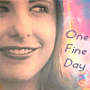
Banner for snowpuppies Themes winners in btvsats20in20 Round 4. (Full-size)

01
*****
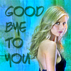
My entries for slayerstillness Challenge 33.

02-06
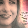
Banner I made for my Mods Choice Award for Challenge 33: (Full-size)

07
Congratulations, links, challenge reminders, alts/extras, some thinky-thoughts and source photos after the cut. Usual disclaimers - don't plagarize, deface or post to another online archive or site without at least checking with me. All icons snaggable. Banners not.[More images and a gallery guide inside the cut:]
Alts and extras for Challenge 33:

08-11

12-16
Now Here BE SOME VERBIAGE:
01 - Congratulations to Snowy and to spikesredqueen, starry_night, sweet_lyri, and midnightisclose for your beautiful winning entries in Round 4 of btvsats20in20! If anyone still wants a banner of their own it's not too late; drop a line at the Winner's Post here - you can reply to me directly in that thread. This is assuming everyone hasn't moved on to their Round 5 Rainbow Theme entries.
02-06 - Thank you to everyone who voted for my icons; I was tickled to see that each of them got at least one vote, and in every possible category. #2 & 6 are my favorites of this set; I'm super-pleased with how they turned out. See below for photo credits.#2 & 6 are far and away my favorites here. I'm very happy that #2 in particular caught starry_night's eye:
07 - Thank you starry_night for the honor, and congratulations to teragramm, tempertemper, pickamix and sweet_lyri for your beautiful winning entries! I gave out two Banner Maker's Choice awards this time for icons by juliet316 and pickamix. Check out all the winners here. Then get ready for Challenge 34, "Illyria, God King of The Primordium"; I'm expecting some truly awesome icons.
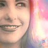
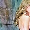
#2, 8-11 - I spent a lot of time getting the text right in 8-11; trying to balance legibility and aesthetics. I'll tend to sacrifice the latter for the former, but I think that's changing as a master the editing toolbox - and can have more fonts. I loved the idea of text fitting snugly above the curl of Sarah's hair in this on-set shot from Gone, and intended to enter one of those until I realized I preferred to just look at the lights and colors. Those sorts of effects are very new for me and I think I fell in love with that icon, perhaps more than a little. And Sarah is just lovely; with the strong contrasts of pale skin with dark lips and her own idiosyncratic beauty, she resembles a silent movie star.
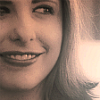
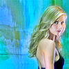
#6, 12-13 - Once again I was working on clarity, color and light; and the subject is really Sarah's face. Once again she resembles a silent movie star, pale face and dark lips, from the days when women still had interesting (not necessarily beautiful) faces onscreen. I merged a cap from Normal Again with this studio photograph of Sarah photographer unknown (to me). And once again I had intended to enter the version with text and spent a lot of time getting it "right" before I realized I preferred the textless version. It seemed less cluttered; the text distracts from the forms of Sarah's face, the sweep of her hair and the wrinkles in her shirt.
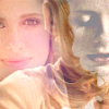
#4 - uses the same screencap from Normal Again as 6, 11, 16, Textured b/g, Cat 2 and several alts for btvsats20in20. eilowyn pointed out to me the parallel between this image and my favorite VampWillow image, in terms of the vintage, old-school beauty, femininity and drama of the dark lips and pale skin in both. FYI: I failed to notice that my entry version of #4 was 100x104 pixels, not 100square proper; #4 is the corrected size.
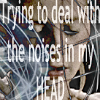
#5, 14-16: Ideas I wanted to play with after btvs_hush Challenge 283. I liked the wall once I played with the saturation and exposure of the original cap; but I don't like Sarah's face here or in the original photo. She looks more like a manniquin than herself, which probably explains the crops of my entry. That's pretty much all I can say about these.
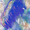
#3 - uses the clone tool for the repeat of Buffy clutching her head. I like the pale colors, but it doesn't quite come together somehow in that small version. It looks like it's cropped from a larger original, although it isn't. (I've done this design in a larger format and it looks very striking. It may be that the pastel colors and white are cencelling out the design in this instance. Thoughts?)
One of the nifty and challenging things about the icontests, especially the 20in20 rounds, is that there are always leftover ideas I don't get a chance to develop in time, or that crop up only after the images have marinated in my mind for a while. With these two rounds I feel like a shift occured in my abilities as an artist in comparison to where I was two months ago.
I really worked to improve clarity, color and light in the last month and I think I got closer to what I'm after than I had before. And thank goodness; this last month was particularly...shall we say, intense. Whereas Round 3 of 20in20 I worked really hard on (not always to the good), Challenge 33 was more easy-peasy playtime; I had no particular concept, just leftover ideas from 20in20 and from btvs_hush; I wanted to continue to practice what I was learning and just make something pretty.
Sources: The on-set image of Sarah from Gone in 2, 8-11 and the studio photograph in 6, 12 & 13 courtesy of The Chosen Two gallery. S7 promo photo from btvs_hush Challenge 283 but can also be found at The Chosen Two gallery here.
Even the banners I've done here are so very different from the ones I did for SS Round 31 it's hard for me to believe they are separated by barely a month. The background for the banners was made from two of my own photographs: the base is a close-up of a weathered wood plank along a bike path where I stopped a couple of weeks ago; the color overlay and faint white diagonal lines from a photo I took on Saturday of site-specific art installation at the Goffe Street Armory auditorium in New Haven for Alternative Open Studios weekend. I think the artist who created the installation might be Mahdi Alibakhshian, but the CWOS website isn't clear on that.
(Right-click photos to view full-size)


If you wish to use these photos btw please feel free to do so! Just don't claim them as your originals, and if you make something from them, send me a link in the comments thread, I'd love to see it.