*SQUEE* Taking all of them and will credit when used. Please, please tell you you're going to make more TP (classic) icons. *bats pretty eyelashes*
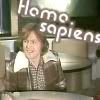
Nice of you to include the Tomorrow People's sap friend, Chris. I love the font you used on the name icons (ex. 10.15). It looks so like the one they used on the show opening credits. Let's see if I *had* to pick favorites: 4, 13, 15, 16, 21,22,24,26. 7 and 10 just barely missed being odds on favorites. I love the colors, the sharp clarity of the images and the name font I just wish John and Elizabeth were looking a bit more forward. Small quibble since they are so nice anyway.
Thank you for taking the time to bring forth the nostalgia and iconage. I had such a crush on Stephen when I was younger. And of course, I loved the watching each adventure with John, Carol, Kenny, Stephen, Liz Mike, Andrew, Tsu Tai, etc.
*is grinning rather a lot* You just made me so happy :oD I do plan to make more in the near future, and probably will once I'm free of university :o)
I adore Chris, so I couldn't very well leave him out :oD And the font is one I found online, modelled on the font from the show. I remember finding one that claimed they'd never seen any lowercase letters in the same style, which made me O_o a little, since the end credits are full of them. Anyway, I love that font :o) It gets a bit weird if it's too small, but it works quite well for simple icons, like names.
I love that you told me favourites! It's great to know what people like specifically. And thank you for the compliments on the colour and clarity and stuff :o) I have the DVDs to thank for image quality, and Dafont for the awesome font. I'll see about a few more forward-facing icons when I next get round to screencapping another story, okay? And feel free to request specific pictures or ideas, if you like. That'd be cool :o)
Comments 3
Reply
Nice of you to include the Tomorrow People's sap friend, Chris. I love the font you used on the name icons (ex. 10.15). It looks so like the one they used on the show opening credits. Let's see if I *had* to pick favorites: 4, 13, 15, 16, 21,22,24,26. 7 and 10 just barely missed being odds on favorites. I love the colors, the sharp clarity of the images and the name font I just wish John and Elizabeth were looking a bit more forward. Small quibble since they are so nice anyway.
Thank you for taking the time to bring forth the nostalgia and iconage. I had such a crush on Stephen when I was younger. And of course, I loved the watching each adventure with John, Carol, Kenny, Stephen, Liz Mike, Andrew, Tsu Tai, etc.
Reply
I adore Chris, so I couldn't very well leave him out :oD And the font is one I found online, modelled on the font from the show. I remember finding one that claimed they'd never seen any lowercase letters in the same style, which made me O_o a little, since the end credits are full of them. Anyway, I love that font :o) It gets a bit weird if it's too small, but it works quite well for simple icons, like names.
I love that you told me favourites! It's great to know what people like specifically. And thank you for the compliments on the colour and clarity and stuff :o) I have the DVDs to thank for image quality, and Dafont for the awesome font. I'll see about a few more forward-facing icons when I next get round to screencapping another story, okay? And feel free to request specific pictures or ideas, if you like. That'd be cool :o)
Thanks again, you really made my day :o)
Reply
Leave a comment