Tutorial: Jeff from Community
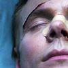
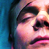
We're going from this: 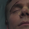
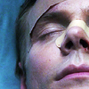
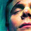
to this: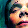
Tutorial requested by lovely Kim, a.k.a. library_of_sex ♥
I hope you don't mind if I start with a preamble, as usual.
First of all, this tutorial heavily involves Curves layers. I'm not going to explain in detail how Curves layers work, so you may want to check this guide by herdestiny before reading, if you're not familiar with this tool. :)
Curves can be a powerful, amazing tool, if you know how to use it. Or even if you don't, because you can experiment a lot without understanding what you're doing! Go wild. Use all the settings (RGB, Red, Green, Blue) and don't be afraid of trying unusual things.
Check out this challenge @theskilltester, for example: the task was to make icons using only Curves layers and the outcomes may surprise you. You can even download some of the psds shared by the makers there, and I suggest you to do so, there's a lot of things you can learn from them. :)
There's a nifty section about "Crazy Curves" in this Q&A session by motorized. Unfortunatly, pictures are not showing for me (maybe they're hosted at tinypic), but if you're lucky and they show for you, you'll discover a whole new method on how to use Curves. :)
Let's begin with the tut, now!
STEP ZERO
>
>
I duplicated my base twice.
- First copy: Filter > Blur > Gaussian Blur - Radius: 2.8px
I set this layer to Normal, 65% opacity.
- Second copy: Filter > Sharpen > Sharpen
I set this layer to Normal, 61 % opacity.
Recently, I've been using this couple of steps a lot. Blur&Sharpen is a lovely combo: you get a nice, soft sharpening.
You can play with the opacity of those two layers, or with their blending mode, and of course you can also choose a different Radius for the Gaussian Blur and sharpen with the Unsharp Mask, for example.
And you can mask them too, if needed.
STEP ONE
>
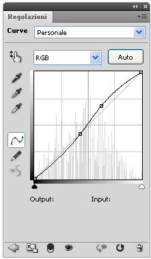
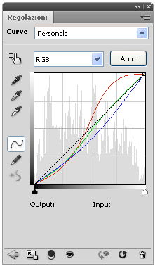
Our first layer is an Auto-Curves layer, obviously! I'm not giving you the settings because they change depending on the picture you're using, but it looks like this:

It improved the contrast a lot, and it brought out nice pink tones on his skin.
STEP TWO
>
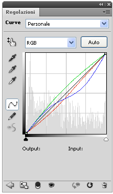
Another Curves layer:
I used this layer to add some more contrast, so I worked only on the RGB settings.
Point 1 - O: 109 I: 109
Point 2 - O: 174 I: 160
I brightened the highlights, mostly, but the shadows darkened a bit too.
STEP THREE
>
I wanted to increase the contrast a little more, so I created a Brightness/Contrast layer:
Contrast: 15
For previous versions of PS you can use these settings instead:
Contrast: 5
STEP FOUR
>
I created a Vibrance layer to enhance the colors:
Vibrance: +69
You can replace the Vibrance layer with a Hue/Saturation one:
Master: 0 +33 -3
STEP FIVE
>
I added a Curves layer to work on the coloring and I experimented with the Red, Green and Blue settings. To be honest, I didn't know what I was trying to achieve: I just dragged the points around to see which colors I could bring out.
RED:
Point 1 - O: 189 I: 150
Point 2 - O: 109 I: 114
GREEN:
Point 1 - O: 138 I: 141
Point 2 - O: 59 I: 84
BLUE:
Point 1 - O: 105 I: 133
So, let's see where this layer brought me: I had a stronger contrast and brighter colors. It also added red tones to highlights and green/blue tones to shadows.
STEP SIX
>
Here comes another Curves layer! I wanted to tone out the red of the highlights a little and to add some different hues to the coloring. There were mainly magenta and blue hues at this point, so I added some green and yellow.
RED:
Point 1 - O: 150 I: 158
Point 2 - O: 87 I: 102
GREEN:
Point 1 - O: 125 I: 105
BLUE:
Point 1 - O: 151 I: 188
Point 2 - O: 87 I: 81
STEP SEVEN
>
I created another Vibrance layer:
Vibrance: +43
You can replace the Vibrance layer with a Hue/Saturation one:
Master: 0 +8 0
STEP EIGHT
>
I used this texture by ohfreckle:
I set it on Soft Light, 100% opacity.
I discovered this gorgeous texture in this awesome tut by skydawnjade and I'm using it a lot lately. It can do wonders to the lighting, if set to Soft Light or Screen!
STEP NINE
>
I created a Selective Color layer:
Blacks: 0 0 0 +12
I worked only on the Blacks settings because I wanted to darken the shadows a bit.
And that's all!
PSD:
- DOWNLOAD @BOX.NET - PS CS4+
- DOWNLOAD @BOX.NET - previous versions of PS
Comments are very appreciated, but it's not a must. No need to credit!
You can ask for psds/tutorials whenever you want, I'll be glad to share. ♥
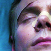
to this:
Tutorial requested by lovely Kim, a.k.a. library_of_sex ♥
I hope you don't mind if I start with a preamble, as usual.
First of all, this tutorial heavily involves Curves layers. I'm not going to explain in detail how Curves layers work, so you may want to check this guide by herdestiny before reading, if you're not familiar with this tool. :)
Curves can be a powerful, amazing tool, if you know how to use it. Or even if you don't, because you can experiment a lot without understanding what you're doing! Go wild. Use all the settings (RGB, Red, Green, Blue) and don't be afraid of trying unusual things.
Check out this challenge @theskilltester, for example: the task was to make icons using only Curves layers and the outcomes may surprise you. You can even download some of the psds shared by the makers there, and I suggest you to do so, there's a lot of things you can learn from them. :)
There's a nifty section about "Crazy Curves" in this Q&A session by motorized. Unfortunatly, pictures are not showing for me (maybe they're hosted at tinypic), but if you're lucky and they show for you, you'll discover a whole new method on how to use Curves. :)
Let's begin with the tut, now!
STEP ZERO
>
>
I duplicated my base twice.
- First copy: Filter > Blur > Gaussian Blur - Radius: 2.8px
I set this layer to Normal, 65% opacity.
- Second copy: Filter > Sharpen > Sharpen
I set this layer to Normal, 61 % opacity.
Recently, I've been using this couple of steps a lot. Blur&Sharpen is a lovely combo: you get a nice, soft sharpening.
You can play with the opacity of those two layers, or with their blending mode, and of course you can also choose a different Radius for the Gaussian Blur and sharpen with the Unsharp Mask, for example.
And you can mask them too, if needed.
STEP ONE
>
Our first layer is an Auto-Curves layer, obviously! I'm not giving you the settings because they change depending on the picture you're using, but it looks like this:
It improved the contrast a lot, and it brought out nice pink tones on his skin.
STEP TWO
>
Another Curves layer:
I used this layer to add some more contrast, so I worked only on the RGB settings.
Point 1 - O: 109 I: 109
Point 2 - O: 174 I: 160
I brightened the highlights, mostly, but the shadows darkened a bit too.
STEP THREE
>
I wanted to increase the contrast a little more, so I created a Brightness/Contrast layer:
Contrast: 15
For previous versions of PS you can use these settings instead:
Contrast: 5
STEP FOUR
>
I created a Vibrance layer to enhance the colors:
Vibrance: +69
You can replace the Vibrance layer with a Hue/Saturation one:
Master: 0 +33 -3
STEP FIVE
>
I added a Curves layer to work on the coloring and I experimented with the Red, Green and Blue settings. To be honest, I didn't know what I was trying to achieve: I just dragged the points around to see which colors I could bring out.
RED:
Point 1 - O: 189 I: 150
Point 2 - O: 109 I: 114
GREEN:
Point 1 - O: 138 I: 141
Point 2 - O: 59 I: 84
BLUE:
Point 1 - O: 105 I: 133
So, let's see where this layer brought me: I had a stronger contrast and brighter colors. It also added red tones to highlights and green/blue tones to shadows.
STEP SIX
>
Here comes another Curves layer! I wanted to tone out the red of the highlights a little and to add some different hues to the coloring. There were mainly magenta and blue hues at this point, so I added some green and yellow.
RED:
Point 1 - O: 150 I: 158
Point 2 - O: 87 I: 102
GREEN:
Point 1 - O: 125 I: 105
BLUE:
Point 1 - O: 151 I: 188
Point 2 - O: 87 I: 81
STEP SEVEN
>
I created another Vibrance layer:
Vibrance: +43
You can replace the Vibrance layer with a Hue/Saturation one:
Master: 0 +8 0
STEP EIGHT
>
I used this texture by ohfreckle:
I set it on Soft Light, 100% opacity.
I discovered this gorgeous texture in this awesome tut by skydawnjade and I'm using it a lot lately. It can do wonders to the lighting, if set to Soft Light or Screen!
STEP NINE
>
I created a Selective Color layer:
Blacks: 0 0 0 +12
I worked only on the Blacks settings because I wanted to darken the shadows a bit.
And that's all!
PSD:
- DOWNLOAD @BOX.NET - PS CS4+
- DOWNLOAD @BOX.NET - previous versions of PS
Comments are very appreciated, but it's not a must. No need to credit!
You can ask for psds/tutorials whenever you want, I'll be glad to share. ♥