Hero Icon
Alright, so we shall be making a tutorial for this icon right here:
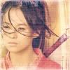
First off, crop your image to 100px by 100px. I began with this picture of Zhang Ziyi from the movie Hero. I snurched the image from Yahoo Movies.

Your image should now look a little like this:

At this point, feel free to duplicate the image and set it to screen to brighten the picture up. Also, any sharpening and smoothing that you want to do should be done at this point. I didn't do any of that on this picture because it washed it out and made it look grainy, i.e. the picture was perfect as far as I was concerned.
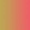
I now made a gradient to use, playing off of the colors that were already present in the image. This particular gradient was made by me. The foreground color was #EC5F65, background color #BDA553. New layter, gradient tool, right to left, soft light 100%. Here's the gradient:
Alright, here comes the famed navy exclusion layer. I've absolutely fallen in love with this trick lately, so here it is. The particular shade in this one is #03243E. So new layer, paint bucket, exclusion 100%.

After you've done both those tricks, your picture should now look a little something like this:

Here's another oldie but goodie. The unsaturated layer. Duplicate your base image, and drag it to the top. You can desaturate it by hand, but I just use the keyboard shortcut. Ctrl-Shift-U (I know it says Ctrl-Alt-U on my layer image at the bottom, but it's a typo, use Ctrl-Shift-U). Here's the B&W image:

Then I set the layer to screen at 12% (random number I know, but that's what felt right) and this is what we get:

Now to add a little texture. I used this brush from miggy and set the color to #EFCFD1.
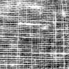
The layer is set to soft light, 100% and I moved it between the navy exclusion and the desaturated screen. I also took the eraser tool and erased the texture from her face.

For a border, I used this brush from inxsomniax and kept the color on #EFCFD1.
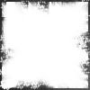
This layer is set at soft light 100%, and then I duplicated the layer twice. Here's what we get.

Now I was almost finished, and even though I liked how I had croped the image, I felt the right hand side was a little empty, so I used another brush from inxsomniax.The color this time was set to #EFE9CF.
Seting that layer on overlay 100% your picture now looks like this:

Finished! Or at least this is where I felt the icon looked good. I didn't want to muddle things up, but if you'd like to add text, then by all means, go for it!
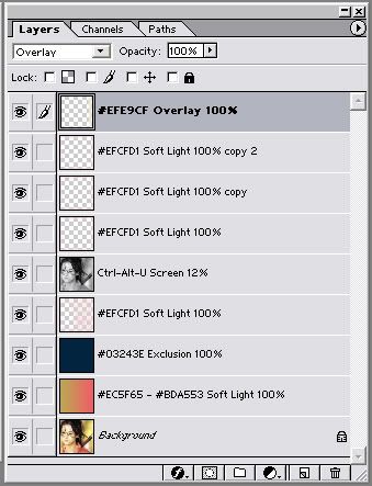
I'm adding a cap. of my layers bar, incase I managed to muddle anything along the way.
And that's all, hope you liked it!
First off, crop your image to 100px by 100px. I began with this picture of Zhang Ziyi from the movie Hero. I snurched the image from Yahoo Movies.
Your image should now look a little like this:
At this point, feel free to duplicate the image and set it to screen to brighten the picture up. Also, any sharpening and smoothing that you want to do should be done at this point. I didn't do any of that on this picture because it washed it out and made it look grainy, i.e. the picture was perfect as far as I was concerned.
I now made a gradient to use, playing off of the colors that were already present in the image. This particular gradient was made by me. The foreground color was #EC5F65, background color #BDA553. New layter, gradient tool, right to left, soft light 100%. Here's the gradient:
Alright, here comes the famed navy exclusion layer. I've absolutely fallen in love with this trick lately, so here it is. The particular shade in this one is #03243E. So new layer, paint bucket, exclusion 100%.
After you've done both those tricks, your picture should now look a little something like this:
Here's another oldie but goodie. The unsaturated layer. Duplicate your base image, and drag it to the top. You can desaturate it by hand, but I just use the keyboard shortcut. Ctrl-Shift-U (I know it says Ctrl-Alt-U on my layer image at the bottom, but it's a typo, use Ctrl-Shift-U). Here's the B&W image:
Then I set the layer to screen at 12% (random number I know, but that's what felt right) and this is what we get:
Now to add a little texture. I used this brush from miggy and set the color to #EFCFD1.
The layer is set to soft light, 100% and I moved it between the navy exclusion and the desaturated screen. I also took the eraser tool and erased the texture from her face.
For a border, I used this brush from inxsomniax and kept the color on #EFCFD1.
This layer is set at soft light 100%, and then I duplicated the layer twice. Here's what we get.
Now I was almost finished, and even though I liked how I had croped the image, I felt the right hand side was a little empty, so I used another brush from inxsomniax.The color this time was set to #EFE9CF.
Seting that layer on overlay 100% your picture now looks like this:
Finished! Or at least this is where I felt the icon looked good. I didn't want to muddle things up, but if you'd like to add text, then by all means, go for it!
I'm adding a cap. of my layers bar, incase I managed to muddle anything along the way.
And that's all, hope you liked it!