Simple Coloring Tutorial
A quick tutorial on how to get some of those vivid colors into your icons.
Going from this: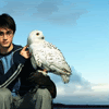
, to this: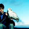
.
Start with the base
Duplicate and set duplicate to screen at around 50% opacity.

Then duplicate the base again on top of the screen layer and set to soft light at around 50% opacity as well.
Next, I created a new layer on top and brushed over the lighter blue on his shirt/arm stripe in #A1ACCE, and over Hedwig in #B7B7B7, and set the layer to color burn. On his shirt it brings out the blue and on Hedwig since we used a grey color, it worked more like a soft light layer.

Next, I filled a new layer with #93CDEB and set it to color burn 100%.
Now is a good time to go back to the screen and soft light layers to adjust the opacity to your liking.
Then we get the final product:
I hope this is helpful to some of you!
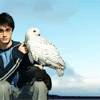
Going from this:
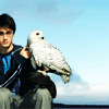
, to this:
.
Start with the base
Duplicate and set duplicate to screen at around 50% opacity.
Then duplicate the base again on top of the screen layer and set to soft light at around 50% opacity as well.
Next, I created a new layer on top and brushed over the lighter blue on his shirt/arm stripe in #A1ACCE, and over Hedwig in #B7B7B7, and set the layer to color burn. On his shirt it brings out the blue and on Hedwig since we used a grey color, it worked more like a soft light layer.
Next, I filled a new layer with #93CDEB and set it to color burn 100%.
Now is a good time to go back to the screen and soft light layers to adjust the opacity to your liking.
Then we get the final product:
I hope this is helpful to some of you!