(no subject)
Yup. I'm making an icon tut. I thought it was a good coloring to share.
From
to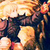
Made is CS2.
*contains a selective coloring layer, so not translatable.
Ah, I just love FFT Artwork. Anyway, crop, resize and do whatever else you do. I left mine as is.

Now duplicate the base and set it to Screen, 50-70% to brighten it up.
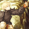
Moar contrast now pleez. Duplicate you base again and set to Softlight, 50-60%
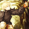
Let's make this incredibly pink and add a new fill layer filled with a dark green color. (I used 074116) Set to Exclusion, 100%.
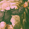
Very pink. Green too. Anyway, add a light tan (I used

edd7a1) and set it to Multiply, 15-25%.
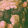
Washed out image is very washed out. Duplicate the base, bring it to the top, and set it to Softlight, 100%.
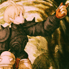
I actually quite like this coloring, but if you have selective color, then go on ahead. As a matter of fact, let's add in that Selective Color Adjustment Layer in now.
*Do not copy the numbers exactly, or you may end up with a very ugly icon. They were adjusted to this image alone. Please, play around with the settings.
Reds: -100, 17, -37, 0
Yellows: -100, -12, 100, -15
Greens: -100, 100, -100, 100
Magentas: -100, 0, 0, 0
Whites: 100, -14, 0, 0
Neutrals: -9, 7, -14, -21
Blacks: 0, 0, -10, 0
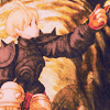
That got rid of some of those ugly greens. Now we'll add some contrast with a Color Balance Adjustment Layer.
*Same condition as the previous step.
Midtones: -42, -13, 18
Shadows: -31, -7, -10
Highlights: 20, 15, -9
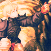
Almost done! Just a little bit more contrast is needed. Let's add a Brightness/Contrast Adjustment Layer.
Brightness: -11
Contrast: 11

Aaaaaaaand, we're done! Yay!
Other examples:

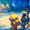

TRYYYYYYYY IIIIIIIIIIIIIIIIT. Experiment with it and play with it. Extra cookie points for those that show me what they come up with. :D
From

to

Made is CS2.
*contains a selective coloring layer, so not translatable.
Ah, I just love FFT Artwork. Anyway, crop, resize and do whatever else you do. I left mine as is.

Now duplicate the base and set it to Screen, 50-70% to brighten it up.

Moar contrast now pleez. Duplicate you base again and set to Softlight, 50-60%

Let's make this incredibly pink and add a new fill layer filled with a dark green color. (I used 074116) Set to Exclusion, 100%.

Very pink. Green too. Anyway, add a light tan (I used


edd7a1) and set it to Multiply, 15-25%.

Washed out image is very washed out. Duplicate the base, bring it to the top, and set it to Softlight, 100%.

I actually quite like this coloring, but if you have selective color, then go on ahead. As a matter of fact, let's add in that Selective Color Adjustment Layer in now.
*Do not copy the numbers exactly, or you may end up with a very ugly icon. They were adjusted to this image alone. Please, play around with the settings.
Reds: -100, 17, -37, 0
Yellows: -100, -12, 100, -15
Greens: -100, 100, -100, 100
Magentas: -100, 0, 0, 0
Whites: 100, -14, 0, 0
Neutrals: -9, 7, -14, -21
Blacks: 0, 0, -10, 0

That got rid of some of those ugly greens. Now we'll add some contrast with a Color Balance Adjustment Layer.
*Same condition as the previous step.
Midtones: -42, -13, 18
Shadows: -31, -7, -10
Highlights: 20, 15, -9

Almost done! Just a little bit more contrast is needed. Let's add a Brightness/Contrast Adjustment Layer.
Brightness: -11
Contrast: 11

Aaaaaaaand, we're done! Yay!
Other examples:
TRYYYYYYYY IIIIIIIIIIIIIIIIT. Experiment with it and play with it. Extra cookie points for those that show me what they come up with. :D