Tutorial 2: Namine
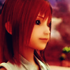
This is a simple coloring tutorial featuring a Namine icon from my latest Kingdom Hearts 2 icon batch.
Program Used: PS7
Original Image: Can be found here.
Final Icon:
Alrighty! First off, let me tell you that I did not save my PSD file, like always. So I'm going to recreate it. So bear with me!
Step 1: Take our original image and crop it down to icon size (100x100). When you crop your image, don't put your subject in the center of the icon. It's much more interesting when things are off-center! I decided on this.

Step 2: Our image is super duper blurry. So let's sharpen it! Go to Filer->Sharpen->Sharpen Edges. We get this, which looks much much better!

Step 3: Because we have a super blurry cap and we had to sharpen our image, we need to make Namine's skin look nice and smooth. Set your Blur tool (The one that looks like a water drop) and set the size to 9, Mode to Normal, and Strength to 50%. Then smooth over Namine's face, carefully avoiding her nose and eyes.

Step 4: Next, we are going to Duplicate our base layer (CTRL+J). Set this new layer to Soft Light at 100%. Then merge your two new layers by pressing CTRL+SHIFT+E. She's looking much better already!

Step 5: Now the fun part! We are going to Duplicate our base layer again. Now, while the top layer is selected, go to Filter->Blur->Gaussian Blur. Set the Radius to 1.0 pixels and click ok. Namine should look very blurry at this point.

Step 6: Remember the layer we just made with the Gaussian Blur? Now we are going to set it to Soft Light, Opacity at 100%. Depending on the colors in your icon, you might want to fiddle with that number. Anything between 50%-100% will work.

Step 7: Now we are going to insert a new layer (CTRL+SHIFT+N). Pick a bright blue color (I chose #9CEBFF) and use a circular paint brush to entirely cover your icon. Set the opacity on this layer to Normal at 50%.

Step 8: For this step, you may want to zoom in on your icon. Once you have done that, take a circular eraser (I chose a 9 pixel circular brush) and erase everythin that is covering Namine's face. You should have something along these lines. I know it looks funny right now, but we'll take care of it in a bit.

Step 9: Now we are going to take that same layer and play around with the opacity. Bring the precentage all the way up to 100%. Then change the layer type to Color Burn. We now have this!

Step 10: We are almost finished! Duplicate the layer before the blue color burn layer and drag it to the top. Change it's setting to Soft Light at 50%.
And tada! You are finished!

But don't stop there! Add personal touches. What about some cool looking font with your favorite song lyric? What about that nifty brush you haven't tried out yet? Go for it. I'd just love to see what you came up with while using this tutorial.
Other icons made using this technique...


Program Used: PS7
Original Image: Can be found here.
Final Icon:

Alrighty! First off, let me tell you that I did not save my PSD file, like always. So I'm going to recreate it. So bear with me!
Step 1: Take our original image and crop it down to icon size (100x100). When you crop your image, don't put your subject in the center of the icon. It's much more interesting when things are off-center! I decided on this.

Step 2: Our image is super duper blurry. So let's sharpen it! Go to Filer->Sharpen->Sharpen Edges. We get this, which looks much much better!

Step 3: Because we have a super blurry cap and we had to sharpen our image, we need to make Namine's skin look nice and smooth. Set your Blur tool (The one that looks like a water drop) and set the size to 9, Mode to Normal, and Strength to 50%. Then smooth over Namine's face, carefully avoiding her nose and eyes.

Step 4: Next, we are going to Duplicate our base layer (CTRL+J). Set this new layer to Soft Light at 100%. Then merge your two new layers by pressing CTRL+SHIFT+E. She's looking much better already!

Step 5: Now the fun part! We are going to Duplicate our base layer again. Now, while the top layer is selected, go to Filter->Blur->Gaussian Blur. Set the Radius to 1.0 pixels and click ok. Namine should look very blurry at this point.

Step 6: Remember the layer we just made with the Gaussian Blur? Now we are going to set it to Soft Light, Opacity at 100%. Depending on the colors in your icon, you might want to fiddle with that number. Anything between 50%-100% will work.

Step 7: Now we are going to insert a new layer (CTRL+SHIFT+N). Pick a bright blue color (I chose #9CEBFF) and use a circular paint brush to entirely cover your icon. Set the opacity on this layer to Normal at 50%.

Step 8: For this step, you may want to zoom in on your icon. Once you have done that, take a circular eraser (I chose a 9 pixel circular brush) and erase everythin that is covering Namine's face. You should have something along these lines. I know it looks funny right now, but we'll take care of it in a bit.

Step 9: Now we are going to take that same layer and play around with the opacity. Bring the precentage all the way up to 100%. Then change the layer type to Color Burn. We now have this!

Step 10: We are almost finished! Duplicate the layer before the blue color burn layer and drag it to the top. Change it's setting to Soft Light at 50%.
And tada! You are finished!

But don't stop there! Add personal touches. What about some cool looking font with your favorite song lyric? What about that nifty brush you haven't tried out yet? Go for it. I'd just love to see what you came up with while using this tutorial.
Other icons made using this technique...

