Tutorial 05: [Karen!]
Going from this: 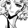
to this: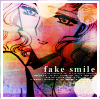
, per request of anty_ <3
Difficulty: Moderate. Don't try if you're a beginner.
Requirements: Curves, Hue/Saturation, Basic Photoshopping
Written for: Photoshop CS2 [but should be transferrable to other editions]
Before Beginning: allow me to remind you that this is only a guideline. don't copy me exactly. That's boring! Adjust opacities, change textures around, and basically just fool around with your image until you like it. Simply copying me will not improve your own abilities.
Also, I suggest using a black-and-white manga base as I have done here, as it is what the tutorial was written for. I dunno if it will work for photos or regular manga bases, but I have some doubts that the coloring will end up nice.
[Step 1] Take your pretty base from undeadmiko and prep it. [for me, this means duplicating and setting to Soft Light, which was totally unnecessary, but it's a habit of mine. ^_^;;]

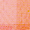
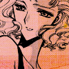
[Step 2] Take this texture, which was cropped out of something by Tre, and set it to Multiply 100%
>>
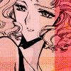
[Step 3] Take this texture, cropped out of a different section of the same large one and set it to Soft Light 100%
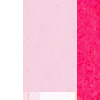
>>
[Step 4] Next texture, by [?] Multiply 100%
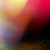
>>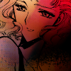
[Step 5] Duplicate the previous texture and set to Soft Light 60%, adjusting opacity to your liking.
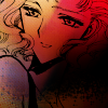
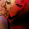
[Step 6] Take this texture by wonderland__ and set to Color 81%. Here, I took a layer mask and masked over any parts that I didn't like. If you don't know how to use a layer mask, use the eraser.
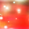
>>
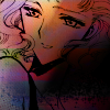
[Step 7] Take this next texture by gender and, a la anty_, select portions of it with the lasso tool and apply the Hue/Saturation filter to little pieces at a time until you like it. Play around with this, as it is the most crucial step and will determine wheter or not your icon is icky or not. I set that layer to Color 51%.
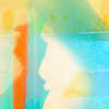
>>
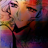
[Step 8] I then duplicated the texture that we've just mangled [hehe ^_^] and rotated it around. I then set it to Soft Light 100%
>>
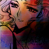
[Step 9] The lines in my base were starting to fade, so I duplicated the very bottom layer, dragged it to the top, and set it to Multiply 62%. You might have a different opacity.
>>
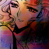
[Step 10] Next, I took this texture by [?] and set it to Soft Light 31%. I didn't want it too light because I kind of liked where the darkness was headed...
>>
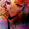
[Step 11] Next, I did something weird. I honestly forgot what... but I ended up with this as a layer and set it to Soft Light 67%. I'm sorry to not be more helpful, but I really don't remember what I did. ^_^;; Please don't hurt me.
>>
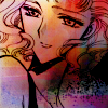
[Step 12] Almost done! I swear!!! I duplicated the base and dragged it on top again, this time setting it to Soft Light 32% [I seem to use that blend mode a lot...]. It increases the visibility of the base a bit and lightens the rest.
>>
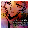
[Step 13] Text and border time!! Just add whatever text and tinytext you want. My border is really basic. 3px white border with a light grey 1px border on top of it. It's a classic. ^_^ You could stop here or anywhere after this if you want to...
>>
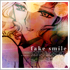
[Step 14] But I didn't stop there. ^_^ Now, I add this light texture by awmp and set it to Hard Light 100%. It's shiny! Melikes the shiny.

>>
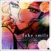
[Step 15] I then made a Curves Adjustment layer. I'm not going to show you my settings because it depends on what looks good... but I ended up with this:
>>
[Step 16] You could stop here if you wanted to, but if you want to make it uber!bright, then mangle the same texture by gender that we did before with the Hue/Saturation thingie, but make sure it looks different from before. I set mine to Overlay 73%, but you can try any blend mode you want to.
>>
The end!! Happy iconing to you all and I hope that you would show me your results. It's always exciting to see what others can do with your tecnique. Also, if you do use this tut, it'd be nice if you gave me a plug in an icon post that has this icon in it. ^_^

to this:

, per request of anty_ <3
Difficulty: Moderate. Don't try if you're a beginner.
Requirements: Curves, Hue/Saturation, Basic Photoshopping
Written for: Photoshop CS2 [but should be transferrable to other editions]
Before Beginning: allow me to remind you that this is only a guideline. don't copy me exactly. That's boring! Adjust opacities, change textures around, and basically just fool around with your image until you like it. Simply copying me will not improve your own abilities.
Also, I suggest using a black-and-white manga base as I have done here, as it is what the tutorial was written for. I dunno if it will work for photos or regular manga bases, but I have some doubts that the coloring will end up nice.
[Step 1] Take your pretty base from undeadmiko and prep it. [for me, this means duplicating and setting to Soft Light, which was totally unnecessary, but it's a habit of mine. ^_^;;]

[Step 2] Take this texture, which was cropped out of something by Tre, and set it to Multiply 100%

>>

[Step 3] Take this texture, cropped out of a different section of the same large one and set it to Soft Light 100%

>>

[Step 4] Next texture, by [?] Multiply 100%

>>

[Step 5] Duplicate the previous texture and set to Soft Light 60%, adjusting opacity to your liking.

[Step 6] Take this texture by wonderland__ and set to Color 81%. Here, I took a layer mask and masked over any parts that I didn't like. If you don't know how to use a layer mask, use the eraser.

>>

[Step 7] Take this next texture by gender and, a la anty_, select portions of it with the lasso tool and apply the Hue/Saturation filter to little pieces at a time until you like it. Play around with this, as it is the most crucial step and will determine wheter or not your icon is icky or not. I set that layer to Color 51%.

>>

[Step 8] I then duplicated the texture that we've just mangled [hehe ^_^] and rotated it around. I then set it to Soft Light 100%
>>

[Step 9] The lines in my base were starting to fade, so I duplicated the very bottom layer, dragged it to the top, and set it to Multiply 62%. You might have a different opacity.
>>

[Step 10] Next, I took this texture by [?] and set it to Soft Light 31%. I didn't want it too light because I kind of liked where the darkness was headed...

>>

[Step 11] Next, I did something weird. I honestly forgot what... but I ended up with this as a layer and set it to Soft Light 67%. I'm sorry to not be more helpful, but I really don't remember what I did. ^_^;; Please don't hurt me.
>>

[Step 12] Almost done! I swear!!! I duplicated the base and dragged it on top again, this time setting it to Soft Light 32% [I seem to use that blend mode a lot...]. It increases the visibility of the base a bit and lightens the rest.
>>

[Step 13] Text and border time!! Just add whatever text and tinytext you want. My border is really basic. 3px white border with a light grey 1px border on top of it. It's a classic. ^_^ You could stop here or anywhere after this if you want to...
>>

[Step 14] But I didn't stop there. ^_^ Now, I add this light texture by awmp and set it to Hard Light 100%. It's shiny! Melikes the shiny.

>>

[Step 15] I then made a Curves Adjustment layer. I'm not going to show you my settings because it depends on what looks good... but I ended up with this:
>>

[Step 16] You could stop here if you wanted to, but if you want to make it uber!bright, then mangle the same texture by gender that we did before with the Hue/Saturation thingie, but make sure it looks different from before. I set mine to Overlay 73%, but you can try any blend mode you want to.
>>

The end!! Happy iconing to you all and I hope that you would show me your results. It's always exciting to see what others can do with your tecnique. Also, if you do use this tut, it'd be nice if you gave me a plug in an icon post that has this icon in it. ^_^