Color Theory - Part Four
This is a series of tutorials which talks about the different tools and techniques for doing color corrections in Photoshop(or psp for that matter). Treat this more like a guide, well you can't treat it any other way.
So, you have an image which you want to icon. But it's horribly pink. I would just dump that image and take another one. BUT, if you're less lazy or you HAVE to icon that image, you get in a fix about what tool to use for the same. This guide, though in no way 'accurate' by the book, will tell you how color adjustments work and what tool should be used where.
We will be covering -
Basic Theory
Color Balance
Levels
Curves(this post)
Selective Coloring
Replace Color
Hue/Saturation
Manually changing the color(when you get REALLY desperate)
Please go through the Basic Theory tutorial first if you want to understand this properly.
If you want to know how to follow tutorials involving Curves, click on any point on the 'line', type in values, and you're done. If you want to know how the tool works, read on.
Now, let's take a blank canvas. Floodfill half of it with Black and let the rest be White. Something like this -

Open the Curves tool(Image-adjustments-curves). The diagonal line is the 'curve'. See the point there in the bottom left hand corner? That represents the darkest areas of an image. The other point at the upper right hand corner represents the brightest areas.
The drop down menu has four options - RGB, Red, Green and Blue. If you've read the color theory, you know what this means. Let's test the darkest/lightest thing now. Choose any of the three colors from the drop down menu. Let's say Green. Now, drag the lower left hand corner point upwards, and you will see the black going green. Grab the upper right hand point now and drag it downwards, the white changes to magenta.
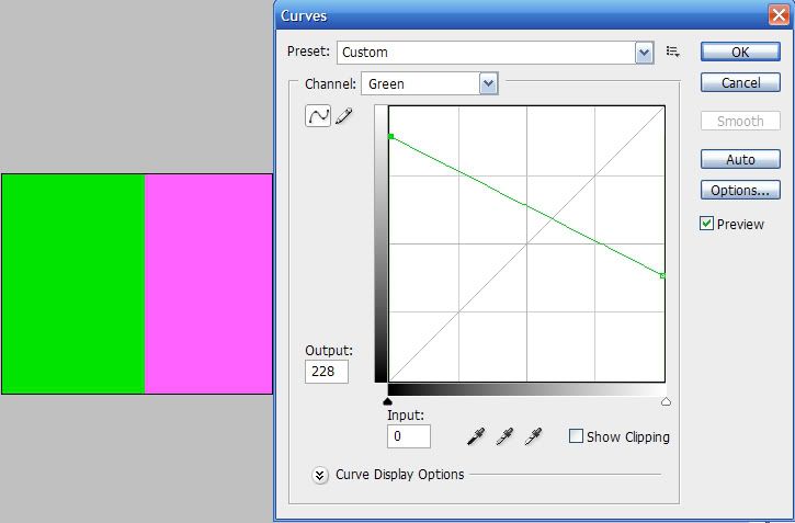
So basically, in 'Green' the higher we go, the higher green is injected into the picture. The lower we go, the more it's opposite color(magenta) appears.
Play around with curves and this BnW image till you get a good idea of how curves works. Remember, we were doing this on one linear scale, just vertical movement. When we move the curves all around, it has lesser limitations. This is not something easy to explain, so you really should freak out with experimenting at this stage till you get an idea of what I mean.
I am sure Curves are not as difficult now. :D Let's try the theory on an image now.
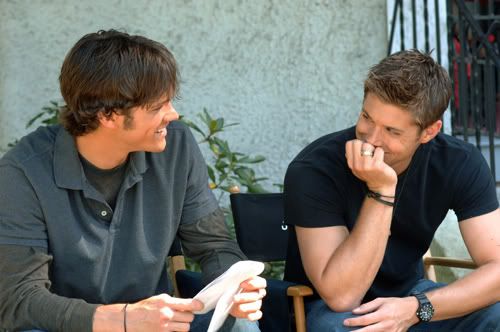
RGB curves can be used to change the general brightness/contrast of an image. So, instead of those 3 layers set on screen, go and use Curves. These are my settings -
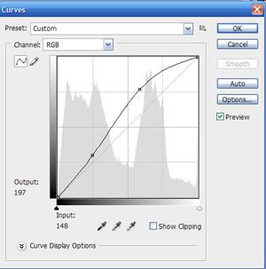
Which give me this -
See how I have used two points here? It is always better to use two points in curves as it gives you more control over the image. Once you fix one point, the second can be used for minor tweaks.
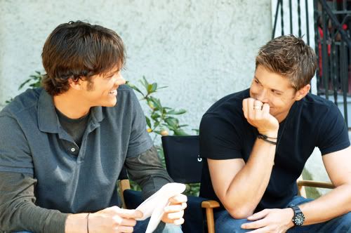
So now the image is all nice and shiny. And pale. Let's correct the colors a bit. I need more yellow. So, I go to the 'Blue' curves and make little tweaks -
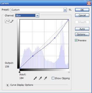
to get this-
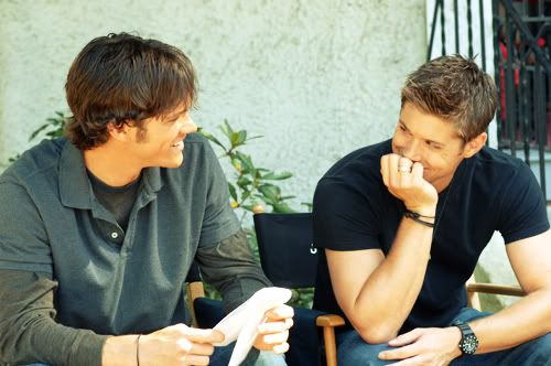
Oh btw, if you are a fan of those crazy selective coloring techniques, just make two points in the blue curves and drag them in opposite directions. I guarantee desired results. :P
Now, let's take away some red from the hair. I went to Red curves and used these settings -
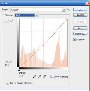
To get-
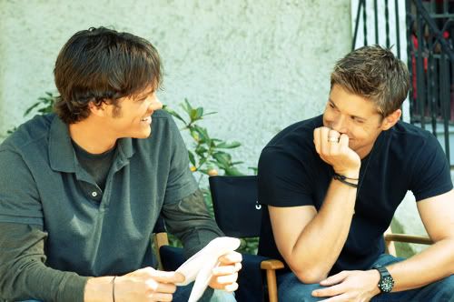
And I am happy with the results.
That's about it. Curves isn't difficult if you know how it works. Also remember, unless the image is horribly blue, if your control points are too far away from the middle line, you're doing it wrong. Or maybe you are just too fond of extreme coloring.
- Comment if this was helpful
- Friend us for more tuts
- Any question, ask.
So, you have an image which you want to icon. But it's horribly pink. I would just dump that image and take another one. BUT, if you're less lazy or you HAVE to icon that image, you get in a fix about what tool to use for the same. This guide, though in no way 'accurate' by the book, will tell you how color adjustments work and what tool should be used where.
We will be covering -
Basic Theory
Color Balance
Levels
Curves(this post)
Selective Coloring
Replace Color
Hue/Saturation
Manually changing the color(when you get REALLY desperate)
Please go through the Basic Theory tutorial first if you want to understand this properly.
If you want to know how to follow tutorials involving Curves, click on any point on the 'line', type in values, and you're done. If you want to know how the tool works, read on.
Now, let's take a blank canvas. Floodfill half of it with Black and let the rest be White. Something like this -
Open the Curves tool(Image-adjustments-curves). The diagonal line is the 'curve'. See the point there in the bottom left hand corner? That represents the darkest areas of an image. The other point at the upper right hand corner represents the brightest areas.
The drop down menu has four options - RGB, Red, Green and Blue. If you've read the color theory, you know what this means. Let's test the darkest/lightest thing now. Choose any of the three colors from the drop down menu. Let's say Green. Now, drag the lower left hand corner point upwards, and you will see the black going green. Grab the upper right hand point now and drag it downwards, the white changes to magenta.
So basically, in 'Green' the higher we go, the higher green is injected into the picture. The lower we go, the more it's opposite color(magenta) appears.
Play around with curves and this BnW image till you get a good idea of how curves works. Remember, we were doing this on one linear scale, just vertical movement. When we move the curves all around, it has lesser limitations. This is not something easy to explain, so you really should freak out with experimenting at this stage till you get an idea of what I mean.
I am sure Curves are not as difficult now. :D Let's try the theory on an image now.
RGB curves can be used to change the general brightness/contrast of an image. So, instead of those 3 layers set on screen, go and use Curves. These are my settings -
Which give me this -
See how I have used two points here? It is always better to use two points in curves as it gives you more control over the image. Once you fix one point, the second can be used for minor tweaks.
So now the image is all nice and shiny. And pale. Let's correct the colors a bit. I need more yellow. So, I go to the 'Blue' curves and make little tweaks -
to get this-
Oh btw, if you are a fan of those crazy selective coloring techniques, just make two points in the blue curves and drag them in opposite directions. I guarantee desired results. :P
Now, let's take away some red from the hair. I went to Red curves and used these settings -
To get-
And I am happy with the results.
That's about it. Curves isn't difficult if you know how it works. Also remember, unless the image is horribly blue, if your control points are too far away from the middle line, you're doing it wrong. Or maybe you are just too fond of extreme coloring.
- Comment if this was helpful
- Friend us for more tuts
- Any question, ask.