Anna's Guide to Icon-Making :p
I started working on this about 3 months ago, completely forgot about it and thought I’d lost it in the first laptop crash of 2008, but I was wrong, it survived!!!!! I was actually smart enough to save it to disk for once :p
Okay, this is probably going to be my last tutorial, not a 100% sure because I might actually become creative one day or go for some weird-ass blue coloring or something, but until that day.....this will be my very last tutorial. Not because I hate writing them, okay, I kinda do, or because I don’t feel like ‘sharing my secrets’, but because I’m just naive enough to think people will actually try and experiment themselves and because I’m sick of copycats *nods*
Step #1: Make sure you use the best quality pictures out there!!!
There is no way anyone’s able to turn an extremely dark and grainy 250x150 pixel picture into a pretty 100x100 pixel icon. Okay, well you might get away with it if you turn it into a B&W icon, but other than that.....just go and look for better quality pictures :p
Home of the Nutty: Gilmore Girls, Supernatural, Lost, Harry Potter, Smallville, One Tree Hill, Grey's Anatomy, Heroes....
In a Dream Doctor Who, Skins, Friday Night Lights, Ugly Betty, Smallville....
Sceencap Paradise Smallville, Supernatural, Buffy the Vampire Slayer, Veronica Mars, Roswell, Dead Like Me, Angel....
Striped Wall Dead Like Me, Roswell, Grey's Anatomy, ER, Supernatural, Torchwood.....
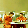
Step #2: Use pictures that have a correct aspect ratio (widthxheight)
If you use pictures from professional photoshoots you shouldn’t have anything to worry about. If you’re using screencaps, it’s a whole different story.....
There’s 2 different ratio’s when it comes to screencaps, the fullscreen one (4:3) and the widescreen one (16:9). That means most fullscreen caps are either 800x600 or 1024x768. Most widescreen caps are either 640x360, 960x540 or 1280x720.
You should be able to see if the screencaps you’re using (or making) are either fullscreen or widescreen and if you’re not a 100% sure the ratio’s correct, just check the image properties and check the size.
Fullscreen:

Widescreen:

Step #3: Do not mess up the perfectly fine aspect ratio of your pictures!!! This one’s extremely important
Not completely sure how this works in Paint Shop Pro, but Photoshop has an extremely simple gadget that, if you know what it does, will make sure you’ll never EVER mess up your aspect ratio again!

If you’d rather use the selection tool than the cropping tool (not sure why anyone would do that, if you do, please tell me why……) try holding the shift key while you’re making the selection, it should give you a perfect square as well.
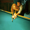
Step #4: CROPPING!!!!!!!!! It’s fun :d
There are NO rules when it comes to cropping. Trust me, there aren’t!!! No matter how you crop, people will always harass you about it, so just do what you like best, doesn’t matter whether you prefer center-cropping, or ‘trendy’ cropping, as long as you like it everything’s okay :d
There are a couple of things you could use to make a crop more interesting though......
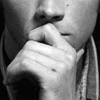
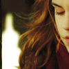
- Center-crops usually look more appealing when there’s a lot of negative space in the icon, that means that the main focus of the icon only takes up a small portion of the icon, the rest’s usually background
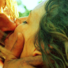
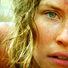
- Close-ups are tricky, they depend more on feeling and practice than anything else. Don’t be afraid to twist and turn the images, and move the selection all over the images to get the crop you like best. Try to focus on something though, whether it’s a nose, or lips, or an eye, if there’s something in the original picture that stands out to you, try to crop it in a way that’ll make it stand out even more.
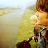
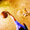
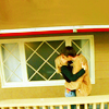
Examples of cropping I like (my own icons):
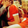
A few examples where I thought there was too little negative space in the original screencaps, so I increased it by moving the base up or down the canvas and copy/pasted (or smudged) part of the background onto the newly created, empty space
Icons made by others:

by letsey-x

by daynawashere

by misses_turner

by xeyra

by likethesun
I’m one of those somewhat ‘trendy’ croppers I guess ;p I don’t really care if people that aren’t into a certain fandom, aren’t able to recognize what’s going on in one of my icons, I really don’t! And neither should you
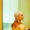
Step #5: Coloring!!! It’s even more fun than cropping, well most of the time
Again: No rules!!! Well, except for the fact that you’re not supposed to turn people magenta, or skies red, or stuff like that.
If you’re a newbie and have no idea what selective color, color balance, levels and curves do, please do NOT try tutorials that just give you an essay full of numbers! Try to find one that actually shows the difference the layers make, or even better.....JUST ADD AN ADJUSTMENT LAYER AND EXPERIMENT!!!! Click and shift everything you can find and check what it does to your picture…
Little tip: check color balance if you want to know which colors you need to add/take away to ‘fix’ certain pictures
For example, if your picture’s too blue, it makes perfect sense to up the colors that are the complete opposites of blue right? Now, if you open a color balance layer, you’ll see that the opposite of blue is yellow, and that the opposite of cyan is red, if you shift the slides towards the yellow and red side, you’ll see that the blue will disappear.

>>>>
See, coloring isn’t all that hard, it just takes some practice :)
Step #6: Textures!!!
I hardly use them, and if I do it’s usually to add a bit of color of depth, so I’m just going to try and find a few tutorials that explain the basics instead of trying to explain them myself :p
Texture Guide: using textures in icons by sanami276
Filling In Empty Space by ack_attack
If something's extremely unclear, or if you want me to go into something a bit more, please let me know :D I'll probably update this post every now and then
Okay, this is probably going to be my last tutorial, not a 100% sure because I might actually become creative one day or go for some weird-ass blue coloring or something, but until that day.....this will be my very last tutorial. Not because I hate writing them, okay, I kinda do, or because I don’t feel like ‘sharing my secrets’, but because I’m just naive enough to think people will actually try and experiment themselves and because I’m sick of copycats *nods*
Step #1: Make sure you use the best quality pictures out there!!!
There is no way anyone’s able to turn an extremely dark and grainy 250x150 pixel picture into a pretty 100x100 pixel icon. Okay, well you might get away with it if you turn it into a B&W icon, but other than that.....just go and look for better quality pictures :p
Home of the Nutty: Gilmore Girls, Supernatural, Lost, Harry Potter, Smallville, One Tree Hill, Grey's Anatomy, Heroes....
In a Dream Doctor Who, Skins, Friday Night Lights, Ugly Betty, Smallville....
Sceencap Paradise Smallville, Supernatural, Buffy the Vampire Slayer, Veronica Mars, Roswell, Dead Like Me, Angel....
Striped Wall Dead Like Me, Roswell, Grey's Anatomy, ER, Supernatural, Torchwood.....
Step #2: Use pictures that have a correct aspect ratio (widthxheight)
If you use pictures from professional photoshoots you shouldn’t have anything to worry about. If you’re using screencaps, it’s a whole different story.....
There’s 2 different ratio’s when it comes to screencaps, the fullscreen one (4:3) and the widescreen one (16:9). That means most fullscreen caps are either 800x600 or 1024x768. Most widescreen caps are either 640x360, 960x540 or 1280x720.
You should be able to see if the screencaps you’re using (or making) are either fullscreen or widescreen and if you’re not a 100% sure the ratio’s correct, just check the image properties and check the size.
Fullscreen:
Widescreen:
Step #3: Do not mess up the perfectly fine aspect ratio of your pictures!!! This one’s extremely important
Not completely sure how this works in Paint Shop Pro, but Photoshop has an extremely simple gadget that, if you know what it does, will make sure you’ll never EVER mess up your aspect ratio again!

If you’d rather use the selection tool than the cropping tool (not sure why anyone would do that, if you do, please tell me why……) try holding the shift key while you’re making the selection, it should give you a perfect square as well.
Step #4: CROPPING!!!!!!!!! It’s fun :d
There are NO rules when it comes to cropping. Trust me, there aren’t!!! No matter how you crop, people will always harass you about it, so just do what you like best, doesn’t matter whether you prefer center-cropping, or ‘trendy’ cropping, as long as you like it everything’s okay :d
There are a couple of things you could use to make a crop more interesting though......
- Center-crops usually look more appealing when there’s a lot of negative space in the icon, that means that the main focus of the icon only takes up a small portion of the icon, the rest’s usually background
- Close-ups are tricky, they depend more on feeling and practice than anything else. Don’t be afraid to twist and turn the images, and move the selection all over the images to get the crop you like best. Try to focus on something though, whether it’s a nose, or lips, or an eye, if there’s something in the original picture that stands out to you, try to crop it in a way that’ll make it stand out even more.
Examples of cropping I like (my own icons):
A few examples where I thought there was too little negative space in the original screencaps, so I increased it by moving the base up or down the canvas and copy/pasted (or smudged) part of the background onto the newly created, empty space
Icons made by others:
by letsey-x
by daynawashere
by misses_turner
by xeyra
by likethesun
I’m one of those somewhat ‘trendy’ croppers I guess ;p I don’t really care if people that aren’t into a certain fandom, aren’t able to recognize what’s going on in one of my icons, I really don’t! And neither should you
Step #5: Coloring!!! It’s even more fun than cropping, well most of the time
Again: No rules!!! Well, except for the fact that you’re not supposed to turn people magenta, or skies red, or stuff like that.
If you’re a newbie and have no idea what selective color, color balance, levels and curves do, please do NOT try tutorials that just give you an essay full of numbers! Try to find one that actually shows the difference the layers make, or even better.....JUST ADD AN ADJUSTMENT LAYER AND EXPERIMENT!!!! Click and shift everything you can find and check what it does to your picture…
Little tip: check color balance if you want to know which colors you need to add/take away to ‘fix’ certain pictures
For example, if your picture’s too blue, it makes perfect sense to up the colors that are the complete opposites of blue right? Now, if you open a color balance layer, you’ll see that the opposite of blue is yellow, and that the opposite of cyan is red, if you shift the slides towards the yellow and red side, you’ll see that the blue will disappear.
>>>>
See, coloring isn’t all that hard, it just takes some practice :)
Step #6: Textures!!!
I hardly use them, and if I do it’s usually to add a bit of color of depth, so I’m just going to try and find a few tutorials that explain the basics instead of trying to explain them myself :p
Texture Guide: using textures in icons by sanami276
Filling In Empty Space by ack_attack
If something's extremely unclear, or if you want me to go into something a bit more, please let me know :D I'll probably update this post every now and then