Tutorial: Six...Black and White Icon
I haven't done a tutorial in a long time. People are always wondering how to make black and white icons from color images so I thought I would share how I achieve the look. It's fairly simple. I first made this icon using Photoshop Elements. When I recreated it for this tutorial I used Photoshop CS2.
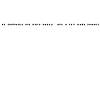
We are going to be making this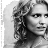
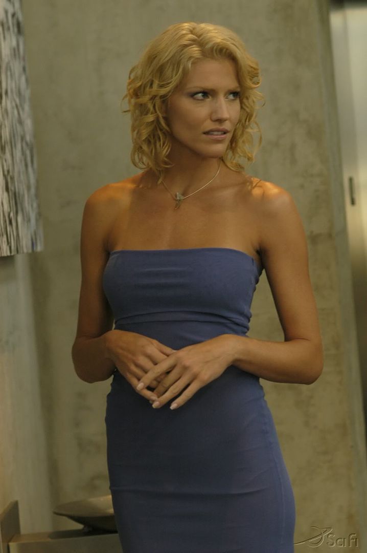
black and white icon from this Hi-res photo.
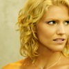
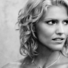
First crop your image. Then prepare the base in your usual way. My base looks like this.
Duplicate your base and set it to screen at 100% opacity.
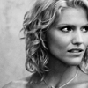
Next is an adjustment layer using a gradient map with a black and white gradient. Black should be on top white on the bottom. Set to normal, opacity 100%. It will look like this now.
It looks fine now but I think it's a little flat. I want more contrast.
Duplicate your base and drag it above the adjustment layer.
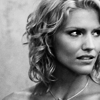
Desaturate this layer and set it to soft light at 100% opacity.
Now it has a little more contrast.
You could stop here. But I wanted something a little darker.
Make another adjustment layer. Use the black and white gradient again and set it to multiply at 30% opacity. Here's what it looks like now. It's a very subtle difference.
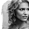
Duplicate your base again and drag it to the top. Desaturate this layer and set it to soft light at 38% opacity.
I like the way it looks now. It's dark and very contrasty.
Next you can add some decorations.
On a new layer I used this tornedges brush by 77words and stamped it in white on top of all the other layers.

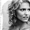
So now my icon looks like this.
On a new layer above the tornedges layer I used a simple decorative text brush by myrasis.
I flipped my icon left and stamped the text brush in the white area using "646464" a medium gray color then flipped the icon back.
And this is the result.
I didn't feel like it had enough contrast the second time I made this icon so I went in and adjusted the "levels" on the base. And that seemed to help by lighening up her face a little.
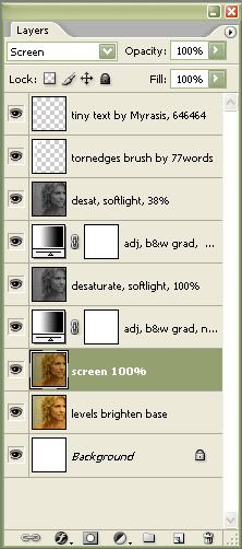
Here's what the layers look like.
Try different blending modes, opacities, brushes, textures, etc. Especially if you use your own image.
Please comment if you felt this tutorial was helpful. Thanks.
Photograph from Dark Thoughts net.
Six from Battlestar Galactica Season 1 Epidsode 11 Colonial Day.
This icon won 1st Place at bstg_icontest in the week 40 challenge.
Thanks for stopping by. :)
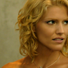
We are going to be making this
black and white icon from this Hi-res photo.
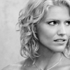
First crop your image. Then prepare the base in your usual way. My base looks like this.
Duplicate your base and set it to screen at 100% opacity.
Next is an adjustment layer using a gradient map with a black and white gradient. Black should be on top white on the bottom. Set to normal, opacity 100%. It will look like this now.
It looks fine now but I think it's a little flat. I want more contrast.
Duplicate your base and drag it above the adjustment layer.
Desaturate this layer and set it to soft light at 100% opacity.
Now it has a little more contrast.
You could stop here. But I wanted something a little darker.
Make another adjustment layer. Use the black and white gradient again and set it to multiply at 30% opacity. Here's what it looks like now. It's a very subtle difference.
Duplicate your base again and drag it to the top. Desaturate this layer and set it to soft light at 38% opacity.
I like the way it looks now. It's dark and very contrasty.
Next you can add some decorations.
On a new layer I used this tornedges brush by 77words and stamped it in white on top of all the other layers.
So now my icon looks like this.
On a new layer above the tornedges layer I used a simple decorative text brush by myrasis.
I flipped my icon left and stamped the text brush in the white area using "646464" a medium gray color then flipped the icon back.
And this is the result.
I didn't feel like it had enough contrast the second time I made this icon so I went in and adjusted the "levels" on the base. And that seemed to help by lighening up her face a little.
Here's what the layers look like.
Try different blending modes, opacities, brushes, textures, etc. Especially if you use your own image.
Please comment if you felt this tutorial was helpful. Thanks.
Photograph from Dark Thoughts net.
Six from Battlestar Galactica Season 1 Epidsode 11 Colonial Day.
This icon won 1st Place at bstg_icontest in the week 40 challenge.
Thanks for stopping by. :)