Notebook Icon Tutorial
This tutorial is for kiaforrest. She wanted to know how to get the "notebook look". And it's very easy.
This tutorial is good for beginners. It's very detailed with pictures. :)
I went ahead and did a tutorial for the entire icon. It uses light textures, the notebook texture and a scratch mask. There is no fancy selective coloring or curves to worry about so it should translate to other programs just fine.
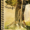
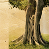
We are going to make this icon. Made in Photoshop CS2...translatable.
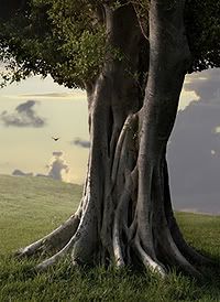
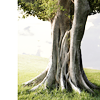
from this stock photo I got at stock.xchng
(Click on the thumbnail to see the larger picture)
Crop your stock photo to icon size. This is your base.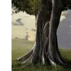
(Please note: You do not need to have a white edge on your icon. I just wanted all of the trunk in my icon and that is why I have a white border)
Make three duplicates of your base and set them all to screen. Two at 100% opacity and one at 75% opacity.
(This will vary depending on what base you use and what look you are going for. So you don't have to copy me exactly unless you are just doing it for practice.)
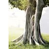
Duplicate your base one more time and drag it to the top of your layers. Set it to soft light at 25% opacity.
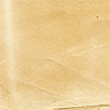
Take this texture of yellowed bent paper by pfefferminzchen and drag it to the top of your layers. Rotate the paper texture 180 degrees and set it to multiply at 100% opacity.
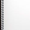
Drag this notebook texture by girlboheme onto the top of your layers and set it to multiply at 100% opacity. ( Very easy, you can use this on just about any icon you make. You could also make the notebook texture into a brush and stamp it on.)
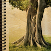
Now find some light textures and try them out on your icon. I used two light textures for this icon.
The first one by svjetlost is of fireworks. Drag it onto the top of your icon and set it to screen at 100% opacity. Then move it down near the bottom of the tree trunk.
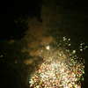
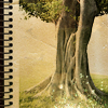
Take this light texture by parisbynight. Drag it to the top of your icon and set it to screen at 100% opacity. I flipped it right and moved it over to the right just little bit.
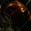
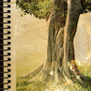
On the next layer I stamped a tiny text brush in black. Use whatever text or brush you want to decorate your icon or don't use anything. (I've omitted it here because I couldn't find it. But you can see it in my original icon at the top of the tut. If you recognize that little text brush and know who made it please let me know.)
Next I took this scratch mask by toybirds. Drag it to the top of your icon and set it to screen at 100% opacity.
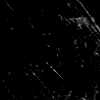
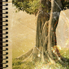
Last, make a new layer at the top of your icon. Do alt + ctrl + shift + e, press them down in order and hold them down. It will make a duplicate of all your layers. Make sure you don't accidently flatten all your layers.
Set this layer to soft light at 60% opacity.
And your done. Save your .psd (layered) file, flatten your layers, then save it as a .png file. I remade the entire icon without the text. The coloring is a little different. Probably because I might have desaturated one of the layers. But I think it looks about the same.
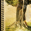
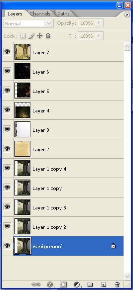
Here are the layers:
As always I would love to see what you come up with.
Thanks for stopping by. Happy icon making! :)
This tutorial is good for beginners. It's very detailed with pictures. :)
I went ahead and did a tutorial for the entire icon. It uses light textures, the notebook texture and a scratch mask. There is no fancy selective coloring or curves to worry about so it should translate to other programs just fine.
We are going to make this icon. Made in Photoshop CS2...translatable.

from this stock photo I got at stock.xchng
(Click on the thumbnail to see the larger picture)

Crop your stock photo to icon size. This is your base.

(Please note: You do not need to have a white edge on your icon. I just wanted all of the trunk in my icon and that is why I have a white border)
Make three duplicates of your base and set them all to screen. Two at 100% opacity and one at 75% opacity.
(This will vary depending on what base you use and what look you are going for. So you don't have to copy me exactly unless you are just doing it for practice.)

Duplicate your base one more time and drag it to the top of your layers. Set it to soft light at 25% opacity.

Take this texture of yellowed bent paper by pfefferminzchen and drag it to the top of your layers. Rotate the paper texture 180 degrees and set it to multiply at 100% opacity.


Drag this notebook texture by girlboheme onto the top of your layers and set it to multiply at 100% opacity. ( Very easy, you can use this on just about any icon you make. You could also make the notebook texture into a brush and stamp it on.)


Now find some light textures and try them out on your icon. I used two light textures for this icon.
The first one by svjetlost is of fireworks. Drag it onto the top of your icon and set it to screen at 100% opacity. Then move it down near the bottom of the tree trunk.


Take this light texture by parisbynight. Drag it to the top of your icon and set it to screen at 100% opacity. I flipped it right and moved it over to the right just little bit.


On the next layer I stamped a tiny text brush in black. Use whatever text or brush you want to decorate your icon or don't use anything. (I've omitted it here because I couldn't find it. But you can see it in my original icon at the top of the tut. If you recognize that little text brush and know who made it please let me know.)
Next I took this scratch mask by toybirds. Drag it to the top of your icon and set it to screen at 100% opacity.


Last, make a new layer at the top of your icon. Do alt + ctrl + shift + e, press them down in order and hold them down. It will make a duplicate of all your layers. Make sure you don't accidently flatten all your layers.
Set this layer to soft light at 60% opacity.
And your done. Save your .psd (layered) file, flatten your layers, then save it as a .png file. I remade the entire icon without the text. The coloring is a little different. Probably because I might have desaturated one of the layers. But I think it looks about the same.

Here are the layers:

As always I would love to see what you come up with.
Thanks for stopping by. Happy icon making! :)