Tutorial...Castle on the Water
It's not actually a castle on the water. It's more like a pier I think.
This tutorial is for emilie24 who asked how I got those colors and textures. And anyone else who is curious of course. It's long and image intensive. Sorry. :)
I use Adobe Photoshop CS2. This tutorial uses Selective color. Everything else should be translatable to other graphics programs.
Before we start go HERE to download ewanism's Scratchy Textures. You're going to need them later on in the tutorial.
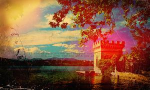
We are going from THIS stock photo I grabbed from Oxford Scientific to this.
Click the thumbnail
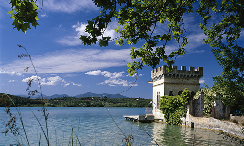
First crop your base picture.
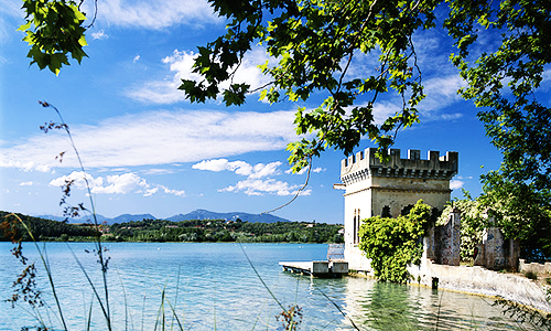
Duplicate your base twice. Set the first duplicate to screen at 100% opacity. Set the second duplicate to soft light at 100% opacity. The soft light layer should be on top of the screened layer.
For Layer 1 I used THIS screencap I took from the Flash Gordon movie and I blurred it, gaussian blur. I dragged it on top of my graphic and set it to soft light at 100% opacity.
Layer 2, another Flash Gordon screencap. Drag it on top of your graphic set it to Multiply at about 35% opacity.
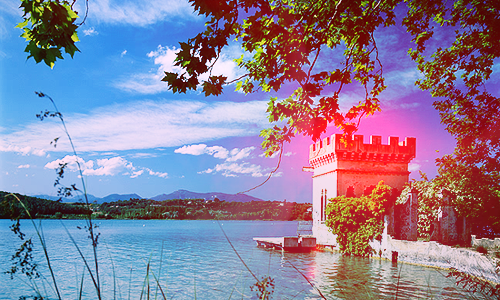
Layer 3, yet another Flash Gordon screencap that's very red blobbish. Drag it on top of your graphic. You can blur it or motion blur it to stretch it out a little. I think that's what I did. Set it to Lighten at 100% opacity. Move it around till you get it where you want it. I wanted it on the part of the castle on the water.
Your graphic will look something like this now.
Layer 4, I took this light texture by gender and I shrunk it down quite a bit. It was huge before. Drag it on top of your graphic and set it to screen at 100% opacity. I moved it so that it lights up the left top corner of my graphic.
It will look similar to this now.
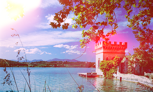
Layer 5, I took another texture by gender, this gray texture with the line through it. I flipped it 180 degrees. Dragged it on top of my graphic and set it to multiply at 60% opacity. Move it around till you get it where you want it. I moved it so the line was near the bottom of my graphic.
Layer 6, this is the last of the texture layers. I took this lovely lovely texture by "I don't know who....anyone know?" and dragged it on top of my graphic. I set it to color burn at 100% opacity. I moved it down till the dark brown part was near the bottom of my graphic.
Now your graphic looks like this with all the textures.
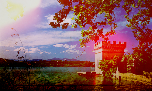
Now we are going to make a Selective Color layer. Click on that half black and half white yin/yang looking thing at the bottom of your layers pallette and choose "Selective Color". Use these settings.
Cyans...relative
magenta -100
Blues...relative
cyan +100
magenta -100
yellow +90
Whites...relative
cyan -94
magenta -84
yellow +96
black +59
Blacks...relative
cyan +47
magenta +18
Everything else is "0". So basically you'll be making changes only to Cyans, Blues, Whites and Blacks. If you are confused about this step just ask me in a comment and I will try to clarify.
If you don't have Selective Color you might try upping the saturation or using some other method you know of to make the colors brighter.
This is how the graphic looks after the Selective Color layer. Big difference!
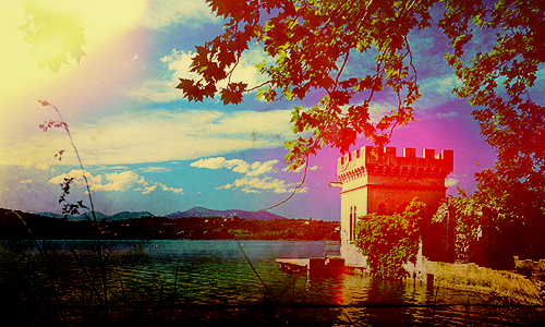
Remember those scratchy brushes by ewanism I asked you to download? You're going to use them now so go ahead and load them up in your graphics program.
For Layer 7, I used some of the scratchy textures and stamped them in black over on the left hand side of my graphic. I left it set to Normal at 100% opacity.
It looks like this now. Click to see the difference
Layers 8 and 9, I honestly cannot remember what texture brushes I used on these two layers. But just about any grungy texture brushes you have will work. I stamped them in black, left them set at Normal and lowered the opacity way down. Layer 8 is set at 28% opacity and layer 9 at 7% opacity. Just mess around till you get the grunge effect you want.
Layer 11, is a scratch mask. Drag it on top of your graphic and set it to screen at 100%. For some reason this brightened up the graphic a little more.
Note: I couldn't find this mask again on my computer so I don't know who it's by. Do you? But really, you can use any scratch mask you like.
Layer 12, you are going to use the scratch textures by ewanism again. This time you will stamp them in white on your layer. Anywhere you want to get the aged and grungy effect you are looking for. I left this layer on Normal and lowered the opacity to 75%.
Now your graphic looks like this.
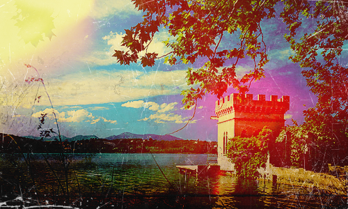
Layer 13, fill this layer with #f2d5bb, a soft peach color, set it to Multiply at 100% opacity.
At this point I added my text. I wanted the grungy layers covering it so I sandwiched it in between my Selective Color layer and Layer 7. Use whatever font you like. I used "Courier" in black set to Normal at 55% opacity.
Now go back up to the top, to Layer 13. Make sure it's selected. Make a new layer above it, Layer 14. Now press Alt+Ctrl+Shift+E. Layer 14 will now have all your layers mooshed into one on it. Sorry, I can't remember the technical term for this.
OK now, select Layer 14. Get out your burn tool and a nice big soft brush, I used a brush sized 65 px. In Range, select "Midtones". For Exposure choose about 25%. Now go over the corners and edges of Layer 14 with your brush. This will darken them a little. Don't do it too much.
See, you can tell the edges are burned.
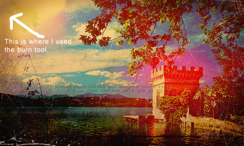
Duplicate the layer. You will now have "Layer 14 copy", set it to "soft light" at about 40%. Leave Layer 14 at "Normal" and lower the opacity to about 55%.
You're done!
Remember you do not have to follow all the steps exactly. Especially if you do this using a different graphics program or a different graphics. Be creative and have fun. :)
If you see any mistakes or any of the steps are unclear please comment.
If anyone would like a tutorial on any of my graphics please ask. I will be happy to write one up.
Thanks. :)
This tutorial is for emilie24 who asked how I got those colors and textures. And anyone else who is curious of course. It's long and image intensive. Sorry. :)
I use Adobe Photoshop CS2. This tutorial uses Selective color. Everything else should be translatable to other graphics programs.
Before we start go HERE to download ewanism's Scratchy Textures. You're going to need them later on in the tutorial.
We are going from THIS stock photo I grabbed from Oxford Scientific to this.
Click the thumbnail

First crop your base picture.

Duplicate your base twice. Set the first duplicate to screen at 100% opacity. Set the second duplicate to soft light at 100% opacity. The soft light layer should be on top of the screened layer.

For Layer 1 I used THIS screencap I took from the Flash Gordon movie and I blurred it, gaussian blur. I dragged it on top of my graphic and set it to soft light at 100% opacity.
Layer 2, another Flash Gordon screencap. Drag it on top of your graphic set it to Multiply at about 35% opacity.
Layer 3, yet another Flash Gordon screencap that's very red blobbish. Drag it on top of your graphic. You can blur it or motion blur it to stretch it out a little. I think that's what I did. Set it to Lighten at 100% opacity. Move it around till you get it where you want it. I wanted it on the part of the castle on the water.
Your graphic will look something like this now.

Layer 4, I took this light texture by gender and I shrunk it down quite a bit. It was huge before. Drag it on top of your graphic and set it to screen at 100% opacity. I moved it so that it lights up the left top corner of my graphic.
It will look similar to this now.

Layer 5, I took another texture by gender, this gray texture with the line through it. I flipped it 180 degrees. Dragged it on top of my graphic and set it to multiply at 60% opacity. Move it around till you get it where you want it. I moved it so the line was near the bottom of my graphic.
Layer 6, this is the last of the texture layers. I took this lovely lovely texture by "I don't know who....anyone know?" and dragged it on top of my graphic. I set it to color burn at 100% opacity. I moved it down till the dark brown part was near the bottom of my graphic.
Now your graphic looks like this with all the textures.

Now we are going to make a Selective Color layer. Click on that half black and half white yin/yang looking thing at the bottom of your layers pallette and choose "Selective Color". Use these settings.
Cyans...relative
magenta -100
Blues...relative
cyan +100
magenta -100
yellow +90
Whites...relative
cyan -94
magenta -84
yellow +96
black +59
Blacks...relative
cyan +47
magenta +18
Everything else is "0". So basically you'll be making changes only to Cyans, Blues, Whites and Blacks. If you are confused about this step just ask me in a comment and I will try to clarify.
If you don't have Selective Color you might try upping the saturation or using some other method you know of to make the colors brighter.
This is how the graphic looks after the Selective Color layer. Big difference!

Remember those scratchy brushes by ewanism I asked you to download? You're going to use them now so go ahead and load them up in your graphics program.
For Layer 7, I used some of the scratchy textures and stamped them in black over on the left hand side of my graphic. I left it set to Normal at 100% opacity.
It looks like this now. Click to see the difference
Layers 8 and 9, I honestly cannot remember what texture brushes I used on these two layers. But just about any grungy texture brushes you have will work. I stamped them in black, left them set at Normal and lowered the opacity way down. Layer 8 is set at 28% opacity and layer 9 at 7% opacity. Just mess around till you get the grunge effect you want.
Layer 11, is a scratch mask. Drag it on top of your graphic and set it to screen at 100%. For some reason this brightened up the graphic a little more.
Note: I couldn't find this mask again on my computer so I don't know who it's by. Do you? But really, you can use any scratch mask you like.
Layer 12, you are going to use the scratch textures by ewanism again. This time you will stamp them in white on your layer. Anywhere you want to get the aged and grungy effect you are looking for. I left this layer on Normal and lowered the opacity to 75%.
Now your graphic looks like this.

Layer 13, fill this layer with #f2d5bb, a soft peach color, set it to Multiply at 100% opacity.
At this point I added my text. I wanted the grungy layers covering it so I sandwiched it in between my Selective Color layer and Layer 7. Use whatever font you like. I used "Courier" in black set to Normal at 55% opacity.
Now go back up to the top, to Layer 13. Make sure it's selected. Make a new layer above it, Layer 14. Now press Alt+Ctrl+Shift+E. Layer 14 will now have all your layers mooshed into one on it. Sorry, I can't remember the technical term for this.
OK now, select Layer 14. Get out your burn tool and a nice big soft brush, I used a brush sized 65 px. In Range, select "Midtones". For Exposure choose about 25%. Now go over the corners and edges of Layer 14 with your brush. This will darken them a little. Don't do it too much.
See, you can tell the edges are burned.

Duplicate the layer. You will now have "Layer 14 copy", set it to "soft light" at about 40%. Leave Layer 14 at "Normal" and lower the opacity to about 55%.
You're done!
Remember you do not have to follow all the steps exactly. Especially if you do this using a different graphics program or a different graphics. Be creative and have fun. :)
If you see any mistakes or any of the steps are unclear please comment.
If anyone would like a tutorial on any of my graphics please ask. I will be happy to write one up.
Thanks. :)