Requested Tutorial
Here is my first tutorial post at the community. This tutorial was requested by the lovely Danielle. This tutorial works with a similar cropping to my icon or close ups of faces. You can achieve the best coloring results if your original image is lighter and cyan/green. I will include a .psd but please, don't use my base or copy my results exactly.
The original icon and several others can be found at this post.
Program: Photoshop CS2
Involves: Selective Coloring, Color Balance, Brightness & Contrast
Level: Easy, depending on the image.
Example-
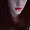
From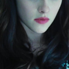
to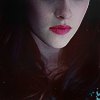
BELLA SWAN TUTORIAL.
1. Begin with your base, I didn't edit it at all. Sharpening and brightening comes later.
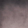
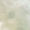
2. I use the next step quite frequently in my icons because it gives them depth and if the colors are too drastic I can fix them subtly. I used three textures for this step. 1. 2. and 3. Begin with texture 1. I pasted it and set it to 'Multiply' at 69% opacity. I pasted texture 2. and set it 'Multiply' at 100%. I pasted texture 1. again and set it 'Lighten' at 20%. I used texture 3. twice, the first was set to 'Multiply' at 30% and the second was set to 'Lighten' at 23%.
to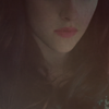
3. Now it looks really bad so we will fix that. Duplicate your base image and bring it to the top and set it to 'Screen' and adjust the opacity as you see fit (mine was 74%). Duplicate your base image and bring it to the top, I set this layer at 'Soft Light' and the opacity I used is 65%. Lastly I copied the whole image (Shft+Ctrl+C) and I sharpened this layer, my opacity is set to 77%.
to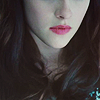
4. Create a new layer and fill it with the color #160901change the layer to 'Exclusion' and adjust the opacity accordingly. I left my opacity at 100% to add some reds into the shadows.
5. Create a new Color Balance layer (Layer - New Adjustment Layer - Color Balance). I used the following settings:
Midtones: -10, -36, -20
Shadows: -23, -6, -7
Hightlights: -1, 4, 3
I used this layer to add some natural cyans/blues into the image but I also added some magneta for depth.
6. Create a new Selective Color layer (Layer - New Adjustment Layer - Selective Color). I used the following settings:
Reds: -25, -5, +26, 0
Yellows: -35, +21, +28, 0
Magnetas: 0, +18, 0, 0
Neutrals: +9, +12, +9, +2
7. Create a new Brightness/Contrast layer (Layer - New Adjustment Layer - Brightness/Contrast). I used the following settings:
Brightness: -9
Contrast: +1
8. Create a new Selective Coloring layer. I used the following settings:
Whites: -54, -13, -27, +7
I used this layer to make the highlights more realistic, adjust these settings as you see fit.
9. Create a new Color Balance layer. I used the following settings:
Midtones: -18, -12, -23
Shadows: -22, -9, +7
Highlights: +9, +8, +6
10. Paste texture 3. (from the second step) and set it to 'Soft Light' my opacity is set to 25%.
11. Paste texture 1. (from the second step) and set it to 'Multiply' my opacity is at 15%.
So far my icon looks like this:
12. Here is where some thought and creativity comes in. I often do this with icons. I create new layers and draw subtly with a soft-edged brush using black and white, I set these layers to 'Soft Light' and lower to opacity to usually 20-40%. These will help highlight or darken certain areas.
to
That is all my friends! You can access the .psd here but please don't use the same base or copy the tutorial exactly.
Any comments/questions? Don't hesitate to post! I would love to see results.
The original icon and several others can be found at this post.
Program: Photoshop CS2
Involves: Selective Coloring, Color Balance, Brightness & Contrast
Level: Easy, depending on the image.
Example-
From
to
BELLA SWAN TUTORIAL.
1. Begin with your base, I didn't edit it at all. Sharpening and brightening comes later.
2. I use the next step quite frequently in my icons because it gives them depth and if the colors are too drastic I can fix them subtly. I used three textures for this step. 1. 2. and 3. Begin with texture 1. I pasted it and set it to 'Multiply' at 69% opacity. I pasted texture 2. and set it 'Multiply' at 100%. I pasted texture 1. again and set it 'Lighten' at 20%. I used texture 3. twice, the first was set to 'Multiply' at 30% and the second was set to 'Lighten' at 23%.
to
3. Now it looks really bad so we will fix that. Duplicate your base image and bring it to the top and set it to 'Screen' and adjust the opacity as you see fit (mine was 74%). Duplicate your base image and bring it to the top, I set this layer at 'Soft Light' and the opacity I used is 65%. Lastly I copied the whole image (Shft+Ctrl+C) and I sharpened this layer, my opacity is set to 77%.
to
4. Create a new layer and fill it with the color #160901change the layer to 'Exclusion' and adjust the opacity accordingly. I left my opacity at 100% to add some reds into the shadows.
5. Create a new Color Balance layer (Layer - New Adjustment Layer - Color Balance). I used the following settings:
Midtones: -10, -36, -20
Shadows: -23, -6, -7
Hightlights: -1, 4, 3
I used this layer to add some natural cyans/blues into the image but I also added some magneta for depth.
6. Create a new Selective Color layer (Layer - New Adjustment Layer - Selective Color). I used the following settings:
Reds: -25, -5, +26, 0
Yellows: -35, +21, +28, 0
Magnetas: 0, +18, 0, 0
Neutrals: +9, +12, +9, +2
7. Create a new Brightness/Contrast layer (Layer - New Adjustment Layer - Brightness/Contrast). I used the following settings:
Brightness: -9
Contrast: +1
8. Create a new Selective Coloring layer. I used the following settings:
Whites: -54, -13, -27, +7
I used this layer to make the highlights more realistic, adjust these settings as you see fit.
9. Create a new Color Balance layer. I used the following settings:
Midtones: -18, -12, -23
Shadows: -22, -9, +7
Highlights: +9, +8, +6
10. Paste texture 3. (from the second step) and set it to 'Soft Light' my opacity is set to 25%.
11. Paste texture 1. (from the second step) and set it to 'Multiply' my opacity is at 15%.
So far my icon looks like this:
12. Here is where some thought and creativity comes in. I often do this with icons. I create new layers and draw subtly with a soft-edged brush using black and white, I set these layers to 'Soft Light' and lower to opacity to usually 20-40%. These will help highlight or darken certain areas.
to
That is all my friends! You can access the .psd here but please don't use the same base or copy the tutorial exactly.
Any comments/questions? Don't hesitate to post! I would love to see results.