Color roughs for last four pieces
In case anyone's interested!
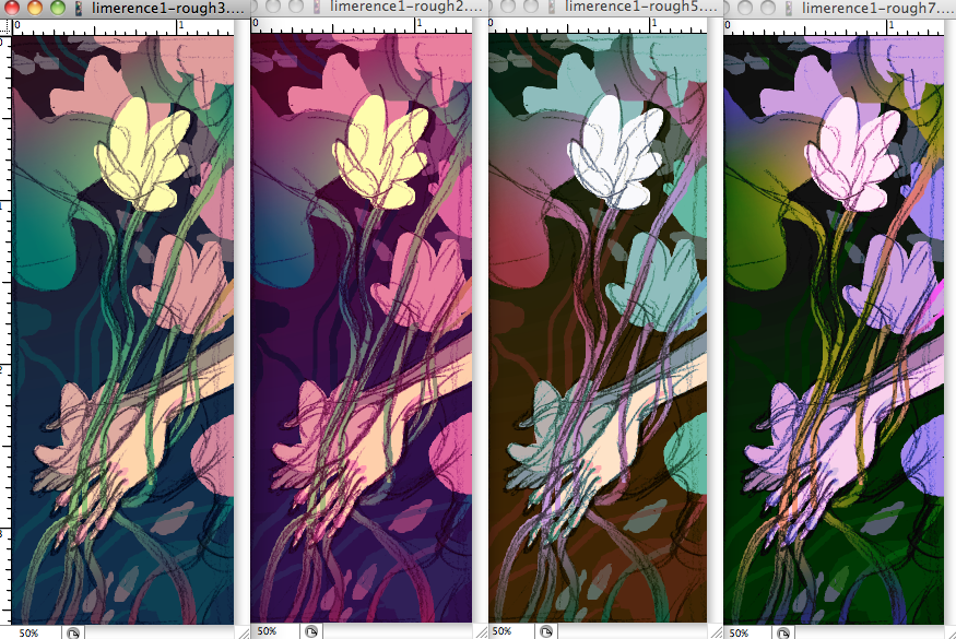
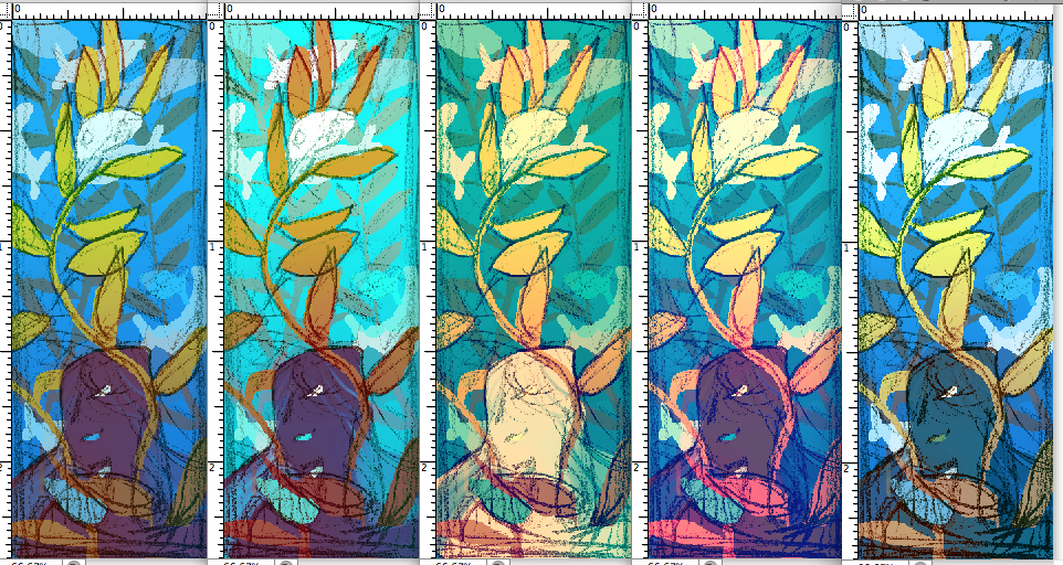
In all examples, left/top left is the initial pass at the colors. After I do the initial pass I'll noodle around with the hues and maybe replace a few colors to see how that changes the way the values work.
I'm pretty glad I didn't go with the purple faces for this one. I was pretty married to that setup for the majority of the roughs, but it would have ended up too heavy to have such a dark shape anchoring the bottom.
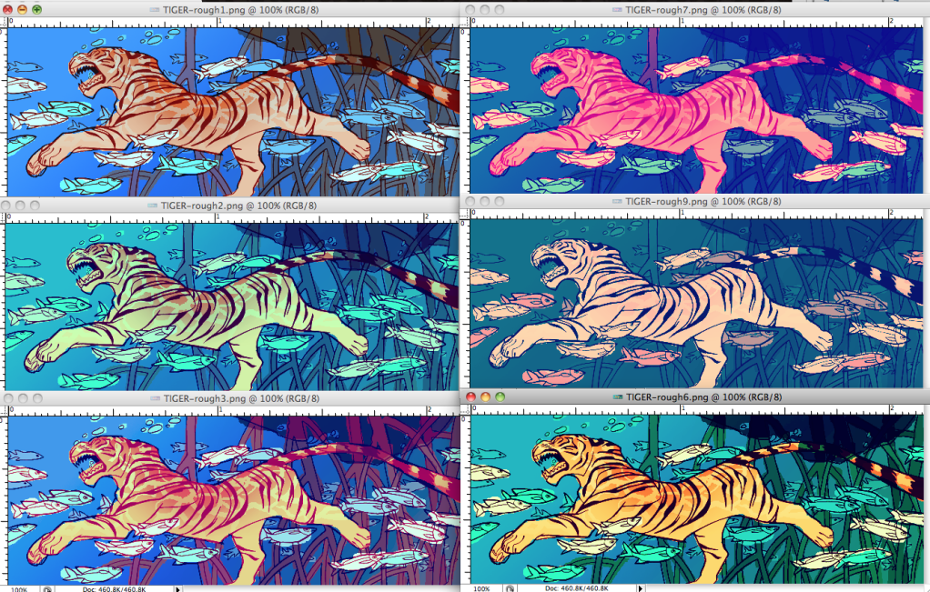
Sometimes it can be hard to decide on a favorite -- I usually have to remind myself repeatedly what feeling I'm trying to get across before I can narrow things down. In this case: water must look warm, shallow and tropical, tiger and fish must stand out while reinforcing the tropical feeling. Only one rough (out of waaaaay more than six, trust me) really hit all of those points, so while the others look nice, they have to go.
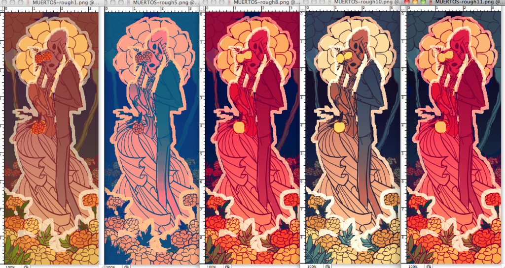
This one started tough and then got easy. I went through a pile of variations that just made NO SENSE (represented by second from left, seriously that's all you need to see, they were all so bad) and then suddenly I had the one in the middle and the one just to the right of it and they rocked! But... not enough. I finally asked my non-illustrator roomie which roughs she liked, and she suggested using the foreground of the red one and the desaturated, cooler background of the other. Tried it out, and I had my final rough right there. So glad I used the suggestion. The brownish rough did look nice but it looked too "aged Victorian photo" for a Mexican holiday, and the redder one was pretty good but there wasn't enough separating the foreground and background.
Whew! They're exhausting to do, but every second I put into these is worth it if it takes the guesswork out of the final. Nothing can take the wind out of my sails faster than the colors on the final illustration not... quite... working. I used to act like these things were such a hardship when teachers would go "and I want so-and-so many color roughs for next week," but it was because I hadn't quite gotten it through my thick skull how much they actually speed the process along. So. Worth. It.
(Actually I mostly hated color roughs because they'd make us do them traditionally, in GOUACHE. You know where that's industry standard? In the lucrative and growing field of IMMORTAL FILTHY RICH MASOCHIST BASTARDS. Bless computers. Hail to the merciful Photoshop overlords.)
TL;DR, BLAH BLAH BLAH, THAT'S ALL VERY NICE JEMMA, BUT WHAT ARE YOUR THOUGHTS ON YAOI