Supernatural Coloring Tutorial
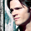
extremefangirl requested a quick tutorial for an icon of my last icon post.
Now, I don't know how quick it'll be, but I hope you find it usefull nevertheless.

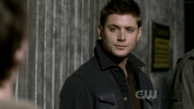
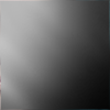
1. I started out with the above of my screen caps from Simon Said, copied it on a new 100x100 canvas and moved it around so that I got my base
2. from
to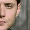
We’re on the base layer. Go to Image > Adjustments > Shadow/Highlight
I used the following settings:
3. from
to
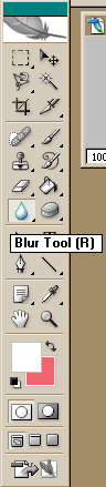
From your tools bar, choose the blur tool with a round brush of about 5pixels in size.
Mode: normal and Strength: 19%. It should look like this:

Go over those parts of his face with the brush which you want to smooth out a little.
This is really a matter of personal preference but it does make subtle differences in the end product ;)
4. from
to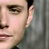
We will sharpen the image now.
Filter > Sharpen > Smart Sharpen
5. from
to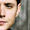
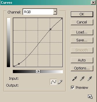
We'll be adding a curves layer now.
Layer > New Adjustment Layer > Curves
We only make alterations on the RGB level so as to increase brightness in the brighter parts of the image and to lower brightness in the darker parts of the image.
Your settings should look like this:
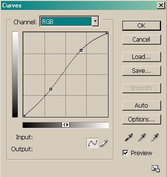
Lower point: Input: 82 Output: 83
Upper point: Input: 175 Output: 202
Leave the layer mode at normal and the opacity at 100%.
6. from
to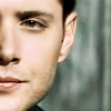
Time to add a selective colors layer.
Layer > New Adjustment Layer > Selective Colors
The following values are the result of countless arbitrary editing and don't follow any reason.
7. from
to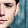
We add yet another selective colors layer.
Layer > New Adjustment Layer > Selective Colors
8. from
to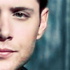
Copy this nifty gradient (by wonderland__, I think) on top of your layers, set the layer mode to overlay and the opacity to 30%.
9. from
to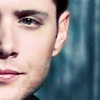
Now, we want to make some other small changes and add another curves layer.
Layer > New Adjustment Layer > Curves
This time we make changes on the RGB and Blue level.
Your settings for RGB should look like this:
Lower point: Input: 27 Output: 14
Upper point: Input: 194 Output: 197
Your settings for Blue should look like this:
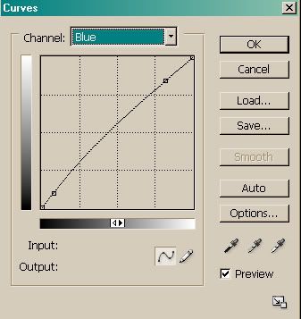
Lower point: Input: 20 Output: 24
Upper point: Input: 209 Output: 216
Leave the layer mode at normal and reduce opacity to 30%.
10. from
to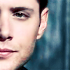
Now, the icon needs some more contrast.
Layer > New Adjustment Layer > Brightness/Contrast
Up the contrast to +7.
11. from
to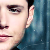
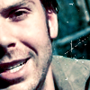
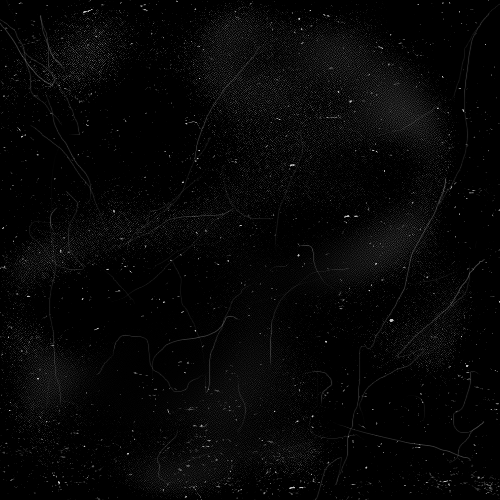
To top the icon off I added a few scratches/abrasions.
I used this texture by lovelamp copied it atop all layers and set the layer mode to screen.
Drag and rotate this texture to your liking.
Erase the scratches from parts of his face with the help of the erase tool from your tools bar.
And you’re done! I hope you all enjoyed.
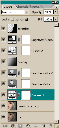
The layer palette for this icon looks like this.
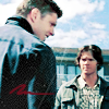
Other icons made using this technique:
Comments and criticism much appreciated!


Now, I don't know how quick it'll be, but I hope you find it usefull nevertheless.
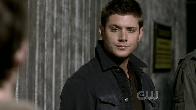
1. I started out with the above of my screen caps from Simon Said, copied it on a new 100x100 canvas and moved it around so that I got my base
2. from
to
We’re on the base layer. Go to Image > Adjustments > Shadow/Highlight
I used the following settings:
- Shadows
- Amount: 12%
- Tonal Width: 100%
- Radius: 92%
- Adjustments
- Color Correction: +26
- Midtone Contrast: +14
- Black Clip: 0%
- White Clip: 0%
3. from
to
From your tools bar, choose the blur tool with a round brush of about 5pixels in size.
Mode: normal and Strength: 19%. It should look like this:
Go over those parts of his face with the brush which you want to smooth out a little.
This is really a matter of personal preference but it does make subtle differences in the end product ;)
4. from
to
We will sharpen the image now.
Filter > Sharpen > Smart Sharpen
- check basic
- Amount: 13%
- Radius: 27.3 pixels
- Remove: lens blur
- Angle: 0°
- check more accurate
5. from
to
We'll be adding a curves layer now.
Layer > New Adjustment Layer > Curves
We only make alterations on the RGB level so as to increase brightness in the brighter parts of the image and to lower brightness in the darker parts of the image.
Your settings should look like this:
Lower point: Input: 82 Output: 83
Upper point: Input: 175 Output: 202
Leave the layer mode at normal and the opacity at 100%.
6. from
to
Time to add a selective colors layer.
Layer > New Adjustment Layer > Selective Colors
The following values are the result of countless arbitrary editing and don't follow any reason.
- Reds
- Cyan: -51
- Magenta: -13
- Yellow: +81
- Yellows
- Cyan: -79
- Magenta: -13
- Yellow: -83
- Neutrals
- Magenta: -21
- Yellow: -15
7. from
to
We add yet another selective colors layer.
Layer > New Adjustment Layer > Selective Colors
- Reds
- Cyan: -100
- Yellow: -40
- Yellows
- Black: -28
- Greens
- Yellow: -100
- Neutrals
- Cyan: +28
- Magenta: +3
- Yellow: -12
- Black: +4
8. from
to
Copy this nifty gradient (by wonderland__, I think) on top of your layers, set the layer mode to overlay and the opacity to 30%.
9. from
to
Now, we want to make some other small changes and add another curves layer.
Layer > New Adjustment Layer > Curves
This time we make changes on the RGB and Blue level.
Your settings for RGB should look like this:
Lower point: Input: 27 Output: 14
Upper point: Input: 194 Output: 197
Your settings for Blue should look like this:
Lower point: Input: 20 Output: 24
Upper point: Input: 209 Output: 216
Leave the layer mode at normal and reduce opacity to 30%.
10. from
to
Now, the icon needs some more contrast.
Layer > New Adjustment Layer > Brightness/Contrast
Up the contrast to +7.
11. from
to
To top the icon off I added a few scratches/abrasions.
I used this texture by lovelamp copied it atop all layers and set the layer mode to screen.
Drag and rotate this texture to your liking.
Erase the scratches from parts of his face with the help of the erase tool from your tools bar.
And you’re done! I hope you all enjoyed.
The layer palette for this icon looks like this.
Other icons made using this technique:
Comments and criticism much appreciated!