Colouring Tutorial in 5 steps - PS CS2
ok so couperose had a question about the colouring on this icon, and since I'm avoiding my homework like the plague I thought it was a perfect opportunity to write a tutorial. yay.

credit for the cap goes to: Striped Wall.
First off I just want to say that this colouring will only look nice on certain caps. The cap I chose is fairly colourful to begin with, therefore it was much easier to achieve a rich colouring. Secondly, I always colour then crop because I find that if I do it the other way around the icon turns out more pixely.
Step One:
Duplicate twice and set to screen at 100% both times
Step Two: CURVES
A lot of people seem to hate on curves, however it's the ONLY way to get this colouring exactly as you want it. Anyway:
Layer > New Adjustment Layer > Curves
RGB -
First Point -
Input: 85
Output: 90
Second Point -
Input: 193
Output: 220
Third Point -
Input: 220
Output: 244
RED -
First Point -
Input: 77
Output: 27
Second Point -
Input: 147
Output: 132
Third Point -
Input: 175
Output: 255
GREEN -
First Point -
Input: 36
Output: 46
Second Point -
Input: 117
Output: 132
Third Point -
Input: 233
Output: 255
BLUE -
First Point -
Input: 46
Output: 53
Second Point -
Input: 120
Output: 108
Third Point -
Input: 255
Output: 233
Step Three:
Set this layer to Soft Light at 100%
Step Four:
Duplicate the original cap and place on top of the others, set to soft light at 20%
Step Five:
crop to 100x100
and you're done!
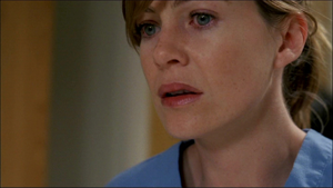
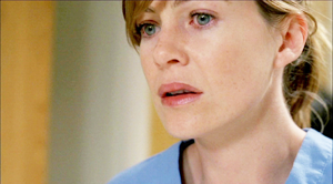
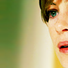
Original:
Remade:
(looks pretty much the same)
Thank you for viewing my tutorial and I hope it was somewhat helpful. :)
credit for the cap goes to: Striped Wall.
First off I just want to say that this colouring will only look nice on certain caps. The cap I chose is fairly colourful to begin with, therefore it was much easier to achieve a rich colouring. Secondly, I always colour then crop because I find that if I do it the other way around the icon turns out more pixely.
Step One:
Duplicate twice and set to screen at 100% both times
Step Two: CURVES
A lot of people seem to hate on curves, however it's the ONLY way to get this colouring exactly as you want it. Anyway:
Layer > New Adjustment Layer > Curves
RGB -
First Point -
Input: 85
Output: 90
Second Point -
Input: 193
Output: 220
Third Point -
Input: 220
Output: 244
RED -
First Point -
Input: 77
Output: 27
Second Point -
Input: 147
Output: 132
Third Point -
Input: 175
Output: 255
GREEN -
First Point -
Input: 36
Output: 46
Second Point -
Input: 117
Output: 132
Third Point -
Input: 233
Output: 255
BLUE -
First Point -
Input: 46
Output: 53
Second Point -
Input: 120
Output: 108
Third Point -
Input: 255
Output: 233
Step Three:
Set this layer to Soft Light at 100%
Step Four:
Duplicate the original cap and place on top of the others, set to soft light at 20%
Step Five:
crop to 100x100
and you're done!
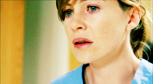
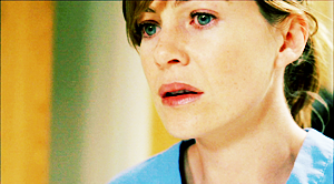
Original:
Remade:
(looks pretty much the same)
Thank you for viewing my tutorial and I hope it was somewhat helpful. :)