304 // Icon Tutorial #4 // Patterned In Circle; Medium
For those of you who might have missed the post I'm taking tutorial requests here for any icons I've made within about the last year. iulieki requested a tutorial for the effects on these icons:
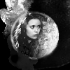
or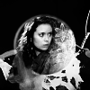
I even asked her to provide me with an image to do the effect on, so today I'll be going from this to this:

to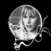
One.
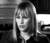
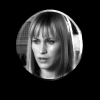
First things first, I took this image, provided by iulieki, and cropped out a section I wanted. For this effect the best thing to do is to start from the shoulders and try to center your subject as much as possible regardless of the direction your subject is facing. I did it like this and then resized by making the width 100px.
You should get something like this:
Two.
Then I desaturated my base by going to Adjust--> Hue and Saturation--> Hue, Saturation, Lightness and putting Hue and Lightness at 0 and Saturation at -100. For other programs you can desaturate in other ways.
Three.
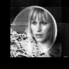
Once my image was desaturated I adjusted the brightness and contrast to a level that stands out a little. In the case of this image I used Brightness 23, Contrast 27, but each and every image will be different. The idea is to make the black and white "pop" out to the eye. Once my icon was adjusted, it looked like this:
Four.
Now the real fun begins. If you image is not 100x100 pixels then you need to create a new image by going to File--> New which is 100x100 and is black in the background. Like this:

If you needed to do this then promote the background to a raster layer (such as by going to Layers--> Promote Background Layer) and paste your black and white image onto the black layer. [Copy-->Paste As New Layer.] Drag the black layer to the top.
If your image is 100x100, merely create a new black layer and floodfill (the paint bucket) with black.
Five.
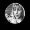
Once the black layer is on top go to your sidebar with your tools and select the crop tool as a circle. Then, beginning at about the center of the canvas (this is why you needed to crop your subject to the center) select a circle of around 60px in diameter and delete the selected portion. It should look something like this:

Six.
Now select the shape tool from your sidebar. That'll be the little tool that looks like an oval overlaying a rectangle. From the menu, pick the "Ellipse" shape at 2.00 width and a solid line. Remember to have anti-alias selected. Then, using the tool, create a white circle outline around the black and white image. You do an outline by making the second color swatch on the color toolbar transparent.
Your program toolbar should look about like this:
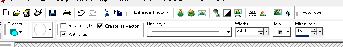
And the icon should now look like this:

Seven.
Now the hard part. Select the eraser tool and pick a non-solid, circular brush such as "fuzzy soft" or, my personal favorite, "chalk medium". Once you have that selected, take the opacity of the brush down into the 20s and slowly erase pieces of the circle to create a murky sort of crescent. This will require you to make the ellipse a raster layer but, at least in PSP, when you try to use the eraser on a vector it does it with a prompt.
You might end up with something like this:
Then go to Adjust-->Blur-->Motion Blur and make the ellipse very slightly blurred in the direction that has the most white left. Because I erased the bottom, left side, I used Angle 50 and Strength 3.
You'll get something like this:

Eight.
We're in the home stretch now! Because Patricia Arquette's face takes up so much of the circle in this icon, I moved the base image (the one with the subject) slightly to one side to give room for brushes now.

Then I picked a brush, set to white, to offset the subject's face. In the original, requested icon I used a flower brush and so I picked another one here. In this case, one by gender but, really, any sort of crazy pattern brush will do. The opacity of the brush depends on what brush it is but 80 percent is a good place to start. You can do any brush color you like but to go with the black and white theme, I chose white.
Create a new layer (Raster 4 for those keeping count) and apply your brush around the part of the ellipse you originally erased. If the brush goes over the subject's face erase the part that did. You will end up with something like this:
Nine.
Obviously, this brush went a little over the side of the circle but that doesn't matter. You're going to select the original black layer with the circle portion cut out. For me, that's labelled "Raster 1". Then, using the magic wand tool from the sidebar (under tool selections there should be a wand looking option) with a feather value of "2", you'll select everything but the circle area missing from the black. Then select the brush layer (Raster 4) and hit "delete" on your keyboard.
That will delete all the brushwork except that inside the circle area.
Ten.
Finally, you can decorate as desired. I decided on some paint lines by sanami276 for this icon and created a new raster layer at the very top (Raster 5) to put it on. That's it and I'm finished:
If you have any questions or need any clarification feel free to ask and I'd love to see what anyone does with this. Remember, you can use any color combination, I just happen to like black and white. Also, if you'd like to request a tutorial you can do so here. Enjoy!
- Andrea.
or
I even asked her to provide me with an image to do the effect on, so today I'll be going from this to this:
to
One.
First things first, I took this image, provided by iulieki, and cropped out a section I wanted. For this effect the best thing to do is to start from the shoulders and try to center your subject as much as possible regardless of the direction your subject is facing. I did it like this and then resized by making the width 100px.
You should get something like this:
Two.
Then I desaturated my base by going to Adjust--> Hue and Saturation--> Hue, Saturation, Lightness and putting Hue and Lightness at 0 and Saturation at -100. For other programs you can desaturate in other ways.
Three.
Once my image was desaturated I adjusted the brightness and contrast to a level that stands out a little. In the case of this image I used Brightness 23, Contrast 27, but each and every image will be different. The idea is to make the black and white "pop" out to the eye. Once my icon was adjusted, it looked like this:
Four.
Now the real fun begins. If you image is not 100x100 pixels then you need to create a new image by going to File--> New which is 100x100 and is black in the background. Like this:
If you needed to do this then promote the background to a raster layer (such as by going to Layers--> Promote Background Layer) and paste your black and white image onto the black layer. [Copy-->Paste As New Layer.] Drag the black layer to the top.
If your image is 100x100, merely create a new black layer and floodfill (the paint bucket) with black.
Five.
Once the black layer is on top go to your sidebar with your tools and select the crop tool as a circle. Then, beginning at about the center of the canvas (this is why you needed to crop your subject to the center) select a circle of around 60px in diameter and delete the selected portion. It should look something like this:
Six.
Now select the shape tool from your sidebar. That'll be the little tool that looks like an oval overlaying a rectangle. From the menu, pick the "Ellipse" shape at 2.00 width and a solid line. Remember to have anti-alias selected. Then, using the tool, create a white circle outline around the black and white image. You do an outline by making the second color swatch on the color toolbar transparent.
Your program toolbar should look about like this:
And the icon should now look like this:
Seven.
Now the hard part. Select the eraser tool and pick a non-solid, circular brush such as "fuzzy soft" or, my personal favorite, "chalk medium". Once you have that selected, take the opacity of the brush down into the 20s and slowly erase pieces of the circle to create a murky sort of crescent. This will require you to make the ellipse a raster layer but, at least in PSP, when you try to use the eraser on a vector it does it with a prompt.
You might end up with something like this:
Then go to Adjust-->Blur-->Motion Blur and make the ellipse very slightly blurred in the direction that has the most white left. Because I erased the bottom, left side, I used Angle 50 and Strength 3.
You'll get something like this:
Eight.
We're in the home stretch now! Because Patricia Arquette's face takes up so much of the circle in this icon, I moved the base image (the one with the subject) slightly to one side to give room for brushes now.
Then I picked a brush, set to white, to offset the subject's face. In the original, requested icon I used a flower brush and so I picked another one here. In this case, one by gender but, really, any sort of crazy pattern brush will do. The opacity of the brush depends on what brush it is but 80 percent is a good place to start. You can do any brush color you like but to go with the black and white theme, I chose white.
Create a new layer (Raster 4 for those keeping count) and apply your brush around the part of the ellipse you originally erased. If the brush goes over the subject's face erase the part that did. You will end up with something like this:
Nine.
Obviously, this brush went a little over the side of the circle but that doesn't matter. You're going to select the original black layer with the circle portion cut out. For me, that's labelled "Raster 1". Then, using the magic wand tool from the sidebar (under tool selections there should be a wand looking option) with a feather value of "2", you'll select everything but the circle area missing from the black. Then select the brush layer (Raster 4) and hit "delete" on your keyboard.
That will delete all the brushwork except that inside the circle area.
Ten.
Finally, you can decorate as desired. I decided on some paint lines by sanami276 for this icon and created a new raster layer at the very top (Raster 5) to put it on. That's it and I'm finished:
If you have any questions or need any clarification feel free to ask and I'd love to see what anyone does with this. Remember, you can use any color combination, I just happen to like black and white. Also, if you'd like to request a tutorial you can do so here. Enjoy!
- Andrea.