303 // Tutorial #3 // Carnivale, Ben Hawkins; Using Textures With Multiply
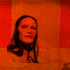
I'm doing this tutorial at the request of sirduke, who asked how to make this icon. While I couldn't recreate it, not being able to remember what cap I used, I'll be using another image to illustrate. Thus, we're going to go from:
to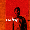
This tutorial was written using PSP8, but I'm fairly certain it's at least translatable to other PSP programs, PS programs, and GIMP.
Step One: Pick and prep your image.
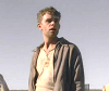
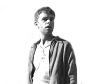
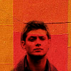
As a general rule, for this sort of icon you want to pick an image which has both shoulders intact and space above the head so that you don't have to recreate any pieces of a person in the icon itself. I chose this image (cap by raven_annabelle) because it had a relatively clear background, no intense backlighting, and showed both the top of his head and the space around him.
Then I cropped and resized the image. It doesn't matter if the image is 100x100, so long as it is 100 pixels wide and shows, again, both the space around the character and above him. In my case I ended up with one about 100x84, which I then lightened and sharpened slightly. It looks like this:
Step Two: Isolate the image: Erase.
The next step is to remove everything from the base except for the character him or herself. Using the eraser brush (which looks like a pencil with the eraser end down in most programs) erase everything but the person from the image itself.
The brush width, hardness, etc. is going to depend on what image you originally began with. For this one I started with width: 13, hardness: 46, opacity: 49 to create a silouhette around the character, like so:
In your image there should be a checkered white-grey area behind the character and not a white space. To erase, by the way, I zoomed into the image so I could see the details. In PSP you do this by clicking on the image with the crossbar tool (the one that allows you to move things around) and using the zoom tools in the bar.
Once I had a silouhette I switched to a finer brush (width: 6, hardness: 36, opacity: 55) to get the little details. With this, if I erased too much I then right-clicked over the over-erased areas and they reappeared until I was satisfied. This trick can also be used to firm up edges and lines of an image.
Step Three: Isolate the image: double-check.
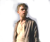
Once I thought I'd erased everything but the character I created a new raster layer and floodfilled it (using the little tool that looks like a paintbucket) with white, then moved that layer below the partially erased image to check for blindspots. If the white came back clean I think floodfilled the white layer with a bright colour, like red, magenta, or bright blue.
As you can see, there's a few white spots missed, which I clean up now. You want to doublecheck using both a white and a bright, darker toned colour to make sure you didn't miss anything. Any flaws will be very obvious in the finished product. Once you're satisfied delete the colour-filled layer.
Step Four: Making your image B&W.
This step isn't one that you'll always want to take. But in the case of my example and the icon I was asked to do a tutorial for, I did. I'm presuming here you know how to make an image black and white in your native program, using either the hue settings under adjust or a desaturation brush. The key here isn't making it black and white but instead increasing the brightness and contrast to the appropriate levels.
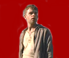
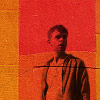
Once your image is B&W go to Adjust-->Brightness And Contrast-->Brightness/Contrast or any other tool which can increase the brightness and contrast (without adding colour) at the same time. For this image I made Brightness: 13, Contrast: 19 to create a look something like this:
Preferably you want to make it slightly brighter and more contrasted than you think is attractive because a later step will counteract this. Speaking of, we're to the home stretch.
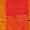
Step Five: Add your texture.
For this icon, as well as the icon I was asked to do a tutorial for, and about half my icons lately, I used a texture from this set by elli. In particular I used this texture:
First, to do I created a new image at 100x100. The background colour doesn't matter so I picked white as default. Then I copied my character image and pasted it onto the new layer, moving it until there was no white space underneath him. Then I selected my texture and pasted it above the character and base layer before setting it to Multiply.
Step Six: Fiddling around.
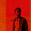
To be quite honest, I wasn't entirely happy with how this turned out so I did a final step. Taking the image above I copy merged and pasted that as a new layer, setting it to Multiply at 82% and I got something I felt was more striking:
Then, just for some spice, I added some text and ended up with my finished product:
Voila, finished product!
Thus, I reach the end of the tutorial. As you can see, it's a fairly simply process. If anything is unclear please tell me so that I can edit it and if anyone uses this to make icons of their own I would love to know. Thanks!
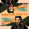
Here are a few more examples using this process to make icons, both using B&W and not:

Also, if anyone is curious the subject of this icon is Ben Hawkins, from HBO's Carnivale.
- Andrea.
to
This tutorial was written using PSP8, but I'm fairly certain it's at least translatable to other PSP programs, PS programs, and GIMP.
Step One: Pick and prep your image.
As a general rule, for this sort of icon you want to pick an image which has both shoulders intact and space above the head so that you don't have to recreate any pieces of a person in the icon itself. I chose this image (cap by raven_annabelle) because it had a relatively clear background, no intense backlighting, and showed both the top of his head and the space around him.
Then I cropped and resized the image. It doesn't matter if the image is 100x100, so long as it is 100 pixels wide and shows, again, both the space around the character and above him. In my case I ended up with one about 100x84, which I then lightened and sharpened slightly. It looks like this:
Step Two: Isolate the image: Erase.
The next step is to remove everything from the base except for the character him or herself. Using the eraser brush (which looks like a pencil with the eraser end down in most programs) erase everything but the person from the image itself.
The brush width, hardness, etc. is going to depend on what image you originally began with. For this one I started with width: 13, hardness: 46, opacity: 49 to create a silouhette around the character, like so:
In your image there should be a checkered white-grey area behind the character and not a white space. To erase, by the way, I zoomed into the image so I could see the details. In PSP you do this by clicking on the image with the crossbar tool (the one that allows you to move things around) and using the zoom tools in the bar.
Once I had a silouhette I switched to a finer brush (width: 6, hardness: 36, opacity: 55) to get the little details. With this, if I erased too much I then right-clicked over the over-erased areas and they reappeared until I was satisfied. This trick can also be used to firm up edges and lines of an image.
Step Three: Isolate the image: double-check.
Once I thought I'd erased everything but the character I created a new raster layer and floodfilled it (using the little tool that looks like a paintbucket) with white, then moved that layer below the partially erased image to check for blindspots. If the white came back clean I think floodfilled the white layer with a bright colour, like red, magenta, or bright blue.
As you can see, there's a few white spots missed, which I clean up now. You want to doublecheck using both a white and a bright, darker toned colour to make sure you didn't miss anything. Any flaws will be very obvious in the finished product. Once you're satisfied delete the colour-filled layer.
Step Four: Making your image B&W.
This step isn't one that you'll always want to take. But in the case of my example and the icon I was asked to do a tutorial for, I did. I'm presuming here you know how to make an image black and white in your native program, using either the hue settings under adjust or a desaturation brush. The key here isn't making it black and white but instead increasing the brightness and contrast to the appropriate levels.
Once your image is B&W go to Adjust-->Brightness And Contrast-->Brightness/Contrast or any other tool which can increase the brightness and contrast (without adding colour) at the same time. For this image I made Brightness: 13, Contrast: 19 to create a look something like this:
Preferably you want to make it slightly brighter and more contrasted than you think is attractive because a later step will counteract this. Speaking of, we're to the home stretch.
Step Five: Add your texture.
For this icon, as well as the icon I was asked to do a tutorial for, and about half my icons lately, I used a texture from this set by elli. In particular I used this texture:
First, to do I created a new image at 100x100. The background colour doesn't matter so I picked white as default. Then I copied my character image and pasted it onto the new layer, moving it until there was no white space underneath him. Then I selected my texture and pasted it above the character and base layer before setting it to Multiply.
Step Six: Fiddling around.
To be quite honest, I wasn't entirely happy with how this turned out so I did a final step. Taking the image above I copy merged and pasted that as a new layer, setting it to Multiply at 82% and I got something I felt was more striking:
Then, just for some spice, I added some text and ended up with my finished product:
Voila, finished product!
Thus, I reach the end of the tutorial. As you can see, it's a fairly simply process. If anything is unclear please tell me so that I can edit it and if anyone uses this to make icons of their own I would love to know. Thanks!
Here are a few more examples using this process to make icons, both using B&W and not:
Also, if anyone is curious the subject of this icon is Ben Hawkins, from HBO's Carnivale.
- Andrea.