LJ Anniversary
It's been exactly one year since I created this lj.
I can't believe it's already been a year, but at the same time it feel like I've been here forever. *g* Thanks to everybody on my flist who welcomed me back then (I know who you are *snuggles*) and to all of you for making me feel at home, supporting and having fun with me the last year. It's been awesome. Life without lj seems boring these days. *g* Does that sound pathetic?
It has also been almost exactly one year since I started making fanart, seeing as the header of this lj was one of the first artworks I did. Celebrating this fact, I thought I should dig up some old (crappy - please kill me now xD) stuff and comment on what's so ugly about them and what I could have done better. Or to just let those of you who praise my art (and I still don't see why xD) see that I've made some shitty stuff. Hee. I'd really like to think I have become better at fanart and photoshop in general during this past year. You decide. (Note: I did not know photoshop until I started making fanart. It was how I learnt, I'm self-taught and kind of proud of it. *g*)
Yes, this is a total rip off of Vrya's Collage Redux, a discussion which I love and adore. Here we go...
First pic:
Use of Texture
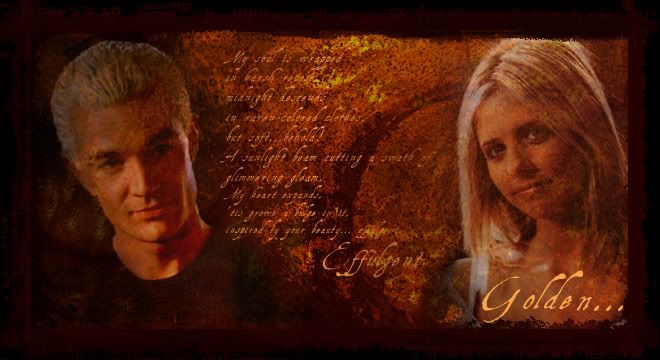
This was actually the third or fourth piece of fanart I did ever. Keeping that in mind, I think it's pretty good, but still, there's some things that can be discussed. I chose this to examplify how to (not) use texture. The yellow/orange pic that is the background of this pic is one of my own stocks and I'm using it here as a texture as well. Which just dons't work. See how both Spike and Buffy becomes darker and the texture of the stock is in their faces making them look pretty damn fugly? Alsmost scarred? Not a good idea. Smoothing out the stock over their faces (with the smudge tool, perhaps) would have worked, or just masked those places. Plus, adding some light.
Still that pic of Spike is my favourite ever. Not kidding you (I'm very picky about which James pics I like xD)
Other things that can be discussed in this pic, like the use of text, will be brought up later.

Lighting
I can't believe I'm showing you this pic. I hate it. With everything I've got and would most of all disclaim any ownership of it, and delete it off my harddrive, but well, here it is. Last time you'll see it. Promise. :P
This is a perfect example of many things. How to not do many things, of course. The more obvious one, being the lighting. It's so damn dark we can't make out the faces or some of the text! Black is nice and all, but this pic would have needed so much light it's not even funny. That's a good rule btw, when you think a pic is light enough? Add an extra screen layer. Most of the time, it just gets better (and I find saving the pic in .jpg format makes them a little darker)
Other things (everything *groan*) can also be discussed about this pic, like the use of text and the compostition. See following paragraphs. :P
Just one thing to say: this is the fugliest I've ever made. There, I admitted it. :P
Use of text
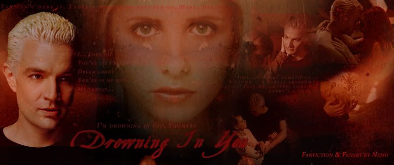
This is the first (well, first pic but second version) of the header of my now neglected website. This is an excellent exapmle of times when I wanted too much and had too little space. There's just too much text nd it's not really visible. And it's boring text. The title ("Drowning in you") looks good enough, but the rest of the text just doesn't speak to you, serve little purpose and you have no idea what you should read first. Nowadays, I rarely use text, but if I do, I use it with caution. :P
Composition
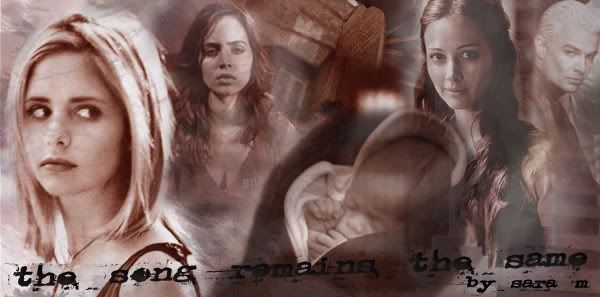
Usually, I think I'm prettty good at composition. Not this one. This is a story banner for a fanfic (I would link to it but TSR seems really weird...) Again, it's me wanting to put too much into a too small space. It's crowded, without focalpoint, and when the baby could have been an excellent focus this ends up just a bunch of people looking in ten different directions. *sigh* Bad art.
Bad blending
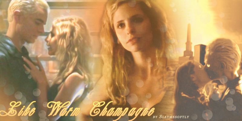
Although there are things I like about this pic and still think are okay (like how I put the Tabula Rasa kiss in the graveyard) I still need to comment on on the belending from Buffy to the graveyard. It's like, half of her is missing, and it's not done in a very good way. *sigh* There's also that thing where I've used a filter on both of the pics at the sides which just makes Buffy in the middle look extra grainy. Not sure what to learn from this. Getting better with the fonts/text though. *g*
Yeah, okay, I think I'm done now.
And with the risk of sounding very elitistic (not intended, promise, just some good advice):
Other art pet peeves of mine:
(that I thankfully couldn't find among my art but that I need to add)
+ Different skin tones - putting together two caps/pics with different lighting and not adjusting the skin tones to match. With just some color balance and intensity/contrast and you're good. :)
+ Visible network logo - letting the "CW" logo show if we're talking VM/SPN. Tip? Either cut it out completely if that's possible, or use the clone tool. Remember, the clone tool is your best friend. :)
+ Cut off foreheads. Yeah, you know how those close-ups are on tv but it's a good idea to disguise it in some way. Vrya discusses this beautifully in forementioned tut. :)
And because staring at my old lame art makes me feel crappy, here goes some newer stuff (that you've probably seen before but anyway) to make me feel better:


Yes, all better. *g* Sorry for the self-centered post, I'll go back to being modest now. xD
I can't believe it's already been a year, but at the same time it feel like I've been here forever. *g* Thanks to everybody on my flist who welcomed me back then (I know who you are *snuggles*) and to all of you for making me feel at home, supporting and having fun with me the last year. It's been awesome. Life without lj seems boring these days. *g* Does that sound pathetic?
It has also been almost exactly one year since I started making fanart, seeing as the header of this lj was one of the first artworks I did. Celebrating this fact, I thought I should dig up some old (crappy - please kill me now xD) stuff and comment on what's so ugly about them and what I could have done better. Or to just let those of you who praise my art (and I still don't see why xD) see that I've made some shitty stuff. Hee. I'd really like to think I have become better at fanart and photoshop in general during this past year. You decide. (Note: I did not know photoshop until I started making fanart. It was how I learnt, I'm self-taught and kind of proud of it. *g*)
Yes, this is a total rip off of Vrya's Collage Redux, a discussion which I love and adore. Here we go...
First pic:

Use of Texture
This was actually the third or fourth piece of fanart I did ever. Keeping that in mind, I think it's pretty good, but still, there's some things that can be discussed. I chose this to examplify how to (not) use texture. The yellow/orange pic that is the background of this pic is one of my own stocks and I'm using it here as a texture as well. Which just dons't work. See how both Spike and Buffy becomes darker and the texture of the stock is in their faces making them look pretty damn fugly? Alsmost scarred? Not a good idea. Smoothing out the stock over their faces (with the smudge tool, perhaps) would have worked, or just masked those places. Plus, adding some light.
Still that pic of Spike is my favourite ever. Not kidding you (I'm very picky about which James pics I like xD)
Other things that can be discussed in this pic, like the use of text, will be brought up later.

Lighting
I can't believe I'm showing you this pic. I hate it. With everything I've got and would most of all disclaim any ownership of it, and delete it off my harddrive, but well, here it is. Last time you'll see it. Promise. :P
This is a perfect example of many things. How to not do many things, of course. The more obvious one, being the lighting. It's so damn dark we can't make out the faces or some of the text! Black is nice and all, but this pic would have needed so much light it's not even funny. That's a good rule btw, when you think a pic is light enough? Add an extra screen layer. Most of the time, it just gets better (and I find saving the pic in .jpg format makes them a little darker)
Other things (everything *groan*) can also be discussed about this pic, like the use of text and the compostition. See following paragraphs. :P
Just one thing to say: this is the fugliest I've ever made. There, I admitted it. :P

Use of text
This is the first (well, first pic but second version) of the header of my now neglected website. This is an excellent exapmle of times when I wanted too much and had too little space. There's just too much text nd it's not really visible. And it's boring text. The title ("Drowning in you") looks good enough, but the rest of the text just doesn't speak to you, serve little purpose and you have no idea what you should read first. Nowadays, I rarely use text, but if I do, I use it with caution. :P

Composition
Usually, I think I'm prettty good at composition. Not this one. This is a story banner for a fanfic (I would link to it but TSR seems really weird...) Again, it's me wanting to put too much into a too small space. It's crowded, without focalpoint, and when the baby could have been an excellent focus this ends up just a bunch of people looking in ten different directions. *sigh* Bad art.

Bad blending
Although there are things I like about this pic and still think are okay (like how I put the Tabula Rasa kiss in the graveyard) I still need to comment on on the belending from Buffy to the graveyard. It's like, half of her is missing, and it's not done in a very good way. *sigh* There's also that thing where I've used a filter on both of the pics at the sides which just makes Buffy in the middle look extra grainy. Not sure what to learn from this. Getting better with the fonts/text though. *g*
Yeah, okay, I think I'm done now.
And with the risk of sounding very elitistic (not intended, promise, just some good advice):
Other art pet peeves of mine:
(that I thankfully couldn't find among my art but that I need to add)
+ Different skin tones - putting together two caps/pics with different lighting and not adjusting the skin tones to match. With just some color balance and intensity/contrast and you're good. :)
+ Visible network logo - letting the "CW" logo show if we're talking VM/SPN. Tip? Either cut it out completely if that's possible, or use the clone tool. Remember, the clone tool is your best friend. :)
+ Cut off foreheads. Yeah, you know how those close-ups are on tv but it's a good idea to disguise it in some way. Vrya discusses this beautifully in forementioned tut. :)
And because staring at my old lame art makes me feel crappy, here goes some newer stuff (that you've probably seen before but anyway) to make me feel better:


Yes, all better. *g* Sorry for the self-centered post, I'll go back to being modest now. xD