Suncatchers!
In thumbnail size! (Click for a bigger view)
Here's the one I made for the children's room at church:
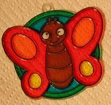
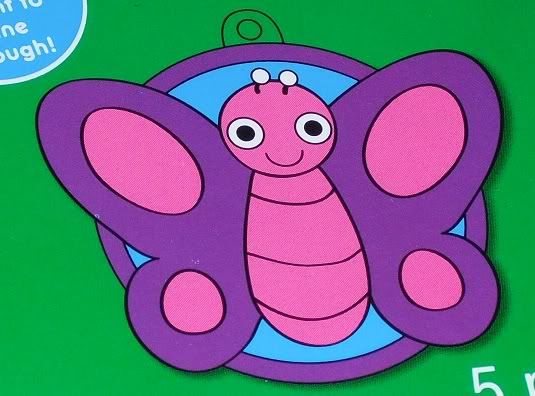
Which I'm sure you will agree is far better, from the standpoint of wanting to make something that boys can stand to look at for more than a fraction of a second, than what the package would have had me create:
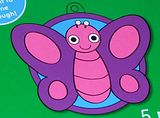
Pink is fine, purple is fine, but both together and swamping the thing like that? Owww. :~P
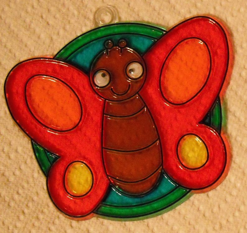
Here's the one I made for my classroom, which is very highly symbolic:
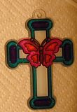
Besides the cross + butterfly combo, we have:
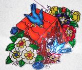
KJ did a couple too:


I have no insight into her designs other than to say they look pretty spiffy, despite my personal objection to putting green on any part of a butterfly.
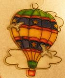
While we're at it, here are some old ones of mine:
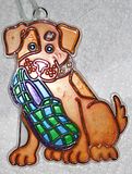
I don't know if you can tell, but there are several orange patches on the dog. I used a glitter paint for those. Don't know if the glitter shows up, but it's there.
Not a very good image of it, but hopefully you can guess that the lower leaves are darker than the upper. I had two greens available (and possibly not enough of one of them) and thought, "This is mostly two colors. Maybe I should make it mostly three colors so that it's more interesting." So I made it mostly red, green, and dark green. Or red, green, and light green, depending on how you look at it.
Not much to say here. The white has a bit of a frosty thing going on. This is possibly my second-oldest suncatcher, and it's faded from hanging in my bedroom window for years.
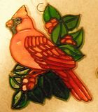
I made this one for KJ about 3-4 years ago. Unfortunately the flash caught it right in the entrance hole, so the brown of the walls looks reddish here. I really put my color arrangement skills to work on this one, as you can hopefully tell. (Hint: Notice how I spread out the areas of blue and contrasted the two groups of flowers.)
Here's the one I made for the children's room at church:
Which I'm sure you will agree is far better, from the standpoint of wanting to make something that boys can stand to look at for more than a fraction of a second, than what the package would have had me create:
Pink is fine, purple is fine, but both together and swamping the thing like that? Owww. :~P
Here's the one I made for my classroom, which is very highly symbolic:
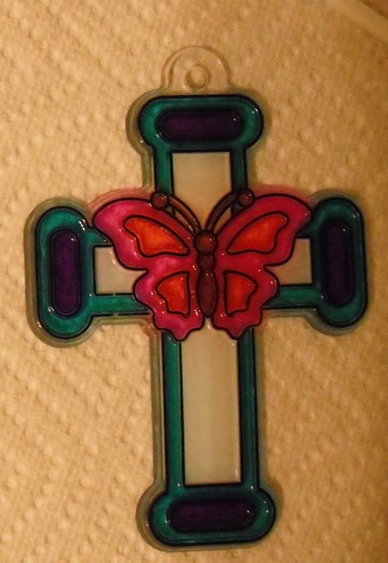
Besides the cross + butterfly combo, we have:
- Blue: represents heaven
- Purple: symbolizes royalty
- White: stands for my sudden suspicion that too much purple too close to the butterfly would reduce the contrast between butterfly and cross purity, which turns out pretty well since it's at the center of the cross and Christ's purity is central to his ability to fulfill God's plans via the cross. Obviously I planned that all along
- Pink and orange: underscore the fact that I like bright colors
- Oh, and brown: um, I just always visualize butterflies' bodies as brown
KJ did a couple too:
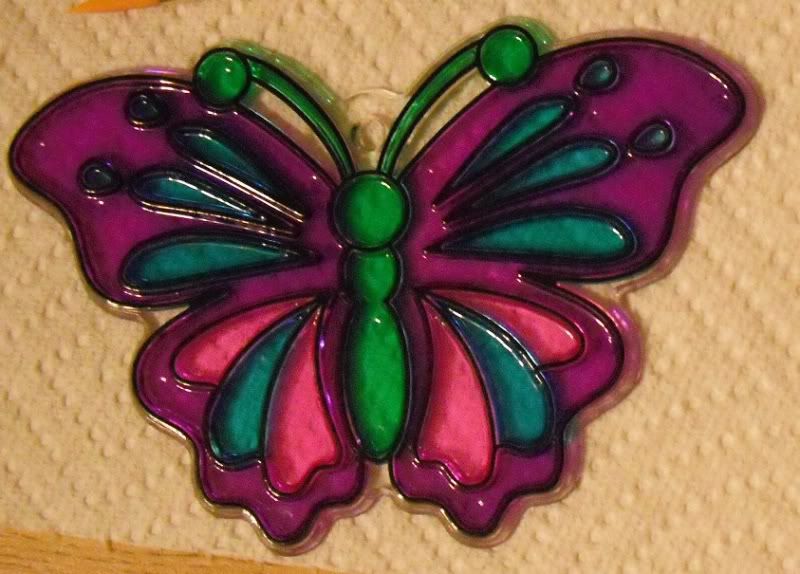
I have no insight into her designs other than to say they look pretty spiffy, despite my personal objection to putting green on any part of a butterfly.
While we're at it, here are some old ones of mine:

I don't know if you can tell, but there are several orange patches on the dog. I used a glitter paint for those. Don't know if the glitter shows up, but it's there.
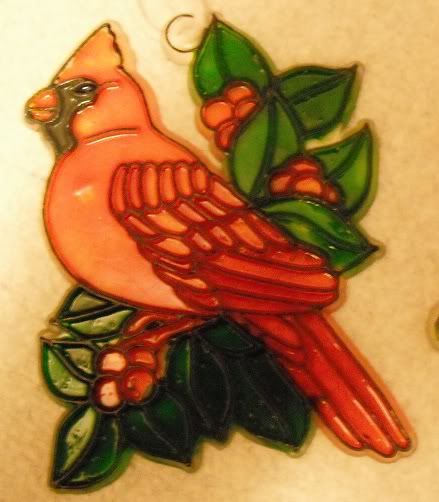
Not a very good image of it, but hopefully you can guess that the lower leaves are darker than the upper. I had two greens available (and possibly not enough of one of them) and thought, "This is mostly two colors. Maybe I should make it mostly three colors so that it's more interesting." So I made it mostly red, green, and dark green. Or red, green, and light green, depending on how you look at it.
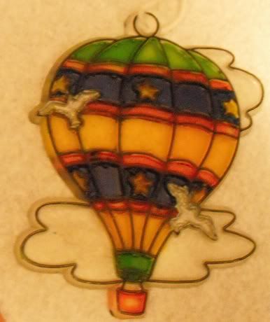
Not much to say here. The white has a bit of a frosty thing going on. This is possibly my second-oldest suncatcher, and it's faded from hanging in my bedroom window for years.
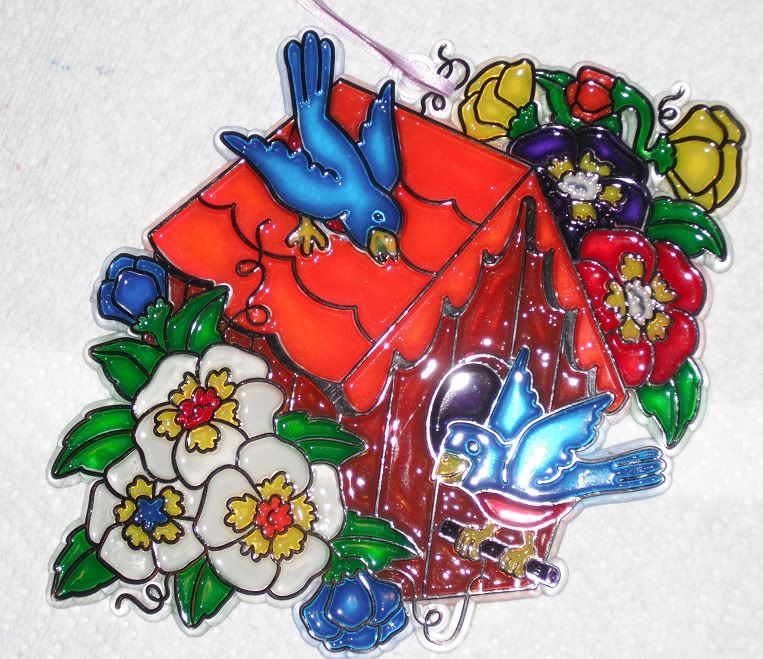
I made this one for KJ about 3-4 years ago. Unfortunately the flash caught it right in the entrance hole, so the brown of the walls looks reddish here. I really put my color arrangement skills to work on this one, as you can hopefully tell. (Hint: Notice how I spread out the areas of blue and contrasted the two groups of flowers.)