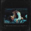
Icon Tutorial: Willabeth.
mooie_ogen suggested that I write a tutorial on how to make this icon:
Truth be told, I couldn't remember exactly how I did it, but after a bit of experimenting in PS, I remembered the coloring and such that I used.
Uses Photoshop CS2, includes selective coloring. Credit for some of the coloring layers goes to this tutorial.
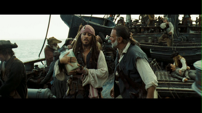
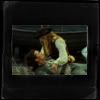
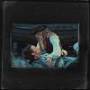
Start with this image (DMC screencap taken by me). Forefront of the image is Jack and Gibbs, though if you look over Gibbs's shoulder, you see Will/Elizabeth goodness in the background.
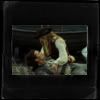
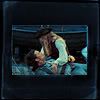
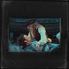
Select the Selection Marquee tool. In the tool bar for the selection marquee at the top, there should be a style drop-down menu. From this menu, select "Fixed Aspect Ratio" (not "Fixed Size"). Type "75 px" in the width box and "50 px" in the height box next to the style drop-down menu. Select the area of the image you want to use (in this case, Will and Elizabeth), paste into a new document, and resize to 75 x 50. It should look something like this:

(Note: You don't have to use the "Fixed Aspect Ratio" tool. You can use your usual cropping methods if you like. This is just my method.)
Paste your resized pic over this texture by
mata090680 . Move it around to your liking.
Hue/Saturation adjustment layer, and up the saturation to +30.
Selective coloring adjustment layer:
Reds: -100, +42, +100, -24
Yellows: -75, 0, +100, 0
Cyans: +100, 0, -100, 0
Neutrals: +68, 0, -40, -19
Using Ctrl + E, select each adjustment layer and merge it with your image layer, not with your base texture layer. That way, the image retains the color, and the base texture remains black and white.
Duplicate the texture layer, and drag it to the top. Set the blending mode to Darken.
Paste this texture by peoplemachines on. Set the blending mode to Screen, Opacity 50%, and move it around to your liking.
I decided to give the image a bit more color, so I selected the image layer, went to Image>Adjustments, Hue/Saturation, and upped the saturation just a little. Not much difference, but there's a bit more color.
I put the finishing touches on with some text, Velvet font (find it here), 3 px.
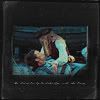
And there you are! I hope this tutorial was helpful. Feel free to ask any questions! ;)