(no subject)
Hey guys! I've got two tutorials and a sort-of lesson detailing how I work with Exclusion layers for you guys! :)
Rules and Info:
-This tutorial is NOT translatable to other programs, because of the Color Adjustment Layers.
-DO NOT COPY THIS TUTORIAL EXACTLY!!! This is why I WILL NOT upload a psd. file, because I've had a few of my icons copied already.
-Let me know what you think of the tutorial! I like to know how I'm doing :)
This is more of a tutorial to kind of share my views on the use of Exclusion layers. Lately I've been kind of playing with the use of different colors as Exclusion layers, and this icon tutorial will show tutorials for icons w/ Exclusion layers as the main source of color. One thing to do to learn better how to use Exclusion layers is to experiment. The best colors to use are your standard colors at the darkest hue before you hit black. The best way I use them is in photoshop, you have your color palate, and I always experiment w/ the darkest line of color swatches. Here's a picture to show what I mean:
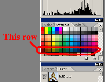
These will obviously give you a much stronger effect than desired, but you'll get the general idea of what it will look like and the color effects you will get, and what colors will be brought out. I tend to go w/ the colors that bring out colors I want, usually Blue, Yellow, Red, or Cyan, but that's my personal choice. You can use whatever you like best. Once you have the color you like, click on the swatch and drag it down towards black, and keep on putting a new layer of color here and there as you go down til you are satisfied.
Another step that I usually use in conjunction to Exclusion layers is either a Multiply layer or a Color burn layer to achieve a little more depth and contrast, which you lose w/ Exclusion layers. This will be totally dependent on, once again, what colors you want. Usually I use an Exclusion layer that brings out Blue/Yellow, or Red/Cyan, so I want something that will even it out. Generally I use either a color that's brought out, but its weaker then the other (IE, w/ Blue/Yellow, generally Yellow). With Color burn and Multiply color layers, you want to use a really light, almost white color, so it doesn't burn it too much. 2 colors I use frequently for Color burn is a really light pink, such as #f6e9ef, or grey, usually at about 20% grey in the color swatches. For multiply, I usually use once again 20% grey or a greyish blue, as in the tutorial.
Now that I've explained the concepts, here are the tutorials!!
Tutorial 1: How to go from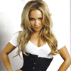
to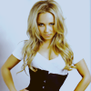
Tutorial 1: Hayden Panniettere
1. Get your base. I seriously have been looking for this photoshoot pic of Hayden in the tutorial for like an hour, and can't find it ANYWHERE, so sorry about that :S. Crop your base and you can either shrink it to 100x100 or leave it as is. For tutorial purposes, mine is shrunk to 100x100.

2. The base is really dark and has some ugly contrast issues, so we'll start fixing that and the coloring w/ a Levels color adjustment layer (Layer>New Adjustment Layer>Levels). My settings are as follows:
Channel: Input levels/#/#
RGB: 24/1.55/255
Red: 21/1.21/255
Green: 14/1.00/238
Blue: 13/1.07/235
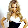
3. Next a Curves Adjustment layer. I really love using curves to get a lot more contrast and some cool contrasty tricks, as well as a lot of really fun coloring that you can only get, at least from my experience, w/ Curves. I use them in pretty much every icon I make, so this method I use here pertains to most of my other icons as well. My settings are as follows:
Channel: Dot # input/output
RGB: Dot 1 56/50 -- Dot 2 121/137 -- Dot 3 196/205
RED: Dot 1 66/50 -- Dot 2 186/190
GREEN: Dot 1 60/58 -- Dot 2 187/196
BLUE: Dot 1 61/54 -- Dot 2 181/203
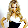
4. Next the Exclusion layer. I wanted to bring out some Cyany-blue and Yellowish colors into this icon, so I used a really dark Golden Orange color to achieve this. I filled a layer with #f6e9ef, and set it to Exclusion 65%.

>>>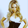
5. I thought the icon was a little too yellow and not Blueish enough, so I decided to create a new fill layer, and I added a light grey color #cccccc, set to Multiply at 40% to darken things and slightly bring out some more Blue.

>>>
Your Done!!
Tutorial 2: How to go from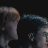
to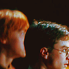
Tutorial requested by navi_glow :)
1. Get your cap. This tutorials cap is from Harry Potter and the Order of the Phoenix, and I got the cap HERE, Credit to www.homeofthenutty.com (AKA the best caps EVER). I cropped the icon and resized to 100x100 to keep things small for tutorial purposes, but you can have it as large as you want.

2. Obviously the base is super dark, and the color is pretty flat, so I'll start out w/ a Levels Color Adjustment layer. I use Levels generally to fix things, not try to do major color changes, just to make the base workable. Usually I go w/ what the histogram shows, pulling the arrows to where the histogram starts and stops for each channel. Keep in mind to use your gut as sometimes the suggestions in the histogram are way off. My settings are as follows:
Channels: input levels#/#/#
RGB: 13/1.00/173
RED: 6/1.15/243
GREEN: 3/1.00/233
BLUE: 13/0.86/229
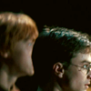
3. Now that you have most of the color and light fixed, I'll continue to fix the contrast and bring out the color a bit more w/ a Curves Color Adjustment Layer. My settings are as follows:
Channel: dot # input/output
RGB: Dot 1 52/48 -- Dot 2 118/134 -- Dot 3 190/205
RED: Dot 1 45/69 -- Dot 2 196/186
GREEN: Dot 1 55/50 -- Dot 2 189/201
BLUE: Dot 1 61/51 -- Dot 2 173/221
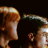
4. Next, I wanted to make this icon super saturated, because I like the look of a lot of saturation blended w/ the darkness of this shot. I used a trick that I learned and modified from threeeyespiee. Create a new layer, and fill it with a light greyish-blue color #b9c9dd, and set it to Luminosity 50% opacity. Obviously the color is a little too bright and way low on contrast, and we'll fix that in the next step.

>>>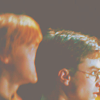
5. To tone down your Luminosity level, go down to your base, duplicate it, drag it to the top as the top layer in the palate above your Luminosity layer, and set it to Soft Light 100% opacity.
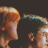
6. The icon is still a little too low contrast for me, so I added another new layer, filled it w/ 20% grey, and set it to Color Burn at 80% opacity.

>>>
original icon>>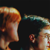
Your Done! This is a little different from the original, the original I put a Blurred layer on top, which I dislike now, so I didn't include it. Also, it's a little Bluer/Cyany, which can be adjusted thru the Curves if you wish, by pulling the 2nd Dot in the Red and Blue Channels up a little more til your satisfied.
Rules and Info:
-This tutorial is NOT translatable to other programs, because of the Color Adjustment Layers.
-DO NOT COPY THIS TUTORIAL EXACTLY!!! This is why I WILL NOT upload a psd. file, because I've had a few of my icons copied already.
-Let me know what you think of the tutorial! I like to know how I'm doing :)
This is more of a tutorial to kind of share my views on the use of Exclusion layers. Lately I've been kind of playing with the use of different colors as Exclusion layers, and this icon tutorial will show tutorials for icons w/ Exclusion layers as the main source of color. One thing to do to learn better how to use Exclusion layers is to experiment. The best colors to use are your standard colors at the darkest hue before you hit black. The best way I use them is in photoshop, you have your color palate, and I always experiment w/ the darkest line of color swatches. Here's a picture to show what I mean:

These will obviously give you a much stronger effect than desired, but you'll get the general idea of what it will look like and the color effects you will get, and what colors will be brought out. I tend to go w/ the colors that bring out colors I want, usually Blue, Yellow, Red, or Cyan, but that's my personal choice. You can use whatever you like best. Once you have the color you like, click on the swatch and drag it down towards black, and keep on putting a new layer of color here and there as you go down til you are satisfied.
Another step that I usually use in conjunction to Exclusion layers is either a Multiply layer or a Color burn layer to achieve a little more depth and contrast, which you lose w/ Exclusion layers. This will be totally dependent on, once again, what colors you want. Usually I use an Exclusion layer that brings out Blue/Yellow, or Red/Cyan, so I want something that will even it out. Generally I use either a color that's brought out, but its weaker then the other (IE, w/ Blue/Yellow, generally Yellow). With Color burn and Multiply color layers, you want to use a really light, almost white color, so it doesn't burn it too much. 2 colors I use frequently for Color burn is a really light pink, such as #f6e9ef, or grey, usually at about 20% grey in the color swatches. For multiply, I usually use once again 20% grey or a greyish blue, as in the tutorial.
Now that I've explained the concepts, here are the tutorials!!
Tutorial 1: How to go from

to

Tutorial 1: Hayden Panniettere
1. Get your base. I seriously have been looking for this photoshoot pic of Hayden in the tutorial for like an hour, and can't find it ANYWHERE, so sorry about that :S. Crop your base and you can either shrink it to 100x100 or leave it as is. For tutorial purposes, mine is shrunk to 100x100.

2. The base is really dark and has some ugly contrast issues, so we'll start fixing that and the coloring w/ a Levels color adjustment layer (Layer>New Adjustment Layer>Levels). My settings are as follows:
Channel: Input levels/#/#
RGB: 24/1.55/255
Red: 21/1.21/255
Green: 14/1.00/238
Blue: 13/1.07/235

3. Next a Curves Adjustment layer. I really love using curves to get a lot more contrast and some cool contrasty tricks, as well as a lot of really fun coloring that you can only get, at least from my experience, w/ Curves. I use them in pretty much every icon I make, so this method I use here pertains to most of my other icons as well. My settings are as follows:
Channel: Dot # input/output
RGB: Dot 1 56/50 -- Dot 2 121/137 -- Dot 3 196/205
RED: Dot 1 66/50 -- Dot 2 186/190
GREEN: Dot 1 60/58 -- Dot 2 187/196
BLUE: Dot 1 61/54 -- Dot 2 181/203

4. Next the Exclusion layer. I wanted to bring out some Cyany-blue and Yellowish colors into this icon, so I used a really dark Golden Orange color to achieve this. I filled a layer with #f6e9ef, and set it to Exclusion 65%.

>>>

5. I thought the icon was a little too yellow and not Blueish enough, so I decided to create a new fill layer, and I added a light grey color #cccccc, set to Multiply at 40% to darken things and slightly bring out some more Blue.

>>>

Your Done!!
Tutorial 2: How to go from

to

Tutorial requested by navi_glow :)
1. Get your cap. This tutorials cap is from Harry Potter and the Order of the Phoenix, and I got the cap HERE, Credit to www.homeofthenutty.com (AKA the best caps EVER). I cropped the icon and resized to 100x100 to keep things small for tutorial purposes, but you can have it as large as you want.

2. Obviously the base is super dark, and the color is pretty flat, so I'll start out w/ a Levels Color Adjustment layer. I use Levels generally to fix things, not try to do major color changes, just to make the base workable. Usually I go w/ what the histogram shows, pulling the arrows to where the histogram starts and stops for each channel. Keep in mind to use your gut as sometimes the suggestions in the histogram are way off. My settings are as follows:
Channels: input levels#/#/#
RGB: 13/1.00/173
RED: 6/1.15/243
GREEN: 3/1.00/233
BLUE: 13/0.86/229

3. Now that you have most of the color and light fixed, I'll continue to fix the contrast and bring out the color a bit more w/ a Curves Color Adjustment Layer. My settings are as follows:
Channel: dot # input/output
RGB: Dot 1 52/48 -- Dot 2 118/134 -- Dot 3 190/205
RED: Dot 1 45/69 -- Dot 2 196/186
GREEN: Dot 1 55/50 -- Dot 2 189/201
BLUE: Dot 1 61/51 -- Dot 2 173/221

4. Next, I wanted to make this icon super saturated, because I like the look of a lot of saturation blended w/ the darkness of this shot. I used a trick that I learned and modified from threeeyespiee. Create a new layer, and fill it with a light greyish-blue color #b9c9dd, and set it to Luminosity 50% opacity. Obviously the color is a little too bright and way low on contrast, and we'll fix that in the next step.

>>>

5. To tone down your Luminosity level, go down to your base, duplicate it, drag it to the top as the top layer in the palate above your Luminosity layer, and set it to Soft Light 100% opacity.

6. The icon is still a little too low contrast for me, so I added another new layer, filled it w/ 20% grey, and set it to Color Burn at 80% opacity.

>>>

original icon>>

Your Done! This is a little different from the original, the original I put a Blurred layer on top, which I dislike now, so I didn't include it. Also, it's a little Bluer/Cyany, which can be adjusted thru the Curves if you wish, by pulling the 2nd Dot in the Red and Blue Channels up a little more til your satisfied.