(no subject)
Hey guys :) I wrote up two tutorials for everyone :)
- For Photoshop CS2 (not convertable to PSP because of selective color layers)
- Medium difficulty, both use selective color adjustment layer.
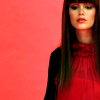
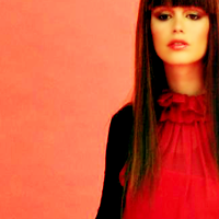
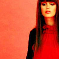
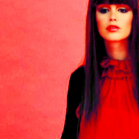
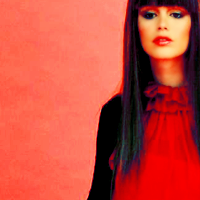
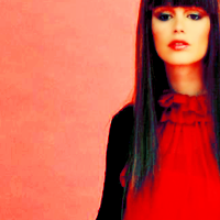
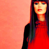
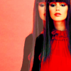
How to go from this >>
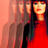
to this >>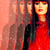
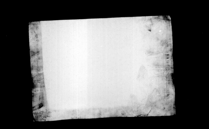
1. Get your cap. Mine is from www.rachel-bilson.com. Crop and resize. I crop mine with the cropper set to 100 for height and width, and then resize it to 200x200.
>>>
2. Duplicate your base, and smart sharpen your layer. smart sharpen is located under the sharpen selection in the filter menu. My settings are as follows:
Amount: 67%
Radius: 64 pixels
Remove: Gaussian Blur
Angle: 0%
>>>
3. Delete the original base layer. I blurred the areas with skin in the picture, as it was a little pixel-y. I used a blurry round brush, size 9, strength 30%.
>>>
4. Duplicate the base and set it to Screen at 100% opacity.
>>>
5. Create a new layer. Fill it with a light beige color (#fee7ae). Set it to Multiply 100%.

>>>
6. Create a new Selective Color layer. Settings are as follows:
Neutrals:
Cyan: -14
Magenta: 15
Yellow: 12
Black: 0
>>>
7. Another new Selective Color layer, Settings as follows:
Reds:
Cyan: -16
Magenta: 50
Yellow: 43
Black: -20
>>>
8. Another new Selective color layer! Settings:
Neutrals:
Cyan: 100
Magenta: -10
Yellow: -50
>>>
9. One last selective color layer, Settings:
Reds:
Cyan: 0
Magenta: 16
Yellow: 14
Yellows:
Cyan: -100
Magenta: 13
Cyans:
Cyan: 100
Magenta: 35
Blues:
Cyan: 100
Magenta: 27
Yellow: -100
Magenta:
Cyan: -100
Magenta: 100
Yellow: 100
>>>
10. Create a new layer, and fill it with a light blue (#b2d4f4). Set it to color burn at 40% opacity. Play with the opacity until its to your liking. Its different for different pictures, depending on how bright the reds and yellows are.

>>>
11. Go back down to the light beige color layer. Click on it. Then add a new layer, which will be right above the beige layer. Fill it with a lightish green color (#7cc576), and set it to soft light 50%. Play with this layer a bit. If your icon has more blue/cyan/green, then it should be lower, and if it has more red/yellow, it should be higher.

>>>
12. Go down to the screen layer. Duplicate it and set it to 50% opacity. Play with this depending on how much more light you need. It usually needs to be brighter if you have the blue Color Burn layer set to a higher opacity, and lower if the color burn layer is a lower opacity.
>>>
13. Go to the very top, and click on the top layer. Create a new layer and stamp all the layers into it (ctrl-shift-alt-E; this creates and stamps, its all you have to do). Sharpen this layer. Then fade the sharpen layer down to 30%. To do this go to Edit and then fade sharpen.
>>>
14. Shrink the image to 100x100.
>>>
15. Do the stamp new layer thing again. (don't duplicate the sharpened layer, it'll mess everything up sharpening wise). Drop the opacity to around 20% and nudge the layer to left until you like where it is (IE consider what you can see of the top layer past the main layers). Erase the part of the top layer thats covering her in the rest of the layers, so just the part visible to the left is still there. Use a very small brush, and be very careful, using small strokes. Once you've erased it all, change the opacity of the layer to 60%.
>>>
16. Duplicate the top layer. Nudge it to the left until it lines up with the layer below it like that one does with the main image. Change its opacity to 40%. Do this same thing over again, but have the opacity set to 20%. You should now have three of the lightened layers to the left of the main image.
>>>
17. Add this texture on top of all the other layers. Set it to Screen 100%. I erased the texture on her face, but thats up to you.
>>>
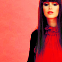
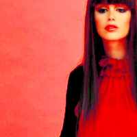
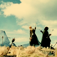
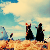
Your done!!! This looks a little different then the original, the main difference of the first is that there is an Exclusion layer with a dark blue (#002157) at 100% opacity, and no color burn or soft light color layers. I personally like this version better though :)
Original Icon: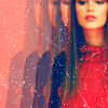
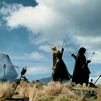
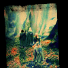
How to go from this >>
to this >>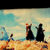
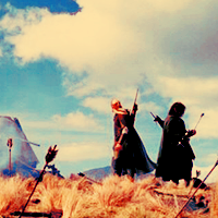
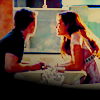
Going from
TO
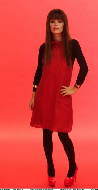
1. Get your cap. Mine is from LotR The Two Towers, from www.nightly-whispers.com/lotr/. Crop and resize it. I crop my pictures with the cropper set to 100 for width and height. Then I resize my base to 200x200.
>>>
2. Duplicate the base layer. Smart sharpen your layer by going to filter and the sharpen menu. My settings are as follows:
amount: 55%
radius: 64 pixels
remove: gaussian blur
Delete the original base.
>>>
3. Duplicate the base and set it to screen at 100%.
>>>
4. Create a new layer. Fill it with a light beige color (#fee7ae). Set it to Multiply at 100% opacity.
>>>
5. Create a new Selective Color layer. My settings are as follows:
Neutrals:
Cyan: -44
Magenta: 14
Yellow: 14
>>>
6. Another new Selective Color layer, settings:
Reds:
Cyan: -100
Magenta: 100
Yellow: 100
>>>
7. Another Selective Color layer, settings:
Neutrals:
Cyan: 67
Magenta: -10
Yellow: -40
>>>
8. One more selective color layer. Settings:
Red:
Cyan: -33
Yellows:
Cyan: -100
Magenta: -26
Yellow: 21
Cyans:
Cyan: 100
Magenta: 34
Blues:
Cyan: 100
Magenta: 44
Yellow: -100
Magentas:
Cyan: -100
Magenta: 100
Yellow: 100
>>>
9. Create a new layer. Fill it with a light blue color (#b2d4f4). Set it to Color Burn at 40% opacity. Play with this layer a bit, changing the opacity to your liking. If the image is more red/yellow, you might want it a bit stronger, and lighter if the image is more blue/cyan/green.
>>>
10. Go down to the light beige color layer. Create another layer above it. Fill it with a light mossy green color (#7cc576), and set it to Soft Light 40%. Play with this layer as well. If your icon doesn't have that much red, you want it much lighter, as it downplays the reds and yellows and brings out the blues and cyans.
>>>
11. Resize your image to 100x100.
>>>
12. Go to the top layer. Create a new Hue/Saturation layer. My settings are:
Saturation: 10
>>>
13. Take this texture (by lovelamp), and rotate it 90 degrees clockwise. If you want, you can resize it and shrink it a little, depending on how much of the grainy-ness you want in the icon. Drag it on top of all the layers, and position it so some of the darkness at the top is showing at the top a little. Set the layer to Multiply 100%.
>>>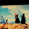
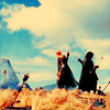
14. At this point, your done!! I played with it a little, and I also tried it with duplicating the screen layer and setting it to 50% opacity. Below is what it looks like if you add the screen layer. Either way it looks a little different then the original, but its close enough. I used this method with basically every Lord of the Rings icon in this batch, and with many others in the batch as well. :)
>>>
Other icons made with this technique: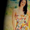
- For Photoshop CS2 (not convertable to PSP because of selective color layers)
- Medium difficulty, both use selective color adjustment layer.
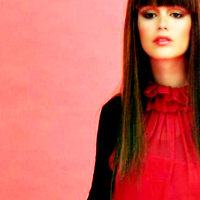
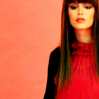
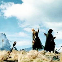
How to go from this >>
to this >>
1. Get your cap. Mine is from www.rachel-bilson.com. Crop and resize. I crop mine with the cropper set to 100 for height and width, and then resize it to 200x200.
>>>
2. Duplicate your base, and smart sharpen your layer. smart sharpen is located under the sharpen selection in the filter menu. My settings are as follows:
Amount: 67%
Radius: 64 pixels
Remove: Gaussian Blur
Angle: 0%
>>>
3. Delete the original base layer. I blurred the areas with skin in the picture, as it was a little pixel-y. I used a blurry round brush, size 9, strength 30%.
>>>
4. Duplicate the base and set it to Screen at 100% opacity.
>>>
5. Create a new layer. Fill it with a light beige color (#fee7ae). Set it to Multiply 100%.
>>>
6. Create a new Selective Color layer. Settings are as follows:
Neutrals:
Cyan: -14
Magenta: 15
Yellow: 12
Black: 0
>>>
7. Another new Selective Color layer, Settings as follows:
Reds:
Cyan: -16
Magenta: 50
Yellow: 43
Black: -20
>>>
8. Another new Selective color layer! Settings:
Neutrals:
Cyan: 100
Magenta: -10
Yellow: -50
>>>
9. One last selective color layer, Settings:
Reds:
Cyan: 0
Magenta: 16
Yellow: 14
Yellows:
Cyan: -100
Magenta: 13
Cyans:
Cyan: 100
Magenta: 35
Blues:
Cyan: 100
Magenta: 27
Yellow: -100
Magenta:
Cyan: -100
Magenta: 100
Yellow: 100
>>>
10. Create a new layer, and fill it with a light blue (#b2d4f4). Set it to color burn at 40% opacity. Play with the opacity until its to your liking. Its different for different pictures, depending on how bright the reds and yellows are.
>>>
11. Go back down to the light beige color layer. Click on it. Then add a new layer, which will be right above the beige layer. Fill it with a lightish green color (#7cc576), and set it to soft light 50%. Play with this layer a bit. If your icon has more blue/cyan/green, then it should be lower, and if it has more red/yellow, it should be higher.
>>>
12. Go down to the screen layer. Duplicate it and set it to 50% opacity. Play with this depending on how much more light you need. It usually needs to be brighter if you have the blue Color Burn layer set to a higher opacity, and lower if the color burn layer is a lower opacity.
>>>
13. Go to the very top, and click on the top layer. Create a new layer and stamp all the layers into it (ctrl-shift-alt-E; this creates and stamps, its all you have to do). Sharpen this layer. Then fade the sharpen layer down to 30%. To do this go to Edit and then fade sharpen.
>>>
14. Shrink the image to 100x100.
>>>
15. Do the stamp new layer thing again. (don't duplicate the sharpened layer, it'll mess everything up sharpening wise). Drop the opacity to around 20% and nudge the layer to left until you like where it is (IE consider what you can see of the top layer past the main layers). Erase the part of the top layer thats covering her in the rest of the layers, so just the part visible to the left is still there. Use a very small brush, and be very careful, using small strokes. Once you've erased it all, change the opacity of the layer to 60%.
>>>
16. Duplicate the top layer. Nudge it to the left until it lines up with the layer below it like that one does with the main image. Change its opacity to 40%. Do this same thing over again, but have the opacity set to 20%. You should now have three of the lightened layers to the left of the main image.
>>>
17. Add this texture on top of all the other layers. Set it to Screen 100%. I erased the texture on her face, but thats up to you.
>>>
Your done!!! This looks a little different then the original, the main difference of the first is that there is an Exclusion layer with a dark blue (#002157) at 100% opacity, and no color burn or soft light color layers. I personally like this version better though :)
Original Icon:
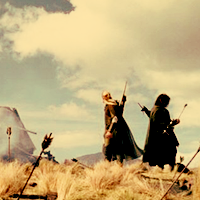
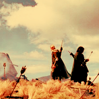
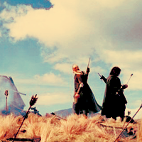
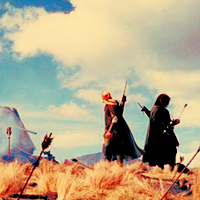
How to go from this >>
to this >>
Going from
TO
1. Get your cap. Mine is from LotR The Two Towers, from www.nightly-whispers.com/lotr/. Crop and resize it. I crop my pictures with the cropper set to 100 for width and height. Then I resize my base to 200x200.
>>>
2. Duplicate the base layer. Smart sharpen your layer by going to filter and the sharpen menu. My settings are as follows:
amount: 55%
radius: 64 pixels
remove: gaussian blur
Delete the original base.
>>>
3. Duplicate the base and set it to screen at 100%.
>>>
4. Create a new layer. Fill it with a light beige color (#fee7ae). Set it to Multiply at 100% opacity.
>>>
5. Create a new Selective Color layer. My settings are as follows:
Neutrals:
Cyan: -44
Magenta: 14
Yellow: 14
>>>
6. Another new Selective Color layer, settings:
Reds:
Cyan: -100
Magenta: 100
Yellow: 100
>>>
7. Another Selective Color layer, settings:
Neutrals:
Cyan: 67
Magenta: -10
Yellow: -40
>>>
8. One more selective color layer. Settings:
Red:
Cyan: -33
Yellows:
Cyan: -100
Magenta: -26
Yellow: 21
Cyans:
Cyan: 100
Magenta: 34
Blues:
Cyan: 100
Magenta: 44
Yellow: -100
Magentas:
Cyan: -100
Magenta: 100
Yellow: 100
>>>
9. Create a new layer. Fill it with a light blue color (#b2d4f4). Set it to Color Burn at 40% opacity. Play with this layer a bit, changing the opacity to your liking. If the image is more red/yellow, you might want it a bit stronger, and lighter if the image is more blue/cyan/green.
>>>
10. Go down to the light beige color layer. Create another layer above it. Fill it with a light mossy green color (#7cc576), and set it to Soft Light 40%. Play with this layer as well. If your icon doesn't have that much red, you want it much lighter, as it downplays the reds and yellows and brings out the blues and cyans.
>>>
11. Resize your image to 100x100.
>>>
12. Go to the top layer. Create a new Hue/Saturation layer. My settings are:
Saturation: 10
>>>
13. Take this texture (by lovelamp), and rotate it 90 degrees clockwise. If you want, you can resize it and shrink it a little, depending on how much of the grainy-ness you want in the icon. Drag it on top of all the layers, and position it so some of the darkness at the top is showing at the top a little. Set the layer to Multiply 100%.
>>>
14. At this point, your done!! I played with it a little, and I also tried it with duplicating the screen layer and setting it to 50% opacity. Below is what it looks like if you add the screen layer. Either way it looks a little different then the original, but its close enough. I used this method with basically every Lord of the Rings icon in this batch, and with many others in the batch as well. :)
>>>
Other icons made with this technique: