Icons! Tutorial #15 - Gradient maps
People have been asking for this for months and I've been wanting to DO it for months but I'm not good at BIG things like this. I'm best at explaining how I got from point A to point B with one image, or two, but with gradient maps, or any tool, there are so many different routes and alternatives and colours and way to apply what you want that I wasn't sure how to approach this.
The best way to approach anything with graphic making is to experiment with everything. The only way you're going to get used to using any of the graphic programmes and the tools in them would be through experimentation. There's only so much that tutorials and written-out steps can teach you before you have to tackle it yourself on your own images. But don't hesitate to ask questions!
Okay. To be totally honest, I don't understand exactly how gradient maps work. I don't understand the science behind them so this site explains them far better than I ever could.
A Gradient Map is an adjustment that can be made to a layer or selection. (This can be found under Image > Adjustments > Gradient Map.) Photoshop looks at the grayscale value of every pixel and assigns it a new color based on that value. The new colors are represented by a single gradient in the dialog box. Imagine a white circle and a gray rectangle on a black background. A Gradient Map is then applied to this, with the gradient running from blue on the left to red on the right. The resulting image will show a red circle and a purple rectangle on a blue background.
For any of these examples presume I've prepared my base the same each time, which is the way I generally always prepare them: base --> base dup set to multiply --> base dup set to screen, sharpen. Prepare your base however you do it and we'll go from there. I can't guarantee the results will be the same but these caps I'm going to work with as examples are going to be general ones just to show the results.
I'm starting with a cap from episode 416 of Supernatural, "On the Head of a Pin".

This cap has great contrast. When I resized and dragged it to a new 100x100 image it looked darker than it did on the cap. So I prepared it and ended up with this:
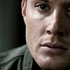
The goal here is just to show you how to use different gradients. So I picked a lighter one, tinged with a little yellow and pink. I don't always know which gradients are going to produce which effects on a particular image but after awhile you can get familiar enough with the gradients and the lightness/hues of them that you can give a pretty good guess as to what the outcome will be. Sometimes it'll be right, sometimes it won't. Don't be afraid to try different things.
So with the first gradient I applied I got this result:
-->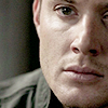
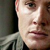
If you think this is fine for lightness and you just want to finish it off you could up the saturation just a bit to enhance the light pink/red of the icon and add a slight contrast layer as well. The result for this particular icon is this:
Say you want to continue playing with the gradient maps and see what comes out of it. Another way to create a bit more natural colouring with gradient maps is to reduce the opacity on colours that at full strength would probably look like poo.
I used a green to yellow gradient to get the following result:
-->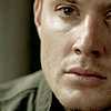
Then I played with a new brightness/contrast layer. I added a little contrast but this time also increased the brightness a little. With a little more playing this could be a really vibrant icon.
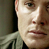
With icons like these, where they could easily drift into too dark it's important not to go overboard. For example:
-->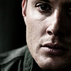
If you reduce the opacity and fill a little you can make it a bit better but without a little more aid, in my opinion, it's just going to look very over-contrasted.
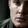
In this one I might try working on the saturation just a little to make the light part of Dean's skin not look so grey and dead. :(

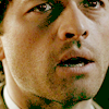
Example 2 is darker than the cap of Dean. Same episode but Castiel is chillin' in the dark. To prepare this cap I added two screened duplicated base layers, rather than one and a multiply. It's still quite dark.
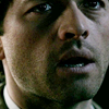
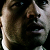
You're definitely going to want to go with a lighter gradient here because if you add something darker, depending on the colour and what you might be adding later with textures or brushes, etc, it's going to make the icon quite hard to see. But let's try two things here. We'll add a lighter gradient on top of the darker one, and then a lighter one without the darker.
[ETA] When I wrote this it was getting late into the evening and I didn't match the images up with what I was writing as I did it. So I can't really tell if I added the black & white gradient and the coloured gradient separately or if I did the b&w and then the coloured one on top. I can't remember what I was trying to do. Um... sorry?

-->
-->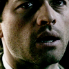
So yeah, for me this doesn't work. Some people can take an icon like this, add some textures and it would be amazing, but for me this just doesn't look good. So back to the prepared base.

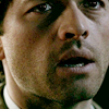
I tried a lighter, pinker gradient next. The icon still needs some finishing touches but for me the colouring is light enough to not be affected badly by adding light textures or maybe another gradient and it's a natural colouring.

-->
Even duplicating the gradient map again doesn't look too bad, but it's bordering on meh, for my tastes.
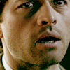
By adding too many light colours it can cause the icon to look splotchy and really bad so you have to balance the lighter bits with the darker. The contrast tool sometimes comes in handy here. But if an icon can't be saved, it can't be saved. Try a new cap or start over with the one you have and try something different.
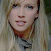
One more just for shits and giggles. I used my girl old!Ruby.
I duplicated three times. Based --> multiply --> screen --> screen (sharpened).
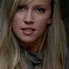
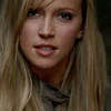
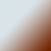
I applied this brownish gradient here. It goes from a darker brown to a lighter brownish grey. When applied so the darker part is in the upper left fading to light brownish grey it adds some colour to Ruby's face while keeping the overall colour very natural and subtle. It would be easy to add a lighter gradient, perhaps a peach or maybe even light beige next to lighten it up overall.
-->
-->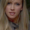
As you can see, the dark to light gradient gives the icon more definition in the features. On some monitors I suppose it might look darker and harder to see but for me when I reverse the gradient and apply it light to dark it washes the icon out more than I prefer but some people might like it better. I'll use a gradient with a more obvious colour range to show how reversing a gradient can really change things up.
-->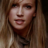
I would need to work on this one a little more to get it to where i would like it enough to use it.
-->
But when compared to the light to dark version of the gradient, I enjoy the first icon so much more.
The very best way I can say you'll ever "get" gradient maps is if you experiment with them. I'm explaining how I use them in my icon routine. For me gradient maps are a very important part of the colouring process. But other people who already use other methods, like levels or colour balance or textures might want to use gradient maps as a way to enhance colour or to add something that looks more like texture. And that's fine! That's great! Just don't take what I'm doing as the be-all, end-all of gradient maps or gradients in general.
I use my gradient maps 90% of the time on soft light. It's a mode that I can control the colours the best with. But I applied a gradient using all the modes to show you what the others look like on full opacity an fill. As you will see, most of them are not modes you want to use at full strength, and sometimes not at all, depending on the gradient and image you're using. But that's not to say you shouldn't 100% of the time. Again, experiment!
Started out with this cap from 114 "Nightmare" of Supernatural.
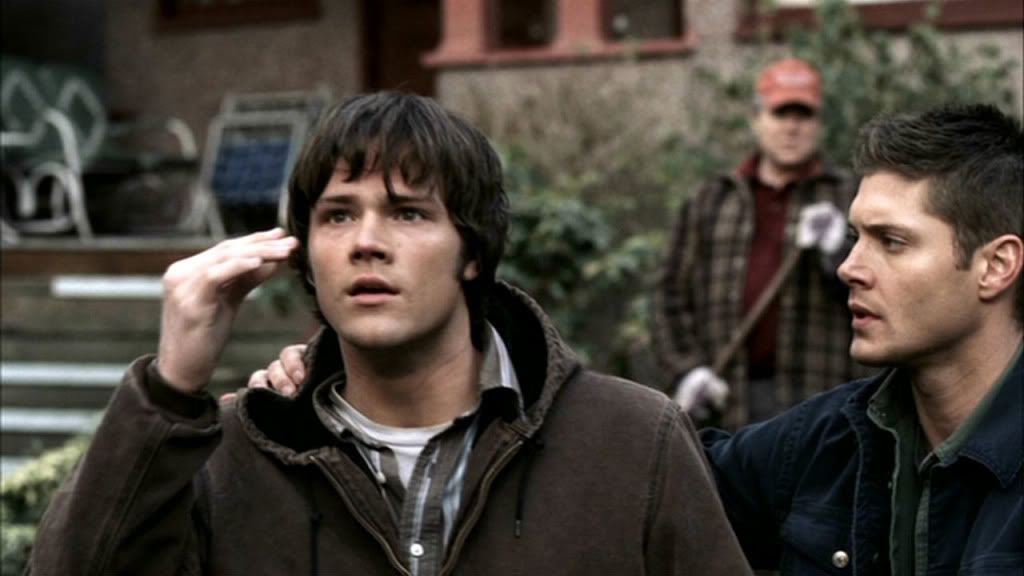
I applied this gradient, which is my favourite most of the time.

The modes go in alphabetical order since that's how they were uploaded, but not in order of how they appear in PS.
Darken mode
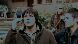
Difference mode
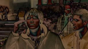
Exclusion mode - full opacity
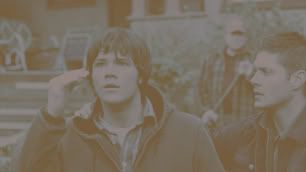
Exclusion mode - reduced opacity
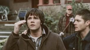
Hard light mode
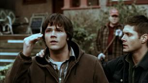
Lighten mode
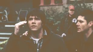
Luminosity mode - I'm not sure I've seen anyone use this mode properly or well.
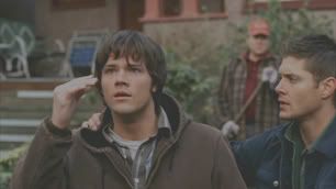
Multiply mode - Probably the mode I use second most frequently, although not with this cap and not with this gradient.
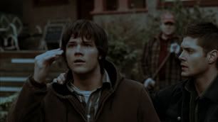
Overlay mode - This one can be tricky. It doesn't look too bad here, although it didn't do much for the colour of the cap. It just made Sam and Dean's faces and hands a bit more contrasted. When used with brighter colours it can really make them overwhelm the icon and be too bright.
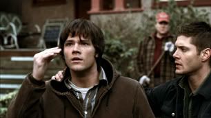
Pin mode - For me this mode is a tempting bitch. Sometimes on the right icon and with the right gradient the icons look really cool but it's so rare that it's frustrating. I also don't have much luck with reducing opacity with this mode. It just kind of muddles the colour and makes the overall look of the icon dull.
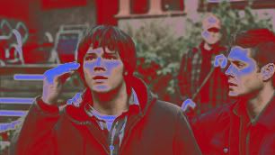
Pin mode - reduced opacity. See?
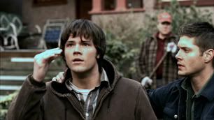
Screen mode

Screen mode - reduced opacity
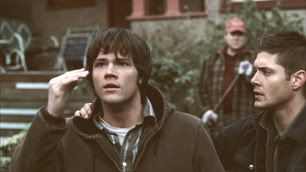
Soft light mode - The one I'd probably use. It didn't affect this cap very much, however, so I likely would have used a pinker gradient to bring out more flesh tones on the boys. Or it could be applied after this example gradient.
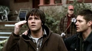
How do I make my own gradients? (click the images for full-size)
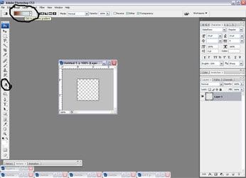
The gradient tool and the flood fill tool share a button. So click to the gradient tool and then look to the top tool bar where the current gradient is shown. I'm not sure how to make it by hitting the arrow on the gradient palette. I don't even know if you can.
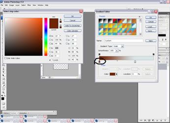
That will open the gradient work palette. It has all your gradients in it and allows you to change them, select new ones or make new ones. Click on the arrows that I've circled and a colour palette will open to allow you to select a new colour. Play around, see what ones you like. I'd recommend sticking with two colours just because multiple colours are hard to work with, especially if you're using bolder colour modes like hard light or overlay. Using the masking tool or blurring the colours would come in handy if they get too over saturated or awkward on the icon. ANYWAY.
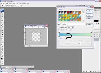
The diamond shaped doohickey on your slider bar controls how much of each colour you want. You can do half and half or a little of each, etc.
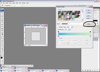
Finally, when you save your gradient, it's not like saving an icon. You can give it a name, if you want, but you could name every single one the same and the programme wouldn't care. Name it, don't name it--whatever you want. Then hit the "new" button that I've circled. It will appear at the bottom of all your gradients!
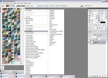
You don't have to do this after every time you open your PS or make changes to your gradients but it's good to get into the habit of saving your gradients. This is where you'd hit the arrow I told you not to in the first step. That's where all your gradient packs will be listed (the .grds), where you can reset to programme defaults, load new ones, etc.
As you can see from my list, I have a lot of gradient packs. I loaded them all at once and then went through and deleted the ones I knew I'd never use, then saved the whole lot in one giant pack. Or you can save each maker's gradients and load them individually as you need them. Some systems might not be able to handle loading a buttload of gradients at once, so whatever makes your graphic making easier.
Here's a cool tutorial on how to make textures using gradients, by spectacular
How do I load other people's gradients?
After you dl some gradient packs, like the one I've offered in this post, you're going to save it directly to your gradient folder. So go to your C drive --> Program Files --> Adobe --> Adobe Photoshop CS3 (this is my adobe, yours is whatever yours is. These are not compatible with PSP or some versions of PS, as far as I know) --> Presets --> Gradients. Drop the grd file in there and you're good to go.

Follow this screen cap and go to "load gradients". Choose the one(s) you want in your PS and shazaam, there they are!
Where can I find gradients made by other people?
Check the resource communities. icon_extras has a tag for them here, There IS a comm called icongradients but it looks like some of the posts are textures instead (gradients have fallen by the wayside in the face of textures, as have brushes).
Check out the resource lists of other icon makers. I have some listed on mine, but in taking a quick look at the list there's a lot of deleted journals or flocked posts now.
Your best bet is to probably make your own right now, since gradients aren't as popular. The options to make gradients are limitless.
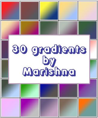
Here are 30 gradients to get you started.
[x] comments & credit appreciated
[x] don't redistribute as your own
[x] no hotlinking
I know there's a lot I didn't cover and the examples I used were only for SPN so I'm open to questions. If you have anything you want to know about, are confused about, think I could help with, please ask! Leave images in the comments with questions or that you're trying to work with. Leave your own attempts in the comments so I can see!
Please let me know if this was helpful or not. If it was, what was it that helped you the most? If not, what could I do differently to explain things? Was it the caps I used, that I only focused on SPN, that I didn't show enough examples? That I didn't explain things in enough detail?
The best way to approach anything with graphic making is to experiment with everything. The only way you're going to get used to using any of the graphic programmes and the tools in them would be through experimentation. There's only so much that tutorials and written-out steps can teach you before you have to tackle it yourself on your own images. But don't hesitate to ask questions!
Okay. To be totally honest, I don't understand exactly how gradient maps work. I don't understand the science behind them so this site explains them far better than I ever could.
A Gradient Map is an adjustment that can be made to a layer or selection. (This can be found under Image > Adjustments > Gradient Map.) Photoshop looks at the grayscale value of every pixel and assigns it a new color based on that value. The new colors are represented by a single gradient in the dialog box. Imagine a white circle and a gray rectangle on a black background. A Gradient Map is then applied to this, with the gradient running from blue on the left to red on the right. The resulting image will show a red circle and a purple rectangle on a blue background.
For any of these examples presume I've prepared my base the same each time, which is the way I generally always prepare them: base --> base dup set to multiply --> base dup set to screen, sharpen. Prepare your base however you do it and we'll go from there. I can't guarantee the results will be the same but these caps I'm going to work with as examples are going to be general ones just to show the results.
I'm starting with a cap from episode 416 of Supernatural, "On the Head of a Pin".

This cap has great contrast. When I resized and dragged it to a new 100x100 image it looked darker than it did on the cap. So I prepared it and ended up with this:

The goal here is just to show you how to use different gradients. So I picked a lighter one, tinged with a little yellow and pink. I don't always know which gradients are going to produce which effects on a particular image but after awhile you can get familiar enough with the gradients and the lightness/hues of them that you can give a pretty good guess as to what the outcome will be. Sometimes it'll be right, sometimes it won't. Don't be afraid to try different things.
So with the first gradient I applied I got this result:

-->

If you think this is fine for lightness and you just want to finish it off you could up the saturation just a bit to enhance the light pink/red of the icon and add a slight contrast layer as well. The result for this particular icon is this:

Say you want to continue playing with the gradient maps and see what comes out of it. Another way to create a bit more natural colouring with gradient maps is to reduce the opacity on colours that at full strength would probably look like poo.
I used a green to yellow gradient to get the following result:

-->

Then I played with a new brightness/contrast layer. I added a little contrast but this time also increased the brightness a little. With a little more playing this could be a really vibrant icon.

With icons like these, where they could easily drift into too dark it's important not to go overboard. For example:

-->

If you reduce the opacity and fill a little you can make it a bit better but without a little more aid, in my opinion, it's just going to look very over-contrasted.

In this one I might try working on the saturation just a little to make the light part of Dean's skin not look so grey and dead. :(

Example 2 is darker than the cap of Dean. Same episode but Castiel is chillin' in the dark. To prepare this cap I added two screened duplicated base layers, rather than one and a multiply. It's still quite dark.

You're definitely going to want to go with a lighter gradient here because if you add something darker, depending on the colour and what you might be adding later with textures or brushes, etc, it's going to make the icon quite hard to see. But let's try two things here. We'll add a lighter gradient on top of the darker one, and then a lighter one without the darker.
[ETA] When I wrote this it was getting late into the evening and I didn't match the images up with what I was writing as I did it. So I can't really tell if I added the black & white gradient and the coloured gradient separately or if I did the b&w and then the coloured one on top. I can't remember what I was trying to do. Um... sorry?

-->


-->

So yeah, for me this doesn't work. Some people can take an icon like this, add some textures and it would be amazing, but for me this just doesn't look good. So back to the prepared base.

I tried a lighter, pinker gradient next. The icon still needs some finishing touches but for me the colouring is light enough to not be affected badly by adding light textures or maybe another gradient and it's a natural colouring.

-->

Even duplicating the gradient map again doesn't look too bad, but it's bordering on meh, for my tastes.

By adding too many light colours it can cause the icon to look splotchy and really bad so you have to balance the lighter bits with the darker. The contrast tool sometimes comes in handy here. But if an icon can't be saved, it can't be saved. Try a new cap or start over with the one you have and try something different.

One more just for shits and giggles. I used my girl old!Ruby.
I duplicated three times. Based --> multiply --> screen --> screen (sharpened).

I applied this brownish gradient here. It goes from a darker brown to a lighter brownish grey. When applied so the darker part is in the upper left fading to light brownish grey it adds some colour to Ruby's face while keeping the overall colour very natural and subtle. It would be easy to add a lighter gradient, perhaps a peach or maybe even light beige next to lighten it up overall.

-->


-->

As you can see, the dark to light gradient gives the icon more definition in the features. On some monitors I suppose it might look darker and harder to see but for me when I reverse the gradient and apply it light to dark it washes the icon out more than I prefer but some people might like it better. I'll use a gradient with a more obvious colour range to show how reversing a gradient can really change things up.

-->

I would need to work on this one a little more to get it to where i would like it enough to use it.

-->

But when compared to the light to dark version of the gradient, I enjoy the first icon so much more.
The very best way I can say you'll ever "get" gradient maps is if you experiment with them. I'm explaining how I use them in my icon routine. For me gradient maps are a very important part of the colouring process. But other people who already use other methods, like levels or colour balance or textures might want to use gradient maps as a way to enhance colour or to add something that looks more like texture. And that's fine! That's great! Just don't take what I'm doing as the be-all, end-all of gradient maps or gradients in general.
I use my gradient maps 90% of the time on soft light. It's a mode that I can control the colours the best with. But I applied a gradient using all the modes to show you what the others look like on full opacity an fill. As you will see, most of them are not modes you want to use at full strength, and sometimes not at all, depending on the gradient and image you're using. But that's not to say you shouldn't 100% of the time. Again, experiment!
Started out with this cap from 114 "Nightmare" of Supernatural.

I applied this gradient, which is my favourite most of the time.

The modes go in alphabetical order since that's how they were uploaded, but not in order of how they appear in PS.
Darken mode

Difference mode

Exclusion mode - full opacity

Exclusion mode - reduced opacity

Hard light mode

Lighten mode

Luminosity mode - I'm not sure I've seen anyone use this mode properly or well.

Multiply mode - Probably the mode I use second most frequently, although not with this cap and not with this gradient.

Overlay mode - This one can be tricky. It doesn't look too bad here, although it didn't do much for the colour of the cap. It just made Sam and Dean's faces and hands a bit more contrasted. When used with brighter colours it can really make them overwhelm the icon and be too bright.

Pin mode - For me this mode is a tempting bitch. Sometimes on the right icon and with the right gradient the icons look really cool but it's so rare that it's frustrating. I also don't have much luck with reducing opacity with this mode. It just kind of muddles the colour and makes the overall look of the icon dull.

Pin mode - reduced opacity. See?

Screen mode

Screen mode - reduced opacity

Soft light mode - The one I'd probably use. It didn't affect this cap very much, however, so I likely would have used a pinker gradient to bring out more flesh tones on the boys. Or it could be applied after this example gradient.

How do I make my own gradients? (click the images for full-size)

The gradient tool and the flood fill tool share a button. So click to the gradient tool and then look to the top tool bar where the current gradient is shown. I'm not sure how to make it by hitting the arrow on the gradient palette. I don't even know if you can.

That will open the gradient work palette. It has all your gradients in it and allows you to change them, select new ones or make new ones. Click on the arrows that I've circled and a colour palette will open to allow you to select a new colour. Play around, see what ones you like. I'd recommend sticking with two colours just because multiple colours are hard to work with, especially if you're using bolder colour modes like hard light or overlay. Using the masking tool or blurring the colours would come in handy if they get too over saturated or awkward on the icon. ANYWAY.

The diamond shaped doohickey on your slider bar controls how much of each colour you want. You can do half and half or a little of each, etc.

Finally, when you save your gradient, it's not like saving an icon. You can give it a name, if you want, but you could name every single one the same and the programme wouldn't care. Name it, don't name it--whatever you want. Then hit the "new" button that I've circled. It will appear at the bottom of all your gradients!

You don't have to do this after every time you open your PS or make changes to your gradients but it's good to get into the habit of saving your gradients. This is where you'd hit the arrow I told you not to in the first step. That's where all your gradient packs will be listed (the .grds), where you can reset to programme defaults, load new ones, etc.
As you can see from my list, I have a lot of gradient packs. I loaded them all at once and then went through and deleted the ones I knew I'd never use, then saved the whole lot in one giant pack. Or you can save each maker's gradients and load them individually as you need them. Some systems might not be able to handle loading a buttload of gradients at once, so whatever makes your graphic making easier.
Here's a cool tutorial on how to make textures using gradients, by spectacular
How do I load other people's gradients?
After you dl some gradient packs, like the one I've offered in this post, you're going to save it directly to your gradient folder. So go to your C drive --> Program Files --> Adobe --> Adobe Photoshop CS3 (this is my adobe, yours is whatever yours is. These are not compatible with PSP or some versions of PS, as far as I know) --> Presets --> Gradients. Drop the grd file in there and you're good to go.

Follow this screen cap and go to "load gradients". Choose the one(s) you want in your PS and shazaam, there they are!
Where can I find gradients made by other people?
Check the resource communities. icon_extras has a tag for them here, There IS a comm called icongradients but it looks like some of the posts are textures instead (gradients have fallen by the wayside in the face of textures, as have brushes).
Check out the resource lists of other icon makers. I have some listed on mine, but in taking a quick look at the list there's a lot of deleted journals or flocked posts now.
Your best bet is to probably make your own right now, since gradients aren't as popular. The options to make gradients are limitless.
Here are 30 gradients to get you started.
[x] comments & credit appreciated
[x] don't redistribute as your own
[x] no hotlinking

I know there's a lot I didn't cover and the examples I used were only for SPN so I'm open to questions. If you have anything you want to know about, are confused about, think I could help with, please ask! Leave images in the comments with questions or that you're trying to work with. Leave your own attempts in the comments so I can see!
Please let me know if this was helpful or not. If it was, what was it that helped you the most? If not, what could I do differently to explain things? Was it the caps I used, that I only focused on SPN, that I didn't show enough examples? That I didn't explain things in enough detail?