Veronica Mars icons as an experiment

Feb 06, 2006 18:46

Just to let all of you, who are still waiting on the interest icons, know; I already started on them and hope to have them done by this weekend. I just want it to be as good as I can possibly do.

In the mean time, I made these (25) Veronica Mars icons, as kinda an experiment. I'd love to hear your thoughts on it!

Teaser:
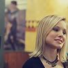
Read more... )

icons, veronica mars, *fly_meaway

Leave a comment

Comments 49

(The comment has been removed)

fly_meaway February 6 2006, 18:49:01 UTC
Aww, thank you. I know about the lack of text, but I really felt that it was appropriate for the experiment, which I will let you in on at a later time ;)

Reply


: ) paipere February 6 2006, 18:16:21 UTC
Bad me, I was already to give you a nudge or something like that about the interest icons.Oh, but now I see what are you trying to do : ) I just wish may they all be wonderful and gorgeous : D
Im not waiting for them SO MUCH! I just know that you are amazing maker. Still I think The Hours icons, are the best! What you ever had made.
Eh,I just wanted to say that you are great icon maker!

Those are fantastic.Thought, I never was into Veronica Mars ( because of K.Bell, I have something against her lol ).

Truth?Ehh, I do not like the colors, sorry but Im trying to be true as I can be, they are kind a too ' heavy ' for my eyes.

But Im gonna took number 8, for using, right now.
Cheers.

And YOU DID AMAZING JOB!

Reply

Re: : ) fly_meaway February 6 2006, 18:51:11 UTC
Ahhh, thank you SO much for writing that all out! I really loved "The Hours" set too, such a different style from my latest (which is not really well represented above though). I had so much fun making those icons too. But yeah, I really hope to have your interest icons done by this weekend!

And thanks for your comment about the colors. They were mostly part of the experiment. Normally I don't color like this at all, so yeah, truth about that is definetly good! So thank you for that :D

Reply


(The comment has been removed)

fly_meaway February 6 2006, 18:56:42 UTC
Thank you so much for your comment, I really appreciate it. The colors and the textless-ness were mostly the experiment, so yeah, I appreciate you commenting so much and I'm so glad you like the framing on those icons especially :D

Reply


natacha92 February 6 2006, 18:27:44 UTC
Lovely. Took 12 and 13.

Reply

fly_meaway February 6 2006, 18:57:26 UTC
Thank you for letting me know :D

Reply


agurkis February 6 2006, 18:29:02 UTC
Wow, I think these are great. Love the colouring especially, and the cropping in 4, 5 and 23 is really great. Gives the icons something extra, which really works. I love the colouring and the feel to 11.. And the light colouring in 13 is really good. I wanna know about this experiment! ;)

Reply

fly_meaway February 6 2006, 19:00:40 UTC
Awww, thank you hun. I'm so glad you mention the cropping in those, because the cropping is the only thing really not part of the experiment, so I'm really glad that you like that :D

I'll let you in on the experiment asap. It's just something about how I made them and how I did the coloring though. But they turned out different than I had intended ;)

Reply


Leave a comment

Up