Australian clichés (part 1)

May 07, 2007 12:43


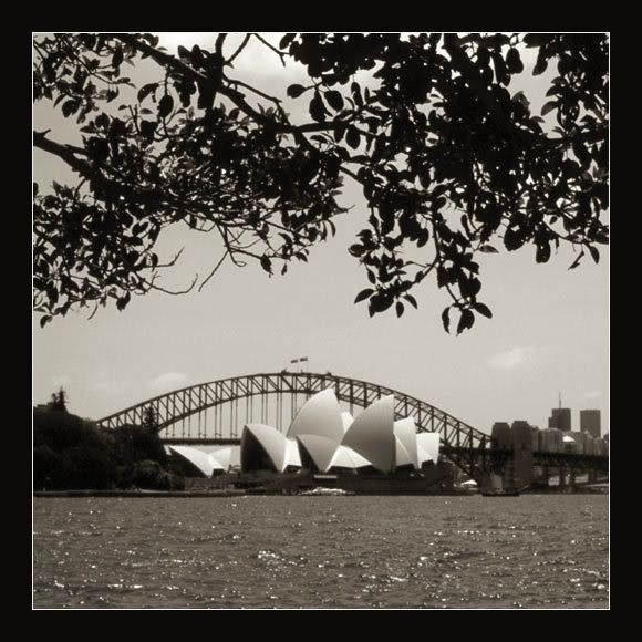
I spent a considerable part of my weekend talking about holiday clichés. Perhaps that's what prompted me to do a few "Australian clichés" posts. Well, they don't come any more clichéd than this, do they? :-)

Read more... )

sydney, architecture, toned b&w, australia, converted colour photos

Leave a comment

Comments 17

cosmiccircus May 7 2007, 13:14:27 UTC
I like the glass lights in the second one! They kind of off set what you'd expect to see and add a roundness to the photo!

Reply

mistress_elaine May 7 2007, 14:26:08 UTC
Thanks! I loved the combination of different shapes, as well, plus the way the light bounced off the lanterns and the building itself.

I guess the picture would have been more exciting if I had taken it with a wide-angle lens, but alas, I only had my 50mm lens with me...

Reply


taotianone May 7 2007, 14:09:19 UTC
the second one is a little more daring, but there's really nothing wrong with the top one. its symmetry is unusual in your work and gives it a static quality, but it's a quality piece of documentary imaging.

Reply

mistress_elaine May 7 2007, 14:26:39 UTC
"A quality piece of documentary imaging", eh? What a lovely way to describe a snapshot. Heh. :-)

For what it's worth, I know these aren't the most exciting pictures I've ever posted; I'm just getting some clichés out of the way. I have a few more pictures of the bridge coming up that are a bit more adventurous, but I'll save those for later.

Reply

taotianone May 8 2007, 03:24:30 UTC
i wasn't poking fun at you; i meant it. in my line of work, the documentation of a structure is a major goal. not only does it give context to the building and its environment, but think of this: if in a hundred years from now, the opera house has ceased to exist, the top photo will be of much more value than the lower one in understanding what the building was, the boldness of its architecture, and the place it held in the cityscape.

now, having said that, i'm not at all adverse to artistic photography. in fact, that's what i've been trying to master these last ten years. i just wanted to point out that there's a whole other world of photographic utility and that your first pic wasn't a bad example of it.

Reply

mistress_elaine May 8 2007, 08:44:07 UTC
I agree the top photo, being more of an overview photo, is a better document of what the Opera House is all about. That said, it's a tricky picture perspective-wise. If you were to judge the place the Opera House holds in the cityscape (as you put it) from that top photo, you might come to the mistaken conclusion that it's sitting right in front of the bridge, closing off the harbour, when in reality it does nothing of the sort. From a documentary point of view, this sadly rather overexposed photo gives a much better impression of the place, putting it into the right perspective:


... )

Reply


insomniacdoze May 7 2007, 15:27:14 UTC
ben wel erg benieuwd naar de kleurenversies van de foto's nu :)

Reply

mistress_elaine May 7 2007, 15:41:33 UTC
In dit geval krijg je die niet te zien. Ik heb de foto's midden op de dag gemaakt, toen het licht erg slecht was, dus de kleuren van de bovenste foto zijn vaal en flets en gewoon niet erg mooi. Ik had er met de nodige hoeveelheid Photoshoppen nog wel iets van kunnen maken, maar dat leek me niet de moeite waard. En aangezien het in deze plaatjes toch om de vormen en lijnen gaat, en niet om de kleuren, heb ik toen maar besloten er zwartwit van te maken, wat vormen en lijnen benadrukt...

Reply

insomniacdoze May 7 2007, 19:38:43 UTC
jammer, maar fair enough
zag die onderste al helemaal voor me met een strak blauwe lucht :)

Reply

mistress_elaine May 7 2007, 19:55:12 UTC
De onderste had in kleur gekund; die heeft inderdaad een strakblauwe lucht, zij het dat die op twee plaatsen wordt ontsierd door kleine wolkjes. Maar aangezien ik besloten had de eerste foto in zwart-wit te plaatsen, leek het me logisch de tweede ook in zwart-wit te doen...

Misschien plaats ik hem nog wel eens in kleur en in een ander formaat. Ik zie wel. Eerst wil ik aan een paar andere foto's werken. :-)

Reply


minn May 11 2007, 12:15:40 UTC
The top photo looks like a vintage postcard, and the bottom one, a surrealist painting. Love them both (but I admit I'm leaning slightly more towards the top one ;-))

Reply

mistress_elaine May 11 2007, 17:57:09 UTC
Heh. More nice words to describe what are essentially snapshots. Thank you, Minnie. :-)

Reply

minn May 11 2007, 18:04:29 UTC
Hey, I meant it! :-)

Reply

mistress_elaine May 11 2007, 18:08:46 UTC
I know you did. And I really do thank you for those nice words. :-)

Reply


Leave a comment

Up