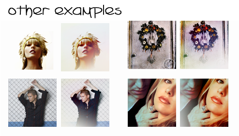
Tutorial #10
From 
to
or make
01. Duplicate the base, put it on screen, 50%.
02. Add a selective color layer, this is to give the icon contrast and to darken it.
Reds:
-100 0 0 0
Yellows:
-95 0 14 0
Cyans:
-30 100 100 0
Neutrals:
12 0 0 30

03. Take this gradient, or make your own with the gradient tool, and put it on screen, so it will lighten a part of the icon.
04. Add a levels layer, this will slightly lower the contrast.
RGB:
Input 0 1,00 255
Output 0 236

05.
Take this texture and put it on soft light, 100%, to give the background more colors.
06. Last step is to put this texture on top, color burn.
Remember to always play with the opacity of the layers since every base is different, I also recommend to experiment a bit with the gradient to see what fits the best.
Friend/Join this community, comment and feel free to show me your results!
One last thing: the reason I haven't updated the community is the bandwith problems I'm having with box.net, so I have started to reupload them to deviantart instead. When I've caught up, I'll make sure to post more textures :)
to
or make
01. Duplicate the base, put it on screen, 50%.
02. Add a selective color layer, this is to give the icon contrast and to darken it.
Reds:
-100 0 0 0
Yellows:
-95 0 14 0
Cyans:
-30 100 100 0
Neutrals:
12 0 0 30
03. Take this gradient, or make your own with the gradient tool, and put it on screen, so it will lighten a part of the icon.
04. Add a levels layer, this will slightly lower the contrast.
RGB:
Input 0 1,00 255
Output 0 236
05.
Take this texture and put it on soft light, 100%, to give the background more colors.
06. Last step is to put this texture on top, color burn.
Remember to always play with the opacity of the layers since every base is different, I also recommend to experiment a bit with the gradient to see what fits the best.
Friend/Join this community, comment and feel free to show me your results!
One last thing: the reason I haven't updated the community is the bandwith problems I'm having with box.net, so I have started to reupload them to deviantart instead. When I've caught up, I'll make sure to post more textures :)