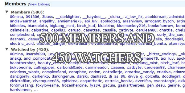
Over 500 members and 450 watchers + Tutorial #12
What type of textures do you want more of? And would you be interested in texture tutorials from me?
Tutorial #12
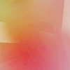
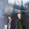
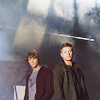
From
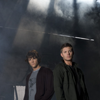
to
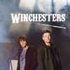
or make
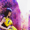
01. First, I need to make the base brighter, I duplicated it three times and put them on screen mode.
02. The next step is to lessen the contrast using this texture (from pack 44), put it on luminosity, 44%.
03. Then I'll up the contrast, to give the icon more depth, by duplicating the base, put it on top and set it on overlay, 72%.
04 I want to give the icon a warmer feeling, so I took the same texture, duplicated it and put it on soft light, 38%.
05. The icon is a bit too bright for me right now, so I use a curves layer to darken it slightly. Layer > New Adjustment Layer > Curves
RGB - Output: 114 Input: 138
06. Last thing I did was adding text and I'm done!
Remember: what opacity the layers are, always depends on the base, comments are appreciated and feel free to show me your results/join/watch misarte!
Added a PSD (CS3) since it was requested.
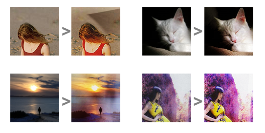
Other examples: