It appears the threat to make a tutorial was not an empty one.
Batman has done a lot of weird things to me. Not the least of which, deciding to make an icon tutorial. Funky spunky, yo. Let's do it.
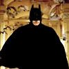
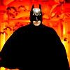
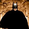
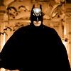
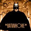
First thing you do is look for a sextastical Batman picture. There are a lot of those. Preferably one from Batman Begins, because the lighting is sincerely droolworthy and the Batsuit is top-notch sexy (and the soundtrack rocks). I used this as an excuse to stare at pictures of Christian Bale in fitted, semi-lustrous black chose this one:
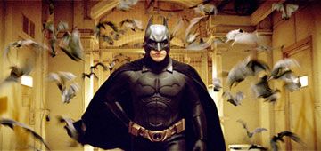
Thank you Yahoo Movies and various other places.
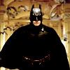
1. Crop and resize the image to a 100x100:
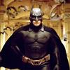
(I think I also worked some 'filter>sharpen>unsharp mask' magic on this one)
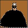
2. You see the way his head's glowing? Let's not have that. In fact, while we're at it, let's black out the Batsuit so there's a nice emphasis on his handsome face/mask and on the text. First step to that, the Magic Wand tool and Quick Mask. Comes out something like this:
so his face and the background are under the mask, hence outside the selection.
3. Go back into normal mode, make a new layer, and on it black out (with the paint tool or fill tool) everything within the marquee. It'll be a shape like this:
fitting onto the image like so:
4. Well, that looks neat and slightly iPod-esque, but not quite what I was going for here. So, we'll set the layer to overlay, and get one of these:
5. The belt and the pec-shine, though, are distracting me. So, new layer, and let's black those out for real, with the paint tool. Like so:
I like that much better.
6. Now, it's background time. I right-click the thumbnail of the blacked-out batsuit overlay layer on the layers palette, choose 'select layer transparency', then select the inverse of that.
7. Then I pick some random brown from the background (in this case hexcode A5692C), create a new layer, and paint that in all around the batsuit -- but not his mouth, which I was just too plain lazy to subtract from the selection. See, like this:
8. Set that layer to something fun, like 'vivid light', and we'll get this:

8. Wooh sexy. But I want to play more. So, duplicate the layer:
Oh. It seems Wayne Manor's on fire again. That's not cool.
9. Why don't we set the layer to 'hue' instead:

Which is better, but still looks like a bad Halloween-angled advert.
10. Duplicate the layer again, and this time set it to 'saturation', but it'll come out boring, like this:
so take it down to 82% opacity to make it prettier.
11. Time for text. Thanks to elizile and late-night AIM, I have this little gem --
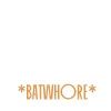
in DE9953 and the font is Mackintosh SF. On the image, it looks like this:
12. Now that everything looks nice, let's ruin it. New layer, and fill it with whatever you happen to have handy (in my case it was Batsuit Black). The finished icon will look like this:

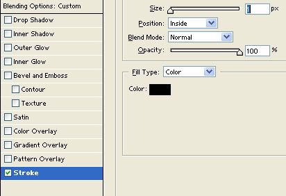
...except it won't. Because we'll go to the layer effects and put a stroke, 1 pixel black, on this layer and set it to happen on the inside. See?
Then we go back to the icon and set the HUGE BLACK LAYER OF DOOM to a fill of 0%. And poof! magic border (I do actually have a brush for this, but it's on my laptop which is in the shop >.< ).
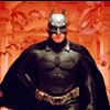
The finished icon is:
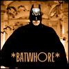
(mine; please don't snag, though you can have the base if you promise not to hotlink)
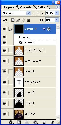
The layers overview is:
And the moral of the story is:
Batman is cooler than you. That and, I'm insane and don't think I will ever do this again kthx.
First thing you do is look for a sextastical Batman picture. There are a lot of those. Preferably one from Batman Begins, because the lighting is sincerely droolworthy and the Batsuit is top-notch sexy (and the soundtrack rocks). I used this as an excuse to stare at pictures of Christian Bale in fitted, semi-lustrous black chose this one:
Thank you Yahoo Movies and various other places.
1. Crop and resize the image to a 100x100:
(I think I also worked some 'filter>sharpen>unsharp mask' magic on this one)
2. You see the way his head's glowing? Let's not have that. In fact, while we're at it, let's black out the Batsuit so there's a nice emphasis on his handsome face/mask and on the text. First step to that, the Magic Wand tool and Quick Mask. Comes out something like this:
so his face and the background are under the mask, hence outside the selection.
3. Go back into normal mode, make a new layer, and on it black out (with the paint tool or fill tool) everything within the marquee. It'll be a shape like this:
fitting onto the image like so:
4. Well, that looks neat and slightly iPod-esque, but not quite what I was going for here. So, we'll set the layer to overlay, and get one of these:
5. The belt and the pec-shine, though, are distracting me. So, new layer, and let's black those out for real, with the paint tool. Like so:
I like that much better.
6. Now, it's background time. I right-click the thumbnail of the blacked-out batsuit overlay layer on the layers palette, choose 'select layer transparency', then select the inverse of that.
7. Then I pick some random brown from the background (in this case hexcode A5692C), create a new layer, and paint that in all around the batsuit -- but not his mouth, which I was just too plain lazy to subtract from the selection. See, like this:
8. Set that layer to something fun, like 'vivid light', and we'll get this:
8. Wooh sexy. But I want to play more. So, duplicate the layer:
Oh. It seems Wayne Manor's on fire again. That's not cool.
9. Why don't we set the layer to 'hue' instead:
Which is better, but still looks like a bad Halloween-angled advert.
10. Duplicate the layer again, and this time set it to 'saturation', but it'll come out boring, like this:
so take it down to 82% opacity to make it prettier.
11. Time for text. Thanks to elizile and late-night AIM, I have this little gem --
in DE9953 and the font is Mackintosh SF. On the image, it looks like this:
12. Now that everything looks nice, let's ruin it. New layer, and fill it with whatever you happen to have handy (in my case it was Batsuit Black). The finished icon will look like this:
...except it won't. Because we'll go to the layer effects and put a stroke, 1 pixel black, on this layer and set it to happen on the inside. See?
Then we go back to the icon and set the HUGE BLACK LAYER OF DOOM to a fill of 0%. And poof! magic border (I do actually have a brush for this, but it's on my laptop which is in the shop >.< ).
The finished icon is:
(mine; please don't snag, though you can have the base if you promise not to hotlink)
The layers overview is:
And the moral of the story is:
Batman is cooler than you. That and, I'm insane and don't think I will ever do this again kthx.