Two Tutorials.
Two requested tutorials from
timian (sorry it took me ages!) and
loveshot -- I'll do the buffy tutorial when I have some more time. I didn't save the original .psd. But I have tried to recreate the icons as close as I could to the original :)
Done in Photoshop CS; tutorials include selective colouring, curves and gradients, so I doubt it's translatable.
Tutorial #01: Dean Winchester
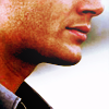
from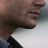
Duplicate the base and set it to screen or color dodge, at 50% opacity.
I prefer using color dodge to achieve the effect in this icon, but it depends on whatever looks best on your base.
New adjustment layer > Curves
RGB:
Input: 90
Output: 140
New adjustment layer > Color Balance
Midtones:
Cyan -20
Magenta +10
Yellow +20
Shadows:
Cyan -20
Magenta -5
Yellow -5
Highlights:
Cyan -10
Magenta -10
Yellow +5
New adjustment layer > Selective Color
Neutrals:
Cyan -10
Magenta 0
Yellow +10
Black +10
New adjustment layer > Curves
RGB:
Input: 115
Output: 150
New adjustment layer > Brightness/Contrast
Brightness: -10
Contrast: +20
New adjustment layer > Color Balance
Midtones:
Cyan +20
Magenta -10
Yellow -5
New adjustment layer > Curves. (Lower the opacity to 50%.)
RGB:
Input: 160
Output: 190
Red:
Input: 180
Output: 150
Green:
Input: 150
Output: 165
Blue:
Input: 145
Output: 180
New adjustment layer > Selective Color
Reds:
Cyan -85
Magenta +30
Yellow 0
Black 0
Now add whatever you want to it, textures, text etc.
I added this gradient, set to 20% opacity.
I've included a .psd for this tutorial, cos it's a tad long.

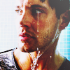
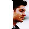
icons made from using a simular tutorial:

Tutorial #02: The Open Road
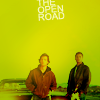
from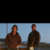
This tutorial will only work well with bases which have alot of blank space at the top.
Duplicate the base and set it to screen at 100% opacity.
New adjustment layer > Curves.
RGB:
Input: 130
Output: 150
Red:
Input: 174
Output: 163
Green:
Input: 161
Output: 157
Blue:
Input: 140
Output: 126
New adjustment layer > Curves.
RGB:
Input: 120
Output: 160
Merge the layers (Shift + Ctrl + E)
Now using the Smudge tool or Clone Stamp tool (whichever you find easiest) smooth the blue colour around the top to create blank space.
It should now look something like this:
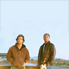
Now add this texture by
crystalcocaineand set it to Linear burn at 100%. Duplicate the texture and set it to Softlight at 100%.
Duplicate the merged blank space image and set it to Softlight at 20% above the texture
I added this gradient set to 40% opacity.
No .psd for this one.
Try not to copy the tutorials exactly, it won't work for every base -- so experiment!
- Comments make my day and I would love to see your results!
- Credit isn't necessary but it's always nice :)
timian (sorry it took me ages!) and
loveshot -- I'll do the buffy tutorial when I have some more time. I didn't save the original .psd. But I have tried to recreate the icons as close as I could to the original :)
Done in Photoshop CS; tutorials include selective colouring, curves and gradients, so I doubt it's translatable.
Tutorial #01: Dean Winchester

from

Duplicate the base and set it to screen or color dodge, at 50% opacity.
I prefer using color dodge to achieve the effect in this icon, but it depends on whatever looks best on your base.
New adjustment layer > Curves
RGB:
Input: 90
Output: 140
New adjustment layer > Color Balance
Midtones:
Cyan -20
Magenta +10
Yellow +20
Shadows:
Cyan -20
Magenta -5
Yellow -5
Highlights:
Cyan -10
Magenta -10
Yellow +5
New adjustment layer > Selective Color
Neutrals:
Cyan -10
Magenta 0
Yellow +10
Black +10
New adjustment layer > Curves
RGB:
Input: 115
Output: 150
New adjustment layer > Brightness/Contrast
Brightness: -10
Contrast: +20
New adjustment layer > Color Balance
Midtones:
Cyan +20
Magenta -10
Yellow -5
New adjustment layer > Curves. (Lower the opacity to 50%.)
RGB:
Input: 160
Output: 190
Red:
Input: 180
Output: 150
Green:
Input: 150
Output: 165
Blue:
Input: 145
Output: 180
New adjustment layer > Selective Color
Reds:
Cyan -85
Magenta +30
Yellow 0
Black 0
Now add whatever you want to it, textures, text etc.
I added this gradient, set to 20% opacity.
I've included a .psd for this tutorial, cos it's a tad long.

icons made from using a simular tutorial:


Tutorial #02: The Open Road

from

This tutorial will only work well with bases which have alot of blank space at the top.
Duplicate the base and set it to screen at 100% opacity.
New adjustment layer > Curves.
RGB:
Input: 130
Output: 150
Red:
Input: 174
Output: 163
Green:
Input: 161
Output: 157
Blue:
Input: 140
Output: 126
New adjustment layer > Curves.
RGB:
Input: 120
Output: 160
Merge the layers (Shift + Ctrl + E)
Now using the Smudge tool or Clone Stamp tool (whichever you find easiest) smooth the blue colour around the top to create blank space.
It should now look something like this:

Now add this texture by
crystalcocaineand set it to Linear burn at 100%. Duplicate the texture and set it to Softlight at 100%.
Duplicate the merged blank space image and set it to Softlight at 20% above the texture
I added this gradient set to 40% opacity.
No .psd for this one.
Try not to copy the tutorials exactly, it won't work for every base -- so experiment!
- Comments make my day and I would love to see your results!
- Credit isn't necessary but it's always nice :)