"My eyes! My eyes!"
Fantasy book covers are the topic of this post. Before I begin, I feel I should make a couple of things clear: Taste/art is subjective, and this is just one gal's opinion. Secondly, to get right into it, bad covers aren't always bad because they have bad art. And, good art doesn't always make good covers. 'Cause there is art on one hand, and then when it's on a book, it isn't just art anymore, it's design. That design is the outer package of the book, the outer skin for the writing and world within.
Covers should do the following, in this order:
Here's a radical idea: I don't think all, or even most, fantasy books actually require the dramatic/fantastic scene illustration as the cover art. It is (too) common; for me, it's not a done deal that the fantasy element must be shown on the cover INYOURFACE, or be realistically painted, or be a scene in the book. (In fact, the last thing is kinda boring. If writers strive to show, not tell, I feel covers should intrigue, not show. I actually dislike most literal covers. I will more happily accept a scene that happened off the pages, 'cause that always feels like a bonus.) So, should the obvious/cliche fantasy element or scene be sidestepped in the art, the art can still capture the feel of the book without being literal. I do love (accurate) portraits that look like portraits (and POC looking like POC), but I also love dramatic landscapes and cityscapes. And I love painterly realism, but I also love art nouveau, art deco, German expressionism (dark and tortured stuff), and riffs on classic art masterpieces. I am partial to books that look like artifacts from their own world. And there are historical fantasy novels (where the fantasy's kinda minimal) that I thought would have been wonderfully presented like an illuminated manuscript frontispiece, textures and patterns and jewelbox colours conveying the richness of the character interactions within.
Maybe some (or all) of those ideas sound gimmicky, I don't know. I don't think every book needs to be uber-unique; but there are definitely a lot of books out there I wish had had more thought put into the cover, because the contents deserved better.
Anyways, here's a smattering of the books I've owned because it was their covers that sold me 90% of the way:

There are a couple of non-fantasy books hiding in there. Because I think their design would work equally well on fantasy novels. None have realistic looking art. (I kinda eschew photorealism on fantasy covers... I want to imagine the book's scenes myself!) And only the first book has a painting that looks really modern fantasy art (and it's an award-winning piece IIRC). The last book, which is fantasy, has been published with several covers. Here's another one it's had that I would never have touched:
Not because it has a sweeping pink sky (I had said I like dramatic landscapes). Not because I think the art is bad or especially cliche (it is a little, mostly because of its overwhelming pastels). Not because it makes me think fluffy romance novel (even though I know it isn't). But because (apologies to this book designer AND cover artist) it looks fluffy (not my thing) AND its cover does at least two things that, for me, put it in the category of not-great fantasy book cover design. (Time now to find your your favourite hated book covers to check which crimes they've committed.) And here's my list of the habits of not-so-successful fantasy book covers:
ROF has recently made me think of adding one more though:
Cliches! Armour on a female body that mysteriously leaves the cleavage uncovered, or heroes facing off big ugly foe, the spaceship in space, or the angsty male hero looks angsty, or the sexy female protagonist is sexy, or the mysterious mage is mysterious and makes magic. But I may half-mean the rule against cliche art in jest, because some of them do wind up reasonable covers if no other design wrongs are committed. I feel cliches actually adapt and change somewhat (though pin-up fantasy art is one of the exceptions), and what is done to death for one may be sparkly new to another.
Cliches changing, new cliches emerging? Here are some amusing parting links:
Scifi Guy looks at urban and paranormal fantasy book covers:
http://www.scifiguy.ca/2008/10/urban-fantasy-paranormal-book-cover.html
The use of photography clip-art in book covers means sometimes you see double (while we're still looking at meesterious nekkid bodies with tattoos):
http://lurvalamode.wordpress.com/2008/12/08/bdb-doppleganger/
And one of my favourite sites where bad covers get trashed, and paranormal/fantasy romance book covers come up often enough:
http://www.smartbitchestrashybooks.com/index.php/weblog/comments/they_make_lead_sunglasses_dont_they/
http://www.smartbitchestrashybooks.com/index.php/weblog/categories/category/covers_gone_wild_non_snoop_dogg_edition/
I probably don't sound very fantasy artist in this entry, because I'm not selling the genre very well here, am I? I just think illustration and book design are separate things, amazingly, and some of my graphic design experience and a LOT of my personal reader/viewer tastes are in this post. And while I like fantasy art, I know it sounds strange that I don't think all fantasy books need it. But there ya go. Apologies go out if any of my examples of what doesn't work, offend.
Thoughts/comments/flames/silence? (It's now past 1am for me; time for bed.)
Covers should do the following, in this order:
- Look good. (Duh. More in a bit.)
- Convey the title and author's name (Duh again. But I've seen effective exceptions that still worked because they rocked Rule #1).
- Carry art that effectively conveys the atmosphere and/or the world/characters in the book.
Here's a radical idea: I don't think all, or even most, fantasy books actually require the dramatic/fantastic scene illustration as the cover art. It is (too) common; for me, it's not a done deal that the fantasy element must be shown on the cover INYOURFACE, or be realistically painted, or be a scene in the book. (In fact, the last thing is kinda boring. If writers strive to show, not tell, I feel covers should intrigue, not show. I actually dislike most literal covers. I will more happily accept a scene that happened off the pages, 'cause that always feels like a bonus.) So, should the obvious/cliche fantasy element or scene be sidestepped in the art, the art can still capture the feel of the book without being literal. I do love (accurate) portraits that look like portraits (and POC looking like POC), but I also love dramatic landscapes and cityscapes. And I love painterly realism, but I also love art nouveau, art deco, German expressionism (dark and tortured stuff), and riffs on classic art masterpieces. I am partial to books that look like artifacts from their own world. And there are historical fantasy novels (where the fantasy's kinda minimal) that I thought would have been wonderfully presented like an illuminated manuscript frontispiece, textures and patterns and jewelbox colours conveying the richness of the character interactions within.
Maybe some (or all) of those ideas sound gimmicky, I don't know. I don't think every book needs to be uber-unique; but there are definitely a lot of books out there I wish had had more thought put into the cover, because the contents deserved better.
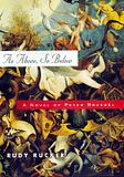
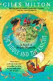
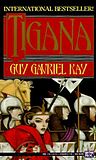
Anyways, here's a smattering of the books I've owned because it was their covers that sold me 90% of the way:
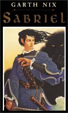


There are a couple of non-fantasy books hiding in there. Because I think their design would work equally well on fantasy novels. None have realistic looking art. (I kinda eschew photorealism on fantasy covers... I want to imagine the book's scenes myself!) And only the first book has a painting that looks really modern fantasy art (and it's an award-winning piece IIRC). The last book, which is fantasy, has been published with several covers. Here's another one it's had that I would never have touched:

Not because it has a sweeping pink sky (I had said I like dramatic landscapes). Not because I think the art is bad or especially cliche (it is a little, mostly because of its overwhelming pastels). Not because it makes me think fluffy romance novel (even though I know it isn't). But because (apologies to this book designer AND cover artist) it looks fluffy (not my thing) AND its cover does at least two things that, for me, put it in the category of not-great fantasy book cover design. (Time now to find your your favourite hated book covers to check which crimes they've committed.) And here's my list of the habits of not-so-successful fantasy book covers:
- Full bleed artwork with no visual separation (borders/frames/lines/boxes) of the text from the art. The art goes to all four edges of the cover. Sometimes, it's even a full wrap to the back. All the text is set directly onto busy artwork. This makes the small text hard to read, at the same time the designer often makes the title a heavy visual sledgehammer (size- and font-wise) to stand out against the art. This doesn't always look bad, but I've learnt more often than not, it's a quick way to make even good eye-catching art look like a cheap and cliche fantasy cover very quickly, quicker still if the next thing is also done...
- Bright-colour text set directly on bright-colour art. Oh, I've seen this done sometimes to brain-melting effects. Neon green text on magenta skies. Red text against deep emerald forest. Yes, it's great someone knows their complementary colours, but sometimes, white, black, or a bleached/subdued colour next to a strong one gives a calmer (and classier but equally contrasting) effect. (In art terms, contrast, which designers/artists want in order to make a cover pop!, can come from differing values/chroma, not just strong-colour-vs-strong-colour.)
- Distracting novelty font face is used, and/or more than one novelty font face. Drippy fonts should always be out unless it's a joke or for kids. Fonts that are easily recognizable or comparable to one used by a movie/computer game, also out. One novelty font is more than plenty. It's often overkill on long titles. If a second typeface is desired, then the second should be unobtrusively normal.
- Plain bad art. Oh, I'm not covering cliche or offensive art yet. I just mean plain bad art, which should never be used for covers: (TURN BACK NOW) [Amazon link opens in new window] I warned you! (If you've never been exposed to Poser in fantasy art before--thankfully rare in paper publishing--I apologize for this brutal deflowering.) There's really not much more detail I can go into about bad art, just to say that there are some things out there that make pics of overdone boobtastic fantasy females look like the work of Leonardo da Vinci.
ROF has recently made me think of adding one more though:
Cliches! Armour on a female body that mysteriously leaves the cleavage uncovered, or heroes facing off big ugly foe, the spaceship in space, or the angsty male hero looks angsty, or the sexy female protagonist is sexy, or the mysterious mage is mysterious and makes magic. But I may half-mean the rule against cliche art in jest, because some of them do wind up reasonable covers if no other design wrongs are committed. I feel cliches actually adapt and change somewhat (though pin-up fantasy art is one of the exceptions), and what is done to death for one may be sparkly new to another.
Cliches changing, new cliches emerging? Here are some amusing parting links:
Scifi Guy looks at urban and paranormal fantasy book covers:
http://www.scifiguy.ca/2008/10/urban-fantasy-paranormal-book-cover.html
The use of photography clip-art in book covers means sometimes you see double (while we're still looking at meesterious nekkid bodies with tattoos):
http://lurvalamode.wordpress.com/2008/12/08/bdb-doppleganger/
And one of my favourite sites where bad covers get trashed, and paranormal/fantasy romance book covers come up often enough:
http://www.smartbitchestrashybooks.com/index.php/weblog/comments/they_make_lead_sunglasses_dont_they/
http://www.smartbitchestrashybooks.com/index.php/weblog/categories/category/covers_gone_wild_non_snoop_dogg_edition/
I probably don't sound very fantasy artist in this entry, because I'm not selling the genre very well here, am I? I just think illustration and book design are separate things, amazingly, and some of my graphic design experience and a LOT of my personal reader/viewer tastes are in this post. And while I like fantasy art, I know it sounds strange that I don't think all fantasy books need it. But there ya go. Apologies go out if any of my examples of what doesn't work, offend.
Thoughts/comments/flames/silence? (It's now past 1am for me; time for bed.)