Ask the maker filled request 1 of 3
This is for round 8 of ATM for esgeee & afastmachine.

First we need to decide what caps work best for close crops. I don't really think too much about it any more since I do it so often, I can usually tell when a cap will work for it or not or I make it work :P, so at first it's a lot of trial and error. Eventually you'll get the hang of it and can make close crops out of almost anything.
I suggest finding a bunch of caps that pull your interest and experimenting to see how many crops you can get out of it and choosing which one is the best. If you need help choosing or aren't sure if a crop is good or not ask on anon_icon or icontalking, there's lots of people who will certainly help you out!
I chose some of the caps that I have on hand for later use or that I've already used (with some finished icons as examples). Also, I have a pool of random caps at the bottom that will work for close crops if you want to test it out yourself!
We'll start off with this cap of Claire (from 2x12).

You could just go with a medium crop, but the close crop is more interesting

>>
You get the better focus on her eyes and hair which is what I like about this cap. When working with a cap like this that the subject is farther away in your result will be grainy. There's lots of ways to fix that though. I prefer to use Topaz Clean in low opacity layers. Sharpening certain spots like her features. Using the smudge tool to smooth out skin, lots of choices! It can take a while of slow building to make it come out well.
It's harder to do if you're working with caps from older shows that don't have HD versions like Angel and Buffy. Those take even longer to fix but if you're patient, they'll work. Some examples of finished icons that aren't grainy as hell,
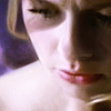

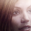
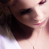
Obviously, if you want some grain (see 2 & 3) you can leave it alone or add it in the end like I did, just make sure the features are clear otherwise it will look like you didn't even try. :P
This is an example of what it would look like if I continued to make it into an icon. I only used topaz on her hair and skin and erased from her eyes and mouth, I sharpened it some more and used a levels layer to even out the contrast. Then I colored it really quick.

>>


This cap of Karen is another example of a lot of grain. It gets worse the darker the base image is, as you see in the first cropped version. In the second one I had to use twice the 'strength' of topaz than I usually use to get rid of most of it without making her look plastic. This wouldn't be the final base I would use to continue making it into an icon but it shows what you can do with an image like that.
Here's some more examples of the farther away subject and their possible results


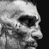


Some caps you can get a few different crops out of so if you want you can make one icon and then have an alt or two if you can't decide. I don't usually have the time to make more than one but I do have some examples.
I'm not usually able to get 3 crops out of an image but I managed to eek out one more for these two. I don't particularly like the third icons because they're rather uninspiring and the easy way out if you can't find a new crop or different way to use an image but they work well enough for what I needed them for. Not that they're bad crops, they're just fine. It's just that you see them often and I try to avoid that, personally.


ok, I love this cap! The emotions it shows and lighting on it is perfect so for that soft, pastel coloring. Even vibrancy works great as you can see in the third example.


(the first one I haven't colored yet) I really like the emotion this conveys with either crop you choose, plus the focus on his hand is great. One of the things that makes close crops interesting is the focus. Is it a hand like here? The subjects facial expression? Hair? It's good to find something to focus on and try to work it in somehow. See all the finished icons and example crops in this post and you'll see there's that one thing that draws your attention. You want to find that when making close crops.

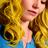
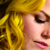
This cap of Emma has been sitting around in my screencaps for aages. I don't know why I hadn't used it because it's awesome, it's a great cap to use to get focus on her hair that looked really great in this episode (1x6). Since I wanted the focus to be drawn to her hair the most, I used strong, bold colors. Coloring is great for helping to draw focus where you want, don't hold back because it's close up, be sure to throw a lot of colors in there sometimes because it really makes it stand out from the rest in a sea of similar crops. Like this next one of Leia that I'm sure you all know, color explosion, amirite? :D


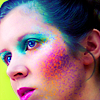
If I had left the weird colors out, it wouldn't be as fun, you know? Like the icon of Elektra above, it's different, it stands out from the rest with a combination of cropping and weird colors. Don't be afraid to break out of the box sometimes, you can get pretty great results!


Here's another icon using a body part as the focus of the icon in this rather iconic shot of Will.


You can use shadows to create a more dramatic and interesting icon like in this one of Oliver that otherwise wouldn't work very well as a farther cropped icon.


When a persons face/head is at an angle can make for an interesting crop, especially obscured icons like this one of Rick. It helps to keep something in there that helps to identify the person though. So while this is obscure, you can still clearly tell who it is.


An example of an obscure crop but you can still tell who it is..well most of the time. If you've seen the show otherwise, er..maybe not..


And another example of a person with their head at an angle + using shadows for dramatic effect.


I really liked this cap of Zed and her expression. As you can see, if you used a medium crop it doesn't have the same effect but a close crop is perfect. Use your best judgement to choose what kind of crop would work best for what you want to convey in the icon (unless I'm the only one who even thinks of that, then just ignore this part xD).


If you're not sure a cap will work or not, try it anyways! I didn't think this would work but it's one of my favorites and best of Scully. Plus her hair looks so fabulous as well *___*


Another one from the same scene and angle to show it wasn't a fluke :P And again, haaiiir *A*
Don't be afraid of the front and center close crop! Again, it's some trial and error but it can work really well!


This one of Elektra in the first crop directing from the cap looks a bit off but if you rotate it to the right juust a hair it looks fine and you can continue to finish it.
These next ones are other great examples of full center crops


screencap pool
Here's some screencaps for you to get started on if you like or to give you ideas of what to look for on your own!


~THE END~
This was soo long but I don't think I explained any of this well at all. D: If anything isn't clear or needs to be expanded on, let me know! Or just if you have any questions in general. :]

First we need to decide what caps work best for close crops. I don't really think too much about it any more since I do it so often, I can usually tell when a cap will work for it or not or I make it work :P, so at first it's a lot of trial and error. Eventually you'll get the hang of it and can make close crops out of almost anything.
I suggest finding a bunch of caps that pull your interest and experimenting to see how many crops you can get out of it and choosing which one is the best. If you need help choosing or aren't sure if a crop is good or not ask on anon_icon or icontalking, there's lots of people who will certainly help you out!
I chose some of the caps that I have on hand for later use or that I've already used (with some finished icons as examples). Also, I have a pool of random caps at the bottom that will work for close crops if you want to test it out yourself!
We'll start off with this cap of Claire (from 2x12).

You could just go with a medium crop, but the close crop is more interesting

>>

You get the better focus on her eyes and hair which is what I like about this cap. When working with a cap like this that the subject is farther away in your result will be grainy. There's lots of ways to fix that though. I prefer to use Topaz Clean in low opacity layers. Sharpening certain spots like her features. Using the smudge tool to smooth out skin, lots of choices! It can take a while of slow building to make it come out well.
It's harder to do if you're working with caps from older shows that don't have HD versions like Angel and Buffy. Those take even longer to fix but if you're patient, they'll work. Some examples of finished icons that aren't grainy as hell,
Obviously, if you want some grain (see 2 & 3) you can leave it alone or add it in the end like I did, just make sure the features are clear otherwise it will look like you didn't even try. :P
This is an example of what it would look like if I continued to make it into an icon. I only used topaz on her hair and skin and erased from her eyes and mouth, I sharpened it some more and used a levels layer to even out the contrast. Then I colored it really quick.
>>


This cap of Karen is another example of a lot of grain. It gets worse the darker the base image is, as you see in the first cropped version. In the second one I had to use twice the 'strength' of topaz than I usually use to get rid of most of it without making her look plastic. This wouldn't be the final base I would use to continue making it into an icon but it shows what you can do with an image like that.
Here's some more examples of the farther away subject and their possible results


Some caps you can get a few different crops out of so if you want you can make one icon and then have an alt or two if you can't decide. I don't usually have the time to make more than one but I do have some examples.
I'm not usually able to get 3 crops out of an image but I managed to eek out one more for these two. I don't particularly like the third icons because they're rather uninspiring and the easy way out if you can't find a new crop or different way to use an image but they work well enough for what I needed them for. Not that they're bad crops, they're just fine. It's just that you see them often and I try to avoid that, personally.


ok, I love this cap! The emotions it shows and lighting on it is perfect so for that soft, pastel coloring. Even vibrancy works great as you can see in the third example.


(the first one I haven't colored yet) I really like the emotion this conveys with either crop you choose, plus the focus on his hand is great. One of the things that makes close crops interesting is the focus. Is it a hand like here? The subjects facial expression? Hair? It's good to find something to focus on and try to work it in somehow. See all the finished icons and example crops in this post and you'll see there's that one thing that draws your attention. You want to find that when making close crops.

This cap of Emma has been sitting around in my screencaps for aages. I don't know why I hadn't used it because it's awesome, it's a great cap to use to get focus on her hair that looked really great in this episode (1x6). Since I wanted the focus to be drawn to her hair the most, I used strong, bold colors. Coloring is great for helping to draw focus where you want, don't hold back because it's close up, be sure to throw a lot of colors in there sometimes because it really makes it stand out from the rest in a sea of similar crops. Like this next one of Leia that I'm sure you all know, color explosion, amirite? :D


If I had left the weird colors out, it wouldn't be as fun, you know? Like the icon of Elektra above, it's different, it stands out from the rest with a combination of cropping and weird colors. Don't be afraid to break out of the box sometimes, you can get pretty great results!


Here's another icon using a body part as the focus of the icon in this rather iconic shot of Will.


You can use shadows to create a more dramatic and interesting icon like in this one of Oliver that otherwise wouldn't work very well as a farther cropped icon.


When a persons face/head is at an angle can make for an interesting crop, especially obscured icons like this one of Rick. It helps to keep something in there that helps to identify the person though. So while this is obscure, you can still clearly tell who it is.


An example of an obscure crop but you can still tell who it is..well most of the time. If you've seen the show otherwise, er..maybe not..


And another example of a person with their head at an angle + using shadows for dramatic effect.


I really liked this cap of Zed and her expression. As you can see, if you used a medium crop it doesn't have the same effect but a close crop is perfect. Use your best judgement to choose what kind of crop would work best for what you want to convey in the icon (unless I'm the only one who even thinks of that, then just ignore this part xD).


If you're not sure a cap will work or not, try it anyways! I didn't think this would work but it's one of my favorites and best of Scully. Plus her hair looks so fabulous as well *___*


Another one from the same scene and angle to show it wasn't a fluke :P And again, haaiiir *A*
Don't be afraid of the front and center close crop! Again, it's some trial and error but it can work really well!


This one of Elektra in the first crop directing from the cap looks a bit off but if you rotate it to the right juust a hair it looks fine and you can continue to finish it.
These next ones are other great examples of full center crops


screencap pool
Here's some screencaps for you to get started on if you like or to give you ideas of what to look for on your own!


~THE END~
This was soo long but I don't think I explained any of this well at all. D: If anything isn't clear or needs to be expanded on, let me know! Or just if you have any questions in general. :]