Ask the maker filled request 3 of ?
Ask the maker fill for nightbulbs & novindalf.
This is a general guide on blue coloring.


When I do any icon that has a main color like in this case; blue the starting image usually is blue or has a variation of it to begin with. The two example icons are ones that have blue in them to begin with, Emma's jacket and Cora's dress. Makes it easier to change everything else if you base the whole icon off of the existing color to begin with.
I'm going to talk about those two icons first off because there's different ways I make an icon one full color. In this case I used the eye dropper tool to pick out the blue I wanted for the background in the icon of Emma which began as this color

Now I wanted it to have more depth so using the same color with a large soft brush on the upper right corner I want it bright on that side. I set the layer to Linear Dodge at 63%. Then with a dark navy blue in the lower left corner I do the same thing again with the large brush and set this to soft light.

Looking better! I then added a Brightness/Contrast layer and a Levels layer and this is the result

I then used Color Balance, Hue/Saturation and Vibrance to bring out the blue in her jacket along with the background as well. This is the final look before textures are added
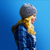
The last layers in this icon don't affect the blue at all, just adds interest and a bit of contrast. So we'll move on to the second icon...
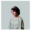
This one I wanted a soft vintage feel to it as well as a minimalistic look as well. I loved Cora's dress so I wanted that to stand out
It starts off a very grey blue

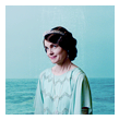
I then cut out Cora and added it to the background and resized it
I added a texture of an ocean and set it to Multiply. Now I'm moving on into making it a brighter blue. I added a pale blue gradient map, hue/saturation layer and a color balance layer and then I'm done with getting the blues that I want.
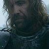
So that's one way of getting blue icons. Another is to use adjustment layers and a LOT of textures like this one of the Hound for example;
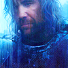
The starting screencap was only a little blue in it as you can see here. The thing to do is build little by little. I have 23 layers on this particular icon, soo I'm going to attempt to break it down in a few chunks.
Making a screencap blue isn't very hard really (or well..maybe it is if you're a newbie at iconning??) It's making it work without overwhelming an icon that's hard. It's really good to know how colors work together and opposite colors so that if you have a person in the icon like with this one they don't turn out too purple or too blue.
With the base I just copied it and set the layer to screen at 65%.
From there I added a pale grey splotch over his face to brighten it up a bit more, I set it to Soft Light on 73%. The next layer is this texture (maker unknown), then I added a dark blue gradient map on Soft Light, a Color Balance layer on Color which bumped up the purples a bit around his face, & another pale grey splotch over his face on Overlay (75%) to brighten it up again.

Next I add a brightness/contrast layer to everything except the sky, a levels layer to even out the white & black, two light blue splotches to the sky on screen & used blur to blend them out a bit, a hue/saturation layer on Color, which then looks like this;

The next layer I had stamped everything at this point and did a looot of sharpening with the sharpen tool

The next layers I add more color to the icon. I add a white blurry layer along the bottom to lighten it, this texture (by pamkips) on Soft Light (38%), this texture (maker unknown) on Screen (29%), another brightness/contrast layer (83%) excluding the sky, then this texture (maker unknown) on Screen (80%) as you can see I've erased parts of it.. & now we have this

It's coming along well! Next I added a bit of black lightly on the top left of the icon to give it some contrast the was washed out from the last layer, this texture (maker unknown) on Soft Light, this texture (maker unknown) on Screen (46%), and then a Vibrance layer on Color with his face erased mostly

Next is one last brightness/contrast layer, then a Levels layer erased so it's adjusting the lighting on his head only, and the final layer is a Color Balance on his face only.
So you can take this process and apply it to any color really (except red..I always have a horrible time with red so I don't have any answers for that color. ha See petite_tomate's tutorial on red here for that!). Once you get the hang of it, it's pretty easy to do.
If anything wasn't clear or you have questions, please let me know!
This is a general guide on blue coloring.
When I do any icon that has a main color like in this case; blue the starting image usually is blue or has a variation of it to begin with. The two example icons are ones that have blue in them to begin with, Emma's jacket and Cora's dress. Makes it easier to change everything else if you base the whole icon off of the existing color to begin with.
I'm going to talk about those two icons first off because there's different ways I make an icon one full color. In this case I used the eye dropper tool to pick out the blue I wanted for the background in the icon of Emma which began as this color
Now I wanted it to have more depth so using the same color with a large soft brush on the upper right corner I want it bright on that side. I set the layer to Linear Dodge at 63%. Then with a dark navy blue in the lower left corner I do the same thing again with the large brush and set this to soft light.
Looking better! I then added a Brightness/Contrast layer and a Levels layer and this is the result
I then used Color Balance, Hue/Saturation and Vibrance to bring out the blue in her jacket along with the background as well. This is the final look before textures are added
The last layers in this icon don't affect the blue at all, just adds interest and a bit of contrast. So we'll move on to the second icon...
This one I wanted a soft vintage feel to it as well as a minimalistic look as well. I loved Cora's dress so I wanted that to stand out
It starts off a very grey blue
I then cut out Cora and added it to the background and resized it
I added a texture of an ocean and set it to Multiply. Now I'm moving on into making it a brighter blue. I added a pale blue gradient map, hue/saturation layer and a color balance layer and then I'm done with getting the blues that I want.
So that's one way of getting blue icons. Another is to use adjustment layers and a LOT of textures like this one of the Hound for example;
The starting screencap was only a little blue in it as you can see here. The thing to do is build little by little. I have 23 layers on this particular icon, soo I'm going to attempt to break it down in a few chunks.
Making a screencap blue isn't very hard really (or well..maybe it is if you're a newbie at iconning??) It's making it work without overwhelming an icon that's hard. It's really good to know how colors work together and opposite colors so that if you have a person in the icon like with this one they don't turn out too purple or too blue.
With the base I just copied it and set the layer to screen at 65%.
From there I added a pale grey splotch over his face to brighten it up a bit more, I set it to Soft Light on 73%. The next layer is this texture (maker unknown), then I added a dark blue gradient map on Soft Light, a Color Balance layer on Color which bumped up the purples a bit around his face, & another pale grey splotch over his face on Overlay (75%) to brighten it up again.
Next I add a brightness/contrast layer to everything except the sky, a levels layer to even out the white & black, two light blue splotches to the sky on screen & used blur to blend them out a bit, a hue/saturation layer on Color, which then looks like this;
The next layer I had stamped everything at this point and did a looot of sharpening with the sharpen tool
The next layers I add more color to the icon. I add a white blurry layer along the bottom to lighten it, this texture (by pamkips) on Soft Light (38%), this texture (maker unknown) on Screen (29%), another brightness/contrast layer (83%) excluding the sky, then this texture (maker unknown) on Screen (80%) as you can see I've erased parts of it.. & now we have this
It's coming along well! Next I added a bit of black lightly on the top left of the icon to give it some contrast the was washed out from the last layer, this texture (maker unknown) on Soft Light, this texture (maker unknown) on Screen (46%), and then a Vibrance layer on Color with his face erased mostly
Next is one last brightness/contrast layer, then a Levels layer erased so it's adjusting the lighting on his head only, and the final layer is a Color Balance on his face only.
So you can take this process and apply it to any color really (except red..I always have a horrible time with red so I don't have any answers for that color. ha See petite_tomate's tutorial on red here for that!). Once you get the hang of it, it's pretty easy to do.
If anything wasn't clear or you have questions, please let me know!