Tutorial
Well, first of all, I wanted to thank all the people who commented on my last entry. Your words meant so much to me ^^
And a special thanks to sunflower_daze_.
She is the most sweetest person alive for lend me her Photobucket account.
And remember, HOTLINKING = BAD
One last thing. I´m still making the requests, I´m just waiting for the people who saved a spot so I guess I post another icon batch before I finished all of the requests.
And now, a tutorial.
myst56 ask me for a tutorial for a Heroes icon. I made it but I can´t find it... *headdesk*
So, meanwhile (I´ll post that tutorial, I promise), here´s a tutorial for an icon that I made yesterday and I´ll post in the next batch.
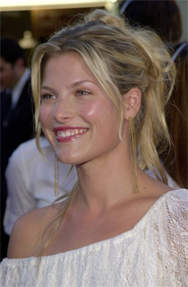
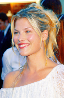
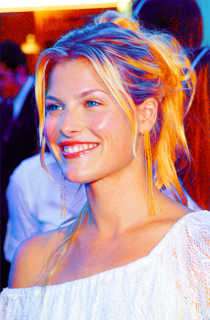
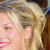
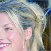
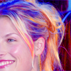
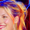
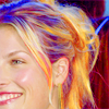
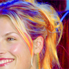
How to go from
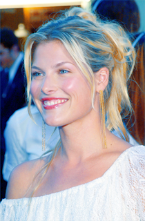
to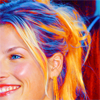
Ok, when I made this icon I was experimenting with the layers so it´s possible that some of these thousand of steps could be pointless, but I don´t know which ones, so I put all of them.
PHOTOSHOP VERSION
01.Take your base
02.Duplicate it and set to Screen

03.Add a new Hue/Saturation Layer. Up the Saturation to +30.
04.Make a new Selective Colour layer and adjust the settings;
REDS
-Cyan >> -14
-Magenta
-Yellow >> +14
-Black
YELLOWS
-Cyan >> -100
-Magenta
-Yellow >> +18
-Black
NEUTRALS
-Cyan >> +41
-Magenta >> -7
-Yellow >> -19
-Black
05. Make a new Selective Colour layer.
Adjust the settings;
REDS
-Cyan >> -100
-Magenta
-Yellow >> +72
-Black
YELLOWS
-Cyan >> -100
-Magenta
-Yellow >> +42
-Black
NEUTRALS
-Cyan >> +15
-Magenta >> +14
-Yellow >> -5
-Black
06.Make a New Layer. Fill it with #43A6F3 and set it to Soft Light (82%)
07.New Selective Colour Layer. Adjust the settings;
REDS
-Cyan >> -100
-Magenta
-Yellow >> +100
-Black
YELLOWS
-Cyan >> -100
-Magenta
-Yellow >> +100
-Black
NEUTRALS
-Cyan >> +17
-Magenta >> +29
-Yellow >> +17
-Black

08. New Hue/Saturation Layer. Up the saturation to +12.

09.Make a new layer and fill it with #EEE291. Set it to Soft Light (33%)
10.Duplicate that same layer and set it to Color Burn (7%)

11.Another Hue/Saturation layer. Up the saturation to +77, and leave it to Color (15%)

12.New Layer. Fill it with #FOBDF9. Set it to Color Burn (30%)
13.New Hue/Saturation Layer. Set the saturation to +42 and set the layer to Color (55%).
BUT erase the part of Ali´s body and face, in order to just bright the hair.

14.New Selective Color layer. Adjust the settings;
REDS
-Cyan >> -14
-Magenta
-Yellow >> +100
-Black
YELLOWS
-Cyan >> +2
-Magenta
-Yellow >> +31
-Black
NEUTRALS
-Cyan >> -48
-Magenta >> +32
-Yellow >> +16
-Black
Again, now you´ll have to ERASE the part of Ali´s body and face or it will be ugly.
15.One last Selective Colour layer to finish the look of the icon.
NEUTRALS
-Cyan
-Magenta >> -8
-Yellow >> +14
-Black >> +17
I always give you this advice. When you make so many Hue/Saturation layer, the picture looks too pixellated.
So, what do we do?
I merge all the layers. Duplicate that new base, select the Magic Wand Tool and select the pixellated parts.
Then, I go to Filter > Blur > Smart Blur
Radius:3.0
Treshold:25.0
Plase, don´t follow this tutorial exactly. I don´t even know if this will work with every picture. Probably it won´t. It worked with this picture for some reason, but if I were you, I´d experiment with the caps, the layers and the oppacities.
That aaaalways works ;)
One last thing.
If any of you prefer the Paint Shop Pro version, I was experimenting too and I could achieve a similar colouring so, just tell me, and I can write the PSP version too ^^
EDIT: PSP Version added ^^
PAINT SHOP PRO VERSION
01.Take your base
02.Duplicate it and set to Screen
03.New Hue/Saturation Layer. Up the saturation to +30
04.New Layer. Fill it with #3F8EF7. Set to Soft Light (82%)
05.New Layer. Fill it with #EEE291. Set to Soft Light (30%)
06.New Layer. Fill it with #FOBDF9. Set it to Color Burn (100%)
07.New Hue/Saturation Layer. Up the saturation to +68, BUT erase the part of Ali´s face.
Ugly, I know. We´ll fix it ;)
08.New Layer. Fill it with #EEE291. Set it to color Burn (20%).
Duplicate this layer 3 times, all of them at 20 % (4 layers total).

09.New Layer. Fill it with #FOBDF9. Set it to Soft Light (10%)
10.New Layer. Fill it with #EEE291 (yes, again..) and set it to Soft Light (10%)

11.New Layer. Fill it with #43A6F3 and set it to Soft Light (12%)

12.New Layer. Fill it with #FCFCFA and set it to Soft Light (10%)
13.New Layer (this is one of the latest, I promise =P). Fill it with #F7ECC7 and set it to Soft Light
14.Duplicate that layer and set it to Color Burn (40%)
15. One last layer. Fill it with #43A6F3 and set it to Color Burn (12%)
16.New Hue/Saturation Layer. Up the saturation to +16.

17.New Brightness/Contrast layer.
-Brightness: -3
-Contrast: +3
And it´s done!
---------
-Feel free to friend this community to keep up with the updates
-Do you want to be an affiliate? Click here
And a special thanks to sunflower_daze_.
She is the most sweetest person alive for lend me her Photobucket account.
And remember, HOTLINKING = BAD
One last thing. I´m still making the requests, I´m just waiting for the people who saved a spot so I guess I post another icon batch before I finished all of the requests.
And now, a tutorial.
myst56 ask me for a tutorial for a Heroes icon. I made it but I can´t find it... *headdesk*
So, meanwhile (I´ll post that tutorial, I promise), here´s a tutorial for an icon that I made yesterday and I´ll post in the next batch.
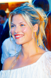
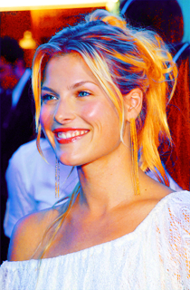
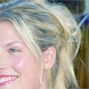
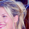
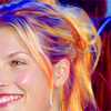
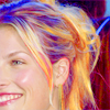
How to go from
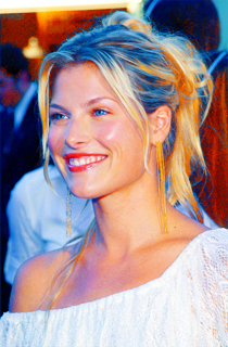
to
Ok, when I made this icon I was experimenting with the layers so it´s possible that some of these thousand of steps could be pointless, but I don´t know which ones, so I put all of them.
PHOTOSHOP VERSION
01.Take your base
02.Duplicate it and set to Screen
03.Add a new Hue/Saturation Layer. Up the Saturation to +30.
04.Make a new Selective Colour layer and adjust the settings;
REDS
-Cyan >> -14
-Magenta
-Yellow >> +14
-Black
YELLOWS
-Cyan >> -100
-Magenta
-Yellow >> +18
-Black
NEUTRALS
-Cyan >> +41
-Magenta >> -7
-Yellow >> -19
-Black
05. Make a new Selective Colour layer.
Adjust the settings;
REDS
-Cyan >> -100
-Magenta
-Yellow >> +72
-Black
YELLOWS
-Cyan >> -100
-Magenta
-Yellow >> +42
-Black
NEUTRALS
-Cyan >> +15
-Magenta >> +14
-Yellow >> -5
-Black
06.Make a New Layer. Fill it with #43A6F3 and set it to Soft Light (82%)
07.New Selective Colour Layer. Adjust the settings;
REDS
-Cyan >> -100
-Magenta
-Yellow >> +100
-Black
YELLOWS
-Cyan >> -100
-Magenta
-Yellow >> +100
-Black
NEUTRALS
-Cyan >> +17
-Magenta >> +29
-Yellow >> +17
-Black
08. New Hue/Saturation Layer. Up the saturation to +12.
09.Make a new layer and fill it with #EEE291. Set it to Soft Light (33%)
10.Duplicate that same layer and set it to Color Burn (7%)
11.Another Hue/Saturation layer. Up the saturation to +77, and leave it to Color (15%)
12.New Layer. Fill it with #FOBDF9. Set it to Color Burn (30%)
13.New Hue/Saturation Layer. Set the saturation to +42 and set the layer to Color (55%).
BUT erase the part of Ali´s body and face, in order to just bright the hair.
14.New Selective Color layer. Adjust the settings;
REDS
-Cyan >> -14
-Magenta
-Yellow >> +100
-Black
YELLOWS
-Cyan >> +2
-Magenta
-Yellow >> +31
-Black
NEUTRALS
-Cyan >> -48
-Magenta >> +32
-Yellow >> +16
-Black
Again, now you´ll have to ERASE the part of Ali´s body and face or it will be ugly.
15.One last Selective Colour layer to finish the look of the icon.
NEUTRALS
-Cyan
-Magenta >> -8
-Yellow >> +14
-Black >> +17
I always give you this advice. When you make so many Hue/Saturation layer, the picture looks too pixellated.
So, what do we do?
I merge all the layers. Duplicate that new base, select the Magic Wand Tool and select the pixellated parts.
Then, I go to Filter > Blur > Smart Blur
Radius:3.0
Treshold:25.0
Plase, don´t follow this tutorial exactly. I don´t even know if this will work with every picture. Probably it won´t. It worked with this picture for some reason, but if I were you, I´d experiment with the caps, the layers and the oppacities.
That aaaalways works ;)
One last thing.
If any of you prefer the Paint Shop Pro version, I was experimenting too and I could achieve a similar colouring so, just tell me, and I can write the PSP version too ^^
EDIT: PSP Version added ^^
PAINT SHOP PRO VERSION
01.Take your base
02.Duplicate it and set to Screen
03.New Hue/Saturation Layer. Up the saturation to +30
04.New Layer. Fill it with #3F8EF7. Set to Soft Light (82%)
05.New Layer. Fill it with #EEE291. Set to Soft Light (30%)
06.New Layer. Fill it with #FOBDF9. Set it to Color Burn (100%)
07.New Hue/Saturation Layer. Up the saturation to +68, BUT erase the part of Ali´s face.
Ugly, I know. We´ll fix it ;)
08.New Layer. Fill it with #EEE291. Set it to color Burn (20%).
Duplicate this layer 3 times, all of them at 20 % (4 layers total).
09.New Layer. Fill it with #FOBDF9. Set it to Soft Light (10%)
10.New Layer. Fill it with #EEE291 (yes, again..) and set it to Soft Light (10%)
11.New Layer. Fill it with #43A6F3 and set it to Soft Light (12%)
12.New Layer. Fill it with #FCFCFA and set it to Soft Light (10%)
13.New Layer (this is one of the latest, I promise =P). Fill it with #F7ECC7 and set it to Soft Light
14.Duplicate that layer and set it to Color Burn (40%)
15. One last layer. Fill it with #43A6F3 and set it to Color Burn (12%)
16.New Hue/Saturation Layer. Up the saturation to +16.
17.New Brightness/Contrast layer.
-Brightness: -3
-Contrast: +3
And it´s done!
---------
-Feel free to friend this community to keep up with the updates
-Do you want to be an affiliate? Click here