Colouring Tutorial
How to achieve a colouring like this;


.
Ok, some people asked me how I achieve the colouring of some of my icons, so I decided to make a tutorial with the steps basics that I follow to achieve that type of colouring.
It´s important to know that each picture is different, and I never follow the same steps in all my icons. Be creative, add new layers, play with the oppacities…just go crazy ;)
So, since I never use the same technique for all my icons, this is not exactly a full icon tutorial but a kind of guide on how to make a colouring like this
or this
.
Then, we begin.
01.Take your base.

02.Probably you´ll have to add some Screen layers to the base, it depends on how dark your picture is, but I always add at least 1 Screen layer.
In this case, I duplicate my base twice. Leave the top layer at 100% oppacitie, but low the layer in the middle´s oppacitie to 48%.

03.Now, add a new Curves layer between both layers, and adjust the settings:
RGB:
-Input: 106
-Output: 150
Red:
-Input: 115
-Output: 137
Green:
-Input: 114
-Output: 130
Blue
-Input: 82
-Output: 142
Set it to Soft Light.

04. I added a new Selective Color Layer at the top of all my layers. And adjusted this settings:
Neutrals:
-Cyan: +46
-Yellow: -21
Yellows:
-Cyan: +29
-Yellow: -19
Reds:
-Cyan: -100
-Yellow: +100
This Selective Color Layer is useful to reduce a little the yellow in the picture.
However, I wanted an icon with more cyan, so I duplicate that Selective Color Layer and set it to 40%

05. But I wasn´t satisfied yet, so I decided to add a New Color Balance Layer and enhanced the blue because I wanted it to be the central color of the icon.
You can leave your icon with that color, indeed.
If you´re not interested in a blueish color you can always add a new Color balance layer enhancing another color. As I said, be creative. There´s the key ;)
Here are my settings:
Midtones:
-Cyan-Red: -34
-Magenta-Green: -21
Shadows:
-Cyan-Red: -31
-Magenta-Green: -19
-Yellow-Blue: -11
Set this layer to Color

09. New Selective Color Layer. Adjust the settings:
Neutrals:
-Black : +20
With this layer, I darkened the parts that should be darker. If you want your picture with that parts darkener, you can duplicate this same layer and play with the oppacities. I duplicate mine and set it to 40-60%

10. Now, Doctor Who has very bright colors so it´s not necessary to up the saturation too much. But I found Rose´s face too grey so I added a new Hue/saturation Layer and set the Saturation to +10.
Set this layer to Color.

A little advice; Be careful at time to up the saturation because it can ruin the look of the icon, so you can erase the parts of the icon that are oversaturated.
11. Merge all the layers.
Now your base is almost done, but sometimes I duplicate the new base and blur it, in oder to make the look of the icon soft.

If you´re not satisfied with your results, just low the oppacity of the duplicate layer as needed.
Please, trust me…all your results depends on your picture and, of course, your likes.
Don´t copy exactly the tutorials that other people make because the icon-makers are characterized by their own style and every single icon is different.
For example, this Pride and Prejudice icon mabe by myself has a similar color to previous, but I made something rather different.
01.First, I just duplicate the base once, and set the duplicate base to Screen.
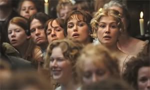
>>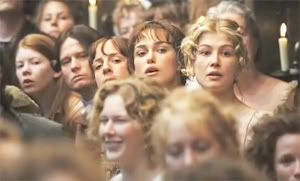
02. Then, between both layers, I added the Curves Layer from the previous icon (step 03) and set it to Soft Ligh, but low the oppacity to 37%.
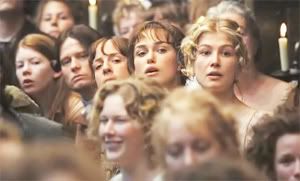
03. Then I added a new Color Selective layer as I did in the previous icon but with the settings:
Neutrals:
-Cyan: -31
-Yellow: -20
Yellows:
-Cyan: -30
-Yellow: -17
Reds:
-Cyan: -100
-Yellow: +100
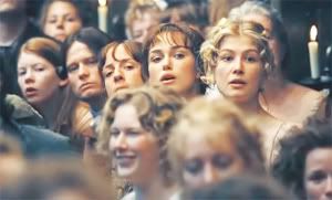
04. Now is when you have to decide the general look you want for your icon. You can achieve the color you want with Levels, Color Balance, Curves or even Selective Color.
I wanted more blue and red in it, so I had to add a couple of Color Balance layers enhancing red and blue, but you know, be creative and experiment with new colors and new layers because this tutorial is just a guide ;)
Color Balance layer 01:
-Midtones:
-Cyan-Red: +46
-Magenta-Green: +30
-Yellow-Blue: +38
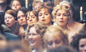
Color Balance layer 02:
Midtones
-Cyan-Red: -27
-Magenta-Green: 0
-Yellow-Blue: +20
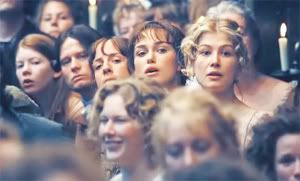
05. Now you can add a Hue/saturation Layer, but be careful again and try not to oversaturate the icon.
Pride and Prejudice´s caps have a soft color that I love so I don´t want to runied the look with very brights and strongs colors.
I add a new Hue/saturation layer and set the saturation to +27. Then I set that layer to Color.

Probably you want to low the opacity of this last layer a little, or even maybe duplicate it!. You can, it´s your icon! Don´t copy this tutorial exactly and you dare to do something that anyone had did before.
Be crazy, and you know, just do it ;)
Others icons using this same technique;


---------
-Feel free to friend this journal
-Do you want to be an affiliate? Click here
.
Ok, some people asked me how I achieve the colouring of some of my icons, so I decided to make a tutorial with the steps basics that I follow to achieve that type of colouring.
It´s important to know that each picture is different, and I never follow the same steps in all my icons. Be creative, add new layers, play with the oppacities…just go crazy ;)
So, since I never use the same technique for all my icons, this is not exactly a full icon tutorial but a kind of guide on how to make a colouring like this
or this
.
Then, we begin.
01.Take your base.

02.Probably you´ll have to add some Screen layers to the base, it depends on how dark your picture is, but I always add at least 1 Screen layer.
In this case, I duplicate my base twice. Leave the top layer at 100% oppacitie, but low the layer in the middle´s oppacitie to 48%.

03.Now, add a new Curves layer between both layers, and adjust the settings:
RGB:
-Input: 106
-Output: 150
Red:
-Input: 115
-Output: 137
Green:
-Input: 114
-Output: 130
Blue
-Input: 82
-Output: 142
Set it to Soft Light.

04. I added a new Selective Color Layer at the top of all my layers. And adjusted this settings:
Neutrals:
-Cyan: +46
-Yellow: -21
Yellows:
-Cyan: +29
-Yellow: -19
Reds:
-Cyan: -100
-Yellow: +100
This Selective Color Layer is useful to reduce a little the yellow in the picture.
However, I wanted an icon with more cyan, so I duplicate that Selective Color Layer and set it to 40%

05. But I wasn´t satisfied yet, so I decided to add a New Color Balance Layer and enhanced the blue because I wanted it to be the central color of the icon.
You can leave your icon with that color, indeed.
If you´re not interested in a blueish color you can always add a new Color balance layer enhancing another color. As I said, be creative. There´s the key ;)
Here are my settings:
Midtones:
-Cyan-Red: -34
-Magenta-Green: -21
Shadows:
-Cyan-Red: -31
-Magenta-Green: -19
-Yellow-Blue: -11
Set this layer to Color

09. New Selective Color Layer. Adjust the settings:
Neutrals:
-Black : +20
With this layer, I darkened the parts that should be darker. If you want your picture with that parts darkener, you can duplicate this same layer and play with the oppacities. I duplicate mine and set it to 40-60%

10. Now, Doctor Who has very bright colors so it´s not necessary to up the saturation too much. But I found Rose´s face too grey so I added a new Hue/saturation Layer and set the Saturation to +10.
Set this layer to Color.

A little advice; Be careful at time to up the saturation because it can ruin the look of the icon, so you can erase the parts of the icon that are oversaturated.
11. Merge all the layers.
Now your base is almost done, but sometimes I duplicate the new base and blur it, in oder to make the look of the icon soft.

If you´re not satisfied with your results, just low the oppacity of the duplicate layer as needed.
Please, trust me…all your results depends on your picture and, of course, your likes.
Don´t copy exactly the tutorials that other people make because the icon-makers are characterized by their own style and every single icon is different.
For example, this Pride and Prejudice icon mabe by myself has a similar color to previous, but I made something rather different.
01.First, I just duplicate the base once, and set the duplicate base to Screen.

>>

02. Then, between both layers, I added the Curves Layer from the previous icon (step 03) and set it to Soft Ligh, but low the oppacity to 37%.

03. Then I added a new Color Selective layer as I did in the previous icon but with the settings:
Neutrals:
-Cyan: -31
-Yellow: -20
Yellows:
-Cyan: -30
-Yellow: -17
Reds:
-Cyan: -100
-Yellow: +100

04. Now is when you have to decide the general look you want for your icon. You can achieve the color you want with Levels, Color Balance, Curves or even Selective Color.
I wanted more blue and red in it, so I had to add a couple of Color Balance layers enhancing red and blue, but you know, be creative and experiment with new colors and new layers because this tutorial is just a guide ;)
Color Balance layer 01:
-Midtones:
-Cyan-Red: +46
-Magenta-Green: +30
-Yellow-Blue: +38

Color Balance layer 02:
Midtones
-Cyan-Red: -27
-Magenta-Green: 0
-Yellow-Blue: +20

05. Now you can add a Hue/saturation Layer, but be careful again and try not to oversaturate the icon.
Pride and Prejudice´s caps have a soft color that I love so I don´t want to runied the look with very brights and strongs colors.
I add a new Hue/saturation layer and set the saturation to +27. Then I set that layer to Color.

Probably you want to low the opacity of this last layer a little, or even maybe duplicate it!. You can, it´s your icon! Don´t copy this tutorial exactly and you dare to do something that anyone had did before.
Be crazy, and you know, just do it ;)
Others icons using this same technique;


---------
-Feel free to friend this journal
-Do you want to be an affiliate? Click here