MAGICMAKERS INTERVIEW (PART I)
the makers at magicmachine decided to conduct an interview amongst ourselves!
we collected questions we hoped our watchers and fellow icon-makers would find interesting, a possible help and inspiration. this is the first part of three (I think. I even had to split the first part, because lj said the post was too big), with the answers of almost all our makers!
THE PARTICIPANTS

darlingbones ohgollygeedamn hopeitallaway fouroux delorentoes
bussbuss realproof justmyb0nes eamesie spud66cat
mm3butterfly shrimpy_19 raiindust blue_emotion rahelcs
please consider that not all of us are native english speakers!
HOW DID YOU GET INTO ICON-MAKING?
I don't even remember. I'm pretty sure it was bandom and it was when My Chemical Romance came out and I fell in love with Frank Iero's face. Then I went away and Twilight brought me back. I have such lame gateway drugs!
One of my friends really wanted an icon of particular people in a particular way and I was keen to help her out. Never mind I had never opened Photoshop before! She actually liked what I made (or pretty convincingly lied about liking it haha) and that gave me the confidence and interest to keep experimenting in ps.
it was at a forum, if i remember right and there was this art/graphics section, and i liked it a lot, so i decided to throw myself in. out of pure curiosity. after a while, i felt there should be something more to do. this was the time when i discovered livejournal. and i will never miss this experience. i've met one of the best people, someone ever could ask for. and it's because icon-making and livejournal.
I can't really remember, to be honest. I started out making wallpapers (a skill I seem to have lost almost entirely) at designer/graphics forums. that must be 7-8 years ago now. I looked at the wallpapers of the more experienced members, tried to do my own thing, posted them and got good concrit on what I could improve and what worked well. I learned fairly quickly, but must've lost interest at some point. discovering LJ must have introduced me to icon-making.
My friend Jordana was getting into it and it was just before we were about to start our GCSE exams. I downloaded the trial version of CS3 and played about with, trying to achieve that en vogue selective colour look of cyan and orange. I left briefly when the trial ran out and I had my exams but during the summer, I used dodgy photo editing software that I got with my camera and kept on trying. I’d like to think I have improved :-)
Well... long story short my discovery of Doctor Who and my voracious thirst for 10/Rose fic led me to livejournal and then I started seeing icon posts and I was like ???? I could do that! (But I really couldn't cause my first icons were HORRIBLE) And then I just kept discovering more and more comms and more and more makers and I fell in lurv.
I did other fanart (mostly wallpapers) and 'collages' first. I started back in 2003 (yes, I've been doing this over 8 years now...), when I found other shiny websites, thought that was awesome and made some reaaaally silly stuff with the Gimp. First art-fandom was Alias btw. I wish I could show you the first wallpaper I was proud of. It was magnificent, all rosé and with Syd and Vaughn on it and badly applied border-brushes.
Then a friend gave me PS7 and off I went. :D I even had a website (after lots of Geocities), elusiveperversion.com (I bet I had some disappointed visitors XD), and a new layout for it every two weeks or so (I actually was into webdesign, then... have let that side of me slide a bit). Ah good old days. Back then every other website had a blend/collage challenge and I entered lots. (And even had my own.) SUCH FUN.
Some of those makers even made it to LJ, which by that point had finally stopped using invites.
Uh, I even had a fanlisting called Grunge Princess [mostly filled with my online friends, but that’s how you we rolled], cause I was really into overusing grungy textures and brushes back then... .I still occasionally do that, but since last year (well, maybe two years ago) I'm trying to do more clean icons.
Anyways, then in 2004 people went to LJ and I checked it out and people talked about icons and I thought, OMG WHY WOULD YOU DO THINGS ON 100X100PIXELS WHEN YOU CAN HAVE SO MUCH MORE ROOM ON WALLPAPERS. But of course, sheep-y me, had to at least try. I still made wallpapers (back then Lost just started and I made a lot of stuff for that, for instance, also Veronica Mars S1), but icons as well... bad ones. I was trying to do teh_indy-esc things, cause she was a goddess back then. It was bad, obviously I didn't feel that way... well, you never do. XD
And then at some point, I stopped with the wallpapers and focused solely on icons and now I have no idea how I ever made so many wallpapers.
I was a member of a forum at this time and a friend I had there introduced me to Photoshop.
Out of necessity. I was in the JRock fandom and back in 2004 there were only very few icons for my fannish corner, so I tried to make them myself.
Basically, I got into icon making because I wanted to give something back to the fandoms that I had been lurking in for so long, particularly Battlestar Galactica the adama_roslin community. I had been lurking in that community for a long time and everyone seemed so nice, I wanted to participate and contribute in some way, but I just don't have the patience to write fanfiction, so I decided to try my hand at making icons. After awhile, I started to branch out into other fandoms outside BSG, and now I have more fandoms than I have time to icon. Somewhere along the way, icon making became less about giving back to the fandom community and more of a creative outlet.
I'd say that it was because I wanted icons from specific scenes or caps on tv shows and couldn't find any to my taste or wanted to make them the way I wanted them. But one way or another, it's such a huge part of fandom on LJ, I couldn't NOT get into it.
When I first got onto livejournal I started seeing all the different things floating around and icons and graphics caught my attention. I was only really into one fandom at the time, Criminal Minds, so I started to look at tutorials and messing around on Photoshop. Once I started joining landcomms I gradually started improving and now I love making icons, no matter what fandom!
I believe I began by making banners for a Degrassi forum. Somehow I must have stumbled upon the art of icons (this time I believe in a Home & Away forum) and I've been a goner ever since. It seriously is the most amazing kind of bad habit to have.
I started about 7 years ago when I developed health problems and had to give up my more physical hobbies. I had a copy of photoshop I’d never used - so I installed it and started to play and the rest is, as they say, history!
oh lord, it was so long ago, i hardly even remember. so i'm not entirely sure but i think it was seeing the icons on forums and i definitely uploaded some to deviantart.
HOW DO YOU GO ABOUT CREATING AN ICON, WHAT COMES FIRST (COLOURING/CROPPING/SOMETHING ELSE?) AND WHY DO YOU FOLLOW THIS PROCESS?
I pretty much always crop down to 100x100 first. I've tried working on bigger bases (300x300 or 200x200) but I find when I resize I'm always a little disappointed by the transition or the loss of features I'd been working on. I tend then to lighten my cap and work towards up the colour to give a feel for what way I should go with the image.
Hmm, well capping first. Then I resize a little, crop and remove any logos, or empty space, do any blending I am planning and fix any other glaring flaws. This way I can resize and am ready to go!
croping → sharpening → lightning (set to screen and/or using curves) → depth (setting to soft light, playing with opacity) → vibrance (layer) - more coloring (color-balance) → getting colors in the direction i want (selective coloring) → some more vibrance (layer) → sometimes blur tool (with set to soft light) → textures / text / light blobs → merging layers down → sharpening(setting the opcity down) → brightness / contrast (layer)
usually i don't really think about why i follow this process. it works for me and that's what counts.
jsyk I work with PS CS5!
I usually open a new canvas at 100x100px, then I open the screencap I want to work with. I always try to get the contrast of the cap right first. I usually do that with soft light and screen layers and some curves after that. once that is done I try to figure out a colouring for the screencap, and finally I drag the whole (merged) thing onto my 100x100px canvas and push it around/resize it in there XD (ikik very professional). then come the textures and gradients and filters and whatnot. I often only sharpen my base, then merge it all down to one layer.
I choose my cap, trim it so no letter boxing shows then open a 200x200 canvas, duplicate the cap onto it and move it about until I can find a good crop.
I always color my caps first. I didn't use to, but I find this it is much easier to control my image quality if I start on a large canvas. Also, if I can't get a good coloring out of a large image I rarely continue on to the cropping process.
Cropping comes first, always dependant on the picture, of course. Then I try to figure out what colouring works for this picture/if it needs sth. else added.
Why? Because I need to see what it looks like in a square first. Occasionally I’ll do some minor cleaning of the cap first to see if it’s worth working with at all, but else it’s a square (usually 400x400, which can easily be zoomed out to 25%) and then I go off and do stuff and hope for the best. I will scrap a lot of icons, though. Or at least never upload them. The mass of fug in my icon folders, is truly astonishing.
I always begin with the cropping because the coloring can change according to what you are working on on the cap.
I always crop first, then color the icon. If it’s a more complicated icon like blocking or removing backgrounds, that step comes between cropping and coloring. I always do it like this because I absolutely loathe cropping. This way I don’t waste loads of time on coloring, only to discard the icon later because I fail at the cropping part.
I usually crop and resize to 100 x 100 before I do anything else so I can see now any subsequent adjustments will effect the quality of the image in the 100 x 100 size. The basic process I follow after cropping is to duplicate the image and set it to screen, adjust the contrast, then adjust the color, and then add textures. Of course, I make slight deviations from this depending on the particular images. I add the screen layer to lighten dark images, but sometimes the image is bright enough, so I lower the opacity of it, or delete it entirely. Sometimes, I use levels to adjust the contrast, but other times, duplicating the layer, setting it to soft light, and lowering the opacity a bit is a quick and effective way to add contrast and brighten the colors of an image.
RANDOMLY. And I am not even joking. Sometimes I follow the "usual" steps, because I'm really boring. They go this way: Cropping, cutting out the background if I want a negative space icon (bigger images when you erase the bg turn out more refined edges), and resizing to 200x200 (or 300x300, depending on how "detailed" the image is). Then, brightening the image with a copy of the image set to screen, or a very light yellow/blue/pink soft light layer, then infusing contrast either with a copy of the bg set to soft Light or with the Levels tool. There goes the prepping, now you color at will :)
But I frequently subvert this order, adding other steps or coloring before brightening, or coloring before resizing/cropping. Depends on what the image asks for. Or (most times) on my mood.
I generally do cropping first. I just find it easier to experiment with all the ways to crop and compose the icon (close, negative space etc.) and get all that out of the way before I do the colouring. It also gives you a sense of what type of mood you are looking at depending on the crop, which means you can colour it in whatever way will work best. I also like to spend a lot of time just looking at the different types of crops I could make before I colour as it often provides me with inspiration for my colouring and textures.
Generally, I tend to colour the image first, and then crop. I'm not all that confident with cropping, and sometimes you can find some amazing colours in an image that may have been cropped away if I did that first. If I colour first, there‘s also room to see where the best possible crop could be, consider interesting parts of the icon that can be used in different ways, or consider really if the colour will work as a medium crop, close crop or whether I'd like to use negative space. I also have a tendency these days to work textures into the original image before cropping as well - so cropping actually becomes one of the last things I do before I finish an icon.
I generally start by resizing a cap to 500 pixels in width, and then I clean it up a bit and start to colour. I do the majority of my colouring whilst the image is this size. Then I try out different cropping with the image, and see what works best.
cropping's first, definitely. then it's usually resizing, and then coloring and textures. if it's a more complex icon, i still crop it first, but i color it, arrange the multiple pictures and add textures before i resize it. and then i maybe edit the colors.
WHAT ABOUT A CAP APPEALS TO YOUR ICON-MAKING SENSES?
I think a focus on light or emotion are big draw cards. You don't often see happy icons! It‘s about downcast glances and longing for me haha. If a cap already has great colouring or is really light I tend to shy away from them cause I find them harder to work with. Also - the higher quality the cap, the better. I don't let watermarks/logo's deter me, they are easily removed (and should be!)
I usually cap a scene or pick an image because I can see a potential crop that I think will be interesting, the potential to expand negative space or it has a good base for experimenting with colouring. Also, I have a thing for caps where people are looking down or hair is being swished around!
it's depending on what i want to focus on. but mostly it just has to "speak" to me. it has to be interesting. i spend a lot of time on an icon, sometimes hours. mainly because i spend quite a long time browsing galleries or downloading folders to find hq caps. if it's not hq, i don't even think about to use it. it's consumes a lot of time, before the actual icon-making can take place.
sometimes while i'm watching a show and see something that inspires/moves me, i make a note (because i forget about this kind of stuff easily.) and when i open photoshop, i have a accurate idea of what i want to do. that is helping a lot. sadly most of the time i can't watch a movie or show without thinking about it. but that's another story.
I'm unbelievably picky about caps. I don't want to know how many good icons I've not made due to me ignoring certain types of caps.
I suppose first of all an idea needs to pop into my head when I look at a cap. if I have no response to it whatsoever, the outcome will most likely look rather dull and uninteresting. I often look for well-known/important scenes or interesting facial expressions, too. I also find outdoor scenes in a cap better to work with than indoor ones, and I often prefer if the character's head is on the cap entirely. not cut off at the top, so I have enough room to work with the subject in my icon.
of course the caps need to be of good quality, that's a given. I have the hardest time making mushy/blurry or small caps look good. /fail
First of all, I make sure it’s good quality. Great colour is always a good thing as well. I mostly use my own caps (I prefer it that way) so I just go through my files and wait until a cap jumps out at me.
I usually look for caps that already have a good sense of shadow and light. I talked a lot about cropping and a little about cap choice in a tutorial I just wrote up here.
Uhm, I do like me my negative space icons. If you've ever seen a post by me in the past two years, you know this. So if that's easily done, the cap usually has me.
Else, I like interesting poses/perspectives. And, as I am a very shallow iconmaker (and aren’t most of us), it just has to be beautiful. Sometimes caps that look absolutely amazing, will be the hardest to work with, though, but that should never stop anyone from at least trying.
The cap has to express an emotion or have a particular meaning for the character or the show/movie it‘s coming from. Or (sometimes and) it has to be pretty. For example a gorgeous crop or a high contrast (I love shadows/lights), or simply a great cinematography.
Far shots and lots of negative space, because these are the main elements of my iconing style. Everything else, like colors and light I can add later. I also need them to be HQ, because my way of coloring involves loads of adjustment layers, which tend to make the image grainy.
I don’t believe in altering a cap completely, I’d rather work with what I have. Partly because I’m lazy and impatient, partly because most of the time you can tell.
I'm usually drawn to caps with bright colors. Ironically, some of my fandoms have rather dark caps most of the time. I also have a thing for centered crops and negative space, so I find I'm also drawn to caps that have a lot of negative space, of the potential to smudge or extend the background to create a lot of negative space.
Closeness. Crispness. Lips. Lashes. Hair porn. Touching. Soft focus. Negative space (sky, walls, etc). Pretty colors. Interesting light/shadows.
Image quality, subject and colours. If the cap is low quality then I’m not very interested in making an icon out of it as I won’t be able to get a result that I’m really happy with out of it like I would if it was a HQ image. I also look for interesting crops that I could get out of the cap. For example, I’ll try to find caps which have lots of hair, closes ups or are quite obscure because I’m trying to be more creative with my cropping at the moment. I also think that caps with lots of colour in them can be easier to work with (especially because I like vibrant icons!) and it can be easier to have more natural vibrant colours in your icon.
I generally find myself drawn to the facial expressions and emotions of screencaps. If someone is pulling an amazing face as Stiles tends to do on Teen Wolf, I'm more inclined to consider that as a worthy cap rather than a blank expression. I'm also a huge fan of movement in caps as well. Anything from the musical numbers in Glee or the action sequences in Sucker Punch or Legend of the Seeker get me excited. And there's also characters I'm drawn to more than others. Quinn Fabray or Amy Pond are more likely to be iconed just because they are so stunning (and have awesome hair).
I like caps that have lots of colours in them, even if they’re a bit hidden (this is why I love Doctor Who caps!) and caps that capture a sense of emotion.
large negative spaces, if the cap in itself is expressive and or gorgeous. be it because of colors, compositions, scenery, etc.
HOW DO YOU CROP A CAP?
I open a 100x100 empty image, paste the cap in and hit Ctrl+T, then holding the Shift button I resize and move it about it get it to where I want.
I generally adhere to a mix of the rule of thirds, centre crops and whatever else happens to work!
the cap is important. if i want to focus on close crops, it has to be big enough to try different angles. if i am looking for negative space, i mostly look for full visible body parts (e.g. head). there are two options on how i crop.
o1. (especially for close crops) i create my base of 100x100 px and use the transform tool to resize it. after that i play around with the cap until i am satisfied with the result. sometimes when i think a crop looks good, i keep it and copy the layer, to try different ones. just to be sure to have the first result saved. i am paranoid like that.
o2. (for neg. space) negative space often comes with extended or removed background, so that's what i do first. when i remove backgrounds, i usually work with the original-sized image, because it's a lot easier to do and imperfections aren't visible anymore, once you've resized it.
as stated in the answer above, I move the cap around a 100x100px canvas and resize it in there.
Like I said before, I place the cap in the 200x200 canvas and move it about.
click.
(It's quite long and there are pictures.)
I stare at the cap for an hour and hope something happens. No seriously, I look, decide if I want to close-up on an area or use most of the cap/do neg.space-y stuff and then make a selection and move that around until I feel it works.
I also try to go by the rule of thirds most of the time, even when I centralize my subjects. So I use a lot of guides to divide the image up. If I do close crops I often just have a guide go through the middle of someone‘s eye, measure to sth. else, and then go on and make that a third, or occasionally also a half. And that way I have my measurements. Negative space works similarly, but I usually go more by the top of people’s heads, or their shoulder-width.
I resize it around 150px if I want a close crop or around 70px if I want negative space and play around with it in a 100*100 base. If it doesn't work, I resize again and play with it again on my base.
I set the crop tool to 100x100 and crop it. Like I said, it’s my least favorite part of icon making.
Basically, I just past my screencap onto a 100 x 100 canvas and use the Free Transform tool, making sure that "Constrain Proportions" is selected so as not to mess up the aspect ratio. That way, I can move the image around manually to experiment and see how different crops will look. Sometimes, if I'm torn between different cropping options, like a close versus more zoomed out crop, I'll try a close crop first, then duplicate the image and do another free transform to get a more zoomed out crop. I might only do that once, or repeat it a couple times depending on the image. Then I'll toggle between the layers with different crops to compare and decide which I like best.
Using the crop tool. Create a copy of the background layer, letting you free to move it around. Select a square around the vague thing you want to focus on, being sure the "Hide" option and not "Delete" is selected on the Options toolbar. Move the square around until you're satisfied with the crop. I like to crop as close or as far as possible.
I’m a guess and check type of person. I open up the cap and try to think of different ways that I could use the cap. I’ll go into image >> image size and adjust the height to various sizes and place each of the different sized caps in a 100x100 canvas and move them around. I spend a while choosing which one or two I like the best and then proceed to colour. I’ve never done it differently and it’s just a habit now and I don’t know if many other people do it that way.
Beyond the process mentioned previously above, I look at the image and try to see where I want the focus to be. Is there an expression on the characters face that I want to really focus on, or is there something in the overall body language of the character that I want to highlight? It can even be as trivial as focusing on the prettiest part of the colours I've put into the icon, or working in a texture to highlight that as well as the character.
I copy merge my larger image, then resize it and move it around my 100x100 canvas. If I can’t find a crop that satisfies me then I resize my larger image again…and so forth. Generally I go for mid crops as I like to have a bit of background framing my subject, but occasionally an image calls for a close crop, or a lot of negative space, and using this method gives me the chance to resize and play about until I decide which I prefer.
i either go for a pretty composition or highlighting something.
WHICH ARE YOUR TOP 3 TOOLS TO USE IN YOUR GRAPHICS PROGRAMME AND WHAT TIPS/TRICKS COULD YOU TELL US ABOUT THEM?
Vibrance - My main tip to share would be don't be afraid to MASK away overly vibrant patches, often the background can become over vibrant in pixels. Or alternatively, stamp a new layer (ctrl+shift+alt+e) and then use the blur/smudge tool to soften over vibrant places then lower that layers opacity.
Layer Mask Cut Outs - When I create cut outs I always mask away the background, I find using a harder brush 60% + is more effective than a softer one at keeping edges tidier. Always check your brush is on #000000, I hate it when I realise it's a shade off of black :P
Curves - don't be afraid to use the AUTO setting, it's a great base to work off, I find if I adjust the curves after I've hit auto, it gives me a good sense of direction
I use ps elements 4 or 8 depending on my mood! Levels layers are probably my most important tool. If you have lots of them I think they are perfect for making miniscule adjustments along the way and then really polishing an icon at the end.
This is a hard question because I don’t actually use the tools as the main focus of making my icons. Most of the colouring and lighting is from textures and solid colour layers. Oh! I guess colour fill layers are a tool? I use so many of these because I don’t have selective colouring. So if an icon is too yellow for example I will make a pale blue softlight layer and then maybe a pink colour burn layer on a low opacity and then a very pale blue layer on multiply and so on slowly working my way up. Very useful and once you get the hang of what colour/layer counterbalances each problem it comes naturally.
So following from that the next most important tool for me is a soft edged erase brush (or alternatively a black soft brush for mask layers). Sometimes there is one part of an icon that is too dark, too blue or whatever so it is important I focus on what I am fixing and ignore the rest of the icon. Once happy I can go back and erase the unnecessary parts.
curves. vibrance. color-balance. (also often used: selective coloring, blur tool, layer masks)
→ curves
the auto button can be very useful or a totally failure. depends on the cap. but i really love to use it.
→ vibrance
you really can't do anything wrong with it. i mean of course you can overpower the cap very easily but you get a feeling when the settings are right. i never want to miss it again. it's a magic tool.
→ color-balance
what i like to do, is give the cap a basic coloring. once i am done with setting things up, i try to use different blending modes with depending opacity. this is more the kind of experimenting thing for me. i try a lot of things before i decide to keep it or not.
so hard to choose :C let me see...
colour balance - I've used this one so rarely before my recent "return" to icon-making, which is amazing, because I can't imagine not to use it anymore! it can change the entire picture's colour palette. especially if you wan't to go from warm to dark colours (or vice versa) it is so helpful. I think colour balance is why I'm on a green/yellow trip these days :D
layer masks - YOU ARE NOT WORKING WITH LAYER MASKS? START NOW. I'm using them so much it's ridiculous. when I started using these, I saw a whole new world of possibilities open up. they help wonders, if you want to erase backgrounds + you can go back any time and add whatever you erased earlier. but don't just use it for your screencaps or pictures, use it on textures/gradients, too!
gaussian blur/surface blur - I always use these two together and all the time, too, so for me this is really "one" tool. it gives your icon an amazingly soft touch (I'm sure many know this already - copy your base (or end result, whatever you prefer), use gaussian and/or surface blur and set the layer to soft light. play around with the opacity). very often I only use it on certain parts of my icon and keep others sharp. I like to think it gives my icon more depth.
other tools I love: vibrance, curves, sharpen (duh), the smudge tool and the layer options soft light, screen and hard light.
When I moved from PS Elements to CS3, I realised what a great took Curves is. It really does make a difference. My main tools in PS are Levels, Curves then Colo(u)r Balance. In my icon making process, after I have used screen and soft light layers, I use the levels to create a deeper contrast and the curves to make the lights lighter. I use the curves tool throughout when making an icon, to make sure the lighting is always looking good. I use colour balance to bring out the colours in the icon and this generally sways the overall colouring of the cap.
I use Photoshop, and my top three tools are the SMUDGE TOOL, the brush tool, and the soft light/gaussian blur layer.
smudge tool - I cannot live without the smudge tool. I use it on every icon. I use to smooth skin, make light blobs, extend backgrounds, on layer masks, to re-arrange backgrounds...etc. IT IS THE BEST. That being said it does take some practice to master.
brush tool - I also use this on every icon. This is the tool I use to erase backgrounds using layer masks. I also use it when I want to make a color really vibrant. If I want to make something more red for example but I don't necessarily want to use color balance or selective color I will create a new layer paint a blurb or bright red over where I want my brighter red to be and then set that layer to screen or soft light or hard light etc. VERY USEFUL.
soft light/gaussion blur layer - I probably do this too much, but it super handy for softening lines, adding contrast, and making things kind of glowy.
Curves - always go for the barely visible S/reverse N curve (at least on CS3, I think in another version they had the graphs exchanged, so it was an N curve...)
Masks - mask everything. I know most people are anyway, but I love them so. Hit ctrl+ a channel in the channel-palette (or the whole preview there; or ctrl+~, but for some reason that doesn't work for me) and you select just the highlights... use that to create masks, especially for your Curve-layers, it'll do wonders.
Photo-Filters... It is cheating, I know. But it’s just a way to quickly scroll through different colourings of your icon, and it’s nice that way. You can get the same results just with Colour-Balance adjustments, or colour-overlays, but that takes much longer. And I’d still not use it at 25% all the time, but vary that, and maybe even just see it as a tip and for a colouring choices, and not use it at all, but create a similar colouring with other tools.
also: Brushes - see minor rant, below
I use Photoshop CS5
- Brightness/contrast: I use this tool instead of the screen option or auto-color to brighten a cap. In my opinion, auto-color brighten a way too much and ruin pics. And for the screen layer, it makes the caps too grainy. You have more control with brightness/contrast. I love contrasted icons so it is probably why I prefer this one. You should be careful in not making it too bright or too contrasted. You should find the right balance. The best way is to increase brightness a bit then the contrasts and then see if it isn't too bright when higher contrast and so on. Play with both settings together.
- Vibrance: This one is awesome to make the colors "vibrant". It is the second tool I use on my icons. You have to be careful though. It is bad on bad quality caps (but perfect for blu-ray). While playing with it, be careful with the saturation. The result can be ugly very fast. I'd advise to play a lot with the vibrance but leave the saturation to +2 or 3 max. (Of course, it depends on the cap).
- Color balance: The easiest way to color an icon. Begin by using the midtones and then the shadows.
Color Balance, Curves and Vibrance. I don’t really have any tricks, other than that you have to know what these tools do and how they work. Knowing color theory is essential for understanding them, so I suggest taking a look at the color wheel and learning about complementary colors. For example, if your icon is too yellow, you balance it out by adding blue in a Color Balance Layer.
Don’t be shy to experiment with blending modes for adjustment layers. For example, if a Color Balance layer is too much, I like to set it to Color. Or set Curves layers to Soft Light for more contrast.
I'm currently using Photoshop Elements 6, so I don't have as many tools in my arsenal as if I had full blown Photoshop, so I would say that my favorite tool is Levels. I use it to adjust the contrast of an image using the RBG channel, and then I go back and use another Levels layer to adjust the coloring using the separate red, green, and blue channels. If anyone is interested, I go into more detail about how I use Levels in this tutorial: http://big-blue-bin.livejournal.com/16280.html Another tool that I rely on a lot is Gradient Maps. Its my preferred way of making black & white icons, because it maintains and in some cases, increased the contrast of the image, and I feel like contrast is very important in black & white images. Gradient maps are also really handy for changing the color of textures. In some cases, I'll like a light effect a texture provides, but not the coloring, so I just create a black and white gradient map and merge the two layers together. Last, but not least, is the smudge tool. Usually use it with a soft edged brush to extend caps to fill the negative space of an icon, or smudge out parts of a texture that obscures the underlying image. Its really helpful to smudge the colors around on a light texture, to shift the emphasis to fit the image. Sometimes, I smudge a texture so much, its barely recognizable from what I started with.
- LAYER MASKS. Thank the photoshop gods for it EVERY DAY. Working with masks becomes second nature after a while, and you don't even notice how much you use it, so it's hard to point out examples. Use it to erase parts of the layer (specially coloring, sharpened or blurred layers) that don't work while you keep the pretty parts, i.e. when vibrancy goes overboard and you end up with jaundiced faces. You can blur on the mask as well, so the areas you "fixed" blend better with the rest.
- BRUSH TOOL. Oldie but goodie. The only tool that you have complete control over (I'm anal about control of my tools and having them do what I WANT them to do). Use it to place light blobs, paint over the layer, and for hard ass direct coloring. One little thing that troubled me for the LONGEST time: where to place the damnable blobs? The easiest answer: where they already are. I like creating/heightening shadows and infusing color with it. Make shadows darker using a black soft light blob on the shadows, make the colors richer by eyedropping the chosen color and placing a light blob on soft light over it. Lower the opacity on the white blobs, afterwards blur the hell out of them to make them softer and less "blobby" (it's a word. :c)
- GAUSSIAN BLUR. a.k.a. my baby. Upon finishing your coloring, clone stamp everything (shift+ctrl+alt+e) two times. Gaussian blur the first stamp on a high rate (20+, 40+, adapt accordingly), and set that to soft light. You get a nice shadowy "glow" to the image. Reduce opacities at will. Blur a bit (3 to 5pt) the second stamp, erase parts that need more definition (faces in special), and voila. Now you know all my secrets. :)
Honorable mentions: Vibrancy (that could perfectly well go on the top three but I'm sure everyone is going to talk about it and way better than me), Variations, Layer blending modes (Soft light, Hard light - new favorite, Pin Light, Exclusion - old school!, Screen, Multiply), Levels, Selective Coloring (Used it a lot, not so much now, for no special reason)
Gradients: I mostly use b&w gradients to create contrast and depth (when you set it on soft light) or just leave it on the ‘normal’ blend mode for a b&w icon. I think this tool is one of the most important for me because I love b&w icons and it’s the method of creating them that I like the best. I’ve recently started using quite a few colour gradients set to soft light to create more colours in the image that didn’t exist or to enhance lighting in the icon.
Vibrance: I love me some vibrant colours and this is my favourite way to achieve them! I often use a vibrance layer at the start of my colouring to get the colours to pop and add a few more throughout if necessary. You have to be careful not to go overboard though and lower the image quality - I mostly stay away from the ‘saturation’ part of the vibrance tool to avoid doing so.
Curves: I find that I almost always have a curves layer in one of my icons doing something. I mostly use them to brighten an image but sometimes I venture into the red, green or blue tabs to increase colours in certain areas. This is a great tool to experiment with and I constantly find myself messing around with it in various ways to see what I can achieve. Try using the ‘auto’ button in the curves tool to see what it does for your icon and experiment with different blending modes.
Firstly, the graphics program I use is Photoshop CS5 and therefore some of the tools mentioned may not be available to everyone using Photoshop.
Variations: There is SO MUCH you can do with variations. If you want to add a certain colour to an image, or colour combination to an image, then variations is your first port of call. I've taken to adding a variations layer to each of my icons these days, just to add a little bit of the colour I want to highlight into the image. Some tips I could offer are play around with colour combination, as well as darker or lighter. I tend to use yellow, red and/or magenta together with darker, and green and blue together with lighter. Also, remember that if you add blue but then add yellow, you are basically leaving the cap as it was originally.
Black & White: I have such a love/hate relationship with b&w icons, so this tool is pretty much heaven for me. Not only does it create a wonderful b&w gradient for your icon, but it also gives you options for you to alter the emphasis of the black &/or white within the icon. There's also this amazing tint tool that will let you tint the gradient whichever colour you please! In terms of tips, it's definitely useful to play around with the different settings. Sometimes if you have a lot of one colour in your icon, the black & white filter will wash it out too much, so that's when you go for the darker setting to add some contrast in. It's also lots of fun to use a black & white layer on Overlay/Soft Light/Hard Light to add some of the contrast into the icon as well.
Channel Mixer: This tool has become my friend recently, because I've been playing with a lot of yellow in some icons, and at times it can be overwhelming, especially in the facial features. At this stage, I've only really played around with the Blue Output channel, working to remove some of the more extreme yellow from facial features, but I'm sure each Output works wonders depending on what colour you want to highlight or remove. In terms of tips, I suggest playing around with the output layers on a low setting first until you get the feel for how each Output layer changes the colours of the image you are working with. Once you can see the effect, go crazy and play around!
1.Hue/Saturation. I don’t have vibrance, so I use this to pull my colours up. You have to watch the saturation tool though, as too much tends to lead to pixelation and major discolouration of skin tones. My tip would be to err on the side of caution; up the saturation slightly, make a few more adjustments, and if you want more then up it a little bit more. This way you should be able to get vivid colours but not lose quality.
2.Layer masks. I love layer masks! They are so handy for colouring selectively. If you want someone’s pink coat to look vibrant you don’t want their face to look the same shade, so just make your adjustment, then use a layer mask to mask it away off the face. I find this tool helpful when I want an icon with lots of different strong colours in it, rather than a same toned icon. I use these a lot ( on colour adjustment layers, blur/sharpen layers, texture layers, soft light layers…) and would be lost without them.
3.Gradients. These are a fab way of adding lighting and colour (can you tell I’m obsessed with colour yet…) I use them set to soft light mostly, and vary the opacity accordingly. A simple black to white gradient can provide a lot of depth when set to soft light. A one colour to transparent gradient is also really handy-these help give an icon a certain hue, or can be used to cancel out a colour that is overpowering. I rarely make an icon without a gradient adjustment these days.
curves, vibrance, photo filter. i guess it's somewhat of a trick that i always place the photo filter under all the adjustment layers.
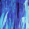
WHICH 3 TEXTURES DO YOU USE THE MOST THESE DAYS AND WHY?
My favourite 3 are in this set here.
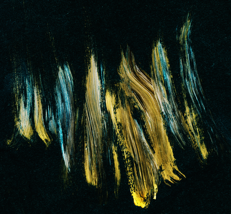
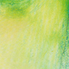
My current fav is the Green/Red one, I love the light the green gives and often I crop it down and change the hue & put it on screen (I used it on this icon here:
)
The Blue texture with the cream streak is my second fav: My icons OFTEN have a purple hue to the blacks, this is normally from using this texture on softlight and then screen (sometimes with a hue change)
My third would be the firey coloured long texture, it add's an interesting texture to edges (I used it on this icon here:
) I will often use the black of it on screen also, to add some red to the blacks of my icon.
I am afraid I don’t have credit for all of these!
By eamesie. I use this texture, or gradients/textures/b&w blobs I draw myself like it, on pretty much every icon. I particularly like this one because it can create a good sense of direction of light in icons that don’t already have definition (and that is very important to me).
I use lovely, colourful, splodgey textures like this one (and especially this one) to help add colour and vibrancy to an icon where it is otherwise muted.
I have to hold myself back from not using this texture more actually! It can add a really good sense of focus to an otherwise wide or uninteresting crop.
o1.

o2.

o3.

o1. light textures by drankmywar (defaultsettings)
o2. textures by poshing (a_darkdesign)
o3. textures by whisperedtimes (lovebasics: member's only)
i use a lot of larger textures these days. so i also have a few links for these.
→ blueymcphluey tag
→ emmahyphenjane tag
→ pandavirus tag
the reason why i use larger textures more often nowadays is that you are not limited to 100x100px. i got into this while, one round at 20inspirations. and i think it works perfect for icons, as well.
the problem is I rarely know the names of the makers. I try to credit everyone at my icon journal, but on my computer all textures are dumped into ca 3 files and renamed :C I'll try to find out the makers for my top 3 textures, let's see.

I've seen this one in a tutorial by schmiss (I'll link to it in another question/answer) and have been using it since. I mostly set it to softlight and copy it several times (if you don't like the green-ish touch, desaturate it or change its colour entirely). it lights up your one half of the icon while it darkens the other. I always feel like my icons look flat without it these days, so I use it 99% of the time.
I think I got this one from deny1984. set to screen, it gives your icon a really nice, grungy/used look. not much more I can say about it (:
since the complexity challenge at 20inspirations I've been using this paint texture by blueymcphluey a lot. again, it adds a nice grungy look to your icon (I mostly set it to soft light), but it's a lot harder to control than the previous texture. it doesn't always work, so use it with care!


I don’t tend to use noticeable textures in my icons, more so in my tumblr graphics, but these are always staple textures that I often slap on to give a little extra to the black in an icon.
Hmmm I tend to use a lot of different textures or I just make a new layer and then paint my own 'texture' on that enhancing what I want to enhance... but I have to been known to overuse these three, the first two are by drankmywar I believe and I'm not sure who made the last one!


uhm... I used some small ones by navras_rheya for my haven-set? (I dislike 100x100textures, though, they feel constrictive and I usually work on 400x400px anyway) They had nice lighting and soft colours. Else I sometimes use random-stock images. But most of the time, I go for texture-brushes by elli, blimey_icons or meivocis. Or stock images (also by elli, resurgere on devianart or since elli linked it lostandtaken)
So, yeah, brushes... examples.
the clouds on this are brushes:
the background on these are brushes
Maidel just asked me (in Chat, I was talking to her about these questions), if I were bringing brushes back, and I am wondering whether they're really gone? Do people mostly remember 100x100 brushes that you stamped on your icon? People, there were tons of lovely and useful brushes out there. Don't be afraid!
I use my own textures which are a new layer with light blops I do myself. I have no idea if you can call this a texture but it is the closest thing to a texture I use. I also use a lot the cap itself as a texture. I resize it in a different (usually bigger) size than the one I use in my icon base and set it to soft light, lighten or screen. You can have some fantastic results doing this.
I rarely use a texture twice, there are just too many pretty ones to use just a few.
The only one I use regularly is this one by lookslikerain, because it’s perfect for creating slightly irregular border: click.
I use so many different textures, its hard to narrow it down to just three, but here are some that I keep going back to.
by eamesie
I love the gradient from light to dark on this. Set it to soft light and it can change the emphasis of light on an icon and give it a more dramatic effect. Sometimes I use it how it is, sometimes, I use Hue/Saturation to change the color to suit the image I am working with, and sometimes I make with black and white with a gradient map.

by cielo_gris
I use this texture a lot when adding borders along the sides or when I want to mask off the top or bottom. I love how there is a softness to the edge and its not just a hard line. It provides a more gradual transition from black to white.
by vol4tica
This is just an all around nice grunge texture. I usually convert this to B & W using a gradient map and set to screen.

by obsidian_gaze.
Looks like a stupid little texture anyone could make, but it's so good! I like the warm coloring it brings to the icon when you set it to soft light, or hard light at a lower opacity. You can also use it on Multiply to create pretty shadows or fix overexposure.

by cielo_gris.
Idk, when I finish an icon and it looks boring, I slap this one on top, lower the opacity, erase some parts if they don't work, and it instantly looks better. Witchcraft, I tell you. All of cielo_gris' textures are magical.

by... me.
It's no more than a black-to-white gradient, but oh boy how damn useful it is. I use it on every icon. Move it around, rotate, smudge it, at any layer blending you want (soft light specially), and it gives a great oomph to the contrast and shadows. Couldn't icon without it if I tried.
I don’t use that many textures and it’s something I’m trying to improve on. I’ve mostly been trying to use light textures on different blending modes to see what things I can come up with and I’ve made some new icons that are much different from what I would usually do because of this. I’m sure you could do amazing things with any three textures by drankmywar @ defaultsettings. This pack, in particular, is great!
Texture by motorized: I love what this texture can do on screen and soft light. There is this lovely shade to the blue that works with the shadows or can really create some lovely lighting effects on an icon.
Texture by elli: I love playing with parts of this texture, turning it either dark blue or black & white and allowing the sharpness to add the same sort of sharpness to my icons.
Texture by shoqolad: BLUE + SHINY! It has a wonderfully textured feel as well that really comes across in icons if you use it the right way. Sometimes I play around with the dark blue/black area, and other times I use the lightness to add some brightness into an icon. It really is lots of fun!
I’ll be honest and say I’m just not that adventurous when it comes to textures, I tend to just use light blobs and maybe overlay part of the edited cap over my icon and set to soft light or something similar. I am currently trying to use them more though. Three I like at the moment are:
This one by noisettee
And these two by lookslikerain:
i mostly just use gradients. i love the soft texture they give the icon.
END PART I.
(spotted any mistakes, wrong coding etc? please let me know!)