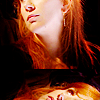
These are stunning! the colours are fantastic and beautiful! Wow, brilliant work! I especially love 17: the red and yellow are so vivid and look amazing together! I also really adore the pastel colours and composition of 21. 8 is really atmospheric and the contrast is perfect.
thank you so much! yeah, i absolutely loved the cap of 17! i just had to modify the color in the background and a bit but i'm satisfied with the end result as well (:
Wow, just wow, your Star Trek icons are just perfect. I'm in love with 14 and 21, the use of space on 21 absolutely kills me. And it looks like candy :D
thank you!! i adored the original cap of #14, it had great potential and i'm fairly satisfied with what i came up with. yes, candy! i'll never forget, my concrit for being accepted to this community was that, kristen said that she loved my icons mostly because the colors remind ed her of candy. it definitely has to do with the style i have now
SUCH PRETTYYYY COLORSSS! ♥ I'm loving how active you are lately. And once more, you're like the QUEEN of negative space. Favorites: #3 (lovely composition), #4 (love the softish coloring, the perfect sharpening and the crop), ALL THE TREK ONES, but specially #13 (pretty coloring + negspace), #14-16 (idk, I just like them), #17 (GORGEOUS coloring and color scheme)and #21 (om nom nom candy)!
Comments 26
Reply
yeah, i absolutely loved the cap of 17! i just had to modify the color in the background and a bit but i'm satisfied with the end result as well (:
Reply
Reply
Reply
Reply
yes, candy! i'll never forget, my concrit for being accepted to this community was that, kristen said that she loved my icons mostly because the colors remind ed her of candy. it definitely has to do with the style i have now
Reply
I don't exactly know what's the difference, but it's refreshingly different from most other negative space icons <3
Reply
Reply
Reply
Reply
Reply
Reply
Leave a comment