Free Text/Blurb: the coding is different there....
Account Status: All
Theme: Flexible Squares, maybe others
Actions: Free Text/Blurb styling.
Links: Code Index

I've done a tutorial where you learned a little bit about tables in a post ( Mixed Content Side by Side or Tables). But, now, let's talk about coding for your free text or blurb on your sidebar. See it is very different and works a little like your profile. Here is the dilemma we are presented with this image on the right. What I don't want my sidebar to do:
You can see all my layouts at http://layout-lounge.livejournal.com">Layout Lounge and my LJ art work at http://graffitigraphic.livejournal.com">Graffiti Graphics.
textarea rows="10" cols="80"
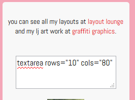
First if you notice the center is on a different line than my text as is the /center. In the free text this will mean extra space. Also, you need to look at the textbox (or text area) like this: the and blank line between my textbox and my text is 2 lines which is why the gap there looks greater than I want. If I change the coding to what you see below it will change the look of my free text.
You can see all my layouts at http://layout-lounge.livejournal.com">Layout Lounge and my LJ art work at http://graffitigraphic.livejournal.com">Graffiti Graphics.
textarea rows="10" cols="80"
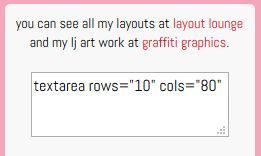
No matter what you do the center and /center will act as a line so this mean for only one line between text and textbox I must remove any extra lines between them in my code.
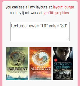
What about those books or images? The reason they are not on the same line is because I have each image and it's link on a seperate line in my coding. But I want a gap between the textbox and those images. This is how we should code it:You can see all my layouts at http://layout-lounge.livejournal.com">Layout Lounge and my LJ art work at http://graffitigraphic.livejournal.com">Graffiti Graphics.
textarea rows="10" cols="80"
But does this apply to the table? Let's look at this part of the coding....
There appears to be only one line between the images and the table. But what have we learned so far. Any extra line breaks can result in extra space. But how can that be because our table looks normal?
Because of the table coding it is shoving all the extra line breaks above the table. So when coding a table it needs to look more like this:
Your sidebar now will look like this:
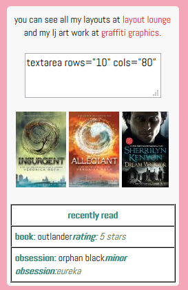
What a change right?
This mentality of coding is pretty much the same when dealing with your profile coding. So the same principles apply.
Any questions about this tutorial? Please Comment
Theme: Flexible Squares, maybe others
Actions: Free Text/Blurb styling.
Links: Code Index

I've done a tutorial where you learned a little bit about tables in a post ( Mixed Content Side by Side or Tables). But, now, let's talk about coding for your free text or blurb on your sidebar. See it is very different and works a little like your profile. Here is the dilemma we are presented with this image on the right. What I don't want my sidebar to do:
- There is a gap at the top of my sidebar
- Looks like there more than one line of a gap between my text and my textbox.
- All my book images are on a different line
- There is a HUGE gap between my book images and my table.
You can see all my layouts at http://layout-lounge.livejournal.com">Layout Lounge and my LJ art work at http://graffitigraphic.livejournal.com">Graffiti Graphics.
| Recently Read |
| Book: Outlander rating: 5 Stars |
| Obsession: Orphan Black minor obsession: Eureka |
First if you notice the center is on a different line than my text as is the /center. In the free text this will mean extra space. Also, you need to look at the textbox (or text area) like this: the and blank line between my textbox and my text is 2 lines which is why the gap there looks greater than I want. If I change the coding to what you see below it will change the look of my free text.
No matter what you do the center and /center will act as a line so this mean for only one line between text and textbox I must remove any extra lines between them in my code.


What about those books or images? The reason they are not on the same line is because I have each image and it's link on a seperate line in my coding. But I want a gap between the textbox and those images. This is how we should code it:

But does this apply to the table? Let's look at this part of the coding....
| Recently Read |
| Book: Outlander rating: 5 Stars |
| Obsession: Orphan Black minor obsession: Eureka |
There appears to be only one line between the images and the table. But what have we learned so far. Any extra line breaks can result in extra space. But how can that be because our table looks normal?
Because of the table coding it is shoving all the extra line breaks above the table. So when coding a table it needs to look more like this:
| Recently Read |
| Book: Outlanderrating: 5 Stars |
| Obsession: Orphan Blackminor obsession:Eureka |
Your sidebar now will look like this:

What a change right?
This mentality of coding is pretty much the same when dealing with your profile coding. So the same principles apply.
Any questions about this tutorial? Please Comment