Icon tutorial # 1
Learn how to make an icon like this.
[x] Don't steal and repost this as your own
[x] Comment if you like or...whatever ^^;;
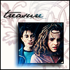
First I will be using this POA screencap of Harry & Hermione:
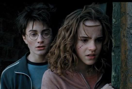
(I cropped it already so it wouldn't be too large)
1. Now prepare your image, if you want to sharpen it do so and lighten it up if you wish. I personally duplicated the image, sharpened it twice then duplicated it again and set it to screen then fiddled with the Opacity. After I was happy with it I merged it together. Try to crop the image so its a square unless you want a small long picture
2. Next go Image > Image Size and make it some number below 100. I believe I did 65 (just the first number you need to change) and it looked like this:

3. I always like to fool around w/ the hue settings for my icons, so now go to Image > Adjustments > Hue/Saturation. A screen like this will pop up and this is what I did
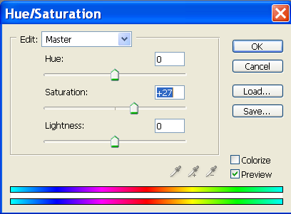
and got this

4. Now go to Image > Adjustments > Brightness/Contrast, mess around with it till you like how your image looks, this was mine,
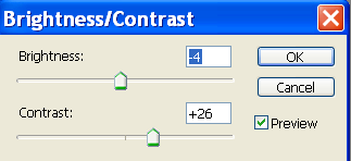
and now I have this

5. Its time for layers now,
I make a new layer and fill it with a dark blue color, set it to Exclusion
Another layer and fill it with a light brown and set it to Multiply (Play around w/ this layers Opacity if you like)
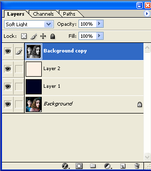
Now duplicate the base picture and bring it to the top, go to Image > Adjustments > Desaturate and set that layer to Soft Light then flatten the image.
This is how your layers should look before you flatten it
and this is what I have now

6. Alright now make a new 100x100 image that is white (File>New>100x100>Backgournd contents:white)
Now I like to use the Deco brushes by dj43, this is the one I used
but any decorative brushes will do, as long as they are large enough to take up most of the white background.
I picked a dark red color and set the opacity to a low number like 30 or 25. You don't want the backgournd image to be too dominate.
Here is what I got,
7. Now drag the little picture of Harry & Hermione over to the new background. Go to Edit > Stroke and pick 1px and a color you want for the border around the small picture to be. Now make sure the layer w/ the picture of Harry and Hermione is still highlighted and go to the little "f" on the bottom of your layers table
see it? click on it and you'll get a little menu, click on "Drop Shadow" a new menu will pop up and use the little dial to rotate the angle of your shadow and adjust how dark or light you would like it.
*That is the basic stuff, after this point its up to you if want to add anything else but this is what I usually do after step 7*
8. I used some light textures by the wonderful entropic_icons and placed them around the icon. These new light layers are on screen and I erase anything that is covering their faces.
9. Then I added a text brush by _blisse
10. I like to add one more layer and thats a layer filled w/ another light brown color and set to Multiply but the opacity is 20 then flatten your icon.
10. Last but not least I go to Select > Select All then to Edit> Stroke> 1px and your done!
The finished product->
Other similar icons I have done this with: