Icon Tutorial 003 --> Boyd Holbrook
Go from this base: 
to this icon: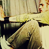
++Beginner Friendly++
Made in PS7, but probably easy to translate. Do not make this exact icon!
At the bottom of this tutorial is a what my layers looked like when I was finished, along with what I did to each layer. It is easier than reading the whole tutorial.
Step One
So I took my base (that's easy, isn't it?):
Step Two
I filled a layer with the color #18105A and set it to Difference at 44% opacity.
Step Three
I then made a copy of my base and set it on top of the Exclusion layer. I made it black and white (Ctrl+U --> Saturation -100) and set it to soft light 100% opacity.
Now my icon looks like this:
Step Four
Then I made a new layer with the color #18105A in it above the B&W layer and set it at Exclusion 67% opacity.
Step Five
I made another copy of my base and set it at the top. I then put it at colorburn 51% opacity.
My icon now looks like this:
Step Six
I'm a fan of tweaking my icons until I get just the perfect coloring for my tastes. So next, I put on a gradient by alex_c_potter at soft light 61% opacity.

Step Seven
I then made yet another copy of my base and set it to the top as well. I set it at vivid light 23% opacity.
My icon looks like this by now:
Step Eight
We're almost done. I decided I wanted a little more orange-y tint to my icon, so I added a layer filled with this color: #CE964A. I set it at multiply and 14% opacity.
After this step, my icon looks as such:
Step Nine
Last step! All I had to do was add text. I chose a color that matched one in his pants. It was #796A38 or something very similar. I aligned it with his sleeve and set it at 47% opacity.
So here is the final icon:
And here is a simple guide to the tutorial's layers, if you just want a small rundown of what I did with them:

to this icon:
++Beginner Friendly++
Made in PS7, but probably easy to translate. Do not make this exact icon!
At the bottom of this tutorial is a what my layers looked like when I was finished, along with what I did to each layer. It is easier than reading the whole tutorial.
Step One
So I took my base (that's easy, isn't it?):
Step Two
I filled a layer with the color #18105A and set it to Difference at 44% opacity.
Step Three
I then made a copy of my base and set it on top of the Exclusion layer. I made it black and white (Ctrl+U --> Saturation -100) and set it to soft light 100% opacity.
Now my icon looks like this:
Step Four
Then I made a new layer with the color #18105A in it above the B&W layer and set it at Exclusion 67% opacity.
Step Five
I made another copy of my base and set it at the top. I then put it at colorburn 51% opacity.
My icon now looks like this:
Step Six
I'm a fan of tweaking my icons until I get just the perfect coloring for my tastes. So next, I put on a gradient by alex_c_potter at soft light 61% opacity.
Step Seven
I then made yet another copy of my base and set it to the top as well. I set it at vivid light 23% opacity.
My icon looks like this by now:
Step Eight
We're almost done. I decided I wanted a little more orange-y tint to my icon, so I added a layer filled with this color: #CE964A. I set it at multiply and 14% opacity.
After this step, my icon looks as such:
Step Nine
Last step! All I had to do was add text. I chose a color that matched one in his pants. It was #796A38 or something very similar. I aligned it with his sleeve and set it at 47% opacity.
So here is the final icon:
And here is a simple guide to the tutorial's layers, if you just want a small rundown of what I did with them: