For this week's Just a Graphics Challenge between valiantarcher and I, here are two icons - Narnian, because I haven't done a Narnia graphic in a while:
Hehe, don't worry about it; I completely understand the feeling. ;))
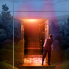
I'm working on my graphic for this week. It's something I've had an idea for for months, but I can't remember exactly how I was picturing it, which is probably good because it's looking different than I thought. We'll see how it turns out...
That is an interesting color scheme on the second one. It's very vintage-y. I am torn on whether I like it, or if it is just too pink in that small a space. (And is it even pink? Maybe it's sepia?) The crop is good, and I like the snow in the background.
The first one immediately strikes one as appealing, but then I don't really have anything else to say about it. So! [/full of opinions]
Me, too, actually. I wanted it a bit more blue, but without starting over I couldn't get that looking right, so I stuck with pink. I didn't look at it as vintage-y before, but I can see a hint of that now you mention it.
Aha! :D I found it. ;)) Very nice colouring on the sig; I like things symmetrical, so I probably would've centered the words on Bilbo (or centered Bilbo between the words...), but it works fine the way you've done it. :) Also, very nice colouring and cropping on the Katniss icon! :)
I like the cropping and colouring on the new avy! And the text does work pretty well. Nice work with it. :) Also, the colouring and cropping is lovely on the sig. :D
Comments 9
The first is very pretty. :) I like the set up on the second, though it looks a little jagged about Peter's edges.
Reply
Reply
I'm working on my graphic for this week. It's something I've had an idea for for months, but I can't remember exactly how I was picturing it, which is probably good because it's looking different than I thought. We'll see how it turns out...
Reply
The first one immediately strikes one as appealing, but then I don't really have anything else to say about it. So! [/full of opinions]
Reply
I had a lot of fun making the first. :)
Thanks for the opinions! :D
Reply
Reply
Reply
Reply
Also, the colouring and cropping is lovely on the sig. :D
Reply
Leave a comment