50.
Another tutorial for likealight, who asked about close cropping and sharpening. This is mostly going to be me rambling, with a little bit of the making of specific icons and screenshots. As always, if you have any questions on anything, feel free to ask.
Warning: Image heavy. ;)
For most of this I'm going to talk about the 3 icons above. The two Dianna Agron icons were made for inspired20in20 and the Fringe one was made for elitesimplicity. I'm warning you in advance that I'm sort of terrible and don't really follow the rule of thirds in the proper way. I follow it, but only because in general that's what looks good. I don't draw lines on my canvas and place the image, etc. I decide where I want the focus, or I put the image on a canvas and move it around until I figure out what the focus should be. XD More below.
Part the First: All Your Base
I am the biggest sucker for close crops and negative space. Basically, I like the extremes. Center crops and middle distance crops are great, don't get me wrong, but there is something about the two ends of the spectrum, especially close crops: they don't just happen. It takes the right cap or picture to pull off, and there are so many times I think I'm going to close crop an image and it just doesn't work.
With negative space, as long as there is enough background, or background you can extend, or a figure you can cut out and put on a different background, etc, you can pretty much make anything work. It's also very forgiving. If the image quality isn't the greatest, you can still make it happen. The right coloring and filters, the perfect background or texture, and you can hide the flaws of a negative space icon. The subject will likely end up so small that you can't even tell what quality the original image was (unless it's just fucking terrible). When it comes to close crops though, it's all in your face (pun totally intended).
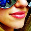
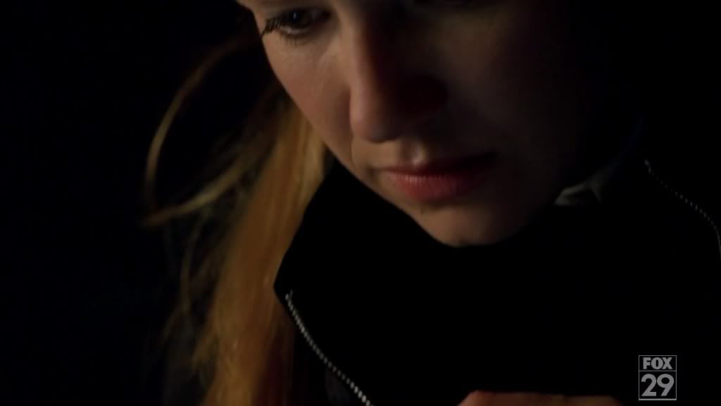
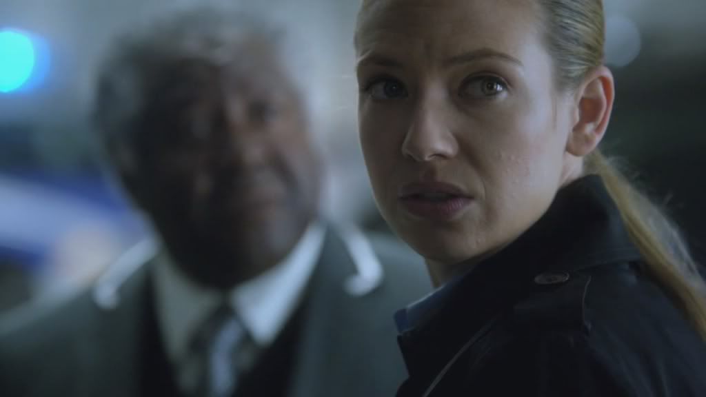
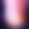
Having said that about negative space, that doesn't mean you have to have these gloriously hi-res images, three by three thousand pixels. For example, the first icon of Dianna came from this base image:
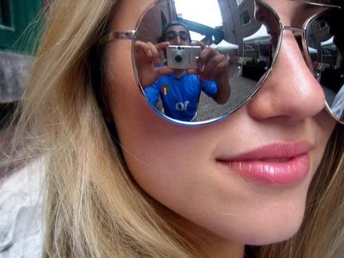
It's 500x375 which isn't very big at all. For me, it's more about the quality of the image and perspective. I want my close crops to have a unique or creative composition. I want them to be somewhat interesting to start with, to have something that makes me want to get up close and personal. In the case of this image, I loved that it was already colorful and was very smooth (i.e. not grainy, evenly colored over the side of her face, no awkward lens flare going on). I also liked that you could only see part of her face, and that there was this almost fish eye effect because of the big sunglasses. It also helps I have a passing fancy with Miss Agron's mouth. *AHEM*
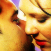
The second icon started with this image:
This screencap can really only be a close crop. When I'm prowling my screencaps folder or a gallery, images like this often jump out at me. The problem is that a lot of them are in motion, or are not framed right to make a good icon. So when I find one, I snag it whether I need it or not, because someday, I MIGHT. When it's zoomed in like this, especially in the case of a kiss, I like to go for the caps where the subjects are just about to kiss, where their faces are still separate and have space between them or shadowing that gives you the impression of space between them. Once faces get all smushed together I find it gets too hard to decide how to crop it. The spacing helps with that because when you crop you won't have this mass of FACE in your face. If that makes sense. You want the eye to have something to focus on that isn't just skin, and in this image my eye immediately goes to her nose and then down to their lips and the space between. It's also really hot. XD
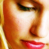
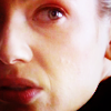
The third icon came from this:
It's a basic sadface!Quinn cap from Glee. There's nothing inherently special about it, so it can become a lot of things. It could be center cropped on Quinn, the blurred background would allow for some negative space, as long as you have something to cover the missing portion of her head texture-wise or with the right composition, or it could be close cropped. OH, THE POSSIBILITIES. :)
Part the Second: Snip Snip
This is my basic method for cropping any image.
1. Open it and check the size.
2. Create a new square image using the lower of the two numbers between height and width. In the case of the first base image, 375x375.
3. Copy and paste the original image to this new square canvas and adjust it until you like it, making sure to keep as much of the subject's face, or the subject you want to crop to visible. For this icon I lined up the right edges, giving me her whole face and some of her hair in the frame.
Now I have something I can work with that is square and can be easily resized to icon size.
4. Ask myself if there is anything I need to crop out of the image: the dude reflected in her sunglasses.
5. Select All (Ctrl+A).
6. Select menu >> Transform Selection (or whatever shortcut you have setup). If you like free transform, go for it. You can also make another canvas in a different size, copy paste and move it around until your happy. Which method I use depends on the size of the base image and if there is anything I need/want to crop out of the picture.
7. Hold the left Shift key and drag the selection down until you've unselected most of what you don't want in the image. The shift key, if you didn't already know, keeps the selection square, so while you are resizing it you don't get it skewed and have to play around with getting it the size you want or shifting it around on a new canvas. For this I shrunk the selection down diagonally from the upper left to bottom right until I had a fair bit of the guy cropped out, but still enough of her sunglasses to tell they are sunglasses. It was 262x262.
8. Okay the selection change and crop image to selection.
If I like where things are at, I stop and resize to 100x100 and work from there on the icon. Most of the time I'm resizing to icon sized a lot and then undoing it. You might find that once you square the image on the new canvas, it makes a good icon, or that once you've cropped out the bits you don't like and resize it, it's good to go. I probably do this 4 or 5 times before I'm happy with my icon base.
Alternatively, for the second icon's starting cap, I made a square canvas 720x720, pasted the original image onto it and just moved it around until it was framed in a way I liked. Again, the nose and mouth area were my chosen focus, so I tried to put her nose in the middle of the icon and let the eye fall on a diagonal down to their lips.
Another thing that helps is if there is a distinct light source or shadow. If there is, you can use that as a guide to help you find a good focal point or to decide how to crop it. You might want to put the light to the side and have only part of the subject visible. With this icon of Ten, there was just a touch of light to his left and shadow to his right. So I played that up, moved him to the right, and some soft light layers and a light blob later...PRETTY!
>>
Or you could have some nice dark shadow at the top or bottom and shift the image to take advantage of that. With the icon below, I brushed some black over the right side of Olivia to make the shadows completely obscure that part of her face.
>>
Here are two other examples I've done using the light source to dictate how I cropped:
From this and this respectively.
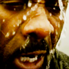
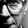
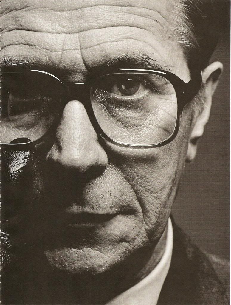
For the Luther icon, his nose ends up at about the middle of the icon and the lighter coloring to the right and the streaking liquid, helps pull the eye along almost as if you are following the gasoline as it falls over his head. For the Tinker Tailor icon, it was already in a drab greyscale, so I punched up the light on the right and dark on the left with white blobs and black blobs. The left side, the dark side, ended up so dark that the center crop I had going didn't really work for me, so scoot to the left and yay! My goal was then to draw the eye to his eye as it stares into your soul. o____o This is helped a little by the glasses circling his eye and making you want to look there.
Part the Third: Rules and Regulations
I have discovered some basic guidelines for cropping through trial and error, and doing a little light reading about art and composition.
Part the Fourth: Don't Run With Scissors
Oh god, sharpening.
I still feel like this is the bane of my existence. My head goes around in circles so much: Is that too sharp? Not sharp enough? Should I blur tool or smudge or a blur layer? OH GOD WHY DO THESE JAGGED EDGES EXIST I HATE YOU SOMETIMES ANTI ALIAS.
*ahem*
Sorry.
Sharpening really becomes key when you're looking at close crops. Anything with an angle or edge is a cause for concern such as nose, jaw/chin, neck, and head/hair. I have never encountered a sharpening issue with lips or eyes unless it was the base image itself. If a base image looks too sharpened too me or already has jagged edges, I will likely avoid even messing with it. I also rarely have to sharpen something more. Typically, I find myself strategically blurring here and there using the blur tool or a blur layer with lowered opacity.
If I know an image is off to begin with I will copy the base layer, Filter >> Sharpen. Then Edit >> Fade Sharpen and adjust the percentage until I like it.
Sometimes to make a not as nice quality image look better, I will use some blur layers. Copy the base layer, Box Blur at 5 or Gaussian Blur at 5, whichever looks better to me at the time. Then lower the opacity to 10 or 15%. It may take a Box Blur layer and a Gaussian layer, but I never set them more than 15% opacity. This is just to do some subtle smoothing of those patchy areas, and give you a better base to work with. If I like the result, then I'll copy merge the whole thing to a new canvas. I never destroy my base image in case I need to go back.
KNOW WHEN TO GIVE UP. If you can't get the base to look decent, the icon will never look decent. If it's an over-sharp catastrophe with splotchy coloring, or a fuzzy hot mess, it's always going to be those things.
Sharpened edges aren't bad, but I'm not gonna lie, they can grate on my last nerve. I find my eye drawn to those lines and I always feel like it makes the finished product seem lower quality. That's not to say there are not FABULOUS sharp/over sharp icons. Some makers can pull them off like nobody's business and when I see them they don't make me want to scratch my eyes out. I think the key to sharpening with any graphic is balance. Is it evenly sharpened, evenly blurred?
My number one rule is NOT to worry about sharpening or blurring until the end/near the end. The process of coloring and adding all these layers changes the image and can make some slightly jagged edges more pronounced or hide them all together. Something might seem fine on the original image is suddenly making you freak out at the end. I also usually hold off on any last textures. Textures used for coloring that you put on in the middle are fine, but when it comes to those black and white ones, or paint and grungy textures, etc, that you set on screen and plunk on top the whole thing, I leave those off until I've looked at my sharpening. Those really don't have much effect on sharpness in my experience.
The second rule I follow is always sharpen or blur on a copy. Before I sharpen I do a clone stamp of all the layers, put it on top, and then do my work on that. If I mess up, or don't like it once I add any finishing touches, I can delete it and just clone stamp again.
Finally, number three, work small. Unless I'm doing a blur layer for some dreamy fuzziness or lighting, or I really need to sharpen the whole thing, I zoom way in when I do touch up sharpening or blurring. Often there are only certain areas that need adjustment, so rather than make sharpened layers or blurred layers and fudge with them, I just zoom in and use about a 3 or 5 pixel blur or sharpen tool and go over what I want to adjust. I do a little, zoom out and see if it's glaring obvious, better, or holy god what did I just do undo undo, zoom back in, and keep going as needed.
For shits and giggles, here is me making an icon, start to finish.
>>
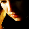
1. Open the base image. Make a new 720x720 canvas, copy and paste the image into it, adjust until Olivia is basically centered. The right edge of the cap is the right edge of the image.
2. Decide where I wanted to focus my close crop. Looking at this, there is a light source on the right side, shadow on the left, and her dark boring coat at the bottom.
3. Make a new canvas 500x500, copy and paste image into it. Slide image to the left until I'm happy. Keeping part of her eye is weird, but that side of her face is so dark, and I don't want a half light, half dark icon. I want to focus on the lighter side of her face, and her wide bright eye. So I move the image along until the eye on the left is basically gone from the frame, but her nose and mouth remain.
4. I resize temporarily to 100x100 to see if I like where this is going. I do, but it's not close enough. So I undo my resize, Select All, then Select >> Transform Selection and hold down my shift key while I move the bounding box around. I ended up with one that was 375x375.
5. It still wasn't close enough to be what I wanted so I made another new canvas 300x300, copy and paste, move around and got this:
6. Resized to 100x100.
7. Now I just do my usual coloring routine. The layers are as follows:
And we are here: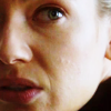
8. Now it's okay, but too dark. So I make a new layer and add some light blobs in white with a soft round brush at 30. I keep most of it to the area under her eye and down her face, and a little on the side of her nose. I also added a little black to the area where her other eye would be.
9. Gaussian blurred this layer at 10 and set it to Soft Light 100%.
10. Clone Stamp all layers, Soft Light 50%.
11. Now it's time for a texture to brighten this and give the color some more guts. I was originally looking for something light and natural, but I noticed that her lips were quite pink and I really liked that. I wasn't going for monochromatic exactly, but more of an overall soft color. I settled on this texture by drankmywar.
Which I manipulated to:
12. I set the texture on Soft Light 100%. It gives it a nice light pinky color, but I want more.
13. Add a Selective Color layer, Reds: -30, 0, 0, +15
14. Clone Stamp all layers. Set to Soft Light 30%.
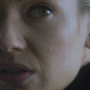
15. Now I like this, but if you look at the right side, the jaw line has a sharp line to it which contrasts quite a bit with the rest that has this soft, dreamy/fuzzy quality. Zooming in it becomes much more obvious.
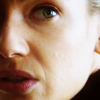
16. Grab your Blur Tool, set it to 3px soft round, and just go along that little jagged edge. I just put my mouse there and followed along it once, then did a tiny bit up by her ear.
17. When you zoom out it might not seem like much but the before and after is noticable to me.
>>
18. Clone Stamp all the layers. Gaussian Blur at 1. Set to 30% opacity.
I might go up to 5px on the blur tool if it's a larger graphic, but very rarely more and certainly never over 10px. All you really want to do is take those 3-5 pixels along that edge and smooth them a bit, blend them to the background or to whatever the object is sitting next to. I find I have to do this a lot when the image is a gentleman in a suit, typically with the shoulders, shirt collar along the neck and one edge of the tie, where it lays against the shirt.
Just remember to do small amounts at first and make sure it's giving you the look you want. It's okay to go over an edge multiple times if it doesn't smooth out right the first time. I still do this even if I think I'm going to put a blur layer on top, just because. If it's a particularly sharp line, like this icon was before I blurred the lines of his coat:
>>
His hair was soft and the lighting was just the right kind of fuzzy, that the hard lines of his coat was making my teeth itch. XD
So I've rambled a fair bit on this topic, but cropping is really something near and dear to my heart. It was the first thing I think I was reasonably good at and I always try to maintain that. A crop can make a great icon FANTASTIC and a bad icon eye bleedingly awful. Sharpening is still something I feel like I don't have down. I play with my blurring and sharpening so much at the end of an icon, and the more I try to do something overall to it, like using the Sharpen filter and then fading the sharpen, the more I just prefer to selectively blur and sharpen what needs adjusting.
Class dismissed. XD
Warning: Image heavy. ;)
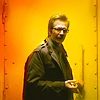
For most of this I'm going to talk about the 3 icons above. The two Dianna Agron icons were made for inspired20in20 and the Fringe one was made for elitesimplicity. I'm warning you in advance that I'm sort of terrible and don't really follow the rule of thirds in the proper way. I follow it, but only because in general that's what looks good. I don't draw lines on my canvas and place the image, etc. I decide where I want the focus, or I put the image on a canvas and move it around until I figure out what the focus should be. XD More below.
Part the First: All Your Base
I am the biggest sucker for close crops and negative space. Basically, I like the extremes. Center crops and middle distance crops are great, don't get me wrong, but there is something about the two ends of the spectrum, especially close crops: they don't just happen. It takes the right cap or picture to pull off, and there are so many times I think I'm going to close crop an image and it just doesn't work.
With negative space, as long as there is enough background, or background you can extend, or a figure you can cut out and put on a different background, etc, you can pretty much make anything work. It's also very forgiving. If the image quality isn't the greatest, you can still make it happen. The right coloring and filters, the perfect background or texture, and you can hide the flaws of a negative space icon. The subject will likely end up so small that you can't even tell what quality the original image was (unless it's just fucking terrible). When it comes to close crops though, it's all in your face (pun totally intended).
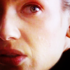
Having said that about negative space, that doesn't mean you have to have these gloriously hi-res images, three by three thousand pixels. For example, the first icon of Dianna came from this base image:
It's 500x375 which isn't very big at all. For me, it's more about the quality of the image and perspective. I want my close crops to have a unique or creative composition. I want them to be somewhat interesting to start with, to have something that makes me want to get up close and personal. In the case of this image, I loved that it was already colorful and was very smooth (i.e. not grainy, evenly colored over the side of her face, no awkward lens flare going on). I also liked that you could only see part of her face, and that there was this almost fish eye effect because of the big sunglasses. It also helps I have a passing fancy with Miss Agron's mouth. *AHEM*
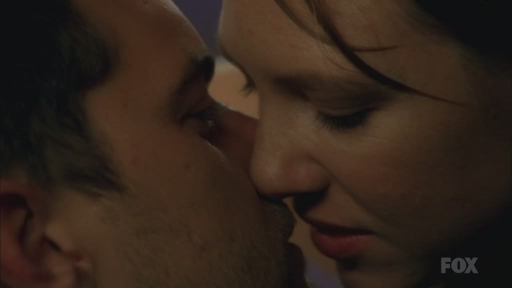
The second icon started with this image:
This screencap can really only be a close crop. When I'm prowling my screencaps folder or a gallery, images like this often jump out at me. The problem is that a lot of them are in motion, or are not framed right to make a good icon. So when I find one, I snag it whether I need it or not, because someday, I MIGHT. When it's zoomed in like this, especially in the case of a kiss, I like to go for the caps where the subjects are just about to kiss, where their faces are still separate and have space between them or shadowing that gives you the impression of space between them. Once faces get all smushed together I find it gets too hard to decide how to crop it. The spacing helps with that because when you crop you won't have this mass of FACE in your face. If that makes sense. You want the eye to have something to focus on that isn't just skin, and in this image my eye immediately goes to her nose and then down to their lips and the space between. It's also really hot. XD
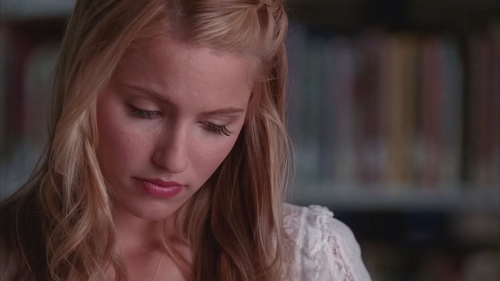
The third icon came from this:
It's a basic sadface!Quinn cap from Glee. There's nothing inherently special about it, so it can become a lot of things. It could be center cropped on Quinn, the blurred background would allow for some negative space, as long as you have something to cover the missing portion of her head texture-wise or with the right composition, or it could be close cropped. OH, THE POSSIBILITIES. :)
Part the Second: Snip Snip
This is my basic method for cropping any image.
1. Open it and check the size.
2. Create a new square image using the lower of the two numbers between height and width. In the case of the first base image, 375x375.
3. Copy and paste the original image to this new square canvas and adjust it until you like it, making sure to keep as much of the subject's face, or the subject you want to crop to visible. For this icon I lined up the right edges, giving me her whole face and some of her hair in the frame.
Now I have something I can work with that is square and can be easily resized to icon size.
4. Ask myself if there is anything I need to crop out of the image: the dude reflected in her sunglasses.
5. Select All (Ctrl+A).
6. Select menu >> Transform Selection (or whatever shortcut you have setup). If you like free transform, go for it. You can also make another canvas in a different size, copy paste and move it around until your happy. Which method I use depends on the size of the base image and if there is anything I need/want to crop out of the picture.
7. Hold the left Shift key and drag the selection down until you've unselected most of what you don't want in the image. The shift key, if you didn't already know, keeps the selection square, so while you are resizing it you don't get it skewed and have to play around with getting it the size you want or shifting it around on a new canvas. For this I shrunk the selection down diagonally from the upper left to bottom right until I had a fair bit of the guy cropped out, but still enough of her sunglasses to tell they are sunglasses. It was 262x262.
8. Okay the selection change and crop image to selection.
If I like where things are at, I stop and resize to 100x100 and work from there on the icon. Most of the time I'm resizing to icon sized a lot and then undoing it. You might find that once you square the image on the new canvas, it makes a good icon, or that once you've cropped out the bits you don't like and resize it, it's good to go. I probably do this 4 or 5 times before I'm happy with my icon base.
Alternatively, for the second icon's starting cap, I made a square canvas 720x720, pasted the original image onto it and just moved it around until it was framed in a way I liked. Again, the nose and mouth area were my chosen focus, so I tried to put her nose in the middle of the icon and let the eye fall on a diagonal down to their lips.
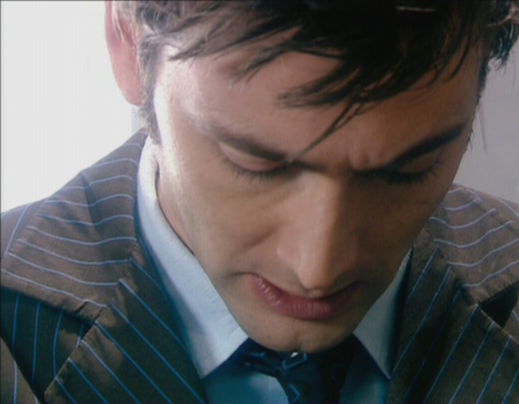
Another thing that helps is if there is a distinct light source or shadow. If there is, you can use that as a guide to help you find a good focal point or to decide how to crop it. You might want to put the light to the side and have only part of the subject visible. With this icon of Ten, there was just a touch of light to his left and shadow to his right. So I played that up, moved him to the right, and some soft light layers and a light blob later...PRETTY!
>>
Or you could have some nice dark shadow at the top or bottom and shift the image to take advantage of that. With the icon below, I brushed some black over the right side of Olivia to make the shadows completely obscure that part of her face.
>>
Here are two other examples I've done using the light source to dictate how I cropped:
From this and this respectively.
For the Luther icon, his nose ends up at about the middle of the icon and the lighter coloring to the right and the streaking liquid, helps pull the eye along almost as if you are following the gasoline as it falls over his head. For the Tinker Tailor icon, it was already in a drab greyscale, so I punched up the light on the right and dark on the left with white blobs and black blobs. The left side, the dark side, ended up so dark that the center crop I had going didn't really work for me, so scoot to the left and yay! My goal was then to draw the eye to his eye as it stares into your soul. o____o This is helped a little by the glasses circling his eye and making you want to look there.
Part the Third: Rules and Regulations
I have discovered some basic guidelines for cropping through trial and error, and doing a little light reading about art and composition.
- Keep enough of the subject so someone who isn't familiar with it can figure it out. - Too often I am browsing icons and see subjects I'm not familiar with, but I can figure out what's going on, or what the maker wanted to say/do/etc. There are also times where I'm looking at Doctor Who icons, a topic I am intimately familiar with, and I have no clue what the hell is going on or I can't make out what the icon is even OF. Making some obscure, or using an unusual crop is not bad AT ALL. But, in my opinion, if the icon is so hipster that someone looking at the icon can't see it and know what it is without staring at it like it's one of those 3-D posters, what's the point? XD
- Noses are important. - Don't crop out noses if you can help it. Faces look weird without noses because they are the center of the face, they give definition, and are a natural angle that you can use to lead or focus the eye. Also light really enjoys looking all shiny and bright on the end of a nose, so it's an easy way to help sort out those pesky light sources. Noses also help if you are cropping to the side of the face such as

by the amazing longerthanwedo.
Facial features establish boundaries. You can very easily see that this is the right side of his face, and while his cheek dominates most of the space, the eye, nose and upper lip that are included make you look to the right side and give it focus. The same all goes for chins. It's not terrible to leave them out, but sometimes it looks odd, especially if you want to focus on the lips/mouth area. (Think Fassbender, people. How dare you crop that manly jaw of perfection.) - Top or bottom, eyes and lips. - A cheap and easy way to close crop is to pick either the eyes or mouth to focus on. You can do something that cuts off the subject's mouth and they are still recognizable because the eyes are very expressive and unchanging. Likewise, some people have very distinct mouths (Billie Piper anyone?) and you can crop out their eyes without losing anything. You can also draw attention to these body parts with the right coloring.
- Personal space. - Like I said above with the Fringe icon, keep some space between subjects, even if it's just a little gap. Space helps give definition and separation.
- Go towards the light. - If there is a light source or some good shadows, use them to your advantage to make the viewers eye go where you want it to.
Part the Fourth: Don't Run With Scissors
Oh god, sharpening.
I still feel like this is the bane of my existence. My head goes around in circles so much: Is that too sharp? Not sharp enough? Should I blur tool or smudge or a blur layer? OH GOD WHY DO THESE JAGGED EDGES EXIST I HATE YOU SOMETIMES ANTI ALIAS.
*ahem*
Sorry.
Sharpening really becomes key when you're looking at close crops. Anything with an angle or edge is a cause for concern such as nose, jaw/chin, neck, and head/hair. I have never encountered a sharpening issue with lips or eyes unless it was the base image itself. If a base image looks too sharpened too me or already has jagged edges, I will likely avoid even messing with it. I also rarely have to sharpen something more. Typically, I find myself strategically blurring here and there using the blur tool or a blur layer with lowered opacity.
If I know an image is off to begin with I will copy the base layer, Filter >> Sharpen. Then Edit >> Fade Sharpen and adjust the percentage until I like it.
Sometimes to make a not as nice quality image look better, I will use some blur layers. Copy the base layer, Box Blur at 5 or Gaussian Blur at 5, whichever looks better to me at the time. Then lower the opacity to 10 or 15%. It may take a Box Blur layer and a Gaussian layer, but I never set them more than 15% opacity. This is just to do some subtle smoothing of those patchy areas, and give you a better base to work with. If I like the result, then I'll copy merge the whole thing to a new canvas. I never destroy my base image in case I need to go back.
KNOW WHEN TO GIVE UP. If you can't get the base to look decent, the icon will never look decent. If it's an over-sharp catastrophe with splotchy coloring, or a fuzzy hot mess, it's always going to be those things.
Sharpened edges aren't bad, but I'm not gonna lie, they can grate on my last nerve. I find my eye drawn to those lines and I always feel like it makes the finished product seem lower quality. That's not to say there are not FABULOUS sharp/over sharp icons. Some makers can pull them off like nobody's business and when I see them they don't make me want to scratch my eyes out. I think the key to sharpening with any graphic is balance. Is it evenly sharpened, evenly blurred?
My number one rule is NOT to worry about sharpening or blurring until the end/near the end. The process of coloring and adding all these layers changes the image and can make some slightly jagged edges more pronounced or hide them all together. Something might seem fine on the original image is suddenly making you freak out at the end. I also usually hold off on any last textures. Textures used for coloring that you put on in the middle are fine, but when it comes to those black and white ones, or paint and grungy textures, etc, that you set on screen and plunk on top the whole thing, I leave those off until I've looked at my sharpening. Those really don't have much effect on sharpness in my experience.
The second rule I follow is always sharpen or blur on a copy. Before I sharpen I do a clone stamp of all the layers, put it on top, and then do my work on that. If I mess up, or don't like it once I add any finishing touches, I can delete it and just clone stamp again.
Finally, number three, work small. Unless I'm doing a blur layer for some dreamy fuzziness or lighting, or I really need to sharpen the whole thing, I zoom way in when I do touch up sharpening or blurring. Often there are only certain areas that need adjustment, so rather than make sharpened layers or blurred layers and fudge with them, I just zoom in and use about a 3 or 5 pixel blur or sharpen tool and go over what I want to adjust. I do a little, zoom out and see if it's glaring obvious, better, or holy god what did I just do undo undo, zoom back in, and keep going as needed.
For shits and giggles, here is me making an icon, start to finish.
>>
1. Open the base image. Make a new 720x720 canvas, copy and paste the image into it, adjust until Olivia is basically centered. The right edge of the cap is the right edge of the image.
2. Decide where I wanted to focus my close crop. Looking at this, there is a light source on the right side, shadow on the left, and her dark boring coat at the bottom.
3. Make a new canvas 500x500, copy and paste image into it. Slide image to the left until I'm happy. Keeping part of her eye is weird, but that side of her face is so dark, and I don't want a half light, half dark icon. I want to focus on the lighter side of her face, and her wide bright eye. So I move the image along until the eye on the left is basically gone from the frame, but her nose and mouth remain.
4. I resize temporarily to 100x100 to see if I like where this is going. I do, but it's not close enough. So I undo my resize, Select All, then Select >> Transform Selection and hold down my shift key while I move the bounding box around. I ended up with one that was 375x375.
5. It still wasn't close enough to be what I wanted so I made another new canvas 300x300, copy and paste, move around and got this:
6. Resized to 100x100.
7. Now I just do my usual coloring routine. The layers are as follows:
- Base
- Soft Light 100%
- Screen 100%
- Brightness +30
- Color Balance, Midtones, +25, 0, -20
- Clone Stamp all layers, Soft Light 30%
- Levels +15
- Selective Color: Reds -45, 0, 0 +25; Yellows 0,0, +30, +15
And we are here:
8. Now it's okay, but too dark. So I make a new layer and add some light blobs in white with a soft round brush at 30. I keep most of it to the area under her eye and down her face, and a little on the side of her nose. I also added a little black to the area where her other eye would be.
9. Gaussian blurred this layer at 10 and set it to Soft Light 100%.
10. Clone Stamp all layers, Soft Light 50%.
11. Now it's time for a texture to brighten this and give the color some more guts. I was originally looking for something light and natural, but I noticed that her lips were quite pink and I really liked that. I wasn't going for monochromatic exactly, but more of an overall soft color. I settled on this texture by drankmywar.
Which I manipulated to:
12. I set the texture on Soft Light 100%. It gives it a nice light pinky color, but I want more.
13. Add a Selective Color layer, Reds: -30, 0, 0, +15
14. Clone Stamp all layers. Set to Soft Light 30%.
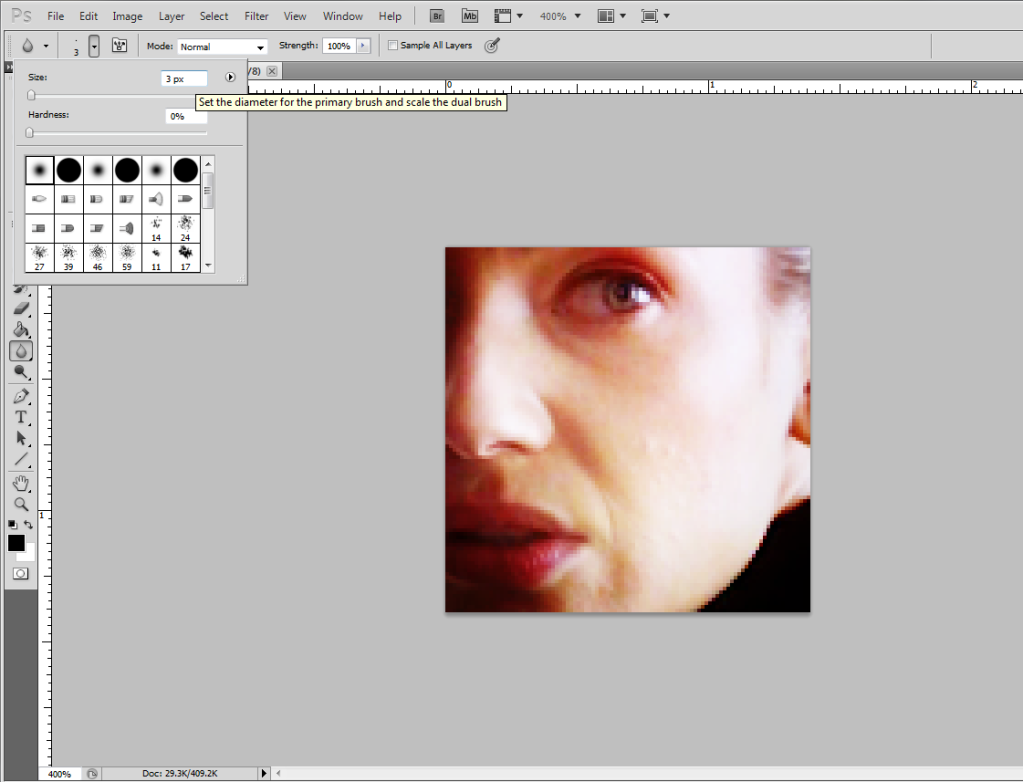
15. Now I like this, but if you look at the right side, the jaw line has a sharp line to it which contrasts quite a bit with the rest that has this soft, dreamy/fuzzy quality. Zooming in it becomes much more obvious.
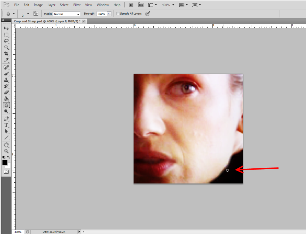
16. Grab your Blur Tool, set it to 3px soft round, and just go along that little jagged edge. I just put my mouse there and followed along it once, then did a tiny bit up by her ear.
17. When you zoom out it might not seem like much but the before and after is noticable to me.
>>
18. Clone Stamp all the layers. Gaussian Blur at 1. Set to 30% opacity.
I might go up to 5px on the blur tool if it's a larger graphic, but very rarely more and certainly never over 10px. All you really want to do is take those 3-5 pixels along that edge and smooth them a bit, blend them to the background or to whatever the object is sitting next to. I find I have to do this a lot when the image is a gentleman in a suit, typically with the shoulders, shirt collar along the neck and one edge of the tie, where it lays against the shirt.
Just remember to do small amounts at first and make sure it's giving you the look you want. It's okay to go over an edge multiple times if it doesn't smooth out right the first time. I still do this even if I think I'm going to put a blur layer on top, just because. If it's a particularly sharp line, like this icon was before I blurred the lines of his coat:
>>
His hair was soft and the lighting was just the right kind of fuzzy, that the hard lines of his coat was making my teeth itch. XD
So I've rambled a fair bit on this topic, but cropping is really something near and dear to my heart. It was the first thing I think I was reasonably good at and I always try to maintain that. A crop can make a great icon FANTASTIC and a bad icon eye bleedingly awful. Sharpening is still something I feel like I don't have down. I play with my blurring and sharpening so much at the end of an icon, and the more I try to do something overall to it, like using the Sharpen filter and then fading the sharpen, the more I just prefer to selectively blur and sharpen what needs adjusting.
Class dismissed. XD