Ginny Weasley cutout tutorial
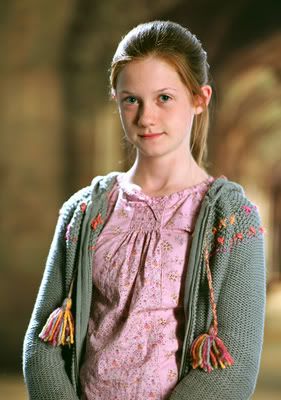
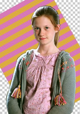
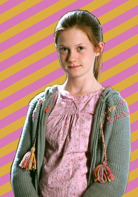
From this to 
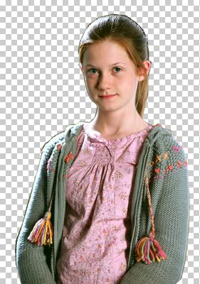
.
Made in Photoshop 7; image heavy.
1. Start off with a largish image. It makes the cutout process easier.
2. Zoom in to 200%. Get the polygonal lasso tool and cut out your person/whatever.

>>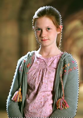
3. Invert the selection - shift ctrl i. Hit the delete key.
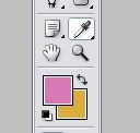
4. Get the eyedropper tool and select two of the brighter colors from your image for background & foreground. I chose #D777B9 & #DBAD3F.
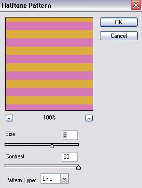
Create a new layer. Drag it below the first layer. Grab the paint bucket tool and fill the layer with foreground color. The go to filter >> sketch >> halftone pattern. Plug these settings in:
Transform the layer, press ctrl t. tilt the layer to -30 degrees or 30 degrees.
Duplicate the layer and move the new layer around until it fills a void and matches up to the pattern. Merge the layer - ctrl e. Repeat until all voids are filled.
5. Go to Image >> Canvas size and reduce the size to 100px by 100px. Link the two layers and hit ctrl t to transform them.
Hold down the shift key to constrain proportions; reduce image to size of your choice. Go to filter >> sharpen >> sharpen. Then go to edit >> fade sharpen; by 50%.

6. Duplicate the figure/whatever layer. Set the new layer to Screen, 100%. Then grab the magic wand tool and select the transparency outside the figure. Hit shift ctrl to select its inverse. Make a new layer and fill it with a dark blue (#00044D) and set it to exclusion, 100%. Keep the selection there. Create another new layer and use the blue-green-yellow gradient found in the pastels, set to radial. Drag the gradient from the face to another part of the icon. Set this layer to color burn, 70%.

Duplicate the base figure again. Drag it to the top of the layers. Set it to Soft light, 70%. With the selection still open, create another layer and fill the selection with #FFCC99 and set it to Multiply, 70%.

Duplicate that layer, drag it to the top, set it to soft light, 100%, and desaturate (Shift ctrl u) it. Go back down to the base figure and desaturate that, too.

7. Now to add the stroke. Stay on the base layer (not the background, but yeah, you know what I'm talking about), and double click it in the layers palette. The layer style window should pop up.
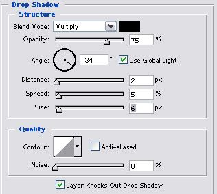
Check drop shadow and set these settings:
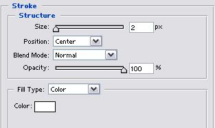
Check Stroke and set these settings (the color is white):
You should get something like this:

8. Now to customize the background. Add a new layer above the background and before the figure/whatever. Set your foreground color to white. Select the gradient tool and select the gradient, foreground to transparency. Make sure it's linear. Drag the gradient across the icon, holding the shift key down to keep it straight. Set this layer to color, 70%.

Duplicate this layer and set it to Overlay, 100%.

9. Then I added the text. Go to the top of the layers and create a new text layer. I typed 'ginny' in 24pt white carpenter icg.
Confused?
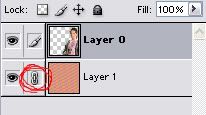
An overview of the layers:
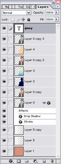
From bottom to top:
Layer 1: diagonal stripe background (#D777B9 & #DBAD3F), normal, 100%.
Layer 5: White-transparent gradient, color, 70%.
Layer 5 copy: White-transparent gradient, overlay, 100%.
Layer 0: normal, 100%, desaturated, drop shadow & stroke.
Layer 0 copy: screen, 100%.
Layer 2: Dark blue (#00044D) exclusion layer. Exclusion, 100%.
Layer 3: Yellow-Green-Blue gradient (pastels). Colorburn, 100%.
Layer 0 copy 2: Soft light, 70%.
Layer 4: #FFCC99 fill layer. Multiply, 70%.
Layer 0 copy 3: Soft light, 100%, desaturated.
'ginny' type layer: 24pt carpenter icg, white. Normal, 100%.
Hope you enjoyed! This tutorial WILL NOT BE AVAILABLE after a few weeks for non members of kirjava17icons. So, join the community, add this to mems, and check back later for more tutorials and icons by me.
For all my Harry Potter graphics, visit Phoenixi.
.
Made in Photoshop 7; image heavy.
1. Start off with a largish image. It makes the cutout process easier.
2. Zoom in to 200%. Get the polygonal lasso tool and cut out your person/whatever.
>>
3. Invert the selection - shift ctrl i. Hit the delete key.
4. Get the eyedropper tool and select two of the brighter colors from your image for background & foreground. I chose #D777B9 & #DBAD3F.
Create a new layer. Drag it below the first layer. Grab the paint bucket tool and fill the layer with foreground color. The go to filter >> sketch >> halftone pattern. Plug these settings in:
Transform the layer, press ctrl t. tilt the layer to -30 degrees or 30 degrees.
Duplicate the layer and move the new layer around until it fills a void and matches up to the pattern. Merge the layer - ctrl e. Repeat until all voids are filled.
5. Go to Image >> Canvas size and reduce the size to 100px by 100px. Link the two layers and hit ctrl t to transform them.
Hold down the shift key to constrain proportions; reduce image to size of your choice. Go to filter >> sharpen >> sharpen. Then go to edit >> fade sharpen; by 50%.
6. Duplicate the figure/whatever layer. Set the new layer to Screen, 100%. Then grab the magic wand tool and select the transparency outside the figure. Hit shift ctrl to select its inverse. Make a new layer and fill it with a dark blue (#00044D) and set it to exclusion, 100%. Keep the selection there. Create another new layer and use the blue-green-yellow gradient found in the pastels, set to radial. Drag the gradient from the face to another part of the icon. Set this layer to color burn, 70%.
Duplicate the base figure again. Drag it to the top of the layers. Set it to Soft light, 70%. With the selection still open, create another layer and fill the selection with #FFCC99 and set it to Multiply, 70%.
Duplicate that layer, drag it to the top, set it to soft light, 100%, and desaturate (Shift ctrl u) it. Go back down to the base figure and desaturate that, too.
7. Now to add the stroke. Stay on the base layer (not the background, but yeah, you know what I'm talking about), and double click it in the layers palette. The layer style window should pop up.
Check drop shadow and set these settings:
Check Stroke and set these settings (the color is white):
You should get something like this:
8. Now to customize the background. Add a new layer above the background and before the figure/whatever. Set your foreground color to white. Select the gradient tool and select the gradient, foreground to transparency. Make sure it's linear. Drag the gradient across the icon, holding the shift key down to keep it straight. Set this layer to color, 70%.
Duplicate this layer and set it to Overlay, 100%.
9. Then I added the text. Go to the top of the layers and create a new text layer. I typed 'ginny' in 24pt white carpenter icg.
Confused?
An overview of the layers:
From bottom to top:
Layer 1: diagonal stripe background (#D777B9 & #DBAD3F), normal, 100%.
Layer 5: White-transparent gradient, color, 70%.
Layer 5 copy: White-transparent gradient, overlay, 100%.
Layer 0: normal, 100%, desaturated, drop shadow & stroke.
Layer 0 copy: screen, 100%.
Layer 2: Dark blue (#00044D) exclusion layer. Exclusion, 100%.
Layer 3: Yellow-Green-Blue gradient (pastels). Colorburn, 100%.
Layer 0 copy 2: Soft light, 70%.
Layer 4: #FFCC99 fill layer. Multiply, 70%.
Layer 0 copy 3: Soft light, 100%, desaturated.
'ginny' type layer: 24pt carpenter icg, white. Normal, 100%.
Hope you enjoyed! This tutorial WILL NOT BE AVAILABLE after a few weeks for non members of kirjava17icons. So, join the community, add this to mems, and check back later for more tutorials and icons by me.
For all my Harry Potter graphics, visit Phoenixi.