Tutorial- Jessica Alba/Invisible Woman icon
OK, I don't know how many tutorials I've done now. But yeah, here's another one, this time using Jessica Alba as Susan Storm from the Fantastic Four movie, my current favourite film.
Make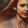
from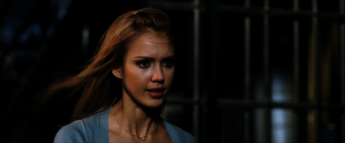
Since I suck muchly, I'm a little shaky on which resources belong to who. I have a list of people I get resources from, but I can't pinpoint a texture to a user, so if you know, could you help out? Please? Thanks ^_^
Ok, so this is the original image, taken from a trailer (capped by edele), scaled down to save loading time-

I then cropped it. I duplicated the base image then twice- the first duplicated layer I set to Screen at 100%. The second layer I desaturated (Shift + H) Saturation -78, Hue and Lightness at 0. I then set this layer to Screen at 50%. Merge all layers. With me so far? Ok!
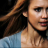
Jessica's still looking a little blurry, so I sharpened the merged image and softened out her face and neck. If you don't know how to do this, there are zounds of tutorials around, just look.

Looking better now, yeah? The next thing I did is fast becoming an icon trend- I duplicated the image again, and used the lasso tool to select Jessica's eyes. I sharpened them once.
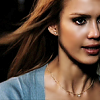
Doesn't make a great deal of difference, but I like it! Next step is to take this gradient by ?? and set it to Darken, 86%, to get a brown faded look. This is also pretty popular nowadays, so you can be creative and use your own effect here.

Next step- took this gradient by ?? and set it to Lighten, 96% (not quite sure why 96... 100% isn't any different). The bottom left hand corner's looking a little lighter now.
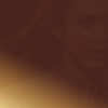
I took this star/spot texture by teh_indy and set it to Lighten 100%. I then erased all the parts that were on Jessica's face and hair.
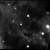
Took another starry texture by inxsomniax and set it to Lighten, 100%. It kinda adds to the cosmic effect now.
I then took this pastelly texture by gender and set it to Multiply, 50%. It doesn't make a vast amount of difference, but it kinda darkens the image a little bit more.
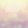
For text, I took this tiny text brush by saihara and set it to Screen, 100%, and moved it along slightly. Since I suck at putting normal text, I thought tiny text was the best way to go, really ^_^
To finish, I duplicated the original image, dragged it to the top, and set it to Soft Light, 25%, to make it a little more bold.

And there you go! If you have any questions or comments I'd love to hear them, similarly I'd love to see what results you get using this tutorial! Have fun!
If you would like me to make a tutorial on any of my other icons, ask, and you may well receive. ^_^
Make

from

Since I suck muchly, I'm a little shaky on which resources belong to who. I have a list of people I get resources from, but I can't pinpoint a texture to a user, so if you know, could you help out? Please? Thanks ^_^
Ok, so this is the original image, taken from a trailer (capped by edele), scaled down to save loading time-

I then cropped it. I duplicated the base image then twice- the first duplicated layer I set to Screen at 100%. The second layer I desaturated (Shift + H) Saturation -78, Hue and Lightness at 0. I then set this layer to Screen at 50%. Merge all layers. With me so far? Ok!

Jessica's still looking a little blurry, so I sharpened the merged image and softened out her face and neck. If you don't know how to do this, there are zounds of tutorials around, just look.

Looking better now, yeah? The next thing I did is fast becoming an icon trend- I duplicated the image again, and used the lasso tool to select Jessica's eyes. I sharpened them once.

Doesn't make a great deal of difference, but I like it! Next step is to take this gradient by ?? and set it to Darken, 86%, to get a brown faded look. This is also pretty popular nowadays, so you can be creative and use your own effect here.

Next step- took this gradient by ?? and set it to Lighten, 96% (not quite sure why 96... 100% isn't any different). The bottom left hand corner's looking a little lighter now.

I took this star/spot texture by teh_indy and set it to Lighten 100%. I then erased all the parts that were on Jessica's face and hair.

Took another starry texture by inxsomniax and set it to Lighten, 100%. It kinda adds to the cosmic effect now.

I then took this pastelly texture by gender and set it to Multiply, 50%. It doesn't make a vast amount of difference, but it kinda darkens the image a little bit more.

For text, I took this tiny text brush by saihara and set it to Screen, 100%, and moved it along slightly. Since I suck at putting normal text, I thought tiny text was the best way to go, really ^_^

To finish, I duplicated the original image, dragged it to the top, and set it to Soft Light, 25%, to make it a little more bold.

And there you go! If you have any questions or comments I'd love to hear them, similarly I'd love to see what results you get using this tutorial! Have fun!
If you would like me to make a tutorial on any of my other icons, ask, and you may well receive. ^_^