i think the size of the stroke on the text "graphic design..." is too thick for the font size. also it looks like you stretched it horizontally. it's kinda weird to me where the "fox feathers" text drops below that line running through the center, i'd either type along the path so it's all flush or maybe just move the text up and off the line. not to say my opinion counts for anything, just my initial thoughts. hope that was helpful and i don't sound like a dickhead. hope you're doing well!
i agree with andrew. also, what if you just got rid of the line in the feather and just added character spacing in the text to kind of create a pseudo line thing?
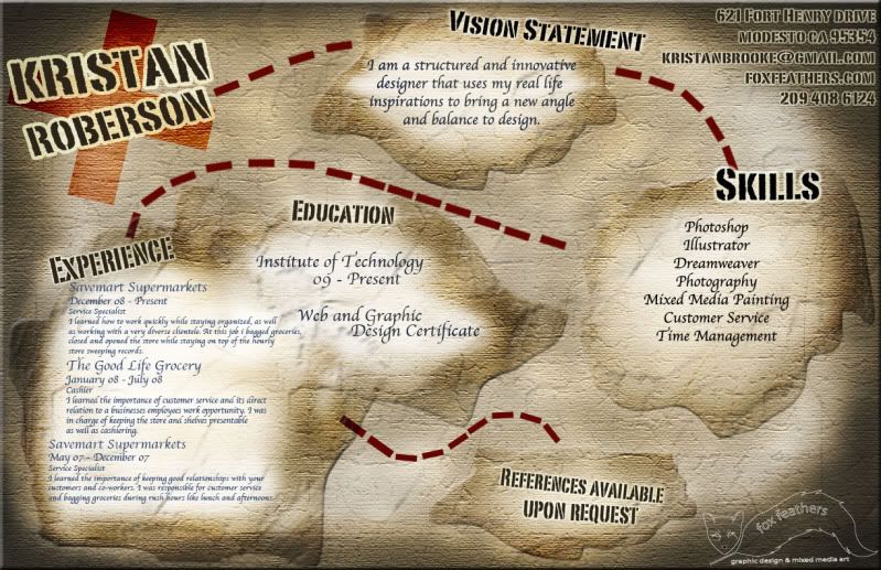
i like the resume idea, and i understand that you have to have the 'important' information easy to find, but it seems a little forced into the corner up there.
the line without the line could work, especially because it's giving me so much trouble with there being a line at all. It's funny you said that information feels forced because i designed the whole thing and realized after that i forgot my contact info.. so i threw it in there. Thanks for your opinion, seriously i really appreciate it.
Comments 4
here's a link someone just sent me to a lot of interesting fonts
http://www.unstage.com/2010/02/70-of-the-best-free-fonts-for-graphic-designers/
Reply
Thanks andrew:)
Reply
i like the resume idea, and i understand that you have to have the 'important' information easy to find, but it seems a little forced into the corner up there.
what? im just talking.
Reply
Reply
Leave a comment